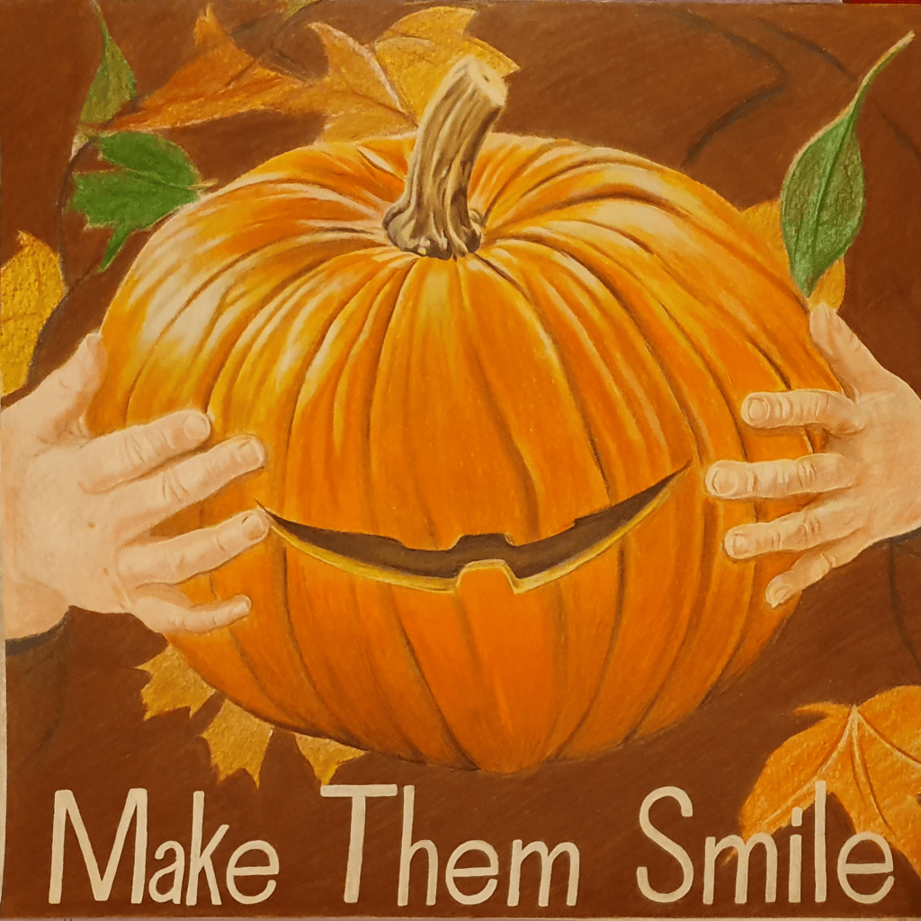
Part Four: Style

Exercise One: Identifying Tools and Materials

For this exercise I decided to look at artists who use markers for their work. I thought that this would be a good idea as I had just bought my own set of alcohol markers, though I didn’t limit the search to purely alcohol markers.

When cataloguing the artists I found, I started with Tom Deslongchamp, Elena Mortirno and Stephen Gardner.

Tom Deslongchamp:
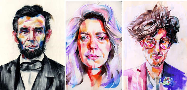
Elena Mortirno:
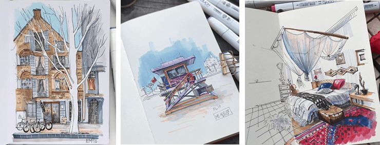
Stephen Gardner:
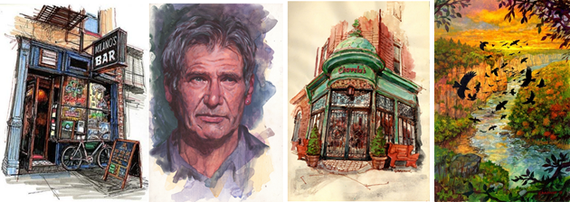
These 3 artists all work in a similar, rushed way with varying degrees of texture. Tom Deslongchamp manages to achieve a high amount of roughness by using dried out markers in his pieces.

Edit:
The rough texture is caused by the dried out markers and many short strokes. Tom’s images have a loose, free style, creating a strict, yet messy look. The marks in the face seem more contained, contrasting the hair. I like this as it creates an interesting image and take on portraits. He seems to have had to push fairly hard because of the dryness of the marker, creating dense, vibrant marks.

Next I looked at instagram artist Znk Art (Tim)
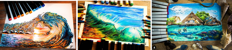
And Vincer Okerman
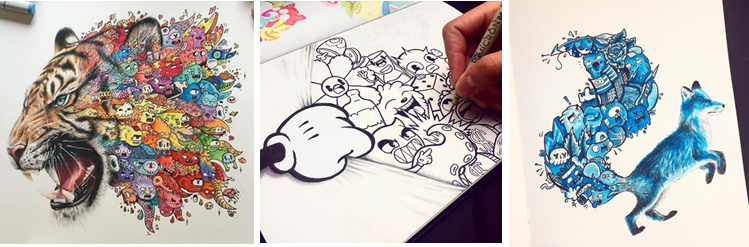
Who both use markers and pencils to create ultra pigmented pieces. They both have a tendency to use a white background to exaggerate this effect.

Next I looked at Tino Valentin
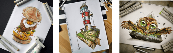
Lisa Krasnova
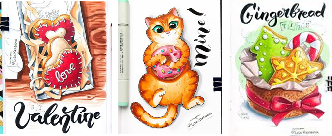
Stephen Wards
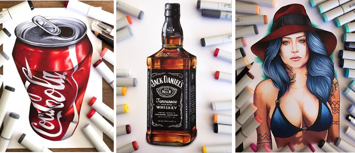
Each of these artist seem highly concerned with creating a smooth, popping effect in their work.

Edit:
Stephen Ward’s work is done with traditional materials, though with his skill it can be hard to tell.

I then began to look at Chichiro Howe
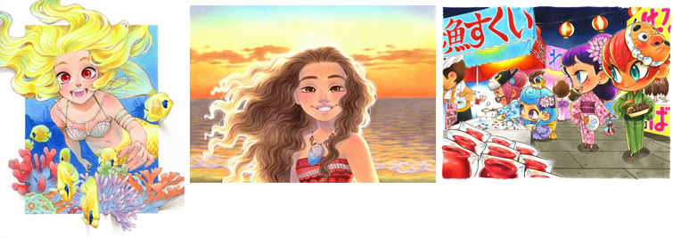
And Sibilline Meynet

I placed these 2 together as they create a clean, almost digital effect in their work. Whereas both use markers, Sibilline also likes to use water colours.

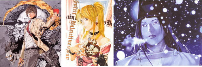
Last of all I looked at Takeshi Obata
And Tyler Goodrum
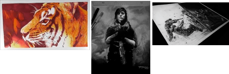
I found similarities here as both artists seem to like to add a darkness to their work. Each of the subjects seem to have a sadness in them.

Categorising these artists was hard as I could see similarities between lots of the pieces. An example of this is the way that Stephen Gardner and Znk Art use colour and the way that Lisa Krasnova and is able to blend colour. Vince Okerman and Tino Valentin are also both really good at creating a 3d effect that pops of the page.
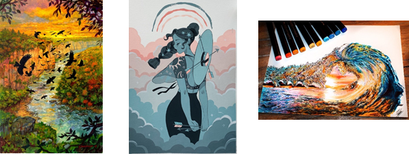
I had trouble choosing between these three images for which would be my favourite as I love them all for different reasons. The colour and serene landscape in the first, the softness of the portrait in the second and the beautiful colours and distortion to create a frame in the third are what appeals to me.
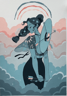
Eventually I decided on this one by Sibilline Meynet. I believe the biggest draw for my favour in this image would be the use of portrait as this is what I enjoy to draw the most. The colours are also enticing as they inspire a feeling of calm, furthered by the simplicity of the image. The limited and muted pallette, along with the simple background brings a uniqueness to this piece. The muted pallette and lack of bright colour makes it easy on the eyes. I like the way that the woman seems to appear from the clouds as it makes her seem as though she could have even been made from them and it adds a depth to image. I think that this image is beautiful in its simple serenity and the stars in the hair add just the right amount of sparkle. Metaphor has been added to the picture through the addition of the arrows. Having them attatched to the hat makes it look like a compass and the one in the hand seems to be showing her the way. Having some cloud at the forefront of the image helps interwine all the compenents and tie the image together. I believe the idea behind this image may be along the lines of following your dreams.

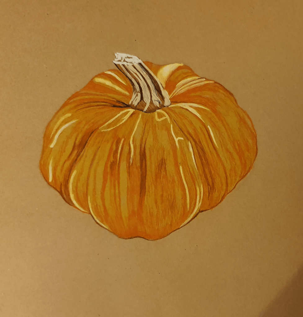
After doing this I had to redraw 2 previous pieces in the style of these artists. For the first piece I decided to redraw my pumpkin in a similar style of Sibilline Meynet.
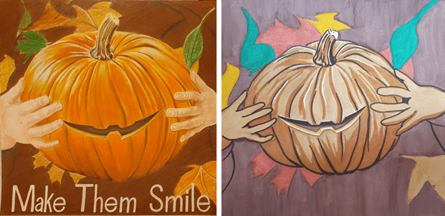
Before After

I like how this turned out but don’t feel that it fully fits with Sibilline’s style. I think that less saturated colours would have been a better fit for this piece. I found that using watercolour was harder than I expected as I don’t use it very often and that I layered it on thicker than it should have been. Not being used to using medium I had trouble controlling it and found it hard to get an even wash of colour. Using the markers for definition and shading was easier but I ended up using the wrong one too outline the hands, which left them too thick and odd looking.

For my second picture I decided to redo the woman I drew for the first assignment.
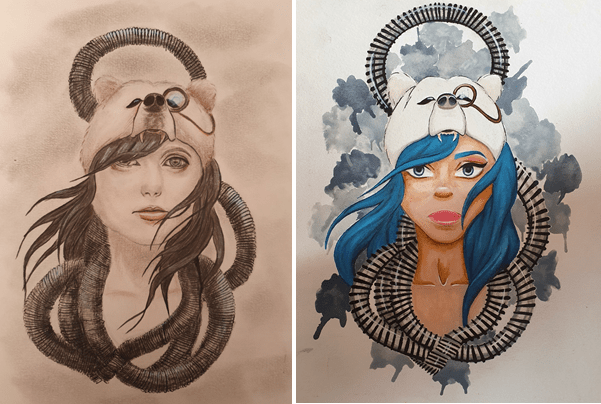
Before After

I like my second attempt at this drawing a lot better. I feel that the colours and the proportions are a better fit for the image, although the eyes are a little too big. For this piece I used more markers than I did in the pumpkin, I found that it helped even out any uneven paint. The area with most marker on is the hair. I like the way that the blues have blended together for a smooth look. Once again I had trouble with the watercolour, laying it on too thick and accidently rubbing some of the paper off. I did try to use a more muted palette, to fit with Sibilline’s style but had just as much trouble with it as the first time. Watercolour definitely isn’t my strong suit. Having tested out both watercolour pans and tubes I have found that I prefer the tubes better as they make it easier to mix colours, though I do like the portability of pans and water brushes better. I couldn’t resist adding some white ink to highlight some areas. I think the part I am most pleased with in this image is the hair and the bear hat.

I enjoyed working with both watercolours and markers as I think that they work well together. I decided to change the colours in this image as I felt it would create a more human and well rounded feel. They might be more vibrant than I intended for this exercise but as an image on its own I believe it has a better effect. I feel that the punchier colours add a sense of life that others wouldn’t have.

Edit:
I like to use traditional media a lot in my work. I seem to find using them easier, and sometimes more enjoyable, than digital work. I do, however, want to get better at using photoshop so that I can use it a lot more. part of the reason for this is that this type of art is more portable, so that I can work on an image anywhere. Another reason is that digital art is becoming more common and the skill is required more and more. Also, I do enjoy using it too.

Exercise Two: Museum Posters

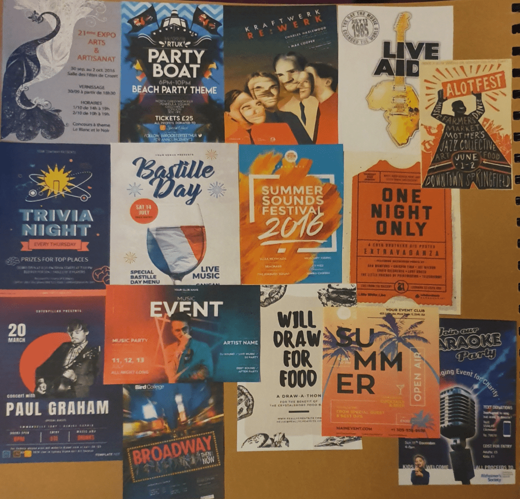
For this exercise I had to think about how an image relates to an audience, which wasn’t super easy. I started the exercise by looking into how and what is required of an advert. This included what is specifically required for kids and any strategies that could be applied to the exercise. I then looked at existing museum poster to try and get a sense of what draws peoples attention and understanding. I found that bright and bold draws a general audience as it stands out against most things. Kids need something that they consider fun, like a character or a game. I found that teenagers and adults generally like that same things but the understanding and general appropriateness differs.

As I couldn’t go to a museum physically because of lockdown, I looked online for a digital museum. By doing this I was able to take a digital tour of the British Museum. I also watched some shows based in a museum, hoping it could help with the exercise. By doing this I gathered a bunch of objects that could be used and I gathered as much background about the objects as I could.

The three age ranges I had to think about were 5-9 year olds, 13-16 year olds and a general adult audience. What was required for each age group made this a little more complicated as the levels of understanding are a lot different. When thinking of the younger kids it was hard to figure just how much they would understand as I didn’t want to make the poster too simple but also didn’t want it too be to confusing for them. I found it hard to make old objects interesting to young kids. This made grouping the objects into age ranges difficult. In the end I chose anything that could resemble a toy or possibly be in a children’s story book for the 5-9 year olds. For the 13-16 year olds I tried to find things that could possibly reference anything that they could be interested in, like fashion or sci-fi.
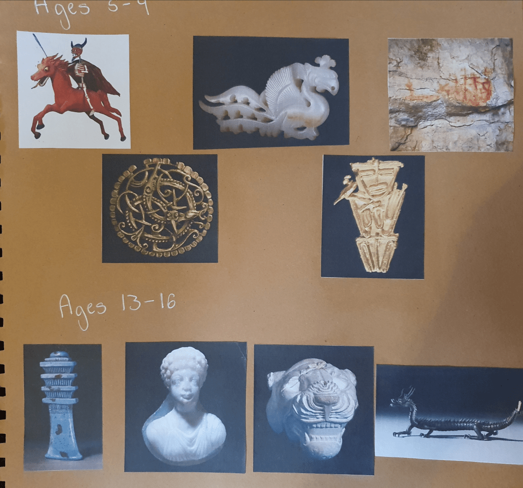
Everything else went into the general adult category as there would be a wider range of interests.
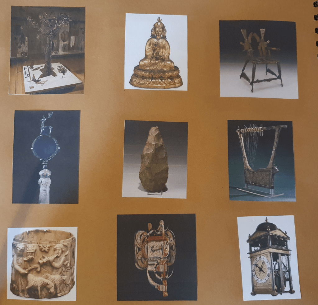
I then picked which object I would like to use from each age group and researched them some more to see if anything about their history could help decide what to do for my poster.

For the kids I decided the Atomic Apocalypse would be best as, although some kids might find it a little creepy, its the one that most resembles a toy. I thought that this would allow for more room in my designs and draw the kids attention the most. I did wrestle with the idea of using the Tunjo however, so thought that drawing them both might help me decide.
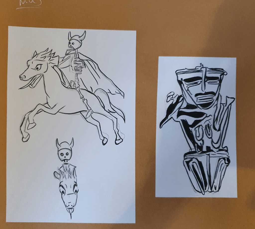
I also played with the angle of the horseman but couldn’t come up with a result I liked.
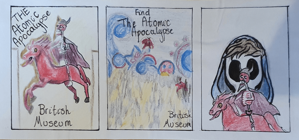
My first idea was the simplest and most boring, showing the painting in the museum. I knew this idea was no good straight away but figured that drawing it any way might help me think of something else. My second idea was to turn the poster into a game, in a Where’s Wally?” kind of way. The third idea was to draw on the Mexican Day of the Dead history and have a face painted kid playing with the horseman but I felt that this was also too boring for the kids and possibly a little scary because of the skull face paint. I may have under estimated kids here though as they seem to be ok with Disney’s Coco.

Out of these three designs I think that the middle one is the best. The idea is more fun and interactive, so more likely to engage and draw their curiosity. The bright colours are also a big attraction.

I decided that the best artefact in the teenage category would be the Myochin Dragon. With its history and significance in fantasy I felt that it would be the biggest draw of all the objects I was considering. I started these designs by researching the history of the object, which I felt was pretty interesting. I didn’t, however, like the static position the dragon was placed in so searched for any references that would help me change it. I came across a partner dragon on an auction site that was a useful reference.
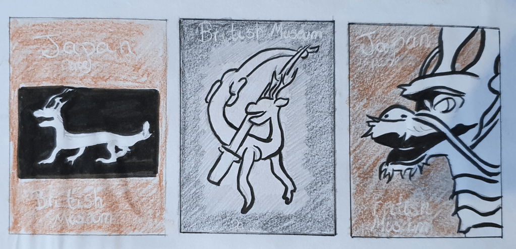
The first idea, again, was boring and quickly discarded. The second, again, was my favourite. This was inspired by its Samurai past and, although not brightly coloured, held the most promise. The last idea was used used to showcase its features and craftmanship, but also seemed too bring.

The second idea is my favourite. It has the most story to tell and feels the most organic. I did know that the background needed something more but at this point, still wasn’t sure what would fit.

For the adults, I felt that the Throne of Weapons would draw the most attention because of its resemblance to the Iron Throne.
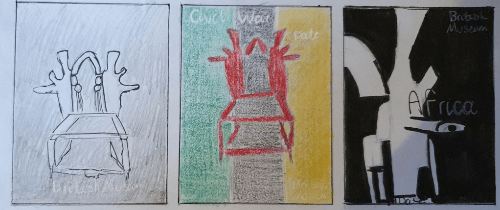
For these designs I drew on the thrones Mozambican background. The throne has an interesting story and I wanted to try and showcase it. The first idea, again the simplest, was intended to be dramatic and resemble the promo photos taken of the Iron Throne to promote Game of Thrones. I thought that this would draw fans of the show. The second idea was based around the flag of Mozambique. I thought it would be a good idea to show its origin country. The last idea was to emphasize the fact that the throne is made up of old guns. I thought that this would interest people and encourage them to attend any event that were to take place.

I like the first design the most. I like the idea of the dramatic lighting and felt that the idea behind it would inspire a higher attendance than the rest. The last design was a runner up though, as I felt that it would be a fitting poster because of all the layers of meaning in its history.

The design I felt was the most promising was the one with the dragon.
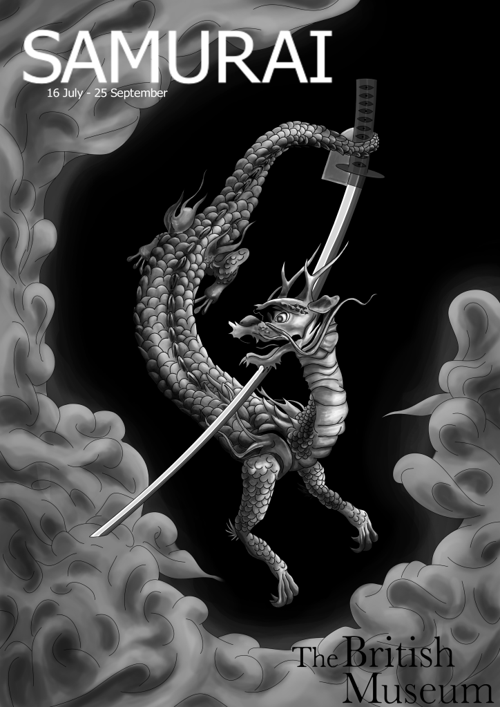
I’m not sure that it is the strongest poster design, however it is the one I, personally, would be the most interested in. This is because the image holds a narrative and generally looks more interesting. By using a photo of the duplicate dragon from the auction site, I was able to reposition the dragon to a more comfortable pose than the one shown in the picture from the British Museum without it looking disproportioned. The designs for the different age groups differ greatly in style. I didn’t think that a matching style was important as long as the correct information was clearly conveyed in the design. I made sure that the British Museum logo was clearly placed in each design so that there would be no confusion as to where the exhibit was placed. I chose a representational approach as this is what I am most comfortable with and felt that a diagrammatic approach wouldn’t fit the purpose.

I changed the design slightly to my original idea as the placement of the samurai sword looked too awkward. By turning it upside down and having the dragon hold it with its tail the image looks more organic and natural, adding a soft flow to it. I decided to try and create a narrative in the design. The idea behind this image is based on the history of the object. Inspired by the peace of 17th century japan and the Myochin family’s history in making samurai armour, I used the ash around the edge of the image to symbolise the end of war. With a double representation of how the dragon was made by metal, forged in fire, I felt that this was an essential part of the image.  I didn’t want the ash to complete its circuit around the edge as I felt that this made the image too confined and stiff looking. The style of the image was inspired by an artist I saw in ImagineFX magazine, Kerby Rosanes, who embraces the Asian style of art. I made this image digitally as I felt that it fit the task better than traditional techniques. I toyed with the idea of traditional mediums as I thought that it would be fitting considering the fact that the object was made hundreds of years ago, before modern mediums were invented, however I didn’t feel that it would achieve the smooth, professional look I feel is needed for a museum poster.

I decided that a black and white Asian style design would be the best fit for this poster, although the opposite to what is expected, as it holds a more ageless and dramatic feel to it. I also felt that this style would appeal to the age group with its resemblance to tattoo and more narrative styles. I wanted the image to convey that that the dragon was rising from the ashes, coming out swinging with its sword. I decided against a geographical setting as I thought that it would take away the slight air of mystery that this design holds. I feel that this is needed to provide intrigue and interest people enough to attend the exhibit. I didn’t feel that a running style throughout the designs was super important, as the information on the poster would give people all that they needed.

Edit:
I did consider using red in the eye, however, I didn’t like the way it drew the attention straight to it, causing the rest of the image to fade into the background.

A website could have been added to the poster so that more information could be gathered and people could see if they wanted to go.

The poster is aimed at an older age group as the monochrome colours wouldn’t be very attractive to young kids.

To fix the pixilation in the image, which I didn’t notice, I would have to get InDesign. I would also have to use InDesign to align the text better by using a grid.

Exercise Three: A Children’s Book Cover

For this exercise I had to create a book cover for a children’s history book, entitled Animals From Around the World. The first thing I did to prepare for this was to research illustrating children’s books and then a book cover in general. My next step was to look at children’s book covers. They were all cute and brightly coloured. Most had a character at the forefront of the design. Next I made a mind map of ideas and anything that related to the subject.
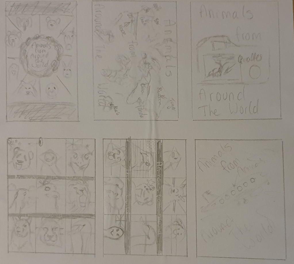
Whilst looking into children’s books I found that they are usually slightly larger than regular books and a square format is a popular choice. When thinking “around the world” I thought of holidays, travel and photo albums. I tried to include these in my designs. I did like the idea of showing lots of different animals from different countries, which became a running theme in my designs. I tried to use the nation animal from each country I chose. The turned out to be: a panda for China, Emu for Australia, Squirrel for the UK (lion was already taken), Bald Eagle for the USA, Tiger for Russia, Rufus-Bellied Thrush for Brazil, Elephant for India, Lion for Kenya and a swan for Denmark.
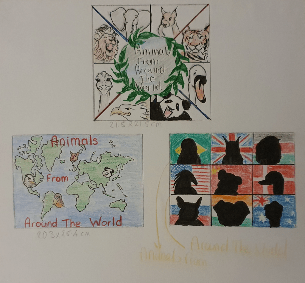
I then redrew my three strongest designs in more detail. The top design, also the one I like best, was supposed to display the animas in a simple way, easy for children to read. The second is a little more geographical and text book like, with a few animals thrown in to get the point across, again fairly easy to understand. The last design was based off of a military picture I saw. I thought the premise of having the animals in front of their national flags would be a good idea and the silhouettes of the animal would add an air mystery. I also felt that it would accentuate the fact that all the knowledge is inside, so until the book has been read they wouldn’t know about the animals, kind of like “Guess Who?” I believe this to be my strongest design, if not the one I like the best.

Edit:
These designs were aimed at a younger age group, though I did try top make them appealing to older kids as well.

I would create the final image in a square format as this is more attractive and easier for a kid to hold. The image would be done digitally as I feel that kids are becoming more familiar with digital art than traditional and it would feel more comfortable for them. I think a softer typeface would be best.

Exercise Four: A Menu Card

Here I had to create an illustration for a menu card for a high quality Seafood restaurant. I had a lot of trouble. Unsure what was meant by “menu card” I had to look it up. I wasn’t sure if it meant a full menu or not. It didn’t. To start designing a small illustration, which could also be used as a logo, for a small card to be placed on plates I looked into the purpose of the card and key points in creating a logo. In doing so I looked into many things, including the theory behind colour emotion and atmosphere. Next I looked at existing menu cards and logos. Thinking of anything that could be used as a logo, mostly fish, I tried to think of some designs and draw them at the required size of 4cm x 4cm.
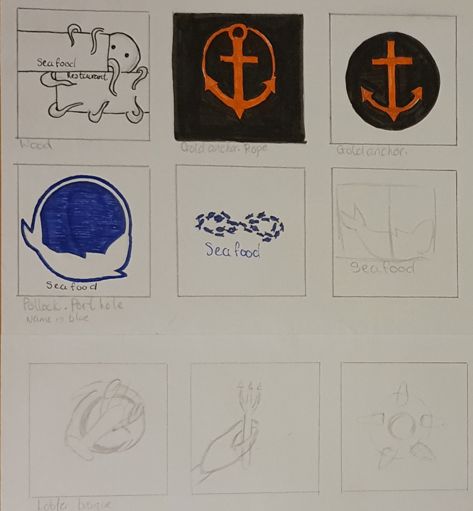
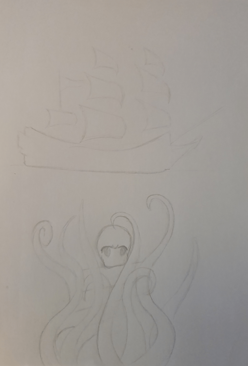
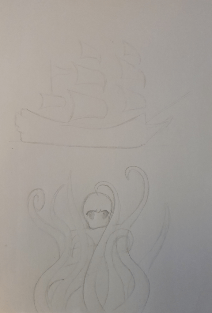
I liked the idea of using driftwood in a design but eventually decided that it wouldn’t make the most sophisticated logo. I did like the design with the octopus peeking out from behind though. I felt an anchor was a staple with sea oriented logos so wanted to play around with that a little. I also experimented with using seafood recipes in the designs.
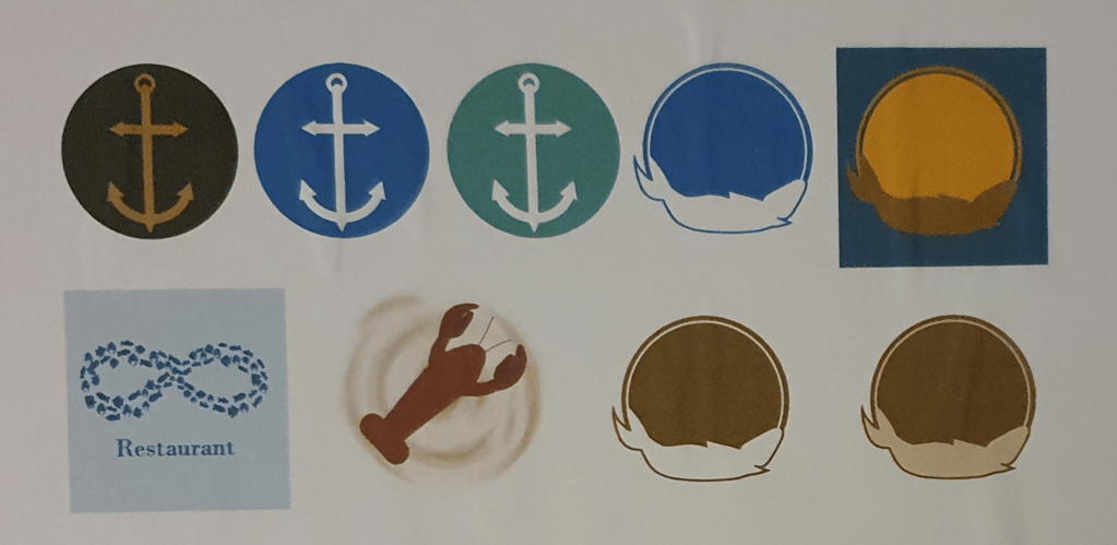
I picked my favourite designs and drew them up digitally for a clear, more professional look. I took this opportunity to also play around with colour, trying to remember colour theory at the same time. I played with the anchor because of its obvious association with the sea. I though that it would have clear meaning. The next is one of my favourites. It’s a fish in a port hole, though depending on colour it can also be a sun. The infinity sign is made of fish. I tried to use this to convey that the restaurant will always be high quality, and had possibly been around a long time, but I didn’t feel this was clear and would confuse people. It’s better in concept than in reality. I liked the idea of using lobster bisque as it’s a high quality food. The lobster alone suggests class and the colours fit with the idea of sophistication. I decides to put it on a menu card to see how it could look.
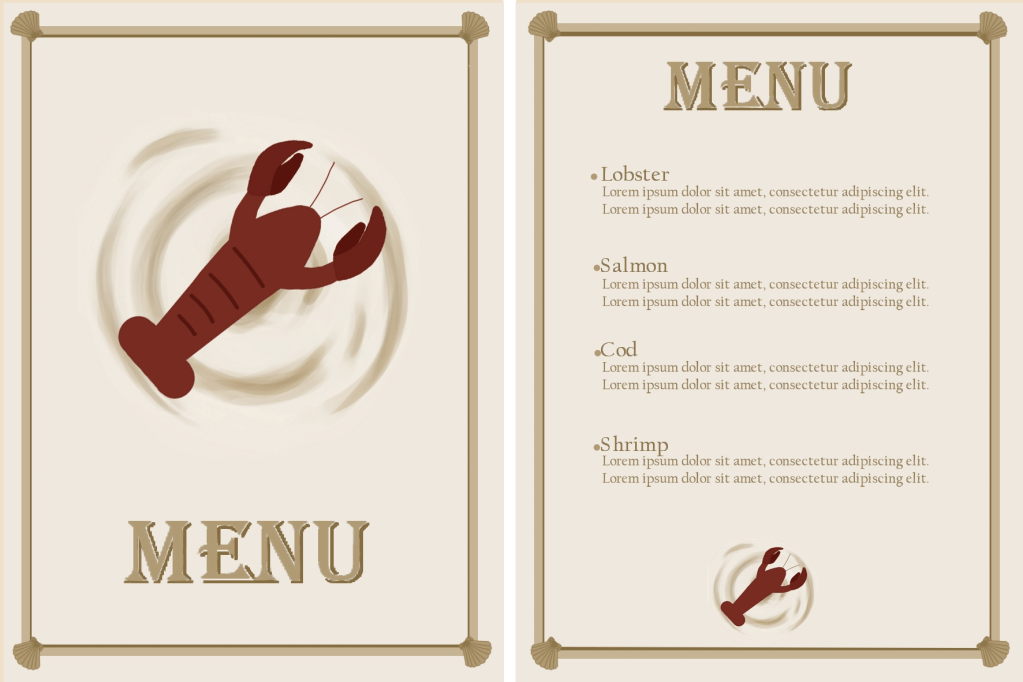
I chose the lobster design in the end as I felt that it would look the best on a sophisiticated menu. I am not totally happy with any of the designs as I feel that none of them are very special or imaginative. I had trouble thinking of a design that would look both creative and sophisitcated at the same time. The idea behind the design is that it resembles a lobster bisque and can be easily incorporated on any background.  I thought that this would work as the circular background should eminate a friendly feel and the lobster should communicate the high quality food and ingredients.

I tried to use nautical and sophisticated colours in all the designs. I wanted to make that restaurant seem comfortable and approachable as well as high class. The idea behind the anchor design I was to create a simple logo that would easily communicate the idea, however I felt that, although simple, it was also too boring. I tried it in a few colours to see if a different colour would work better but it didn’t seem to help.

The circle and fish design was meant to represent a porthole and, of course, a fish, to communicate the food. I like it in the blue but didn’t feel that it fit in a hugh class restaurant. This is why I tried different colours, but none of them seemed to work well enough. The second variation of this design is meant to look like a sun instead of a porthole. I thought that this might make it seem friendlier. This would work in a casual seafood restaurant but doesn’t radiate high class food.  The third variation was the runner up. I feel that of al four variatons this fits the brief best.

The infinity design was meant to communicate confidence, though it didn’t work out as well as I hoped. I constructed it of tiny fish to represent the food. I feel that this could work as a logo on a wall and made of metal but not so much on paper.

I made a menu card mock up to show how the logo could look in the restaurant. The bisque background could be adjusted to any colour it is placed on.

Exercise Five: A Tattoo

I did a lot of research before beginning this exercise. The whole thing seemed a little daunting as I wanted to make a really good design. I began, as directed, with the history of a tattoo. I started as early as 5000 BC to get a clear idea of how they began and how people got the idea to start inking themselves. The origin of intentional marking was more barbaric than I thought. I then looked into the trends and opinions of tattoos, beginning with the 1910s. Next was to look at old examples and how the designs have evolved through the years. I then began to look into the history and meaning of Mothers Day. By doing so I found how the whole thing was started, although it had been going on ages before that, unofficially and less commercialised. next was a mind map based around mothers day. I also looked into Mothers Day cards to get a feel of what people liked on them. I researched into typography so that I could use the right kind when it came to it and tips on creating a tattoo. I also watched Skillshare videos to help with this.

Eventually I started to design. I started with my character and trying to get the right look.
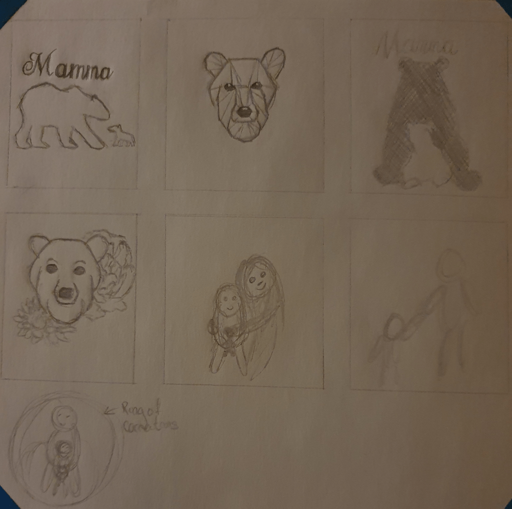
After thinking through some ideas, I decided that I liked the idea of using ragdolls. I felt that the making of these dolls help a sentimentality and tradition to it that would add to the design.
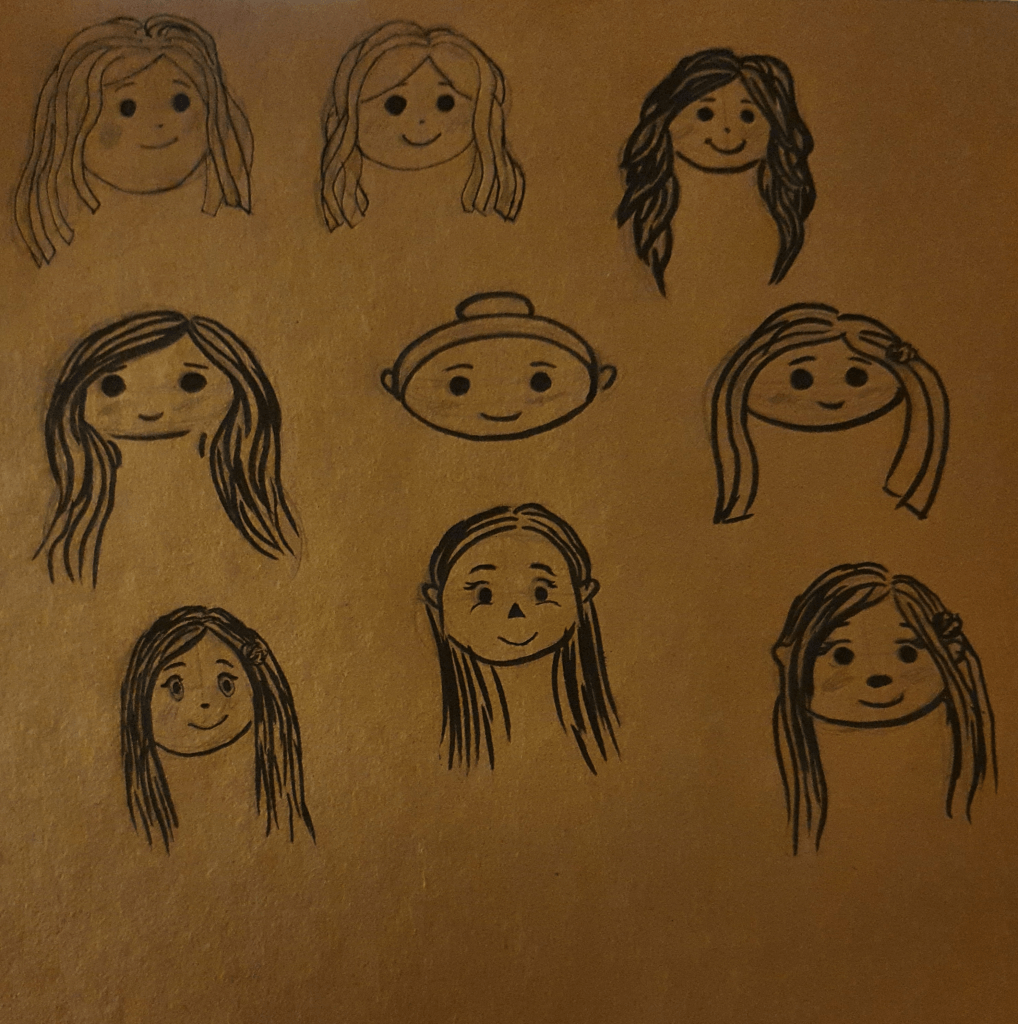
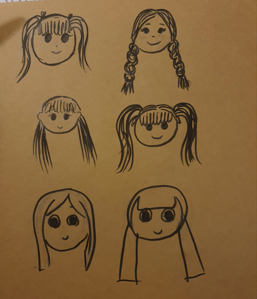
I wanted to get the right look for my character before drawing the tattoo.
I liked the idea of having my characters in a circle, but when thinking of how this would fit on the body I realised that there aren’t many places that it would fit well.
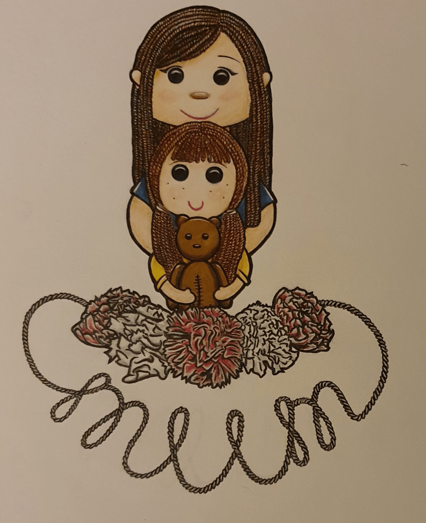
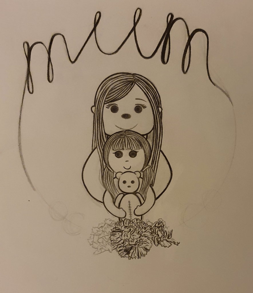
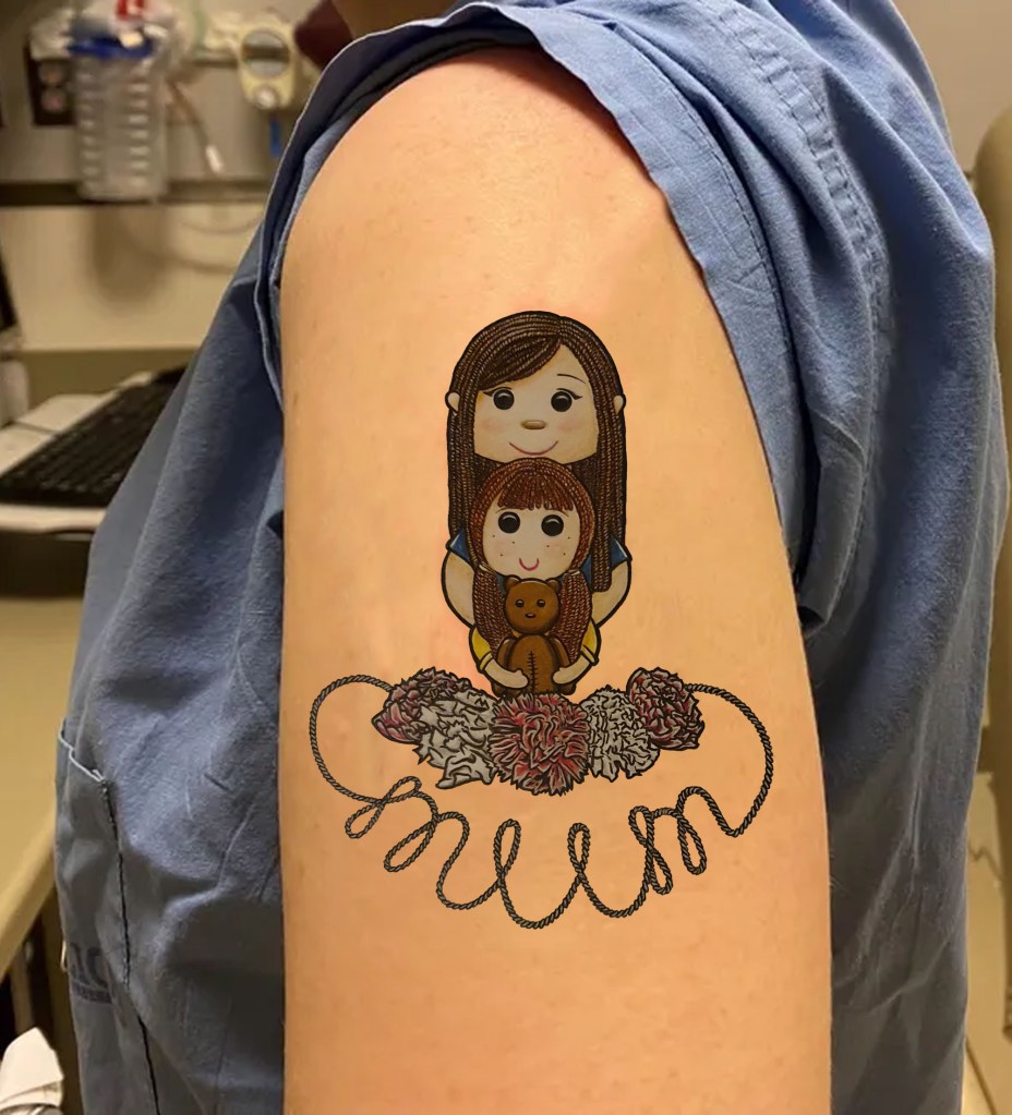
I feel that this fixes that problem. I went into this intending to come out with a traditional styled tattoo, which you can see didn’t happen. I feel that this design fits a card better than a tattoo. I can see it used as a tattoo but not as well as if I had come up with a more traditional style. It’s cuter than intended.

As this is meant to based around Mothers Day I thought it important to have a mother and her child as a base. Having them holding onto each other is meant to communicate the bond and a softness. I liked the idea of the child holding onto her teddy bear as it’s a typical child thing to do but also accentuates the fact the she is a child. This is also the reason I gave her this hairstyle. The bear has stitches on is stomach as I thought this would add a sense of authenticity and it adds to it’s cuteness. I gave her a rounder face and bigger eyes to try and get a more child like appearance. This is why the mothers face is more square. I think that the absence of a nose gives of a more innocent look. I wanted the mums ears to peek out from the hair as I felt she looked a little alien without them. She has eye lashes as they give off more mature, made up look. Their hair is made of wool as this is a traditional material used on ragdolls. I tried cloth hair but it didn’t look right as was a little creepy. This is something I was trying to avoid as this image could easily take a turn that way if the wrong colours were used and some of the features were exaggerated.

I used pink and white carnations as these flowers are the traditional flower of Mothers Day. White was used to represent anyone who had passed. I wasn’t sure whether the word mum was required to be in the image or not but decided to use it just in case. I like this placement more as I feel it would fit more organically on a body part. Throughout the design process I was trying to think of how it would fit on the body and I didn’t want it to look awkward. I’m not sure if I succeeded in this or not but I do know that is is better than before. I’m happy with the flowers as they resemble a more traditional style more closely. I decided to use bright, vibrant colours as they are happier and I didn’t want my colour choice to dampen the spirit of Mothers Day. Using markers helped with this and gave a cleaner look. I used pencil to add any small details and for some light shading.

Over all I’m happy with the final result. I feel that it’s more me than a typical style. However, if I were to do this again, I would try to incorporate a tattoo like style into it more.
Exercise Six: Visual Distortion

I found the beginning of this exercise easy but had a lot of trouble with the second half. I chose to draw my cat. I mostly used a photo of him but he was laid beside me too. The first drawing was meant to look real, which I didn’t have much of a problem with.
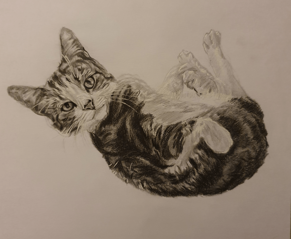
His head is a little too big for his body but other than that I don’t see anything else wrong with it. I tried to find a picture that would show his puppy like personality. Here he is waiting for a tummy rub.

Next was a drawing with no more than five lines.
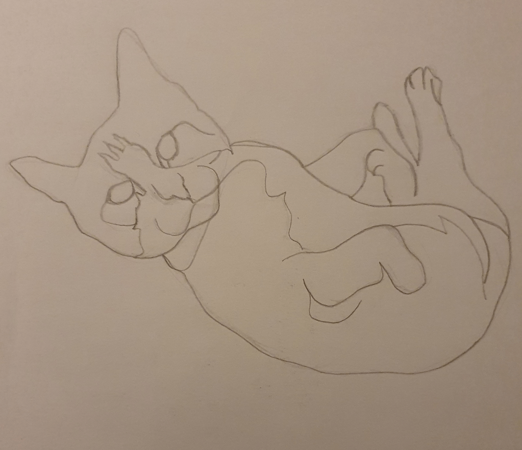
I used 4 lines, overlapping in a few areas.

Next I had to make a collage that distorted reality. This is where I became stuck. I had trouble with the distortion aspect. I wasn’t sure how far I could go. I wanted the image to still be recognisable as a cat but at the same time wanted to meet the brief. I tried a few different ideas and didn’t really like any of them. I ended up doing this digitally to avoid wasting anymore paper since I was struggling with this task.
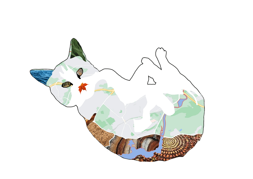
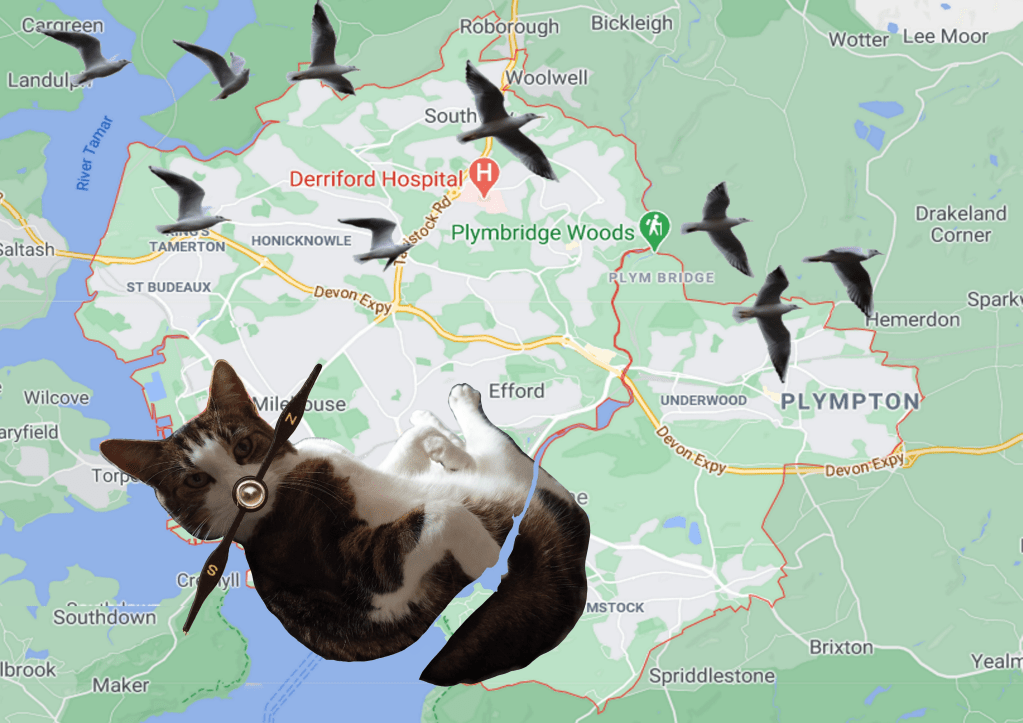
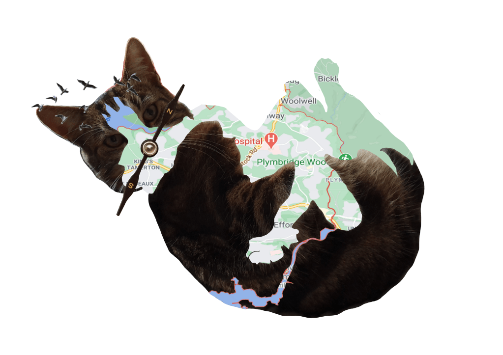
Trying to choose a theme for this collage, I settle on trying to show how he likes to explore (though we keep them in since one of them was hit by a car). Following this thinking I thought of a map. I wanted to use the map of our home and when I saw that the river is the same shape as one of his stripes I thought it would be perfect. I felt that a compass would make a good nose since that’s what a cat mostly uses to get a sense of direction. Since birds are always outside and he has a love for them I thought that they would be good to add to the image. Having them flying around the head was meant to show how they influence him when outside. I distorted the sizes to make for a better collage.

Next was to draw this image.
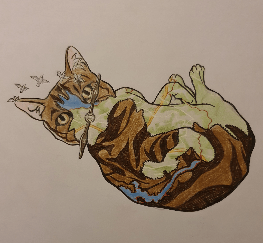
This part was also easy. I added stitching along the edges of the map to make it look as though the had been sewn together. I thought this would exaggerate his wandering personality more. I also added outline to define his shape better.

Next was to turn it into a bigger picture with narrative. I also found this hard.
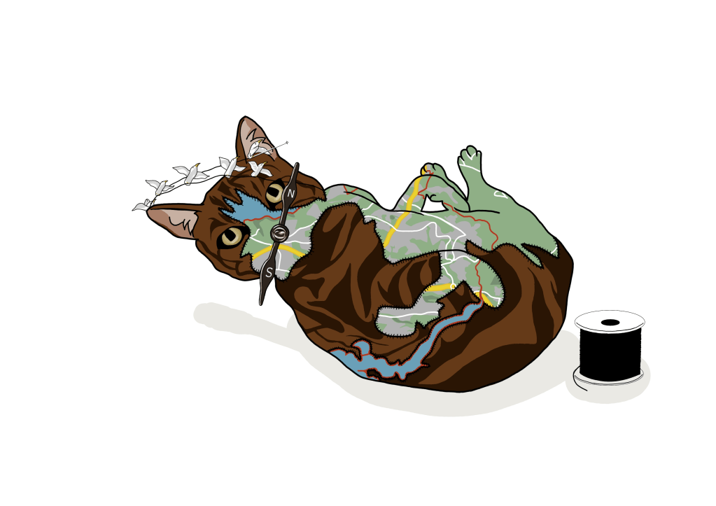
I did this to begin with but didn’t think that there was enough narrative.
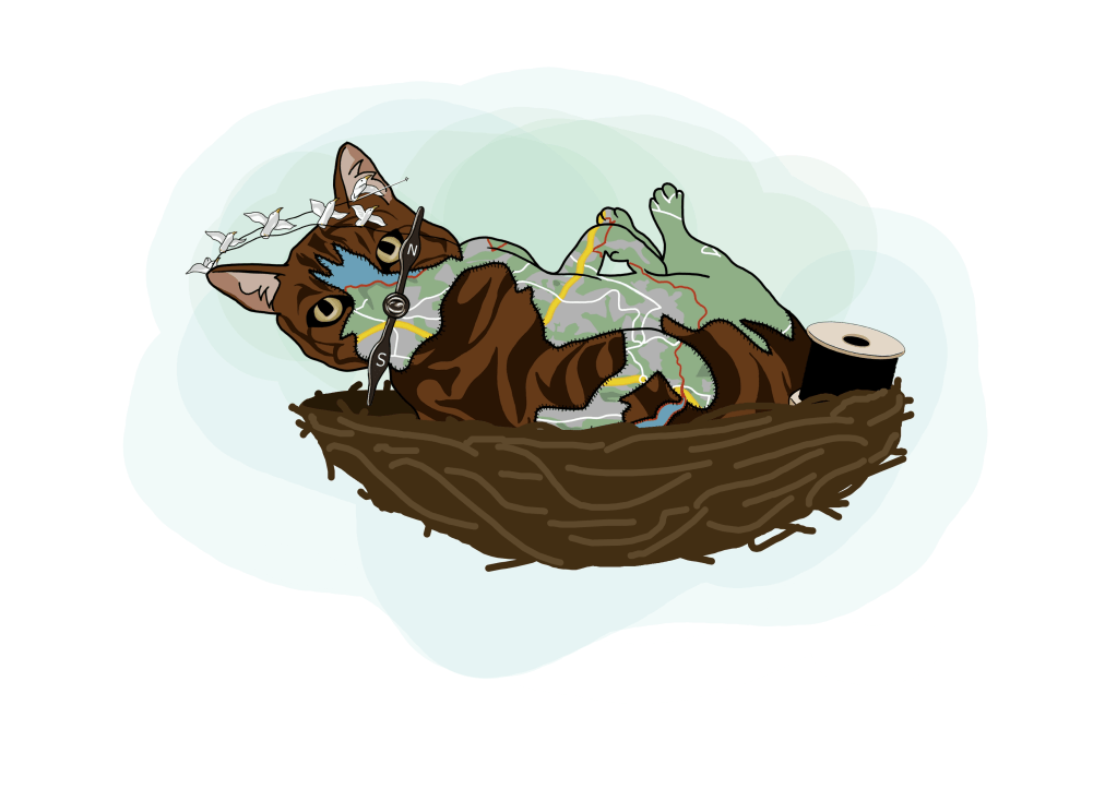
This is my second attempt. It’s meant to show a cat being sewn together by birds out of a map and a material that resembles fur. They are in a birds nest as this is where the birds life, but also because I image a birds nest with eggs in, so it’s nurturing life. The background is green for the tree.

Exercise Seven: Character Development

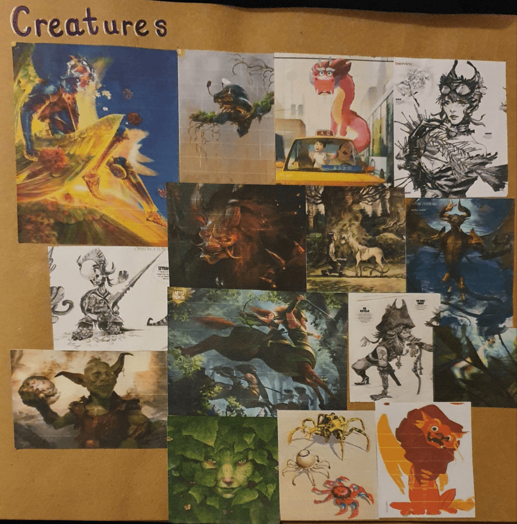
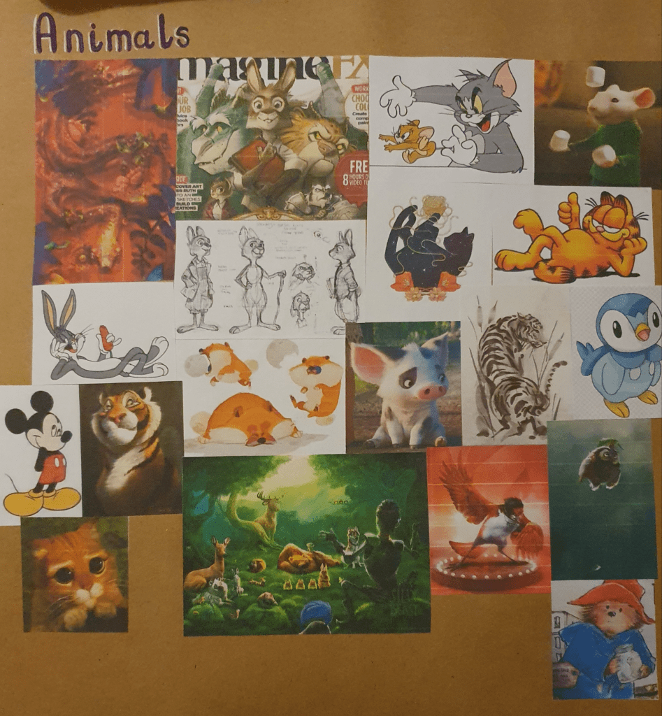
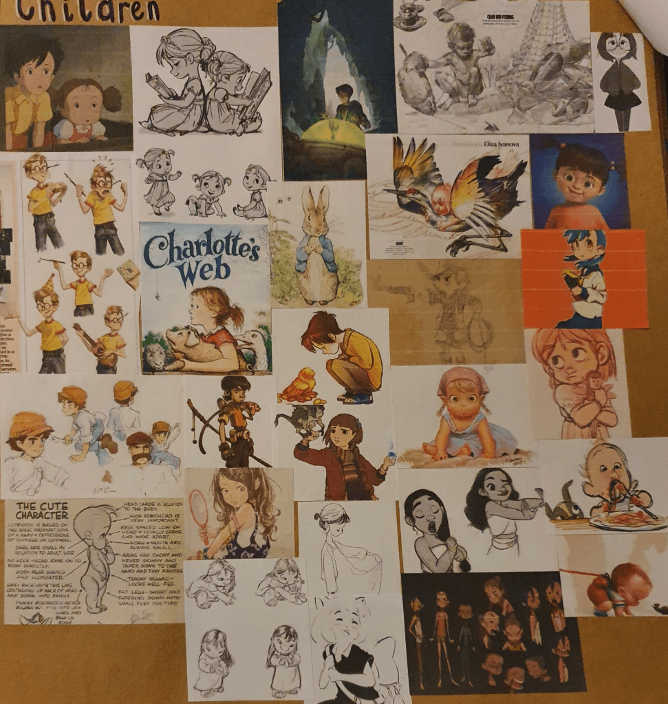
I started this exercise by gathering different types of characters. I used the internet and ImagineFx Magazine for this. I tried to collect a good range of varying designs.
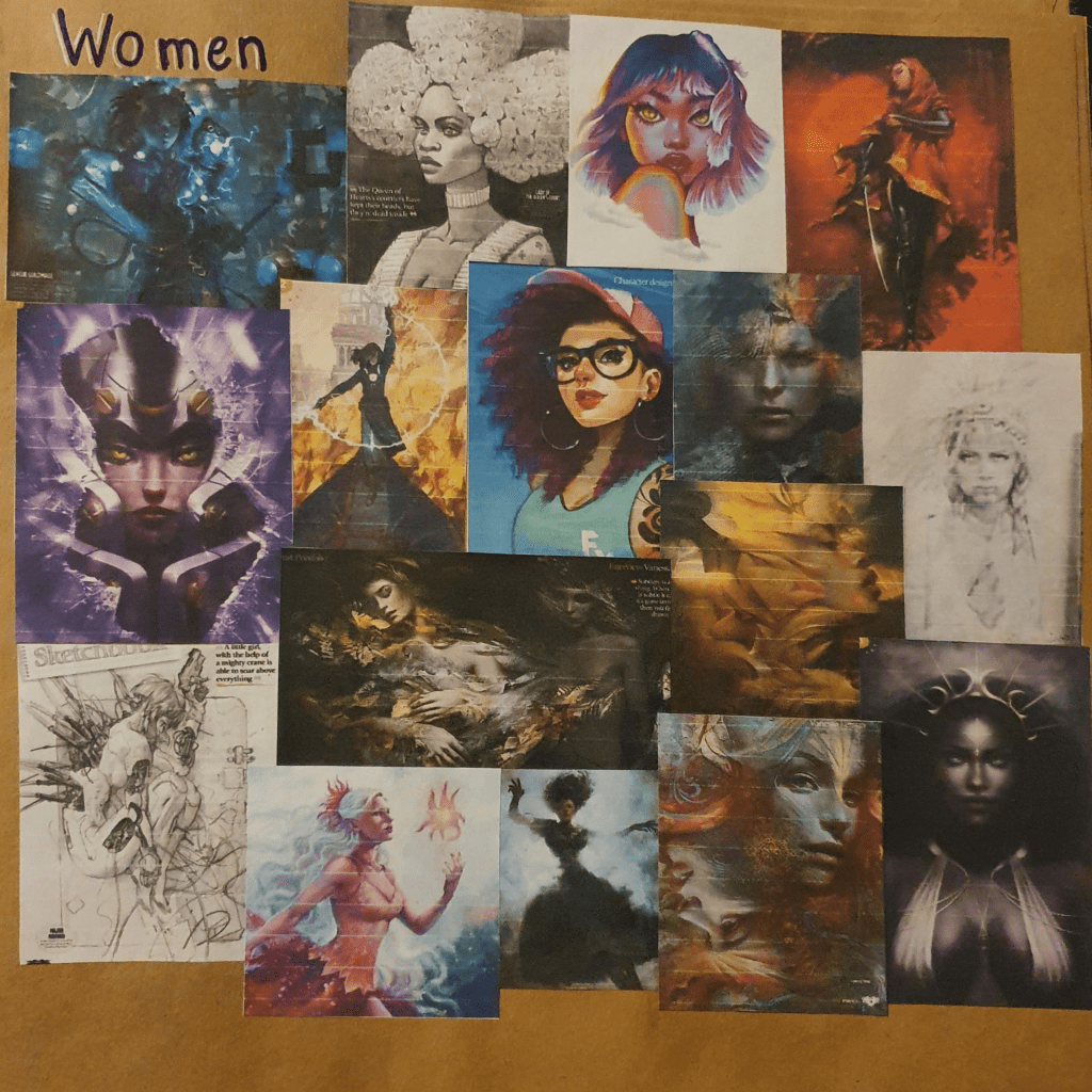
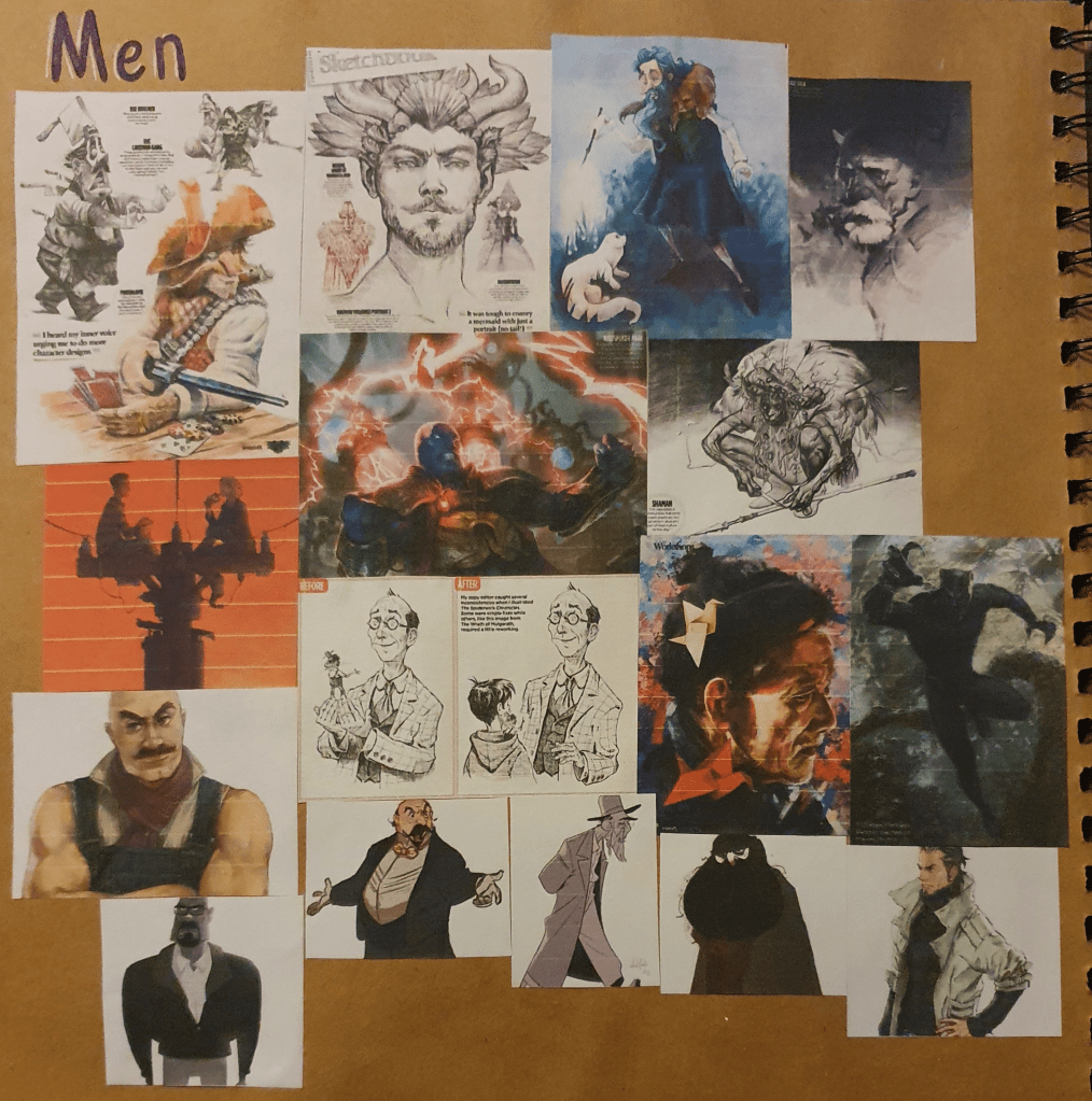
I then took notes from Aaron Blaise’s Character Design course. I didn’t have enough time to watch all the videos so I picked the one I thought would be most helpful, like the ones on expressions, eyes and perspective. Next I tried to think up some characters to draw. The first one I decided on were tiny dragons so I then looked up dragon anatomy so that I could try yo get it accurate. Surprisingly I found a website dedicated to this which was helpful.
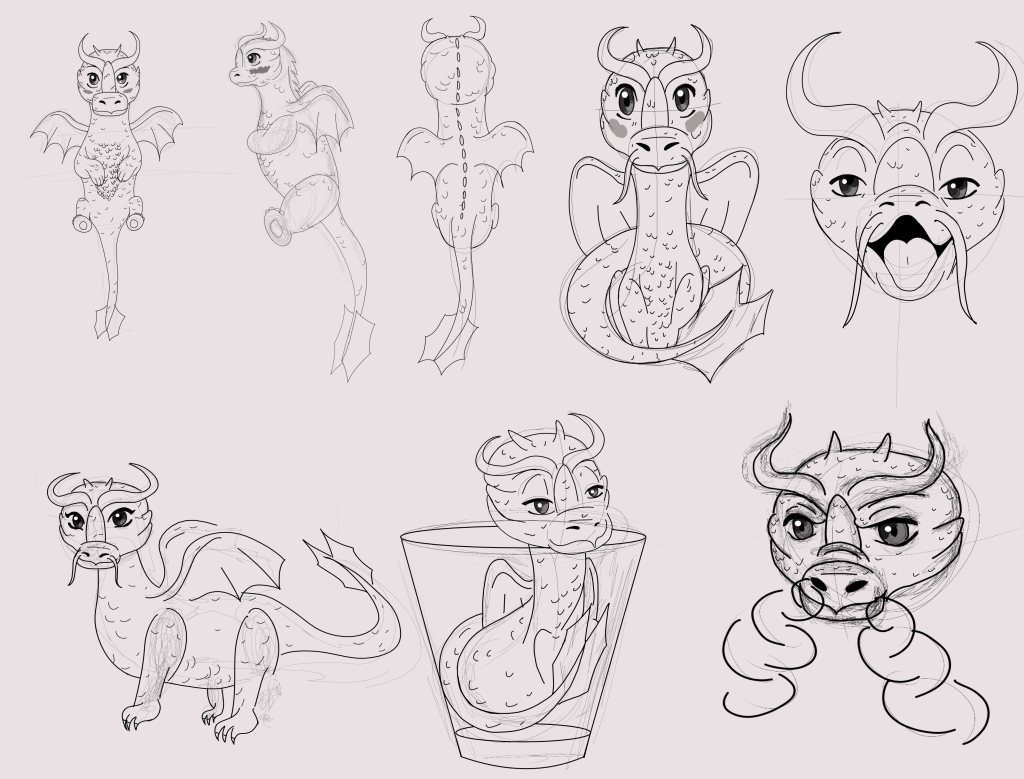
Here I tried to get a range of different angles of the character, including the ones asked for, and different expressions. Some of them could use some work, the proportions on some are definitely off and I need to work on expressions more. Other than these I’m pretty pleased with the results I got. Getting the right perspective from some angles was a little harder than I would have liked. I thought it would be cute to place one of these dragons in a shot glass to show how small it is.

For my second character I tried to create a Werewolf boy, though this didn’t go too well.
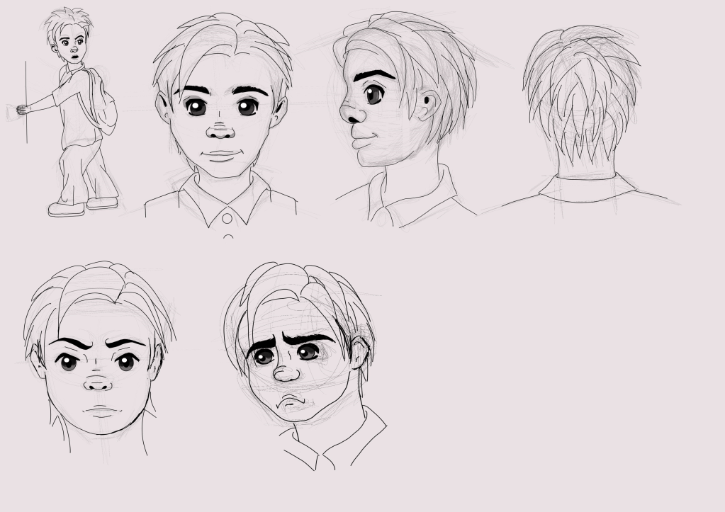
I had a lot of trouble with drawing a full body, more than I expected. I also had trouble keeping a consistent look for the boy. The hair is all over the place. I tried a few different styles of drawing here, not all of them succeeded. To give of the Werewolf look I tried to give him messy hair, slightly pointier ears and a dog like nose. This hasn’t turned out too well in all the drawings. Another surprising thing that I had trouble with was the hand. I thought it would be fairly simple to make it look as though it was holding the door but every attempt came out off, even the one he has now. Once again my perspective is off in some places. I think the first two drawings turned out the best, even with the dodgy hand. I gave him a school uniform to try and make it look like he is skipping school.

All I really took away from this exercise is that I really need to work on my character design and a few tips on how to improve them. I’m not really impressed with any of these drawing, though I do believe the dragon turned out a little better than the boy.

Assignment: Magazine Illustration

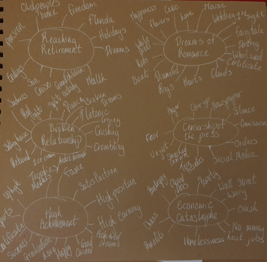
To begin this assignment I created mind maps for each of the topics provided.
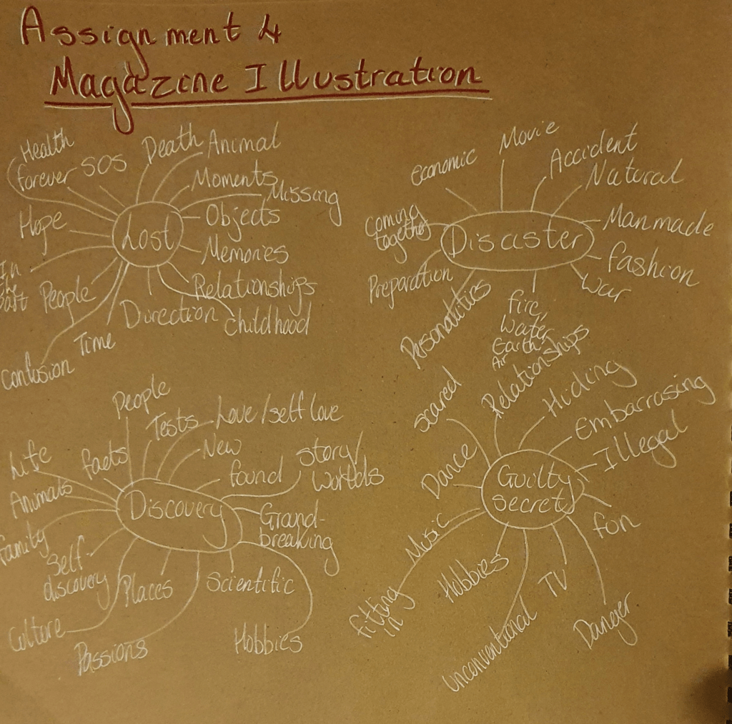
By doing this I decided that I wanted to choose disaster and liked the idea of basing my drawing around the four elements so I began to research them.
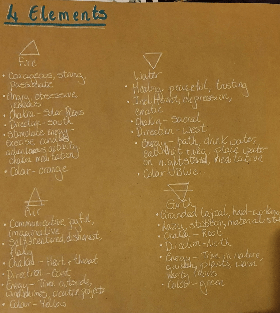
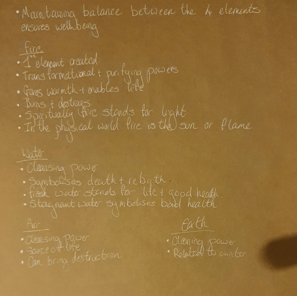
I wanted to focus on how the four elements interact with nature but couldn’t find a huge amount of information on it. I mostly had to use knowledge I already had, which was pretty much limited to them causing natural disasters and that you ned to keep a good balance between them to hold them off.

Next I had to decide on what to use in my still life. I found this tough to do. I ended up with some candles and fruit in the bottom of a clay tagine, trying to represent each of the elements. Placement was also tricky as the fruit kept falling over, so once I had a position that stuck I kept with it.
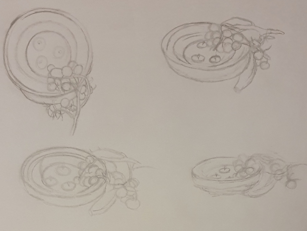
I then drew this from different angles. Picking which one to use in my piece was harder than I expected as I liked the view from the top but you couldn’t really see the flames from the candles. I decided to go with the bottom left corner as it gave a better view of the flames. I wanted the image to have meaning spread out, instead of it being concentrated in one area. I did this by spreading out the candles, I used these to represent fire, though extinguished the one to the left to represent air. I used the clay tagine to represent earth and filled the bottom with water to symbolise itself. I felt that this filled the image fairly well.

I then drew my observational drawing
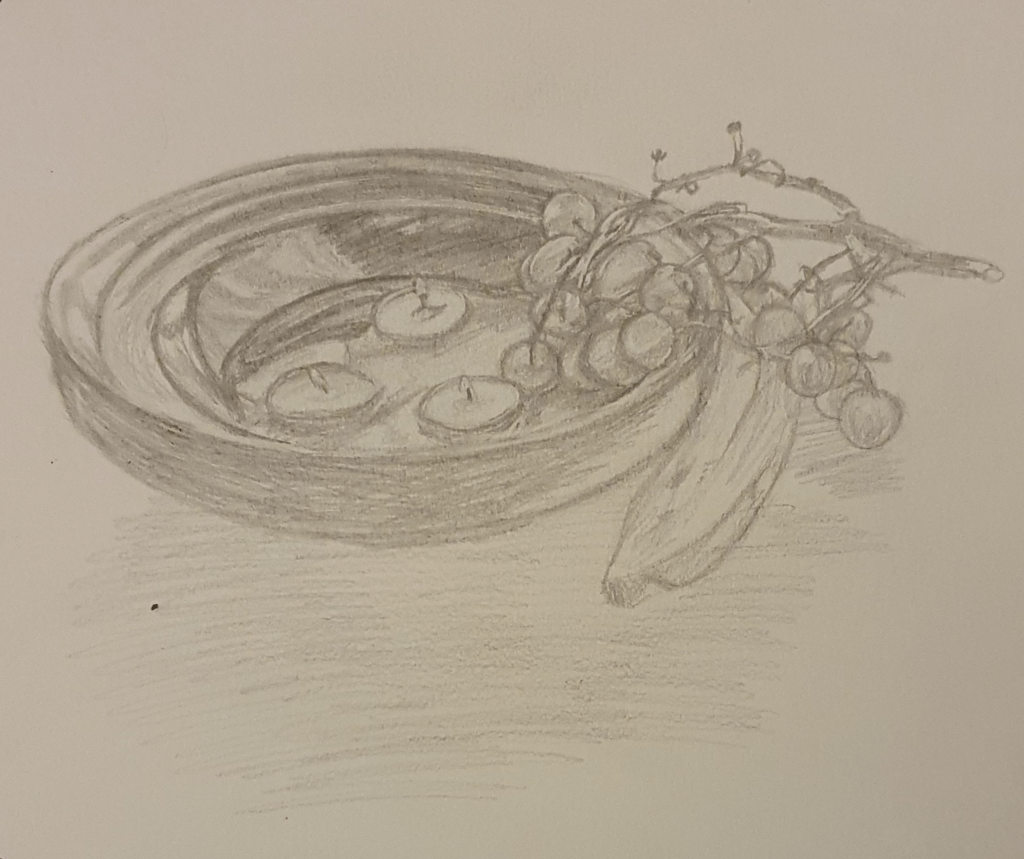
Which I followed with my tonal drawing
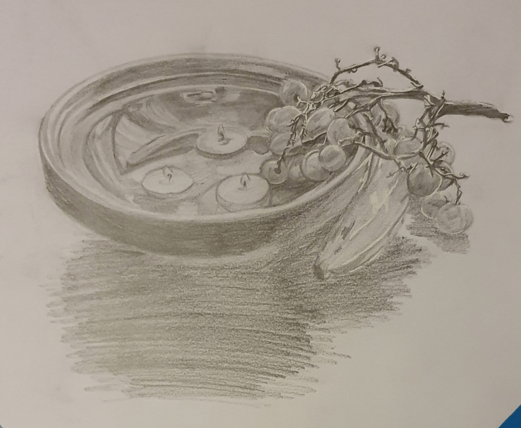
I noticed that I concentrated more on the darker areas and added more details when drawing the tonal drawing. It turned out a better version of the observational drawing.

Next I tried to figure out what I wanted to do for my final piece.
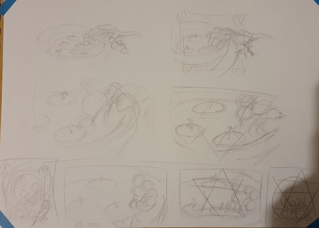
I tested different segments of the image along with adding symbolism to the image. I felt that the image needed something extra to get the point across but couldn’t seem to come up with the right idea. I liked the top right idea but it reminded me too much of a camera viewfinder. I also liked the idea of merging the elemental signs and adding on top but felt that in was too obstructive to the final piece.
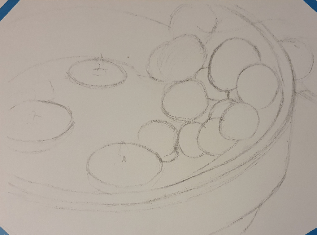
Which is why I decided to go with this one. A simple still life. I felt that it would bring the peace that is needed to balance the elements and represent it well. I felt that this would be a better approach than showing outright disaster. The idea is that the lit flames will represent fire. The extinguished flame will represent air, though there wasn’t much smoke when I did extinguish it so I had to exaggerate the size a little. The water will represent itself and the fruit and tagine work together to represent earth, which I think works well as I see earth as the main element as its what holds everything all together. The tagine works in the same way, holding all the pieces if the image together.

After this is when I started the final image.
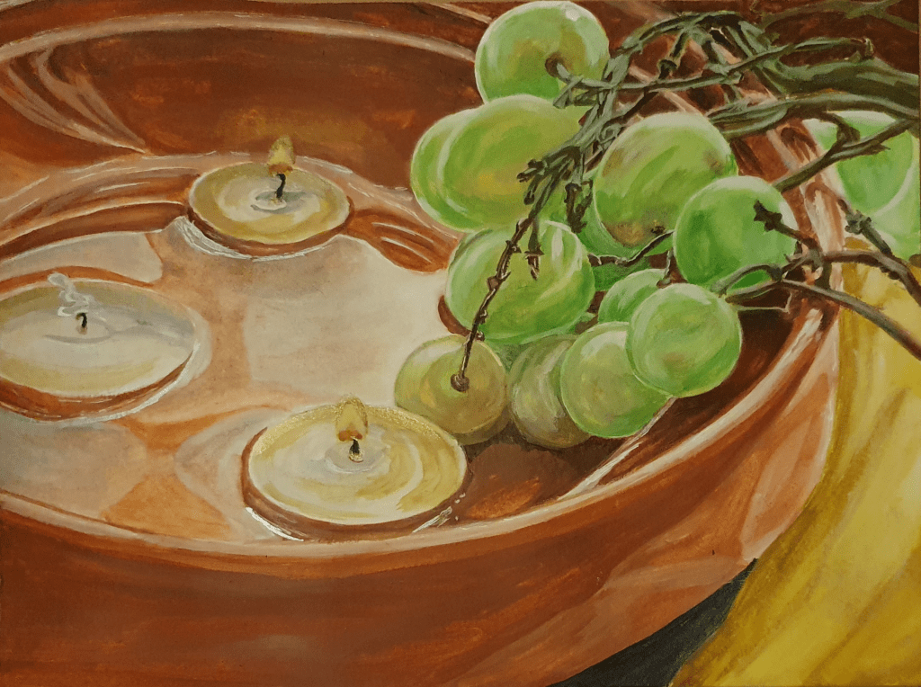
I felt that as simple approach would work best to represent the simplicity of balance. I painted a section of the objects as I felt this holds all the information that is needed and cuts out all the unnecessary noise. I feel that this composition holds a good balance between the represented elements and has a peacefulness to it. I decided that using watercolour would be the best medium to use as its base is one of the elements. I still need to work on my skills with this though as I had trouble controlling it one again and ended up layering it on too thick. I don’t think that I did too bad a job with the water in this painting though. I felt that a more observational route would be best for the style as this would show how these objects naturally looked the best, furthering the representation of nature. I’m not sure that I have managed to complete the brief in the way that was expected but by focusing on the balance needed to keep disaster from happening that I have done so in my own way. After all balance is needed in every aspect of life to keep all kinds of disasters from happening. At the end of the painting I couldn’t resist adding something to the image to further the symbolism but decided to do so with subtlety. I did this by adding some gold and silver ink to the flame, wick, smoke and water. I felt that this added emphasis to each of the elements in a quiet, peaceful way. When the light shines on it each of them are highlighted, though you can’t see this in the photo I took. Although not hard, as the objects were basically the colours used anyway, I used earthy colours as I felt that it fit best with the overall idea of this piece.

Overall I am pleased with this painting. I feel that I have managed to make a fairly realistic, if slightly more dramatized, well balanced image. Any concerns I have, I have already mentioned.

Bibliography

Identifying Tools And Materials

Smart Art. 2018. 5 Marker Art Pieces That Will Inspire and Motivate You. [online] Available at: <https://smartartbox.com/blogs/smart-art-blog/5-marker-art-pieces-that-will-inspire-and-motivate-you&gt;

Tom DesLongchamp. Publish date unknown. Tom DesLongchamp. [online] Available at: <http://www.tomdeslongchamp.com/&gt;

Copicmarker.com.au. 2015. Copic Australia | Copic Feature Artist – Stephen Ward. [online] Available at: <http://www.copicmarker.com.au/copic-feature-artist-stephen-ward&gt;

Youtube.com. 2015. Copic Marker Australia. [online] Available at: <https://www.youtube.com/watch?v=hzMl7Y8-muM&gt;

Gardnerillustration.com. Publish date unknown. Sketches | Stephen Gardner. [online] Available at: <http://www.gardnerillustration.com/sketches&gt;

Cosme, M., 2017. The Prime Belgian Doodler You’ve Never Heard Of. [online] Doodle Arts. Available at: <https://www.doodleartsmagazine.com/benevolent-benelux-the-prime-belgian-doodler-youve-never-heard-of/&gt;

Google.com. 2021. vince okerman – Google Search. [online] Available at: <https://www.google.com/search?q=vince+okerman&safe=strict&rlz=1C1CHBF_en-GBGB902GB902&tbm=isch&source=iu&ictx=1&fir=WNPTjzI8WKLgwM%252CE4J-ZvOP63t0EM%252C_&vet=1&usg=AI4_-kSZjboV9EeFYgL4n-DH2tQTmaLnFQ&sa=X&ved=2ahUKEwiFra6TqOztAhWBYsAKHQAKBkkQ9QF6BAgcEAE&biw=1536&bih=754&gt;

Google.com. 2021. lisa krasnova – Google Search. [online] Available at: <https://www.google.com/search?safe=strict&rlz=1C1CHBF_en-GBGB902GB902&source=univ&tbm=isch&q=lisa+krasnova&sa=X&ved=2ahUKEwiMhP6-quztAhUwQUEAHZkTAlAQ7Al6BAgDECY&biw=1536&bih=754&gt;

The Curiously Creative. 2016. 12 Amazing Copic Marker Artist You Should Follow on Instagram – The Curiously Creative. [online] Available at: <https://www.thecuriouslycreative.com/12-amazing-copic-marker-artist-you-should-follow-on-instagram/&gt;

SIBYLLINE MEYNET ILLUSTRATION & COMICS. 2021. W O R K S P A C E. [online] Available at: <https://www.sibyllinemeynet.com/w-o-r-k-s-p-a-c-e.html&gt;

Art Station. 2022. [online] Available at: <https://www.artstation.com/tinocopic&gt;

Instagram.com. 2021. Login • Instagram. [online] Available at: <https://www.instagram.com/znk_art/&gt;

IAMAG Inspiration. Publish date unknown. The Art of Takeshi Obata. [online] Available at: <https://www.iamag.co/the-art-of-takeshi-obata/#jp-carousel-159969&gt;

Facebook.com. 2021. [online] Available at: <https://www.facebook.com/tlgdrawing/&gt;

Museum Poster

Research Briefings. 2021. Advertising To Children. [online] Available at: <http://researchbriefings.files.parliament.uk/documents/CBP-8198/CBP-8198.pdf&gt;

Google.com. 2021. museum posters for kids – Google Search. [online] Available at: <https://www.google.com/search?q=museum+posters+for+kids&safe=strict&rlz=1C1CHBF_en-GBGB902GB902&hl=en-US&source=lnms&tbm=isch&sa=X&ved=2ahUKEwj8vK7p6bTuAhUJCsAKHVi4BA8Q_AUoAXoECBAQAw&biw=1536&bih=754&gt;

Campaignlive.co.uk. 2004. 10 Tips – How to advertise to children. [online] Available at: <https://www.campaignlive.co.uk/article/10-tips-advertise-children/513770&gt;

Fizzicseducation. Publish date unknown. 6 TIPS FOR TEACHING STUDENTS TO CREATE AWESOME SCIENCE POSTERS. [online] Available at: <https://www.fizzicseducation.com.au/articles/6-tips-for-teaching-students-to-create-awesome-science-posters/&gt;

Travel + Leisure. 2020. Stuck at Home? These 12 Famous Museums Offer Virtual Tours You Can Take on Your Couch. [online] Available at: <https://www.travelandleisure.com/attractions/museums-galleries/museums-with-virtual-tours&gt;

BBC. 2021. [TV series] Secrets of the Museum

Museum of the World. Publish date unknown. The Museum of the World. [online] Available at: <https://britishmuseum.withgoogle.com/&gt;

Teachinghistory100.org. Publish date unknown. Teaching History with 100 Objects – The Atomic Apocalypse. [online] Available at: <http://www.teachinghistory100.org/objects/about_the_object/the_atomic_apocalypse&gt;

Travel. 2017. Top 10 things to know about the Day of the Dead. [online] Available at: <https://www.nationalgeographic.com/travel/destinations/north-america/mexico/top-ten-day-of-dead-mexico/&gt;

En.wikipedia.org. 2021. Tunjo – Wikipedia. [online] Available at: <https://en.wikipedia.org/wiki/Tunjo&gt;

Kevin Page Antiques. Publish date unknown. The stories behind the art: Jizai Okimono – Kevin Page Antiques. [online] Available at: <https://kevinpage.co.uk/news-and-blog/stories-behind-the-art/the-stories-behind-the-art-jizai-okimono/&gt;

Okimono Project. 2020. Jizai okimono. [online] Available at: <https://okimonoproject.wordpress.com/2020/02/03/a-new-okimono/&gt;

Bonhams.com. 2011. Bonhams : A fine, rare and small iron jizai (fully articulated) okimono of a dragon By Myochin Kiyoharu, Edo Period, 18th/19th century. [online] Available at: <https://www.bonhams.com/auctions/18980/lot/376/&gt;
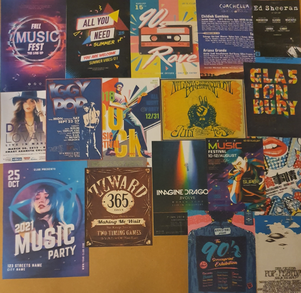
Stories from the Museum Floor. 2015. There be dragons here …. [online] Available at: <https://storiesfromthemuseumfloor.wordpress.com/2015/11/20/there-be-dragons-here/&gt;

Bbc.co.uk. 2010. BBC – A History of the World – Object : Throne of Weapons. [online] Available at: <http://www.bbc.co.uk/ahistoryoftheworld/objects/97OnxVXaQkehlbliKKDB6A&gt;

Museum.wa.gov.au. Publish date unknown. Throne of Weapons | Extraordinary Stories. [online] Available at: <http://museum.wa.gov.au/extraordinary-stories/highlights/throne-weapons/&gt;

En.wikipedia.org. 2021. Throne of Weapons – Wikipedia. [online] Available at: <https://en.wikipedia.org/wiki/Throne_of_Weapons&gt;

The Vintage News. 2017. The Throne of Weapons:A sculpture entirely made of decommissioned weapons used in the Mozambican Civil War – The Vintage News. [online] Available at: <https://www.thevintagenews.com/2017/05/04/the-throne-of-weaponsa-sculpture-entirely-made-of-decommissioned-weapons-used-in-the-mozambican-civil-war/&gt;

A Children’s book Cover

Creative Bloq. 2015. 5 tips for illustrating children’s books. [online] Available at: <https://www.creativebloq.com/illustration/5-tips-illustrating-childrens-books-91516706&gt;

Hassell, L., 2020. Illustrating book covers: the insider’s guide. [online] Digital Arts. Available at: <https://www.digitalartsonline.co.uk/features/illustration/illustrating-book-covers-insiders-guide/&gt;

Hassell, L., 2018. 25 Book Design and Illustration Tips. [online] Digital Arts. Available at: <https://www.digitalartsonline.co.uk/features/graphic-design/25-book-design-illustration-tips/&gt;

99designs. 2018. How to Design a Book Cover: The Ultimate Guide. [online] Available at: <https://99designs.co.uk/blog/book-design/book-cover-design/&gt;

Reedsy. 2019. The 50 Best Children’s Book Covers of 2019. [online] Available at: <https://blog.reedsy.com/childrens-book-covers/&gt;

A Menu Card

Template.net. Publish date unknown. Importance of Menu Card in Food Service. [online] Available at: <https://www.template.net/design-templates/menu/menu-card-importance/#:~:text=A%20menu%20card%20is%20not,and%20theme%20of%20the%20restaurant.&gt;

Annsbridalbargains. Publish date unknown. WHAT ARE WEDDING MENU CARDS?. [online] Available at: <https://www.annsbridalbargains.com/blog/2015/08/what-are-menu-cards-7498.html&gt;

Google.com. Publish date unknown. seafood menu cards – Google Search. [online] Available at: <https://www.google.com/search?q=seafood+menu+cards&safe=strict&rlz=1C1CHBF_en-GBGB902GB902&hl=en-US&source=lnms&tbm=isch&sa=X&ved=2ahUKEwje_4Hp1IXvAhWJunEKHeXPDL4Q_AUoAXoECA8QAw&biw=1536&bih=754#imgrc=Ju66uIjh63r-zM&gt;

Google.com. Publish date unknown. restaurants menu cards – Google Search. [online] Available at: <https://www.google.com/search?q=restaurants+menu+cards&tbm=isch&ved=2ahUKEwjSxYbr1IXvAhUG-hQKHYvwAoEQ2-cCegQIABAA&oq=re+menu+cards&gs_lcp=CgNpbWcQARgAMgYIABAHEB4yBggAEAcQHjIGCAAQBxAeMggIABAHEAUQHjIICAAQBxAFEB4yCAgAEAcQBRAeMggIABAHEAUQHjIICAAQCBAHEB4yCAgAEAgQBxAeOgQIABBDOgIIAFCHxwRYudQEYM7iBGgAcAB4AIABwQGIAYkFkgEDMC40mAEAoAEBqgELZ3dzLXdpei1pbWfAAQE&sclient=img&ei=Cew3YJKdFYb0U4vhi4gI&bih=754&biw=1536&rlz=1C1CHBF_en-GBGB902GB902&safe=strict&hl=en-US&gt;

Google.com. Publish date unknown. restaurant logos – Google Search. [online] Available at: <https://www.google.com/search?q=restaurant+logos&tbm=isch&ved=2ahUKEwjSxYbr1IXvAhUG-hQKHYvwAoEQ2-cCegQIABAA&oq=restaurant+logos&gs_lcp=CgNpbWcQAzIFCAAQsQMyAggAMgIIADICCAAyAggAMgIIADICCAAyAggAMgIIADICCAA6BAgAEEM6CAgAELEDEIMBOgcIABCxAxBDOgoIABCxAxCDARBDUKfMA1is4gNgn-UDaABwAHgAgAHIAYgBrQ6SAQU2LjkuMZgBAKABAaoBC2d3cy13aXotaW1nwAEB&sclient=img&ei=Cew3YJKdFYb0U4vhi4gI&bih=754&biw=1536&rlz=1C1CHBF_en-GBGB902GB902&safe=strict&hl=en-US#imgrc=iDH4E7YAEM7X7M&gt;

99designs. 2020. 61 best restaurant logos to inspire you – 99designs. [online] Available at: <https://99designs.co.uk/blog/creative-inspiration/restaurant-logos/&gt;

BBC Bitesize. Publish date unknown. Emotion, mood and atmosphere – Colour – National 5 Art and Design Revision – BBC Bitesize. [online] Available at: <https://www.bbc.co.uk/bitesize/guides/z3bqycw/revision/10&gt;

A Tattoo
Wellcome Collection. 2010. A brief history of tattoos. [online] Available at: <https://wellcomecollection.org/articles/W9m2QxcAAF8AFvE5?utm_source=Google&utm_medium=adgrant&utm_campaign=Stories_Apr20&gclid=EAIaIQobChMI8pPaqKaK7wIV74FQBh3jGwnzEAAYASAAEgIodvD_BwE&gt;

AuthorityTattoo. 2021. History of Tattoos: A Complete Timeline – AuthorityTattoo. [online] Available at: <https://authoritytattoo.com/history-of-tattoos/#:~:text=Tattoos%20date%20back%20many%20thousands,3370%20BC%20and%203100%20BC.&gt;

king of tattoos. 2013. A Brief History of Tattoos. [online] Available at: <https://kingoftattoos.wordpress.com/2013/11/07/a-brief-history-of-tattoos/&gt;

HuffPost UK. 2014. The Gorgeous History Of Tattoos, From 1900 To Present. [online] Available at: <https://www.huffingtonpost.co.uk/entry/tattoo-history_n_4957215?ri18n=true&gt;

Alker, R., 2020. How tattoos became fashionable in Victorian England. [online] CNN. Available at: <https://edition.cnn.com/style/article/tattoos-victorian-england-conversation/index.html&gt;

Flashbak. 2015. Wonderful Women With Wicked Tattoos: 1900-2000 – Flashbak. [online] Available at: <https://flashbak.com/wonderful-women-with-wicked-tattoos-1900-2000-32177/&gt;

Custom Tattoo Design. 2020. 100 Years Of Ink: Tattoo Fads By The Decade | CUSTOM TATTOO DESIGN. [online] Available at: <https://customtattoodesign.ca/tattoo-trends/100-years-of-ink-tattoo-fads-by-the-decade&gt;

Cornwell, B., 2021. Top 103 Awesome Tattoo Ideas – [2021 Inspiration Guide]. [online] Next Luxury. Available at: <https://nextluxury.com/mens-style-and-fashion/awesome-tattoos-for-guys/&gt;

Thetrendspotter. Publigh date unknown. [online] Available at: <https://www.thetrendspotter.net/tattoo-ideas-for-women/&gt;

En.wikipedia.org. 2021. Mother’s Day – Wikipedia. [online] Available at: <https://en.wikipedia.org/wiki/Mother%27s_Day#:~:text=Mother’s%20Day%20is%20a%20celebration,months%20of%20March%20or%20May.&gt;

Town & Country. 2020. 20 Facts You Probably Didn’t Know About Mother’s Day. [online] Available at: <https://www.townandcountrymag.com/leisure/arts-and-culture/g19561312/mothers-day-facts/&gt;

Town & Country. 2021. Unique and Funny Mother’s Day Cards She’ll Cherish. [online] Available at: <https://www.townandcountrymag.com/style/g26929890/best-mothers-day-cards/&gt;

TatRing. 2020. The Art of Choosing the Perfect Font and Lettering for a New Tattoo. [online] Available at: <https://tatring.com/tattoo-ideas-meanings/Tattoo-Fonts-and-Tattoo-Lettering&gt;

Inkedcartel.com. Publish date unknown. [online] Available at: <https://inkedcartel.com/typography-tattoos/&gt;

Fontsmith.com. 2018. Skin deep – typography and tattoos. [online] Available at: <https://www.fontsmith.com/blog/2018/02/05/skin-deep-typography-and-tattoos&gt;

PMacNaughton, W. and MacNaughton, W., 2014. Pen & ink.

En.wikipedia.org. 2021. Rag doll – Wikipedia. [online] Available at: <https://en.wikipedia.org/wiki/Rag_doll&gt;

Character Development

ImagineFx, 2021. (Character Design)
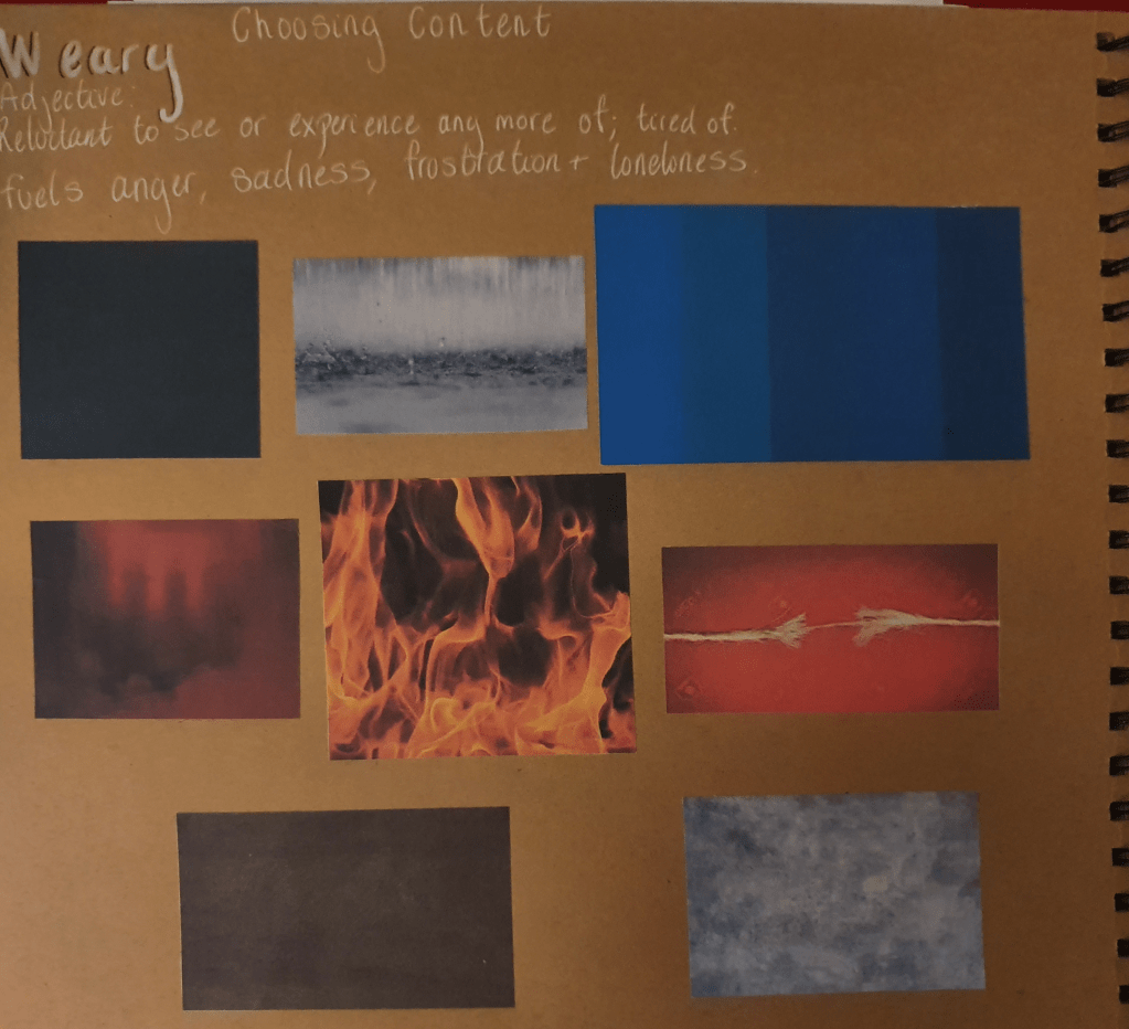
ImagineFx, 2021. (Book Illustration).

ImagineFx, 2021. (Animation).

Google.com. 2021. animal characters – Google Search. [online] Available at: <https://www.google.com/search?q=animal+characters&safe=strict&rlz=1C1CHBF_en-GBGB902GB902&source=lnms&tbm=isch&sa=X&ved=2ahUKEwiAuZXQyNPvAhWyo3EKHc4OBocQ_AUoAXoECAEQAw&biw=1536&bih=754&dpr=1.25&gt;

Google.com. 2021. pokemon animals – Google Search. [online] Available at: <https://www.google.com/search?q=pokemon+animals&tbm=isch&ved=2ahUKEwjs46SJ8dPvAhUIQBQKHfxlA3sQ2-cCegQIABAA&oq=pokemon+animals&gs_lcp=CgNpbWcQAzICCAAyAggAMgIIADICCAAyAggAMgIIADICCAAyAggAMgIIADICCAA6BwgAELEDEEM6BAgAEEM6BQgAELEDUIucAVjyogFgn6QBaABwAHgAgAHRAYgBoAiSAQUzLjQuMZgBAKABAaoBC2d3cy13aXotaW1nwAEB&sclient=img&ei=oO5gYOyTIYiAUfzLjdgH&bih=754&biw=1536&rlz=1C1CHBF_en-GBGB902GB902&safe=strict&hl=en-US#imgrc=cYQi2g1VnDvDMM&gt;

Google.com. 2021. Famous animal characters – Google Search. [online] Available at: <https://www.google.com/search?q=Famous+animal+characters&safe=strict&rlz=1C1CHBF_en-GBGB902GB902&hl=en-US&source=lnms&tbm=isch&sa=X&ved=2ahUKEwjWqtjQ79PvAhXkuXEKHdpRCfQQ_AUoAXoECAEQAw&biw=1536&bih=754&gt;

Blackman, N., 2021. Animal Illustration Inspiration: Character, Wild and Cute!. [online] Design & Illustration Envato Tuts+. Available at: <https://design.tutsplus.com/articles/animal-illustration-inspiration-character-wild-and-cute–cms-35797&gt;

Larsson., A. and Yalanska, M., Publish date unknown. Animality: Awesome Illustrations by Therese Larsson.. [online] Design4Users. Available at: <https://design4users.com/animality-awesome-illustrations-by-therese-larsson/&gt;

Character Design References. Publish date unknown. Character Design | Kid Boys. [online] Available at: <https://characterdesignreferences.com/visual-library-2/kid-boys&gt;

Character Design References. Publish date unknown. Character Design | Kid Girls. [online] Available at: <https://characterdesignreferences.com/visual-library-2/character-design-kid-girls?rq=girl&gt;

Character Design References. Publish date unknown. Character Design | Toddlers. [online] Available at: <https://characterdesignreferences.com/visual-library-2/character-design-toddlers?rq=toddlers&gt;

Character Design References. Publish date unknown. Character Design | Men. [online] Available at: <https://characterdesignreferences.com/visual-library-2/character-design-men?rq=men&gt;

Dragonsinn.net. 2020. Dragon Anatomy and Physiology – Dragonsinn.net. [online] Available at: <https://www.dragonsinn.net/dragon-anatomy/&gt;

Magazine Iillustration
Zennedout.com. 2018. What are the 4 Elements and How to Use Them :. [online] Available at: <https://zennedout.com/what-are-the-4-elements-and-how-to-use-them/&gt;

Ancient Symbols. Publish date unknown. Four Elements Symbolism. [online] Available at: <https://www.ancient-symbols.com/four-elements.html&gt;

Part Three: Working It Out

Exercise One: Illustrating Visual Space

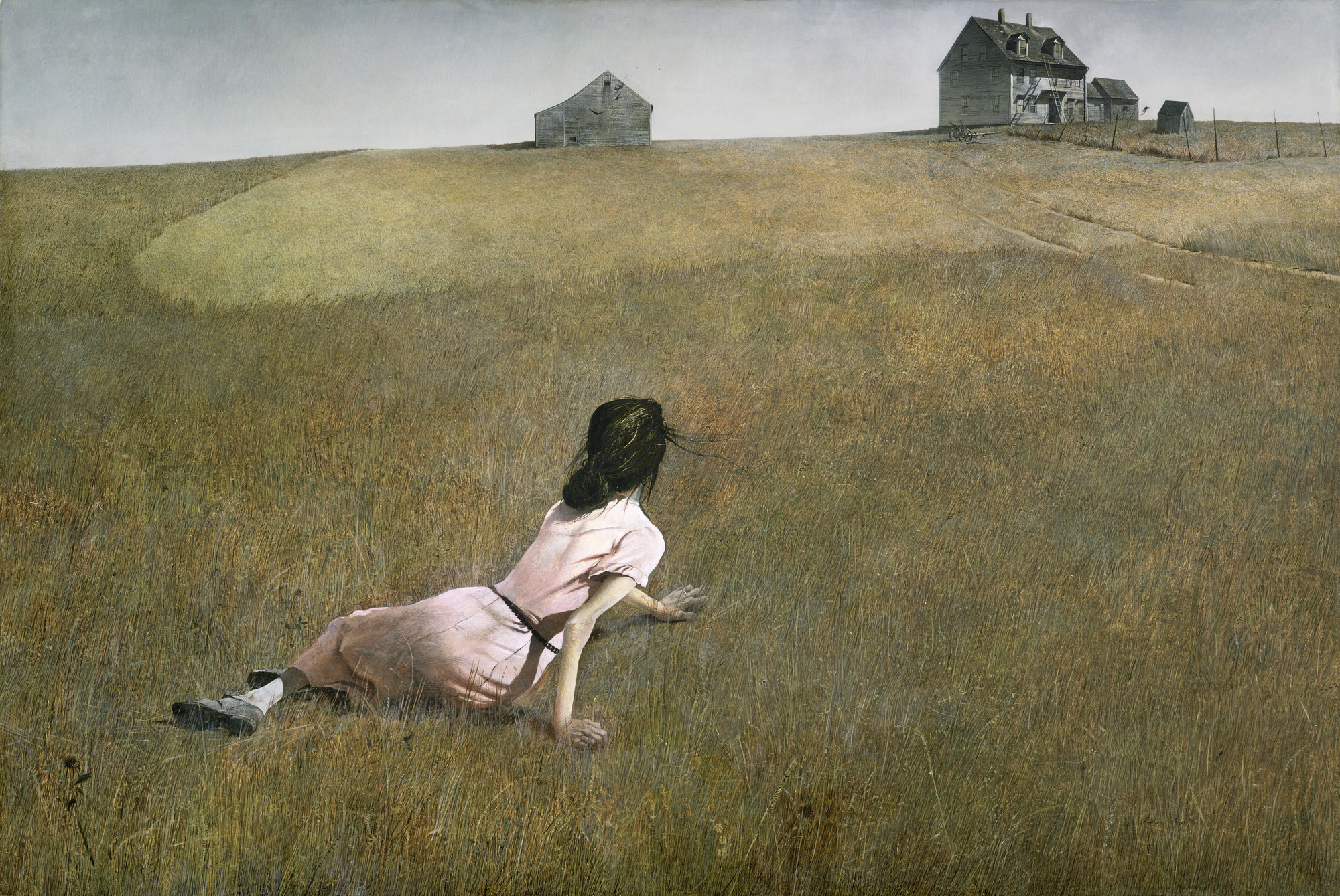
I started this exercise by researching visual space. Doing this lead to me looking at some examples of the use of visual space by artists such as: Andrew Wyeth, Henri Matisse and Henry Moore. A couple examples of the use of visual space I looked at were Wyeth’s Christina’s World and Matisse’s Red Room.

Andrew Wyeth. Christina's World. 1948 | MoMA
Art works
The Mesmerizing Henry Moore Sculptures Are Coming to Houghton Hall |  Widewalls

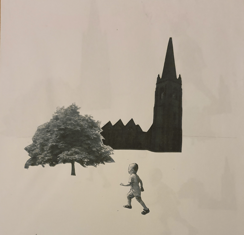
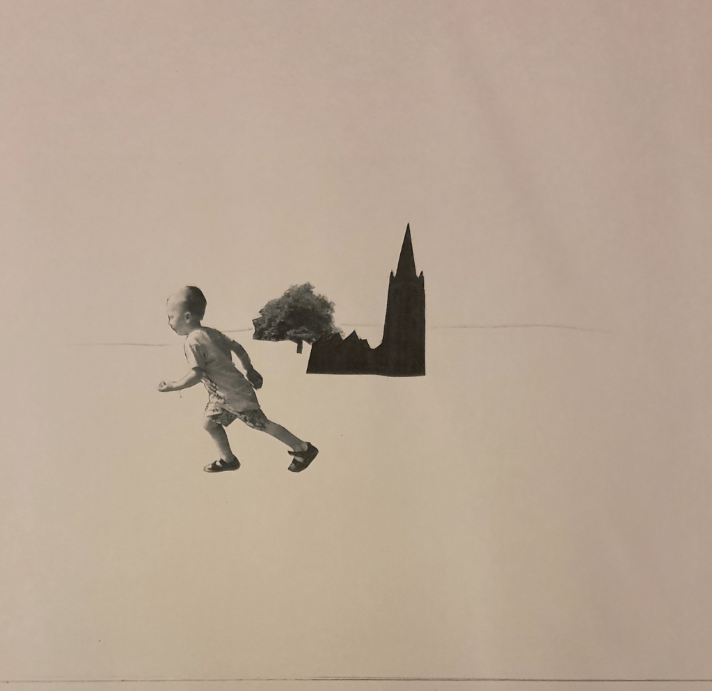
I had to pick an image of three different objects: a tree, a child running/walking and a building. Using feedback from part 2 I used photos I had taken myself. With these images I had to photocopy them in black and white at different scales and sizes and cut them into individual items. On a square format I had to arrange the cut outs into an image.

I kept the first image fairly realistic, so that it looks as though the child is walking passed the church. I brought the tree further into the foreground to add distance within the image. Looking at this the image looked as though it was floating in a white space so I added a horizon line to anchor it.

Moving the church back further would have helped create more depth.

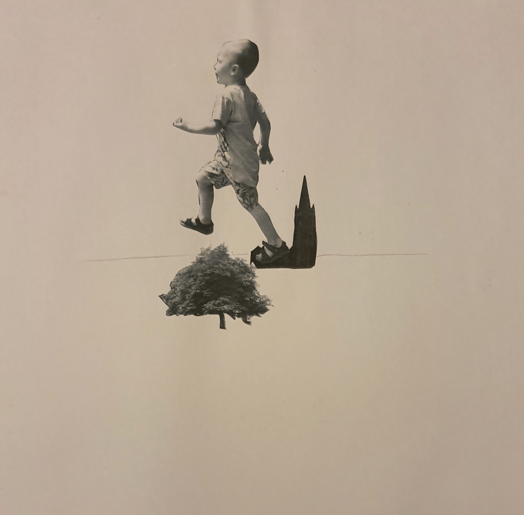
In the second image I played around with size. By doing this I made it look like a giant was stepping on the church. I feel that having the foot hover over the horizon line makes him look like he is stepping further than if it were placed higher up.

I feel that lowering the horizon line a little would have had more impact. There is also too much negative space.

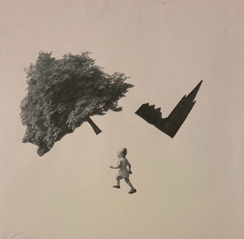
For this image I wanted the tree to appear further away so I picked a smaller cut out and placed it further up the paper, behind the church. I used a bigger cut out of the boy and placed him in the foreground to add even more distance. I tilted him so that he seems to be moving faster.

Here, I put the tree and church on a curve (though the line appears very faint in the photo) to give the impression that the work is twisting around the boy, or that he is moving so fast that the world is rushing by. I feel that this gives the impression that he can bend space and time. The boy is placed up right as positioning him any other way would ruin the illusion. I added the curved horizon line as without it the image just looked a jumbled mess.

I feel that the boy is too small in this and gets drowned out by the other objects.

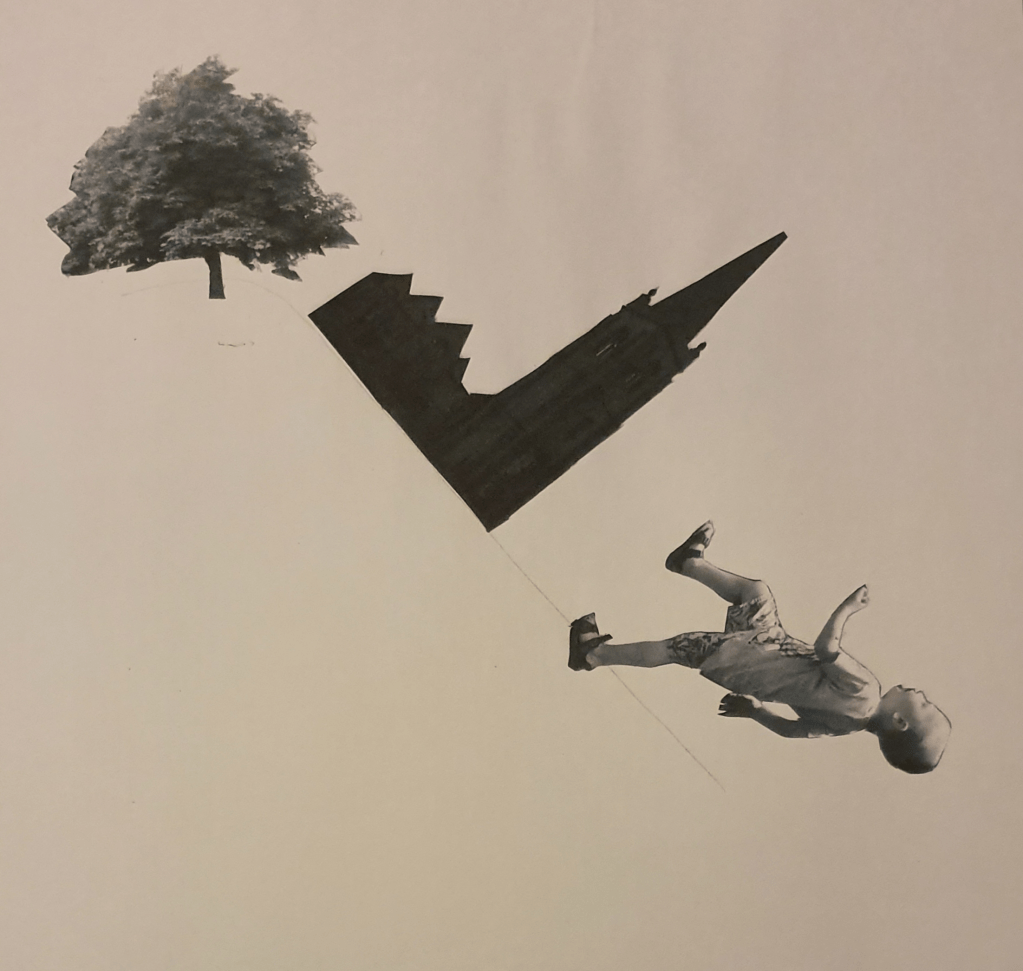
For this image I played with angles. I placed the tree upright and used the horizon line to anchor the angle the image would follow. I tipped the church on its side and placed it along the line so that it would look as though it is sliding down a hill. The boy is placed at a more drastic angle so he would look as though he had fallen down it.

Having the objects placed so close together leaves too much negative space in the image.

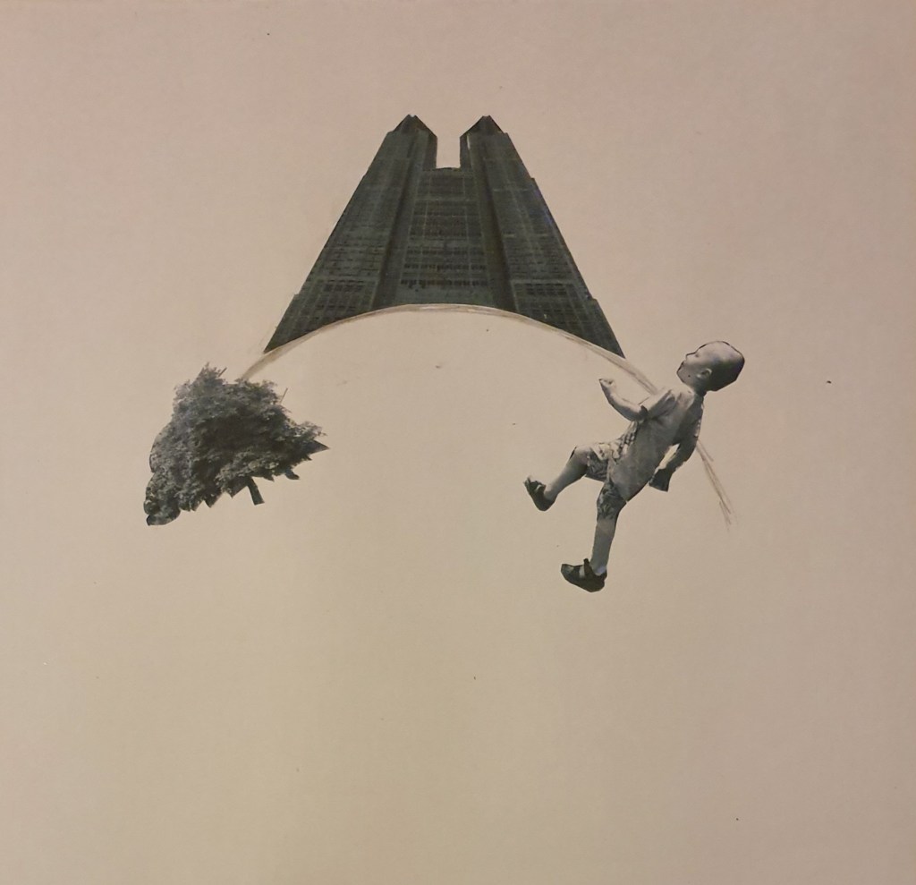
In this last image I once again played with angle. To do this I found an image of a building online that had been taken up close. This distorts the building enough so that when placing a horizon line below it the building looks as though it is falling behind. This gives the illusion that it is on top of a hill or on a ball. The boy looks like he is climbing a hill.

The angle of the building isn’t quite right so ruins the illusion a little and in comparison to the other objects the tree is way too small, giving the image a completely different effect.

Next I was given some questions to answer.

  1. How does your sense of the image and its meaning change when the figure is smaller than the other elements?
    This makes the figure less obvious, drowning it out and giving dominance to the other objects in an image. It gives the image an Alice in Wonderland feel. It can also leave too much negative space and leaves the space too ambiguous.
  2. If the elements are at differing angles to each other and at an angle to the frame, what dynamic is suggested?
    This kind of image is the opposite to what the mind expects so gives an image a surreal feel. I think in the case of my image it gives the world the sense of being warped. This can suggest super fast movement or the bending of reality. It reminds me of Inception. Doing this allows you to play around with what the mind expects and considers normal. Going against what is expected can create different effects and feelings, like falling.
  3. If all the elements are completely horizontal and vertical in relation to the frame what dynamic is suggested? What is your opinion about this image and what sensation does it communicate?
    This kind of composition is what the brain considers normal and expects to see. This gives an image a more comfortable feel and settles into the mind better. This composition is more orderly which gives the viewer a more obvious path to follow. The foreground and background become clearer in this kind of image, making it more comfortable to read.
  4. Which is your favourite composition? Why is it most successful?
    I like the last image best. I feel that is twists reality in a more comfortable way. Bringing the horizon line forward gives the viewer more information, making it more easily read and followed. I think that the angle of the building provides a clear line as the larger component gives a clear focus to the image. It also provides a sense of symmetry, creating a calmer feeling image. The curve of the horizon line reminds me of the moon, adding a sense of serenity.

Edit:
To give the church a feeling of dominance I could have made everything else a lot smaller, so that they looked like ants against the building. I could have also moved it up the page so that it would bleed off the top and give the image a sense of looming I could have also done this other ways by changing the perspective. I thought I had enough variations at the time, however, If I had experimented with more sizes I could have created some more interesting effects. I feel that a bigger contrast in size would have created a better image.

Exercise Two: Reading an Image

Exercise 15 – Drawing and Illustration
  1. What is the image about? What is it saying?
    There is a dragon sleeping. It is surrounded by treasure. A throne, money, armour and weapons make up the treasure. Two kids are to the left of the image, one holding a lit torch, the flame lighting the top left corner.
  2. What is the narrative? Identify the story
    In the image two kids have come across a sleeping dragon. Whether they have stumbled upon it or purposely sought it out is unclear. They are in what appears to be a cave surrounded by treasure, which leaves the possibility that they are after it. One of the kids is pointing out of the image, either showing the other child something we can’t see or asking to turn back. The whole scene reminds me heavily of when Bilbo went to steal the Arkenstone from Smaug.
  3. Describe the palette and tonal range.
    The artist has used a limited palette. They have used a mix of hot and cold colours. The hot colours used are red, yellow and orange. The cold colours are blue, green and purple.  The hot colours have been used for the flame and the parts of the cave that it lights up. Red is also used for the colour of the dragon, a popular choice for this creature because of its fire breathing capabilities.  These are the colours that jump out at you when viewing the image. My attention is first drawn to the light reflected from the flame and then is drawn to the dragon. This is because of the dark blues used in the background. The cool colours are used to make up the shadows, the darker blues adding a depth and making the cave seem bigger.

    After staring at the image for a while I realised that the shadow is in the wrong place as it should be behind the kids. I also realised that the dragons back leg is at an awkward angle, making it look like it is in the wrong place. I feel that the main focus of the image should be the dragon, but the bright colours of the light on the ceiling is what immediately draws my attention. Maybe adding a little more yellow to the dragon’s skin would draw the eye to it more.
  4. Is there a connection between the hot colours and the importance of the element in the story?
    The only importance I can see, that makes sense to the story, is the danger that the dragon imposes because, as stated before, of its fire breathing abilities. The importance given to the roof draws the importance away from the rest of the image.

Hierarchy in the image
I’d say that the most important elements in the image would be the dragon and kids. Having the dragon curled around its treasure really gets the point across of how important it is to the dragon. It also makes me think that it acts as a comfort to the dragon. Sort of like a baby with a comfort blanket. Having the kids pointing in different directions works to send the message that one of them doesn’t want to be there. Though I don’t think the ceiling is as important as the dragon or kids, having it lit up red draws the viewers attention. Whilst this takes attention away from the kids it also leads the eye in that direction, where the eye automatically goes to the kids next. I do feel that the attention should have been brought straight to the kids, instead of through the ceiling. I also think it important that the child who clearly wants to be there is carrying the flame. This distinguishes them as the clear leader. The flame, However could also pose a threat, which would change the idea behind the image. All in all I think that the image is well thought out, I’m just not sure about the reliance given to the importance of the ceiling.

Exercise Three: Image Development

I started this exercise by looking into the development of an image. Doing so gave me tips on the best way to compose an image and where the eye will interpret and read things.
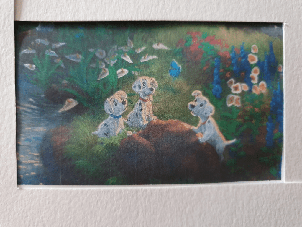
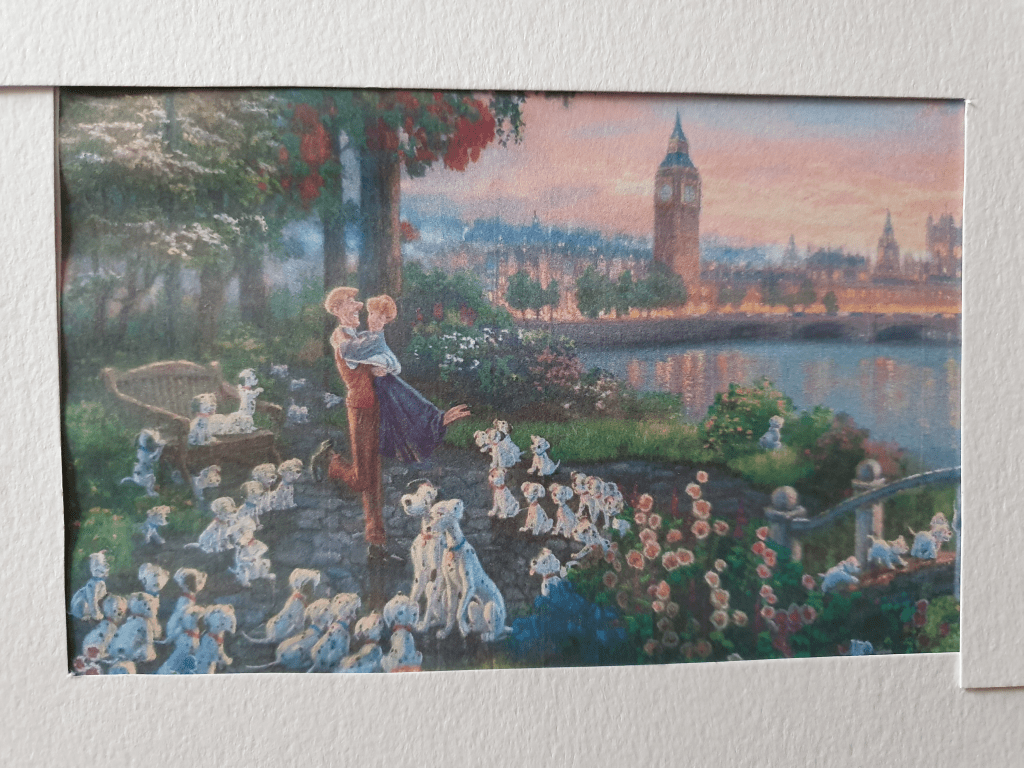
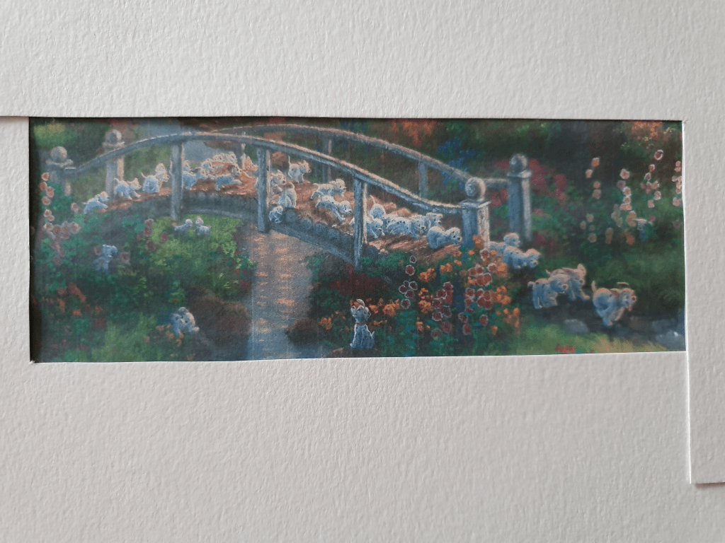
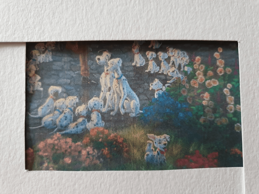
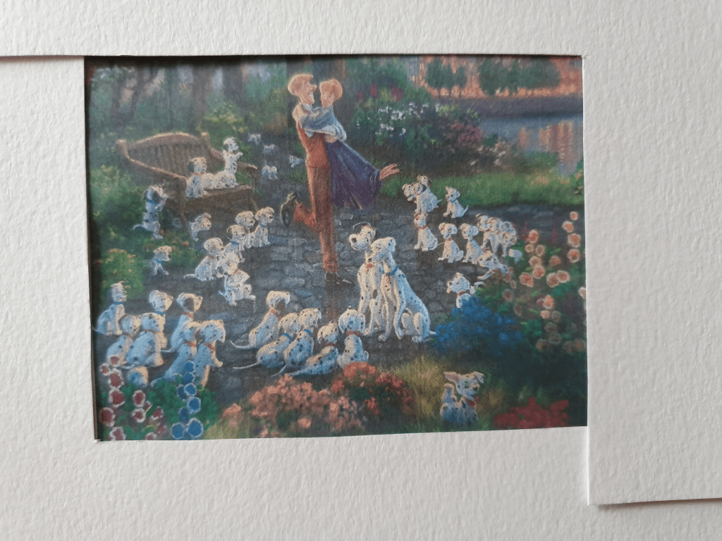
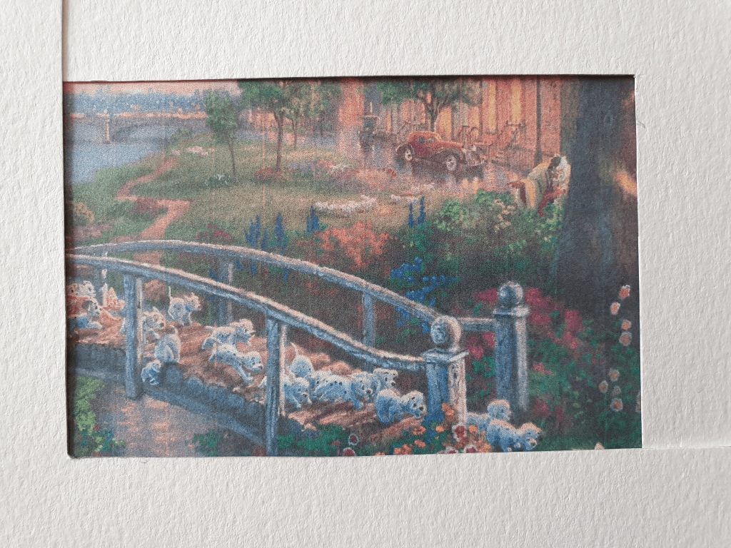
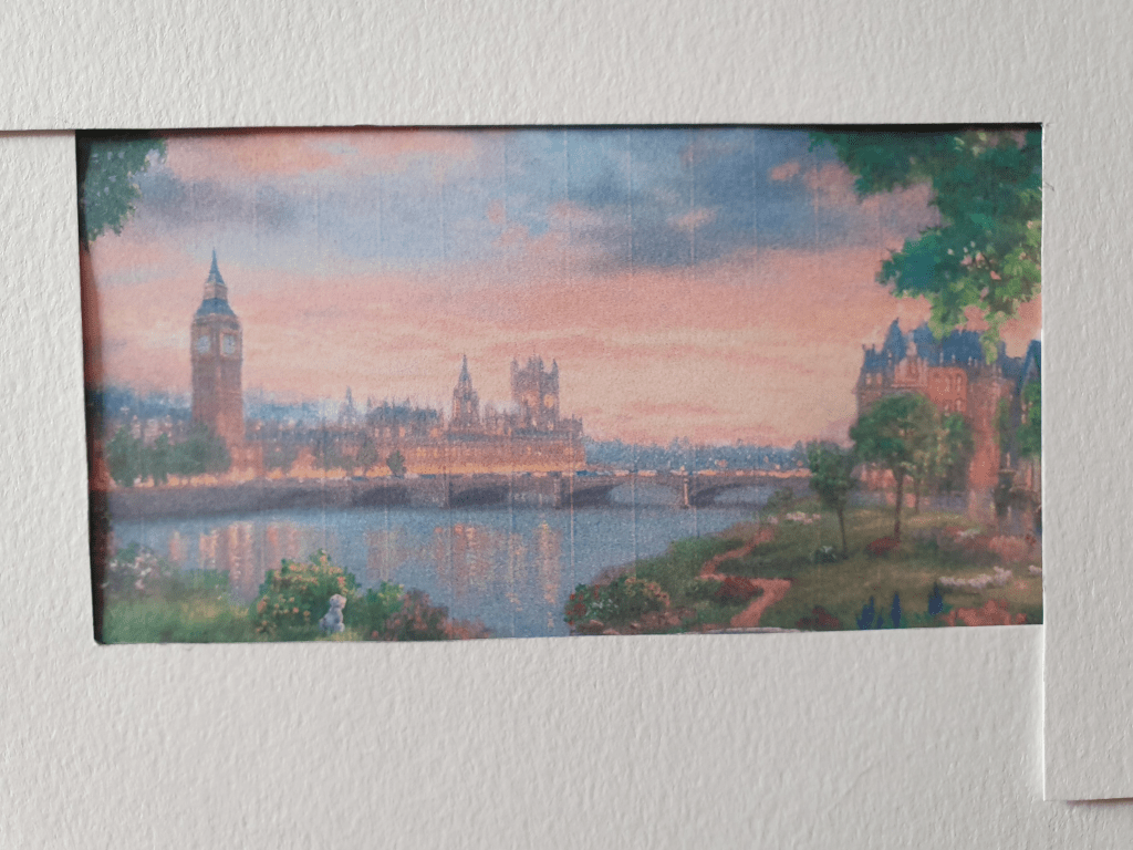
For this exercise I chose to use a painting created by Thomas Kinkade. Kinkade is well known for his Disney art and I picked a painting based on the movie 101 Dalmatians. I picked this as the image is full of activity.

Disney 101 Dalmatians – Limited Edition Canvas | Thomas Kinkade Studios

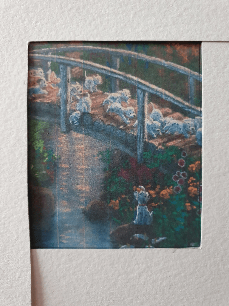
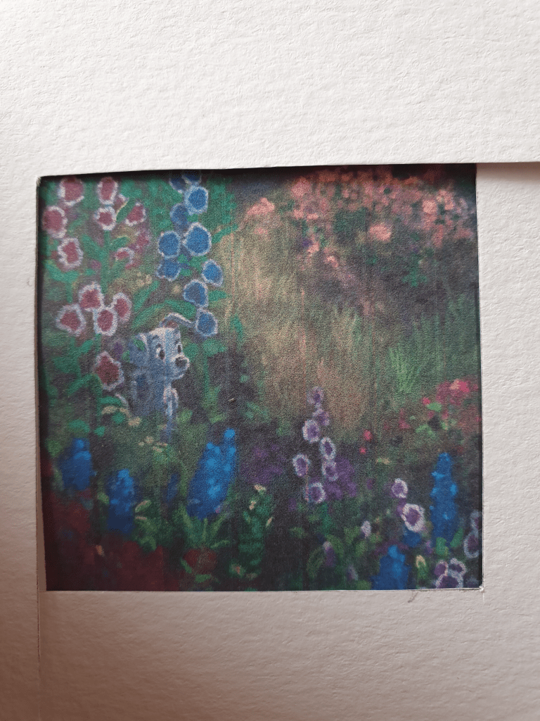
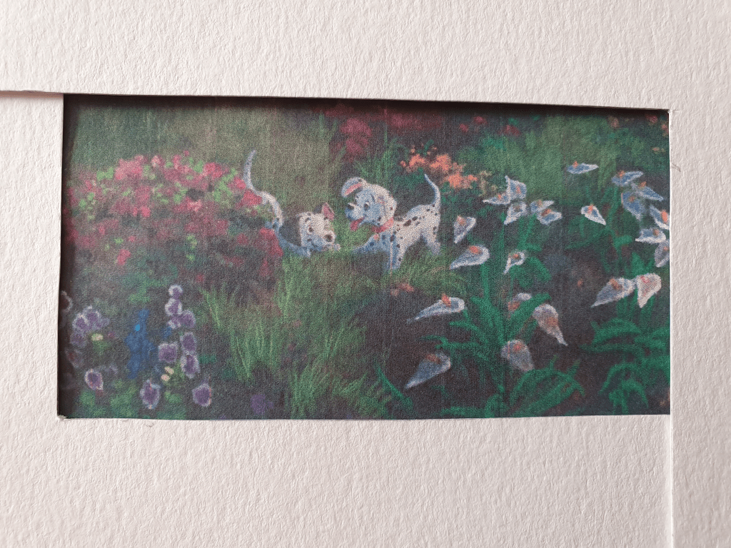
Taking two L shapes to crop the image, having printed it on A4 paper, I created ten smaller compositions. I then had to think of a word to name name each image that related to it in some way.

Here are my images:

I named this one Meeting

I was going to name this one Happily Ever After but changed it to Forever as I wasn’t sure it fell under the brief.

Leading

Proud

Family

Whisper

Hide’n’seek

Playful

Creeping

Dreaming

Doing this I found that cropping an image can change it immensely. Even the smallest change can effect the image and its meaning in a big way. I’d say that two examples of this would be Leading and Creeping. The images are based around the same area of the painting but because I changed the placement of the paper slightly different aspects of the painting are revealed and the narrative is completely different. The same thing happened with Family and Forever.

I found that the shape of an image can change where the focus is placed. This can then affect the importance of other elements of an image, either adding it or completely stripping an element of its importance. sometimes you end up cutting an element out completely. The feeling of a image can also be affected by this.

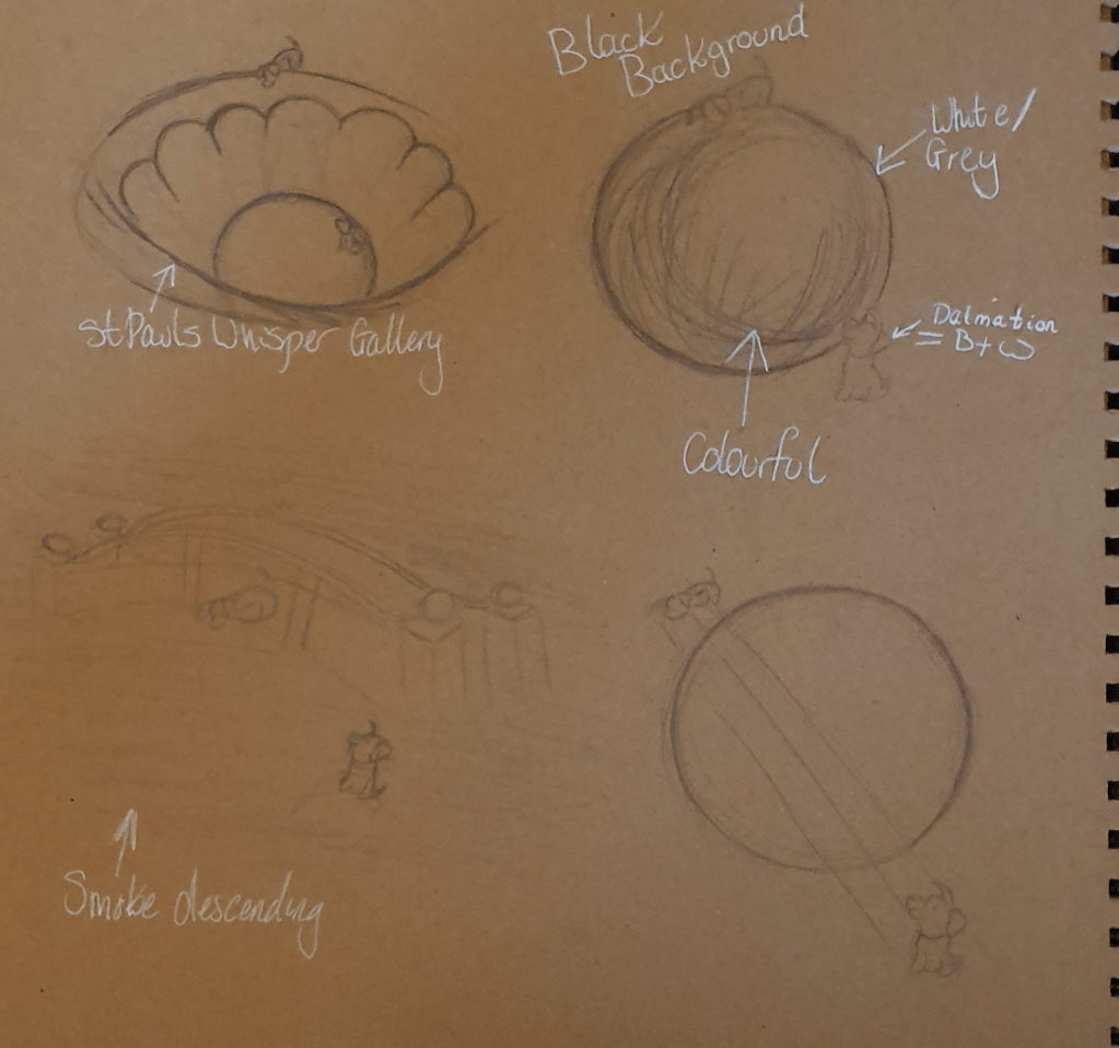
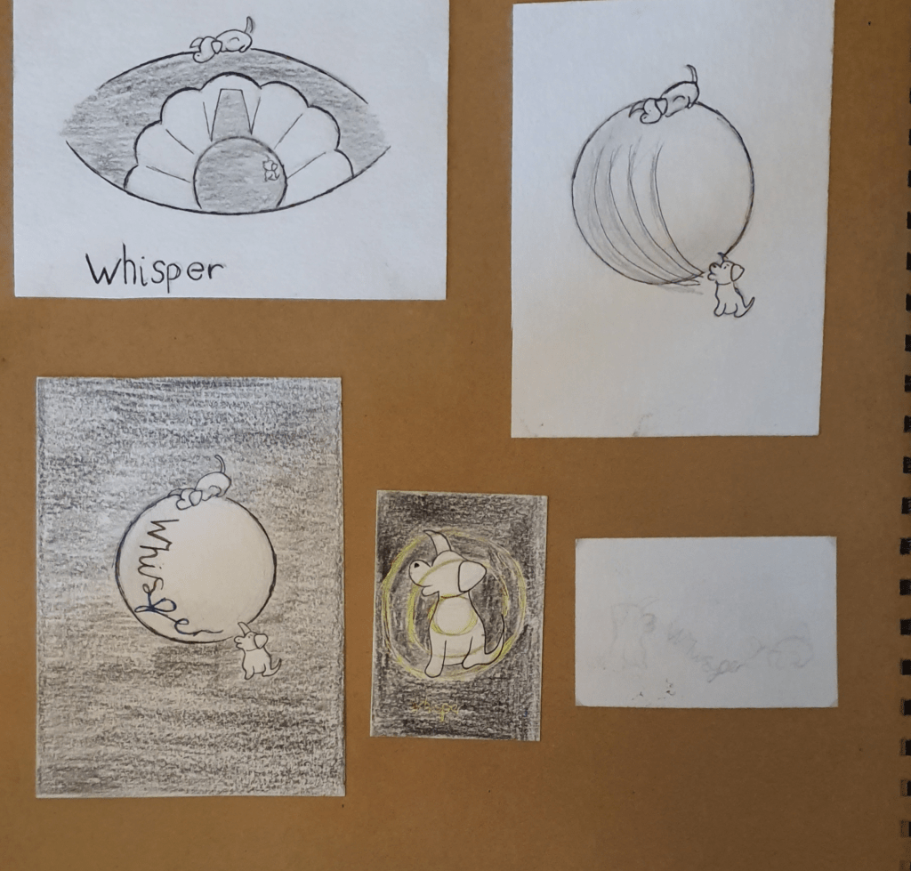
Next I was to pick one of the images as a basis for a new illustration. I had trouble choosing between Meeting and Whisper. To make my decision I made a mind map for each and ended up using Whisper. I proceeded to look into the idea behind whispering draw some designs.

I liked the idea of using a whisper gallery in some way. This is because I liked the idea of being able to hear and send messages to each other from opposite sides of the room. Having looked at both Grand Central and St Paul’s Cathedral, I felt the St Pauls would have been a better representation. I like the shape better.

My Final Piece:

As I didn’t like the effect I was getting working with more traditional mediums and to work on more feedback from the previous part of this course I decided to work digitally. I liked this as it was easier to fix any mistakes I made. I wouldn’t say that I found this an easier medium to work in as I am still getting used to all the tools in the software.

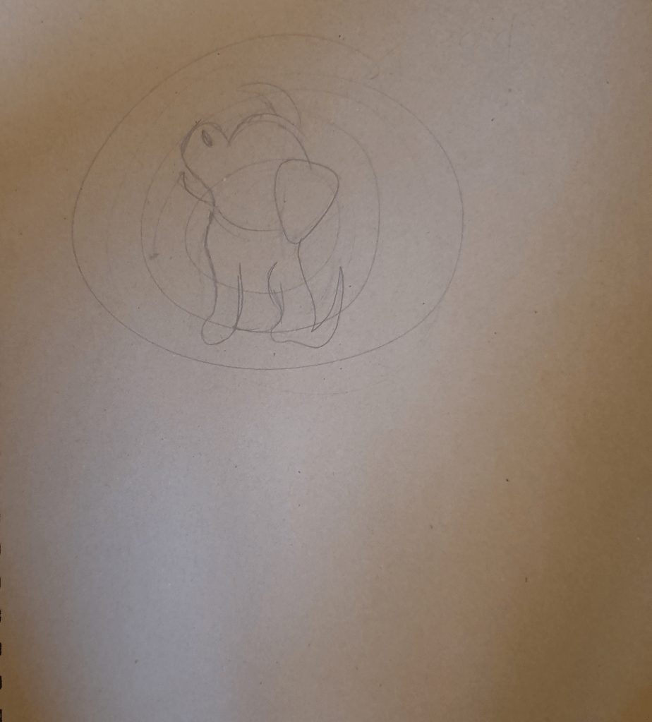
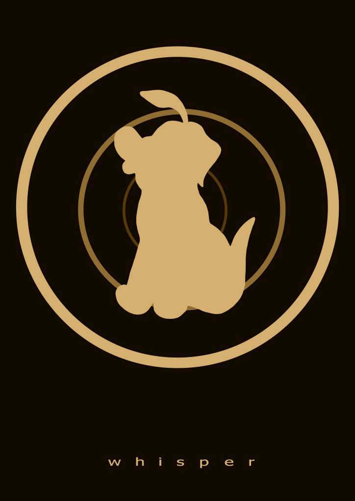
For this piece I decided to use a more muted and restricted palette. I was originally planning to use white for the dog but when viewing it I felt that this made the piece look unfinished and like it had a big blob of negative space as the centrepiece, which wasn’t a good look. I eventually decided upon a cream/beige colour as it is a warmer, more soft and comforting colour. I felt that this added an intimacy to the piece, becoming a better representation of a whisper. The colour is also nearer to the paint used in St Paul’s Cathedral so became a better fit for the rings in the image and adds a more ancient feel to it.

The rings in the picture are used to represent the layers and height of the whisper gallery. This added a few more layer to the image, giving the illusion of distance and looking at the room from a birds eye view. They also look like waves of sound reverberating through the room. Each ring darkens and gets smaller as they travel into the background to add a depth to the image. Doing this also allows the dog in the centre to stand out and not meld into the gallery.

I used the dog as the inspiration from the original image. I placed him in the middle of the gallery to show that the sound is moving around, or to and fro from him. The fact that his ear is up in the position it is in makes it look like he is listening, adding to the effect. I placed the image slightly off centre, up the page to leave room for the text at the bottom so that it wouldn’t look cramped and slapped on.

I had a hard time picking a font as I wanted one that looks soft but I couldn’t find one that felt right. I knew however, that the text should be small, as is the sound that travels the gallery. I chose to use the same colour as the rest of the image to tie it in and because it feels softer than any other colour I thought to use. I spread the letters apart, not only to take up more space but because it makes it last longer, as a whisper takes longer to be heard and lingers. I used all lowercase letters to fit with the whisper.

I do like this image, though I do feel as though something is missing. I’m not sure about the size of the text, I did play around with making it smaller, but this caused it to get lost within the image. I then spread the letters further apart, however, this just made the image look stretched and wrong. The way the text is now does seem to anchor the image more than if it weren’t there. I added a fourth ring but tis just made the image look over full and complicated.

Edit:
I think that having already known the story of 101 Dalmatians, which this painting is based on, has affected my view of the image. Already knowing the characters forms a preconceived idea of what is happening and I am sure that this influenced the feel given by the painting and the way that I cropped the image. I believe that I may have had a different take on this image if I hadn’t seen the movie before.

Exercise Four: Abstract Illustration

I had a lot of trouble with this exercise as I have never really seen what is good about abstract art. It has always looked to me as though someone just threw some paint onto a canvas to make some money so this required me to research the ideas behind this kind of art. I do like the idea of it being free from the restraints of representational art.

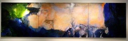
I looked at examples from other artists. Some of my favourites were:

Abstract painting 599 by Gerhard Richter on artnet

The next thing I had to do was decide which of the following musicians I should listen to whilst making my piece: George Gershwin, The Gypsy Kings, Beethoven or Miles Davis. I chose The Gypsy Kings as I felt their music was more joyful than the others.

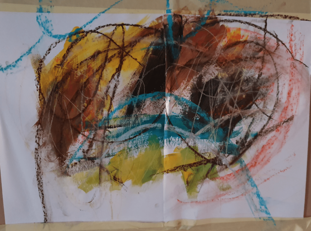
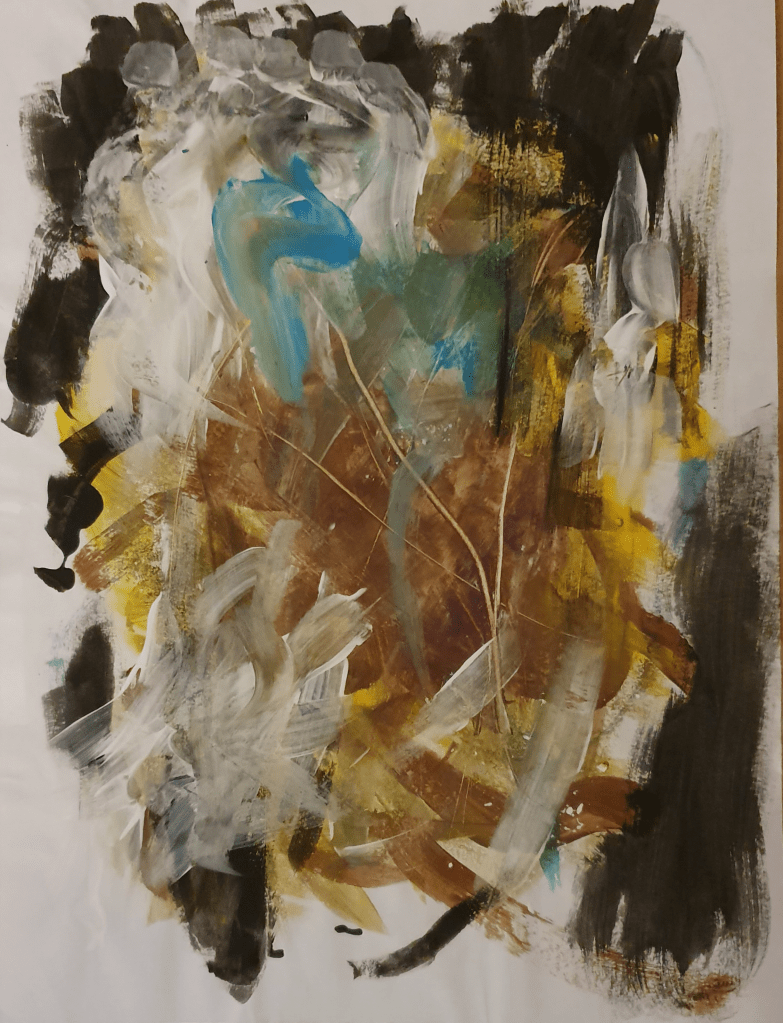
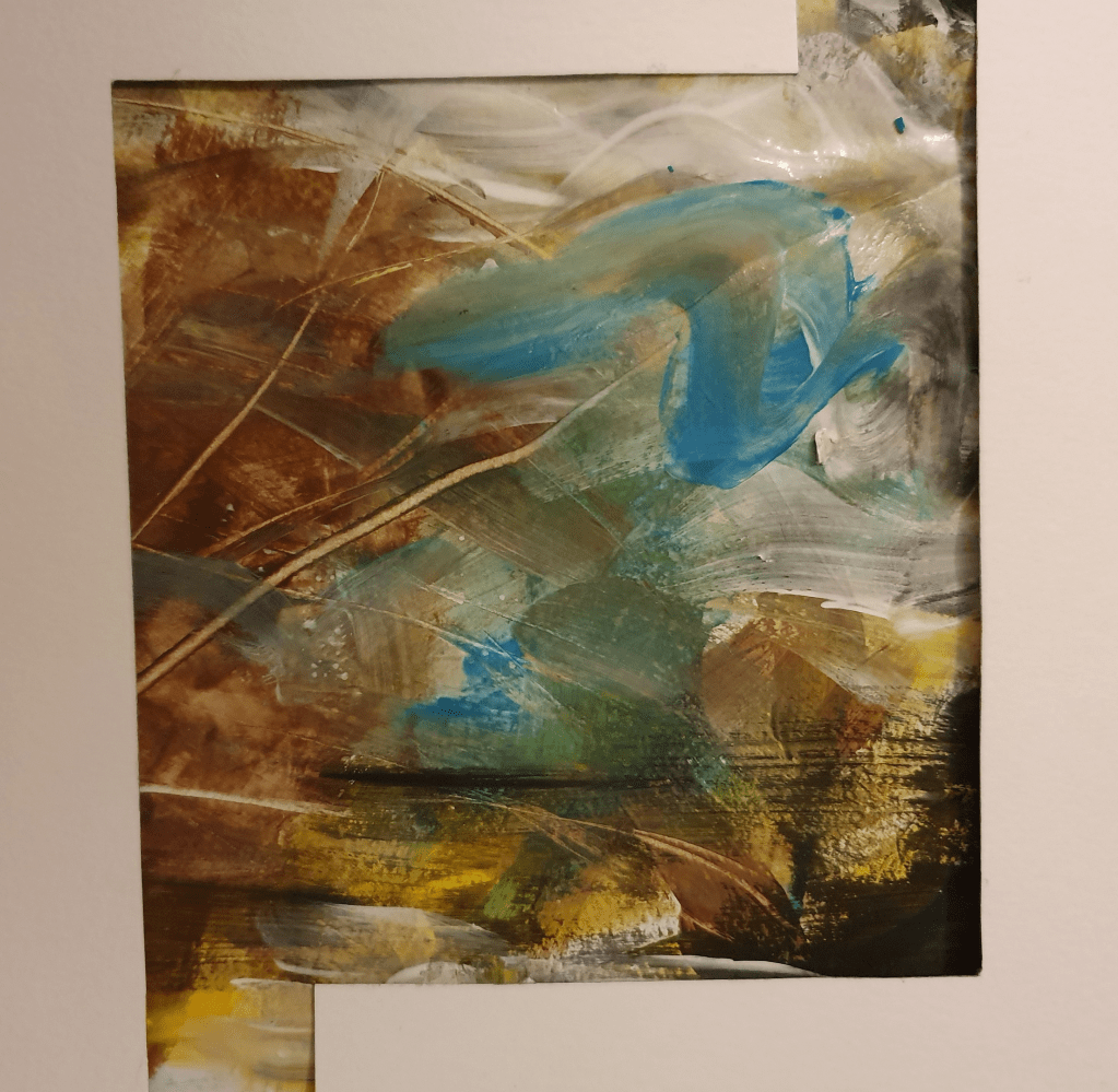
I found working intuitively on this harder than expected. I’m used to giving my subject a form instead of just adding marks to the paper. Because of this I felt that I should try again, hopefully getting better, less restrained results.

I felt that the second attempt was way more successful. In the first image I used a range of materials, trying to vary the effects and textures made. Remembering to change material however stunted my ability to be intuitive so in the second image I only used paint as I felt that this medium allowed more room for experimentation. I did however scratch at the paint with some paper I had beside me to add a different texture. I used earthy and bright colours as that is the feel I get from the music.

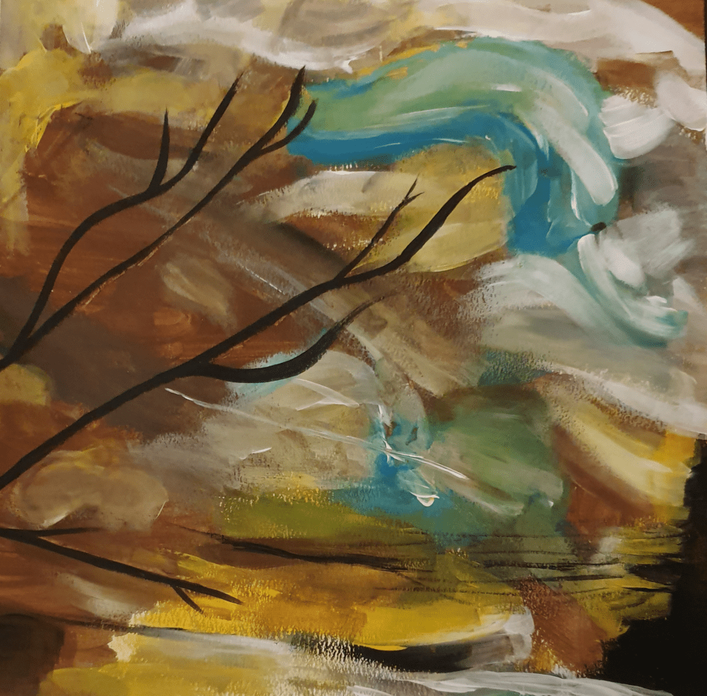
The adjective I chose for the piece is Natural. I chose this one as the scratches I made remind me of a tree and the effect of the paint at the bottom of the image reminds me of water. I feel that the music and piece are both full of life. When looking at the piece and listening to the music in unison I see lively dancing and colours associated with Mexican art. I like the slight bit of black in the corner as everything has a bit of darkness and it looks as though it is being dragged into the image, or out of it, as it seems happens with everything. It also adds a horizon line for the water.

Here I reproduced the last image. I laid black paint over the top of the scratches to enhance the branch look. I felt that using black would give a silhouette look and also tie it in with the black on the opposite side, adding a sense of symmetry. I tried not to change the image too much from the original but brightened it up a little by adding more yellow and blue. The way I have applied the paint gives me a Van Gogh vibe, lending to the reading of the marks as the sky. These marks also help add to the natural, lively feel, and suggest movement. I liked the image this created, however it was at this point that I realised I had only used one type of media which doesn’t fulfil the brief properly, which I had to fix.

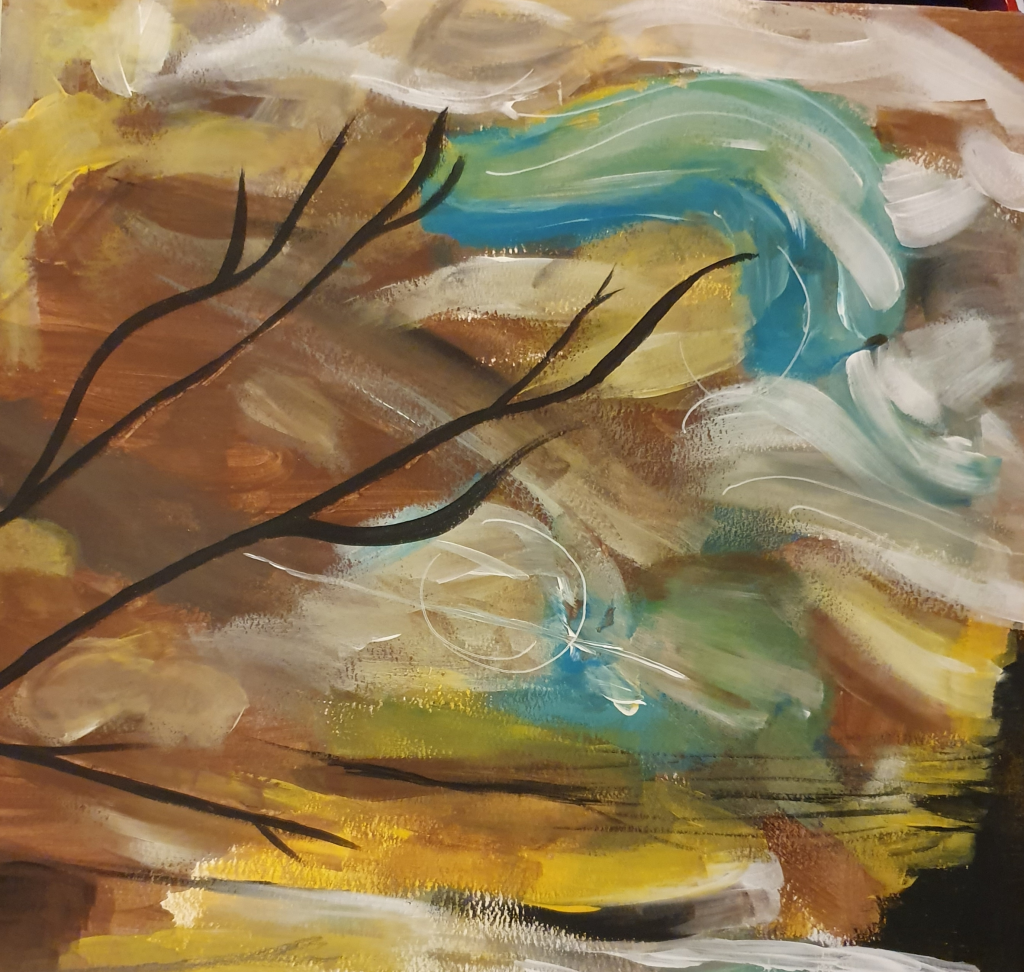
Not wanting to ruin the effect I already had I used pencil and ink sparingly. I added the slightest bit of pencil in the bottom corner to suggest the reflection of a branch in the water. I then added white ink, keeping with the movement in the sky to suggest wind. I like the effect this created although the part in the middle almost looks like a planet, suggesting that this is some alternate universe where you can see the rest of space from land. This does ruin the natural feel I was trying to create. Though if it doesn’t make you think if this I think I have succeeded in my goal.

I’m not convinced that this would work as a successful CD cover for The Gypsy Kings as they are now. However, if they were to make a slightly calmer album I feel that this could be a good contender for that space.

Thinking about it now I should have used something other than a brush to apply the paint and if I had thought about it at the time I would have looked on Skillshare for videos on abstract art.

Exercise Five: Diagrammatic Illustration

The aim of this exercise was to successfully give instructions through visuals. I started off by looking at the key points to creating a successful diagram. I found that a more simple, obvious approach is best. I then made a moodboard of diagrammatic illustrations. For this I used the internet and some instruction manuals I had at home.

I was to then pick of these subjects to illustrate: making a cup of tea, getting to my house or playing a tune on an instrument. I chose making a cup of tea. To start I researched into the history of tea to generate ideas and themes behind the image. I did this because I didn’t want to create the usual boring looking straightforward manual. I then looked into the most used method of creating a cup of tea. There looks to be more steps than expected when laid out in front of me.
These are:
1. Boil the water.
2. Warm a teapot. Use warm water and then tip it out.
3. Add teabags and water to the pot.
4. Use a tea cozy. This step isn’t always necessary.
5. Steep tea for at least 5 minutes. Additional time depends on taste.
6. Pour the tea into a cup then add milk and sugar. Milk is traditionally added first to protect the china.
7. Grab a biscuit.

Next were the designs:

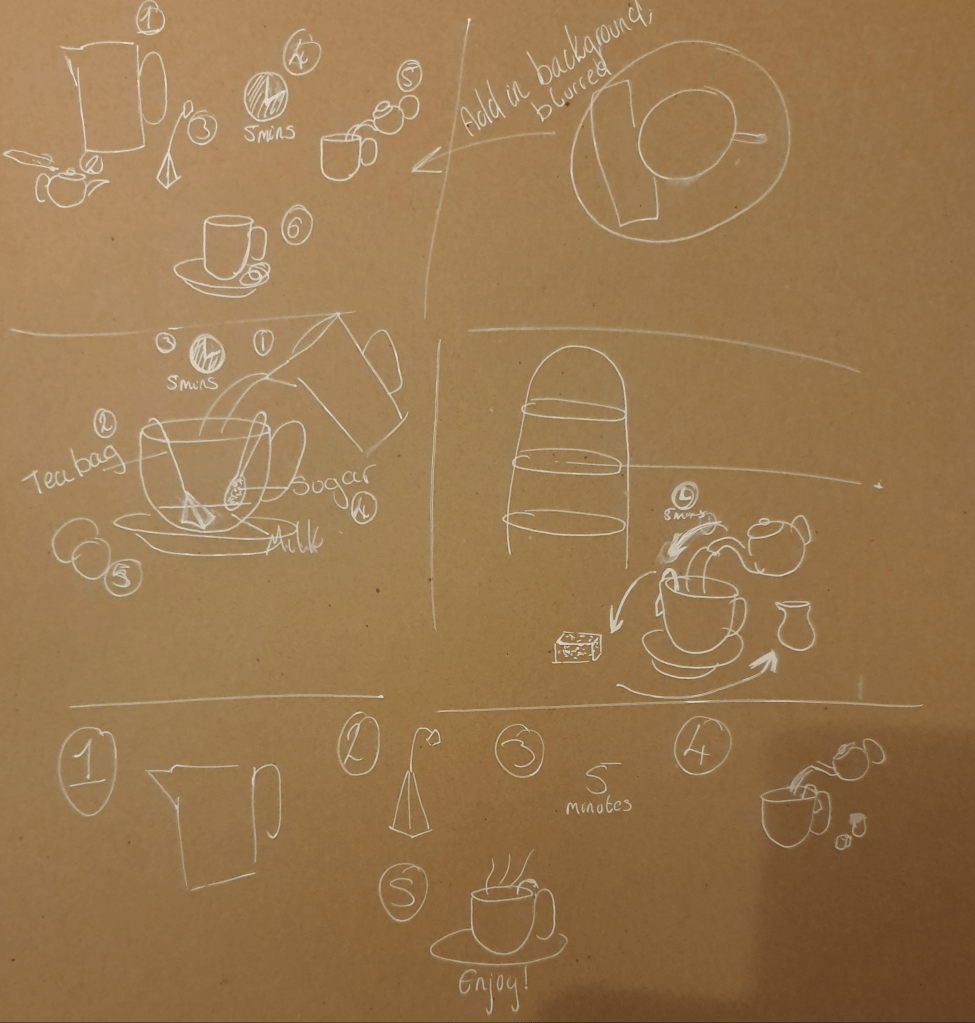
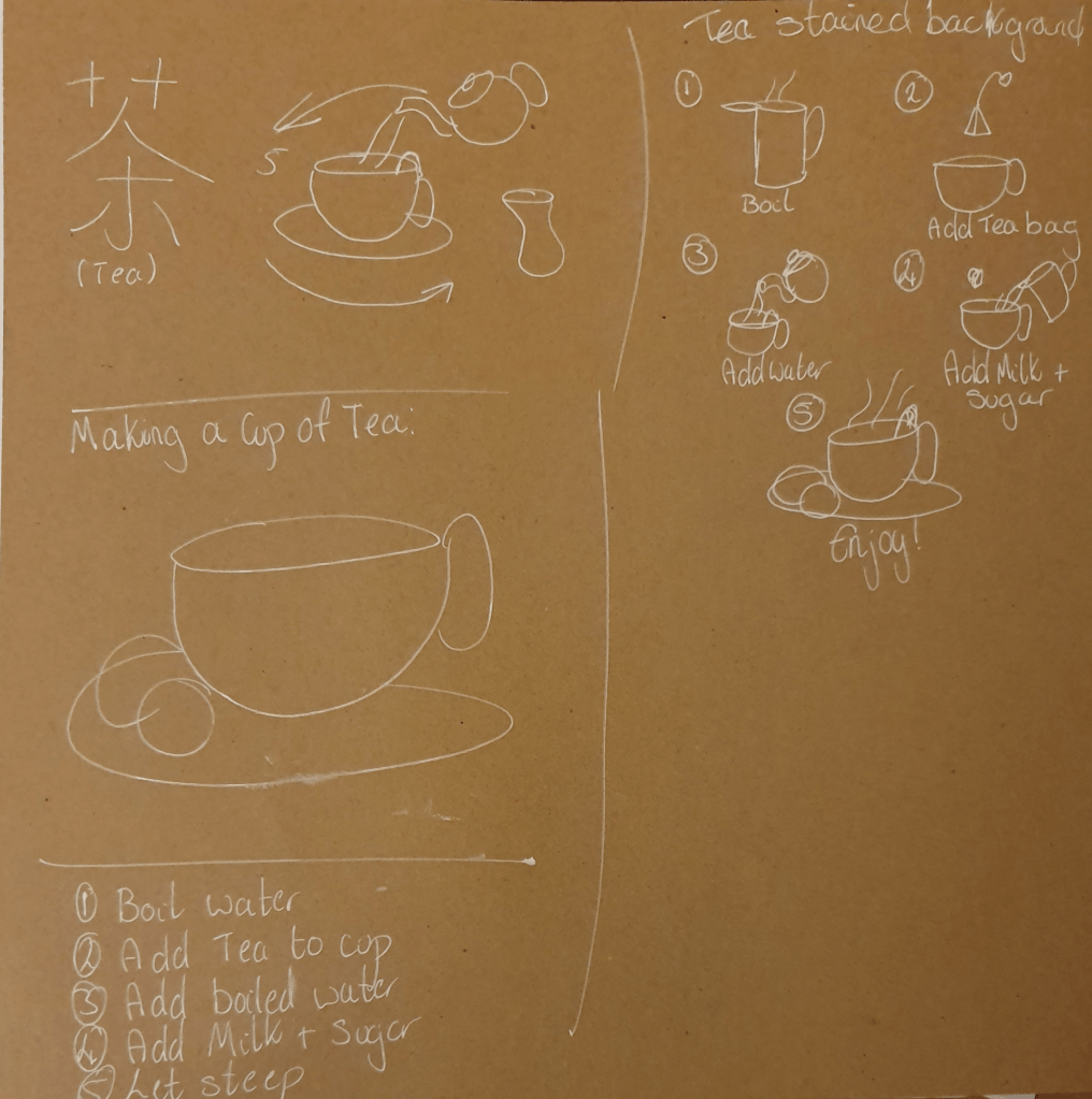
I tried to think of different ways I could present this. I liked the idea of having a cycle as I felt that it would flow better. I eventually decided to have an all encompassing picture. These designs were highly influenced by my experience working at a café. I did try to include influences from other places and cultures in my designs.

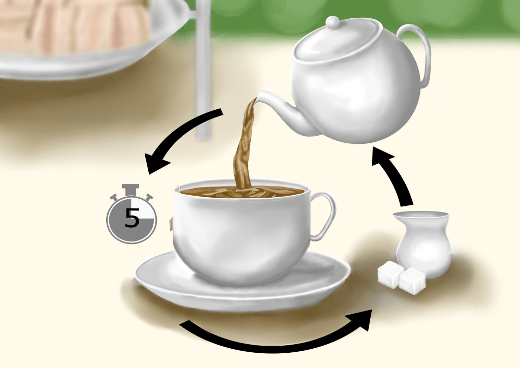
This is my final illustration. Over all I am pleased with it. I decided that since we are in England I would go with an English tradition. Comparing the sketch to the others I felt that this one would make a better illustration. Some of the others seems cold and static. I also thought that it was simple enough to not be confusing and plainly communicate the instructions.

I tried not to use any letters or numbers, however I felt that the number 5 was necessary for the instruction to be correctly interpreted. I thought that a digital illustration would create a better, cleaner look, allowing for clearer instruction. I did change the image slightly from the original sketch as I felt that these instructions are clearer and make more sense, with a better composition. I made a clear separation from the background by blurring anything that wasn’t instructional or necessary. This made the main focus obvious to the viewer. I chose to use colour because I felt that this would make it more approachable and more illustration like. I used a paler palette as I felt it fit the scene best and gives of a calmer vibe. I chose to use big, bold, black arrows as they wouldn’t be able to blend into the background and disappear, making it obvious which way the eye should follow. My only problem with this is that I don’t think I made it clear which one you should look at first. I have relied upon the fact that the viewer would have a basic understanding of the process, which isn’t the best thing when creating an instructional illustration.

Over all I think the illustration looks good, though I’m not sure I highlighted and added the shadows 100% correctly. Other than the concerns I’ve already mentioned I think the image does its job. When asking people what they thought of the image and how it works they said that they find the image to be attractive and function well. I also have a quote on a comment I was given “The background being out of focus really draws the persons view onto the main drawing. On top of this the shadows really bring a great deal of depth to the image and allows it to stand out and the use of lighter colours is very calming and easy on the eyes.”

Edit:
I didn’t feel that showing a person making a cup of tea would be the right way to go as I wanted the focus to go straight to the tea. I thought that having someone in the image would over crowd and over complicate the image.

I chose not to include every step of making a cup of tea as I thought that everyone would have the most basic knowledge of how to do so. I know that the point of this exercise was to show someone how to make the tea, however (I assume) everyone has seen a cup make at least once. With this thought I decided to make instructions on how to make tea properly, with correct timings, and build on the knowledge the person would already have. I do think that moving the tea bag to the forefront of the image, instead of peeking out from the side of the cup, would have had a better effect and create a clearer understanding though. If these instructions were given to someone who had never seen a cup of tea made before, therefore and no prior knowledge to build on, that I would need to add the missed steps.

I agree that a pattern would have made the china stand out more in the image and would have worked to draw the viewers attention easier.

Exercise Six: Viewpoint

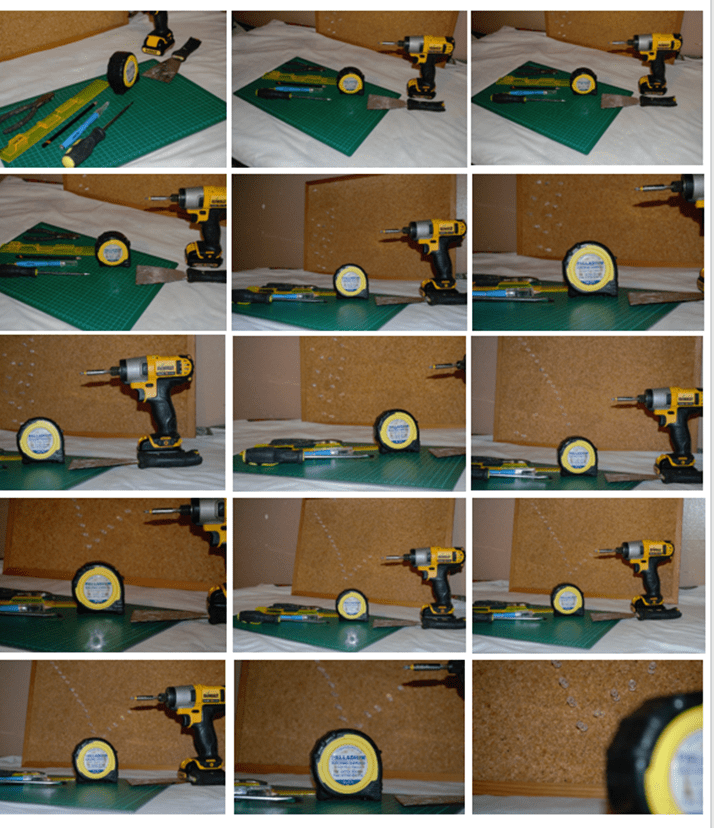
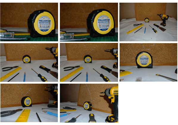
Here I had to choose from a list of objects to base my image around. The options provided were: festival, the morning after, summertime and workshop. To decide which to use I made mind maps of things that related to the subjects. In the end I chose workshop as that’s the category I had the most stuff for. Before taking any photos I researched viewpoint and came across the diagonal method. This is a method that theorises that artists intuitively place what they consider important on the bisection of the diagonals of two squares. Then having arranged my objects, using this method, and others, I began to take my photos.

I tried to think of every aspect of the images, including: placement, number of objects, the way the objects draw the eye, closeness to camera and angle of camera. I don’t think I succeeded as well as I thought I had at the time, however I don’t think it was a total fail. Next was to draw the images.

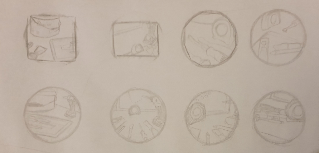
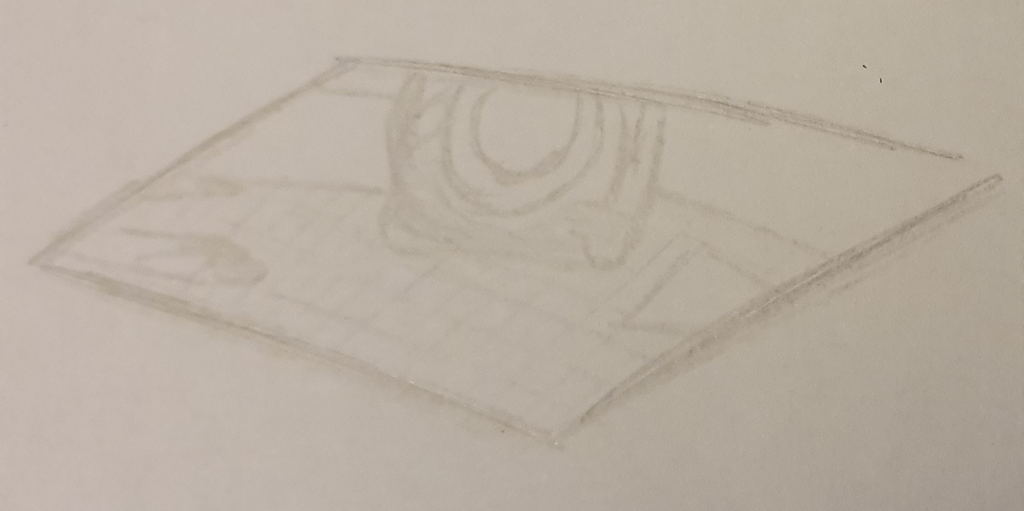
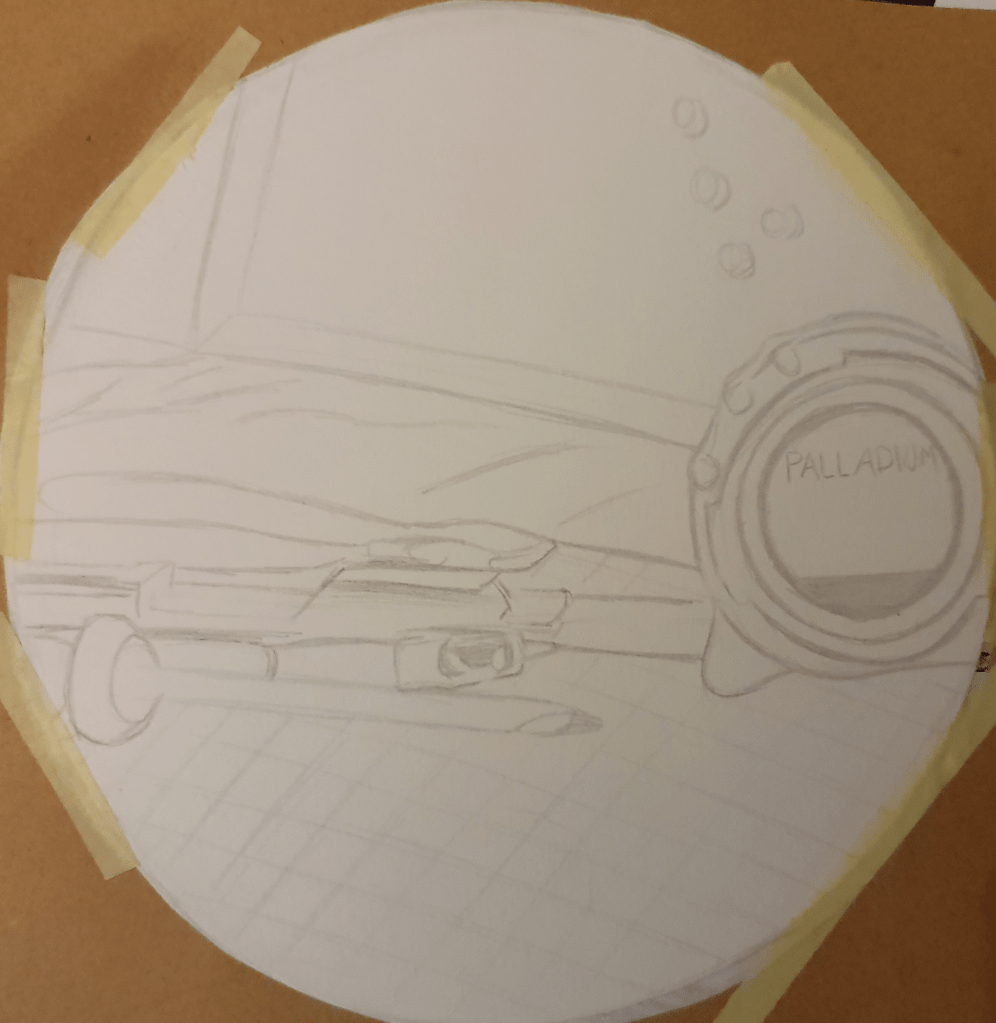
Using the photos I took I experimented with the shape of an image. I tried out a few different formats to find the right one. I liked the circle as it created a smoother image. Choosing my favourite design, I reproduced it in a bigger size.

I liked this one best as I felt it was more directive. I also had some questions to answer.

Which viewpoint best fitted the word your objects illustrated? Why was this?
I found that the second to last image best fitted the word workshop. I feel that this is because I zoomed into the objects, so it was like giving a peek into the room. I feel that having the tools laid out plainly gave a better narrative to match the category. Although this angle doesn’t give the best view of the diagonals used I feel that this angles is more immersive.

Which format best illustrated your words?
I found that a circular format fitted best as the squares and rectangles I used felt to rigid. I feel that the circle creates a better flow within the image.

Did changing viewpoints make you think differently about your choice of objects and arrangement of them?
I found that having a far off viewpoint made the image feel more distanced and off putting. Although the image held more information it felt more disconnected. The arrangement of the objects affected how I read the image. Any diagonals I arranged directed where my eyes went.

Edit:
Looking at these images I again, and considering what I learned in the next exercise, I find that so many objects weren’t needed. I feel that taking some away would have given the viewer all the information needed just as well, of not better.

This exercise could become part of my primary research methods as it is good way of figuring out compositions

Exercise Seven: Client Visuals

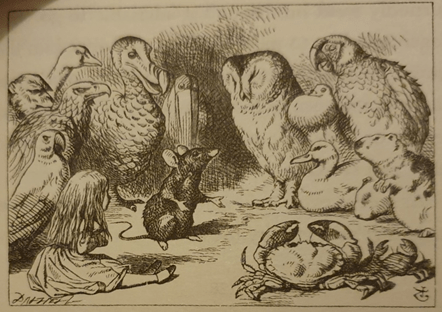
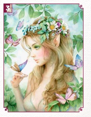
For this exercise I picked an illustration I found in my Alice In Wonderland book, Illustrated by Sir John Tenniel, and an image I found in ImagineFx magazine created by Scot Howden.

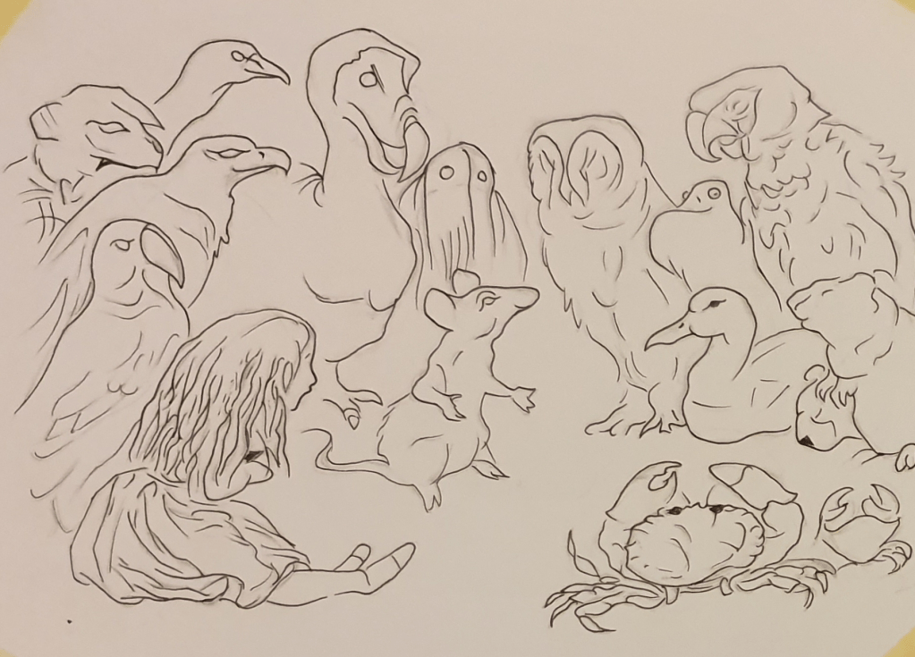
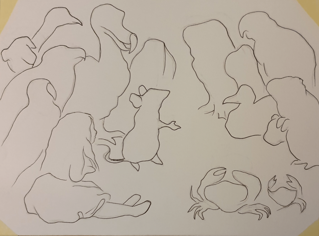
Enlarging the first image by 2.5 times its size to 22cm x 16.75cm I drew a line version of it. I did this twice to allow me to explore just how many lines and details are needed to communicate the image well.

I then reproduced the next image at 17.5 cm x 15cm, having again reproduced it at 2.5 times its original size.

By doing this I got a sense of how much detail is need to effectively communicate an idea. I found that less was needed than I expected. I found that the general shape of an object worked well enough for someone to understand what the image is. I did however find that that for plants and foliage a simple line was not enough to communicate it well. I found that expressions were not needed for understanding but if wanting to show how they will look adding eyebrows will do the job.

I imagine that the purpose behind this image would have been to promote the tablet being used. The main points behind the art direction would have been:
1. Clearly display the tablet.
2. Make it seem exciting/magical
3. Make it bright
4. Have anyone in the image using the tablet
5. Have a clear main focus

2018's best up-and-coming illustrators - Features - Digital Arts

I imagine the direction behind this would have been:
1. Create a beautiful portrait
2. Use collage
3. Keep it simple
4. Use a limited palette
5. Include anatomy

Exercise Eight: Making A Mock-up

To begin this exercise I researched the creation of a book cover. To do this I used websites and Skillshare videos. I looked into the purpose of a mock-up and different methods used for a book cover. I then created a moodboard for book covers. I chose the book Bridget Jones’s Diary as I know the story well.

I started planning by collecting all the book covers that already exist. I then made a mind map of things from the book that I could use as the basis of the cover. Next I drew some ideas.

Here I was trying to figure out placement.

Here I was figuring out colour and if I should add more details.

Here are some more ideas I had.

I had some more ideas and some trouble deciding.

This is the design I went with. I felt that a more sketch like look loosened up the feel of the book. I chose to draw Bridget writing in her diary as this is what to book is based around and the format it is written in. I was originally going to have the drawing take up the whole cover but this didn’t look right. The image looked as though it was lost with some writing slapped on top of it. Because of this I had to rethink the design and anchor it somehow. I decided to add the diary at the bottom as a foundation. I did play around with changing the white background but didn’t think any other colour fit. Having the white background fits better as a representation of paper. I added shading around the edges to make the cover look less empty. I then added some colour to the pen and diary she is writing in to add some life to the image. This then off set the image so I added some shading to the face too. I faded the authors name and quotes on the side so that they wouldn’t draw attention away from the image. I wasn’t sure about the font but I knew that I wanted the word diary to have the same font that they usually do. This helped add to the red and make it look like her diary. I liked the contrast of the red and the white and felt that white font would tie the two part together. This is why her name is in white.

I do like the look of this cover but I’m not sure I managed to fully capture the feel of the book. Not having a huge range of paper to choose from I printed it out on printer paper.

Assignment

The assignment for part three was to create a poster. I cold make one for either an Early Music concert, a Jazz Event or Pop Group. I started with mind maps for jazz and pop.

I then researched making a poster.

Next I started the mood boards.

I ended up picking pop as this is an umbrella term and allowed me to use a pop rock group. I chose Fall Out Boy.

I then started to plan my poster.

Instead of a more traditional venue I felt that since we can’t go to a concert at the moment because of coronavirus that a digital concert would be more fitting. I tried to think of a wide variety of designs using themes from their videos and songs.

I drew a line drawing of my two favourite designs.

I then settled on colour for my final piece.

I chose this design as I felt that it had the most promise. I began to like the idea more once I realised that it echoes the album cover from Under The Cork Tree, their second album.

From Under the Cork Tree - Wikipedia

I had trouble picking the colour scheme but decided on purple as the main colour as a nod to their latest album, Mania, which features a purple cover. I used a dark background to make the purple stand out more. I was originally planning for the background to be monochrome but settled on a very dark blue as black made the sofa look like it was floating in an abyss. This was not helped by the size of the sofa, which looking at it now I feel should have been made a little bigger. The stage, I decided should be fairly pale, not only because of the bright lights used but because it contrasted with the rest of the image, drawing the eye. I wasn’t planning on drawing the image quite so realistic, but with a slightly looser style. This, however, isn’t how it turned out. I got caught up in making it look how a stage should look, which while not bad for the final result wasn’t how I planned for it to go. I feel that the final result has a modern, technological feel to it, fitting in with the fact that the concert will be displayed on a screen. I lightened up the blue between the stage and lights because the lights from the stage would do this naturally. I used shadow and highlight in a way, that I believe, is successful in making the lights look like they are turned on. I added the border to the image because in the thumbnail I drew without one the image looked like it ran off the page, which I didn’t feel looked right. Sort of like there should be more to it. By adding the border I have reined it in and made it look like it is being displayed on a screen.

Type is something I always seem to have trouble with. Choosing the colour was easy as I had already picked the colour scheme but I wasn’t sure which font to use. I decided a clean font for the important information would be best, as would be displayed on a computer. For the title, however, I wanted to go with something a little more unique. Having the same font was too harsh on the pale grey anyway. I thought making the font look as though it is being reflected onto the stage would be a good idea. I think I succeeded in this but there is definitely room for improvement. I made the time white to stand out against the rest of the image and tie it together with the border. The date was placed in a banner so that it wouldn’t get lost. I tried curving the date along with the banner but felt having it straight was better. The banner was originally going to be white but this was to harsh a contrast and the yellow looked a bit classier. I used the Fall Out Boy logo instead of anything else as I felt this would communicate better. I created a website that I placed at the bottom so that people could find out more information and get tickets. I purposely left pricing off the poster as I felt that the website was all that was necessary. the website along the bottom is a little of centre, which I’m not too pleased with.

I used a mix of ink, alcohol markers and pencils to create different textures. A mix of marker and pencil was used on the logo because I felt that a rougher texture would represent the band best. This was also used this on the sofa for a better texture and deeper shadows. Markers were used for a smoother texture. I used blue marker to give the lights a glow and make them look on. I left the sofa empty, one because of coronavirus, I felt that this was a good representation and 2, because I felt that it works as an invitation. It’s like the sofa is waiting for people to come and sit on it. I worked at an A3 size as this is the size it would be preproduced at.

The final piece:

Edit:
The posters I collected have told me that a simpler, less crowded image creates a better image. A less crowded image is gentler on the mind and allows it to processes the information easier. Bright colours are also a good way to draw attention. I like the contrast made between colours made in some of them as they make a striking image and it also works to tell the reader where to look. The “Alotfest” poster is also a good example of the use of perspective in a poster. The dark shape creates an interesting image and leads you straight to what you need to know.

I imagine my poster to be digital as I feel that this would fit the idea behind it a lot better. I also feel that the contrast between modern technology and traditional techniques and materials would reach the viewer better with a warmer feeling.

I think that I should have changed the perspective of the image by bringing the stage down the page, making the sofa bigger and having it bleed off the bottom of the image. This would create a better composition and more immersive experience.

Bibliography

Illustrating Visual Space

Ncbi. 2015. [online] Available at: <https://www.ncbi.nlm.nih.gov/pmc/articles/PMC5016827/&gt;

ThoughtCo. 2019. The Element of Space in Artistic Media. [online] Available at: <https://www.thoughtco.com/definition-of-space-in-art-182464#:~:text=Updated%20May%2030%2C%202019,%2Ddimensional%20or%20three%2Ddimensional.&gt;

Youtube.com. 2015. Elements of Art: Space | KQED Arts. [online] Available at: <https://www.youtube.com/watch?v=U11B_0FCn6o&gt;

Linkedin.com. 2017. The 6 Qualities Meetings Need to Have to Be Effective. [online] Available at: <https://www.linkedin.com/business/learning/blog/productivity-tips/the-6-qualities-meetings-need-to-have-to-be-effective&gt;

Abstract Illustration

Art Inspiration | Inspiration | Art Techniques | Encouragement | Art Supplies. 2016. 8 Abstract art techniques for the beginner. [online] Available at: <https://keetonsonline.wordpress.com/2016/05/16/8-abstract-art-techniques-for-the-beginner/&gt;

Tara Leaver. 2018. 16 ways to make a painting more abstract – Tara Leaver. [online] Available at: <https://taraleaver.com/2018/01/16-ways-to-make-a-painting-more-abstract/&gt;

Ducksters.com. Publish date unknown. History: Abstract Art for Kids. [online] Available at: <https://www.ducksters.com/history/art/abstract_art.php#:~:text=The%20main%20characteristic%20of%20abstract,paintings%20to%20the%20last%20detail.&gt;

The Artling. 2019. Most Famous Abstract Artworks In The Last 100 Years | The Artling. [online] Available at: <https://theartling.com/en/artzine/famous-abstract-art/&gt;

Diagrammatic Illustration
Data Viz Project. Publish date unknown. Illustration Diagram | Data Viz Project. [online] Available at: <https://datavizproject.com/data-type/illustration-explanation/&gt;

Pinterest. 2020. 13 DIAGRAMMATIC ILLUSTRATION ideas | illustration, infographic illustration, technical illustration. [online] Available at: <https://www.pinterest.co.uk/mccluskeysam/diagrammatic-illustration/&gt;

Central Illustration Agency. Publish date unknown. Tobatron | Illustration | Central Illustration Agency. [online] Available at: <https://centralillustration.com/illustration/tobatron&gt;

Google.com. 2020. diagrammatic illustration – Google Search. [online] Available at: <https://www.google.com/search?q=diagrammatic+illustration&safe=strict&rlz=1C1CHBF_en-GBGB902GB902&source=lnms&tbm=isch&sa=X&ved=2ahUKEwiCzdT28eHsAhVkrHEKHX0yBtoQ_AUoAXoECAsQAw&biw=1536&bih=754&gt;

Dreamstime.com. Publish date unknown. Diagrammatic Illustrations & Vectors. [online] Available at: <https://www.dreamstime.com/illustration/diagrammatic.html?pg=2&gt;

speaker manual

2010. Nikon D3100. Nikon. [manual]

Deviantart.com. Not published. Search ‘diagrammatic illustration’ on DeviantArt – Discover The Largest Online Art Gallery and Community. [online] Available at: <https://www.deviantart.com/search?q=diagrammatic%20illustration&gt; .

Globaltea. Publish date unknown. [online] Available at: <https://globaltea.ucdavis.edu/all-about-tea&gt;

Christina’s Cucina. 2012. How to Make a “Proper” Cup of Tea (British Tea, that is). [online] Available at: <https://www.christinascucina.com/how-to-make-proper-cup-of-tea-british/&gt;

EatingWell. Publish date unknown. Here’s How to Prepare Tea Like the British Do. [online] Available at: <http://www.eatingwell.com/featured/StriveProperWayToMakeTea&gt;

Perfectly, H., Publish date unknown. How To Make A Cup of Tea Perfectly. [online] Twinings. Available at: <https://www.twinings.co.uk/about-twinings/latest-news-and-articles/how-to-make-tea-perfectly&gt;

Viewpoint

En.m.wikipedia.org. 2020. Diagonal method – Wikipedia. [online] Available at: <https://en.m.wikipedia.org/wiki/Diagonal_method&gt;

Diagonalmethod.info. Publish date unknown. diagonal method. [online] Available at: <http://www.diagonalmethod.info&gt;

Making a Mock-up

Skillshare. Publish date unknown. [online] Available at: <https://www.skillshare.com/classes/Design-A-Book-Cover-Graphic-Design-Basics/1457491211&gt;

99designs. 2018. Book Cover Design – Design A Creative Book Cover Online | 99designs. [online] Available at: <https://99designs.com/book-cover-design&gt;

Literary Hub. 2018. The 75 Best Book Covers of 2018. [online] Available at: <https://lithub.com/the-75-best-book-covers-of-2018/&gt;

Literary Hub. 2019. The 78 Best Book Covers of 2019. [online] Available at: https://lithub.com/the-78-best-book-covers-of-2019/

Assignment
En.wikipedia.org. 2020. Jazz – Wikipedia. [online] Available at: <https://en.wikipedia.org/wiki/Jazz&gt;

Dawkes Music. 2019. Which Instruments are used in Jazz Music? | Dawkes Music. [online] Available at: <https://www.dawkes.co.uk/sound-room/which-instruments-are-used-in-jazz-music/&gt;

En.wikipedia.org. 2020. Pop music – Wikipedia. [online] Available at: <https://en.wikipedia.org/wiki/Pop_music&gt;

Slideshare.net. 2012. The history of pop music. [online] Available at: <https://www.slideshare.net/LukaWheeler/the-history-of-pop-music#:~:text=The%20instruments%20used%20to%20produce,acoustic%20guitars%20and%20electric%20guitars.&gt;

Piktochart. 2019. How to Design an Eye-Catching Poster in 6 Steps. [online] Available at: <https://piktochart.com/blog/how-to-make-a-poster/&gt;

En.wikipedia.org. 2020. Pop rock – Wikipedia. [online] Available at: <https://en.wikipedia.org/wiki/Pop_rock&gt;

En.wikipedia.org. 2020. Fall Out Boy – Wikipedia. [online] Available at: <https://en.wikipedia.org/wiki/Fall_Out_Boy&gt;

Part Two: Ideas

Exercise One: Writing a Brief

To start part two I was tasked with writing a brief. This brief had to be of a professional standard. To start with I had to find a piece of work by an illustrator whose work I find some connection with. I chose to use the front cover of a book called The Cerulean, illustrated by Craig Shields.

I have always been drawn towards fantasy, which I believe has influenced my choice. The limited colour palette attracted my attention because of the noticeable contrast between them. I also like how the clouds are formed, reminiscent of a forest, and separate to reveal the city. It reminds me of Atlantis, possibly lent by the colour scheme.

To start the exercise, I researched how to write a brief as I don’t remember ever writing one before. Doing this I came across an article on twine.fm that came in very helpful as it laid out exactly what was expected in a brief. I then chose the image I wanted to use. I found deciding what to include in the brief harder than I expected as I didn’t want to include too much detail as a real brief wouldn’t tell the artist exactly what to do but would give them room to experiment.

Brief

Project: The Cerulean Front cover The Cerulean is the first book of a pair to be written by Amy Ewing. It is a Young Adult fantasy novel and will be of standard printing size at 6 inches wide and 9 inches tall.


The book is based around Sera, a girl who lives in a city above the sky. The city is tethered to a planet by magic, which is one day destined to be broken. Sera is chosen as the sacrifice to break the tether and ends up falling to the country below the city.

Vision for the project: the book will be displayed among hundreds of other books so the colour needs to be eye-catching. The cover of this book should appeal to fans of sci-fi and fantasy. There is a feel of mystery throughout the book and this should be expressed through the cover. The city should be made a prominent feature in the image. Sera, the main character, should be displayed in some way. Maybe falling between the two worlds. The only text to be displayed should be the title of the novel and the authors name. Digital media should be used the give the effect envisioned.

Target audience: 12 to 18 year olds.

Exercise Two: Spider Diagrams

The second exercise was Spider Diagrams. This involved creating spider diagrams for a set of words: Seaside, Childhood, Angry and Festival. I had to draw on my own experiences with these subjects to fill the diagrams.

I found filling these diagrams harder than I initially thought. Some words were harder than others, especially when thinking of the least obvious things. Of course the first things I thought of were sandcastles and ice cream but I wanted to go deeper than that, think of things that were more personal and specific to me. This wasn’t easy. I ended up with more generic answers than I am happy with. Having not been to the beach since I was kid I only had my memories and TV to draw on, as is the case with most of what I wrote. Everything in blue is what I thought of and the purple is what other people thought of. A lot of our thoughts over lapped.

I found the word angry hardest to fill. I think this is because as an emotion it doesn’t create a visual memory, therefore I have few visuals to work from, which I found was easier for me to think of. One of the first things I did think of however, was the Hulk and the scene in Avengers when he smashed Loki into the ground, over and over. Of course, a big angry green man isn’t really what the exercise was looking for but having thought of it I felt I should include it.

I probably found childhood the easiest to draw from. Turns out this was a time for lots of changes. New house, new step dad, new sister in law, new schools. Whilst uploading this I realised I mostly wrote down objects and since doing this exercise I have thought of a few things to add: the journey from house to house, the slightly rough feel of cardboard boxes under your fingers bending with the weight of what’s packed inside and the smell of freshly applied paint.

The best way I found to think of more subjects was to give it time. Trying to fill each diagram straight away only succeeded in thinking of the obvious and mundane.

Exercise Three: Turning Words into Pictures

Turning words into pictures was interesting, and I later realised was preparation for a future exercise. Once again I was presented with a list of subjects, but this time I had to pick only one to work with. I picked Exotic, but didn’t feel that I had drawn my images quick enough, therefore defeating the purpose of the exercise. The second word I picked was childhood, where I made a point of drawing my pictures quicker.

For exotic I ended up with lots of different animals. I suppose this shows how my mind prioritises things. I tried to gather lots of objects from different countries, but nothing that was too familiar as I didn’t feel that this would fit under the branch of exotic, even if the objects originated from another country. I also tried not to draw anything that was from a nearby country (the macaron being an example of my failure in this but also of my flow of thoughts). Looking back at my work I have become aware of the fact that once again I have failed to include an adjective. This is possibly the product of not really knowing how to draw an adjective and giving it a physical form (clearly, something I need to work on).

Childhood, I felt, came out a lot better. I feel that I have completed the exercise better. I guess second times the charm (I hope). That’s probably why we had to repeat the exercise, right?

I feel that this time I succeeded in making quick, rough images and I was able to make more sense of the exercise, presenting a better understanding in my work. Although I used the same word in the previous exercise I found that the results were hugely different. Yes, I started with some of the same subjects I had thought of before but eventually I came up with new thoughts and ideas. I believe this to show the difference between thinking visually and verbally.

Working on this I began to think of the toys I used to have. I remembered playing The Sims 2 with my sister and crying when my whole family drowned in the pool (I forgot to add steps) or burned in a house fire. Comparing the two pages to each other I noticed a difference in quality. Where as the exotic page is more controlled, childhood is a bit of a mess (there isn’t a huge difference but exotic seems to me, a more organised mess). The lines are looser and detail is sparser. This is something I struggle with. I hate it when my drawings don’t look all neat and refined, the reason I was glad had to do this exercise all over again. I found myself suggesting the details or skipping them completely to create the general image. Colour helped a lot with this. Where I couldn’t draw the details, adding a block (or blob) of colour conveyed what was there. To get to this point I had to set a timer for each drawing. No more than five minutes an image, for some I only allowed three. I found this got the process moving a lot quicker.

Small scenes were harder to draw. Which objects should I draw? How much detail is needed? Can I draw it quickly? Will it be legible (is that the right word?)? I was still caught up with how it would be presented, so once again the timer was very useful. I added a couple things later, whilst in a rush, and I found (god, how many times a I going to use that phrase?) that having to think quickly also helped (or at least didn’t hinder) and the subjects came out alright.

Exercise Four: Making a Moodboard

For Making a Moodboard, I chose to use travel as my subject. Reading the exercise again now, I am unsure as to whether I should have used one of the words I had already, so hopefully I did this right. Though I feel that travel isn’t too far separated from exotic, so they should tie in together (hopefully you agree).

I started the exercise by making a spider diagram of the things I think of when thinking of travel (Mickey Mouse ears anybody?). Surprisingly, I found this fairly easy and soon had the page filled with food and backpacking and (of course) different types of animals. Though lets not forget another addition, the place that holds all these things plus magic, Disneyworld! Couldn’t leave this one off the list.

Not the best looking moodboard I’ve ever made but I believe it serves its purpose. I tried to group similar things together, though didn’t do the best job, unfortunately. Using google as my source for images (and a photo of the Eiffel tower taken on a family holiday) I managed to find all the things I wanted. During this exercise I realised just how many reasons there are that people travel. From short journeys (daily commute), to longer journeys (going abroad) there are many reasons and ways people travel. Some travel for business, whilst others for pleasure. Some even travel out of necessity, for example, needed medical attention that can only received in one place.

Not having much to work with in sense of swatches I had to create my own patches of colour using pencil. I used the colours I thought people would see fairly often when travelling, using objects such as shells and the ocean as inspiration. I used a dull grey to represent the airport.

Exercise Five: Using Reference

Using Reference was probably my favourite exercise. I’m not quite sure what made me enjoy it so much but after a while I forgot that I was actually working and not just drawing for fun. Or shopping. Using google and movies from the 1950’s as sources I collected a lot of resources for my moodboards.

Whilst doing this I also read a little about the time. Because of this I came to a mixed conclusion. Whilst some people were bringing out brilliant inventions, some bothered me. Not only was the time full of racism and discrimination but some of the ads I saw were idiotic. The one that confused me the most was the one for Seven Up. Who suggests giving a baby lemonade to help them drink milk? I hate to think of how many babies were throwing up because of the curdled milk in their stomachs. Anyway, off topic (sorry), after the moodboards I had to write a visual review of the 50’s.

Visual Review

Judging by what I have found by completing this task, the 1950s were a time based on liberty and appearance. The decade was consumed by the relief caused by the end of the war. People were now able to do as they pleased and no longer had to worry about the effects of the war. They now had disposable income and were safe in the comfort of knowing they weren’t going to lose any more than they already had. This allowed people to focus on rebuilding their communities and making a good life for their families.

With this new found freedom people began to spend their money on things that would have been considered frivolous during the war. This began the focus on appearance. People during the 50s wished to put the war behind them and brought this feeling into their everyday lives. From clothing to advertising, the main focus was to improve everyday life and make it appear as though everyone was able to live their best lives. The decade was a time for progress and new beginnings.

Fashion of the time had been influenced by the war. No longer were people required to look like they had walked straight off the runway, comfort and practicality were the main goals. For women this came with the introduction of trousers and shorts and the lack of a need to always appear perfect. This was influenced by the lack of access to materials. However, this didn’t mean that people of the time didn’t still enjoy dressing up and looking glamorous. In fact, this was still the overall consensus of how people should dress when leaving the house. This included big skirts, big brands and big jewels. For men, as before, this meant sharp suits and expensive footwear. A more casual look common of the time, made popular by James Dean, was a white T-shirt matched with a leather jacket.

Architecture of the 50s took a whole new route, became something people had never seen before. America was heavily changed, most new architecture based around two new themes, either “Googie” or “Tiki”. With this came Futuristic and Polynesian designs. This reflected the need for escape and hopes for the future. Buildings now became sleek and bright, spreading hope and cheer with it. A well-known example of this is Walt Disney’s Disneyland in California. Built in 1955, smack dab in the middle of the decade, it represents the feel of the time. Built to both spread cheer and exhibit Walt Disney’s vision of future progress, Disneyland showcases the idealism that occupied most minds. Featuring a huge fairy-tale castle, painted in bright pinks and blues, invited people to escape their daily lives and fanaticise. On the flip side of this many were still living in the temporary homes built to provide a roof and four walls during the war. These buildings, built for functionality and speed, contrasted greatly to the new styles popping up everywhere. Whereas the new buildings were built with appearance in mind, these buildings were drab and lifeless on the outside.

Interior design during this period, much like the architecture, became smooth and more colourful. An open plan living space was introduced, contrasting the more walled in and cramped designs of previous years. The two most popular design themes were the more traditional décor and Scandinavian influenced minimalism.  Bright, geometric patterns started to make its way onto family walls, often in a repeating fashion. Chrome based furniture became popular along with curved designs. Entertainment became a big influencer, inspiring home bars, outdoor furniture and barbeques.  Record players where still a staple in the home, allowing people to dance to their favourite songs.

For art the 50s were a time of big changes and experimentation. The main movements of the time were abstract expressionism and pop art. These movements brought with them a freedom of expression, bright, bold colours and images people would be familiar with. With abstract expressionism, the process was considered just as important as the end result, possibly even more important as the process allowed artists to become more emotional in their pieces. I think that the action involved in making these pieces allowed artists to feel the art more than traditional methods. They were able to immerse themselves more freely than they would have been able to if they were stuck at a desk or easel. No longer were they only using their hands, this movement (at times) involved their whole bodies, which removed any constraints that may have been there before. As a result of this final pieces varied greatly. Some artists kept a more restrained look, while others let go completely, letting colour fly across the canvas. As for Pop art, this was used as a way to criticise the norm and consumerism. This involved many familiar objects, or people, as the focal piece. Probably the most well-known example of this (or at least the first piece I think of) would be Andy Warhol’s Campbell Soup. The bright colours and recognisable imagery make for an eye-catching piece, and reflected the confidence caused by the end of the war.

Graphic Design and adverts of the time depended greatly on typography. They were kept simple, allowing the slogans to do most of the selling. Today, with the invention of social media and more space for tv ads, we seem to have moved away from this a little. Subject matters focused more on, what seemed after the war, luxury products that were sure to make any person appear wealthier and make everyday life easier. Two big examples of this are holiday and car ads. If you were able to afford these things (similar to today) you would have been on good standing within the community as people would have considered worthy of more respect. Another thing that is eminent from looking through these things is the over sexualisation and misogynistic views of women. It is clear that women were viewed as inferior (made more obvious by the portrayal of women being abused), only meant to serve men to improve their social and, in turn, financial standing. In result women were hugely portrayed as weak housewives who couldn’t possibly manage anything by themselves. Unless of course, they were cleaning or cooking. I found that the time was filled with offensive media. From the clearly unacceptable degrading of overweight children to outright disgusting racism. The starting use of television as hugely influenced how products are advertised today.

Transport seemed to have an overhaul after the war. Gone were the dreary colours and in came the bright and peppy. In addition to this came the commercial use of planes. This became a huge factor in showing wealth. If someone wanted to raise their social standing all they had to do was hop on a plane. This showed a huge well of wealth as flights weren’t cheap. A huge boost in car sales was also a direct result of people wanting to show off their wealth after the war. Being able to afford a second car was the ultimate display of richness. Plastics became more widely used for interiors and partly for construction of transport.

Film and TV of the 50s enjoyed a huge boost in popularity due to the availability of TVs in homes. The TV became a staple in a home (the same attitude towards this is present today – though it may have even been ramped up by the invention of streaming services), allowing viewers to enjoy a wide range of TV movies and shows. Due to technological advances the move was made slowly from black and white to technicolour. Because of this people such as Walt Disney and Audrey Hepburn enjoyed a boost in popularity. Family values were portrayed on screen, showing people what they wanted to see. Rock n Roll began to made its way into the industry with the production of Elvis Presley’s Love Me Tender. This started a string of movies starring the musician, which often featured his music. Walt Disney’s animations became a good source of light hearted entertainment. TV also became a good way to influence a trend. Soon people wanted to dress and act like their favourite actors and actresses.

Next was to create an illustration of someone sitting in a chair surrounded by 50’s artefacts to give someone an idea of what it would’ve been like. I toyed with the idea of having a modern day person surrounded by artefacts but didn’t think it really got the point across. I started off with the outfits then moved on to design ideas.

there became a running theme in each of my ideas. Sexism. The superiority men felt over women (some still do). I didn’t intend for this but it was a point from the time that got to me, so it’s not really surprising that it came through in my work. The first design shows a man relaxing on a sofa reading a newspaper, whilst his wife is forced to sit on the floor, waiting for his next demand. The second I liked the best and became my final piece. It portrays a 50’s housewife getting ready to go out. it sows how much she has to do whilst her husband sits around. The third, which didn’t come out very visible in the picture shows a woman sat in an egg chair, completely alone smoking a cigarette. You can see a car through the window, and 50’s objects around her. This one was mostly just to showcase what kind of objects a regular 50’s living room would of had. The fourth, and last, shows a woman sat on a bench in the underground. On either side of her are typical ads of the time. One showing a woman with a bottle and the words “Even a woman can open?” the word woman underlined. The second ad is a racist ad of two black men. It’s a paint ad. It shows one of the men painting the other white, showcasing it’s quality. The ad was for Elliott’s White Veneer and is absolutely disgusting. The point of this design was to show how discriminating and horrible people attitudes towards this were back then. I did’t pick this one because I didn’t think that I could do the issue justice.

My Final piece:

This piece portrays a 50’s housewife getting ready to go out whilst simultaneously cooking dinner and cleaning. It shows how she’s expected to look perfect and take care of the house and her husband at the same time. It show the expectations put upon women in the 50’s to always be perfect and never show a blemish, whether it be in her appearance or her house. Thinking about it now, instead of her perfect hair she could have had curlers in. Maybe this would have been better to get the point across. She has several makeup products around her, emphasising the work women had to put in to make their husbands happy, whilst he just sits drinking beer and watching TV or reading, as shown in the corner.

I decided to use this angle as I didn’t want to use a boring, over used position. I liked the idea of a mirror as it also allows you to see behind her, giving me more to work with. I’m pretty pleased with how this image turned out. I believe the strongest pint to be the women, probably due to how I usually draw portraits. Her eyes are slightly too big but I think that would be the only I would change about her. The powder compact of to the side would be made bigger if I were to draw this again as I drew it too small. I’m petty pleased with the hairbrush but don’t believe I quite got the angle right. This was one of the things I found hardest in this drawing. I tried to imagine the angle as if I was there, using images on google to help but I still don’t think it’s quite right. The same with the living room. I don’t think I manage to angle the furniture well enough, though this was because I was trying to show each element clearly.

Over all I feel that I did well on this illustration, with only a few things I would change. I think that I managed to decorate and furnish the hoe authentically, although the TV might be a small stretch, depending on how much the husband earns. I did, however, make sure to make it a back and white TV as technicolor was only just beginning to come into use. I like the expression I managed to catch on the woman’s face too. She looks slightly worried, as though she’s running out of time and isn’t sure if she’ll be able to get everything finished in time, or maybe her husband isn’t the best guy around.

Edit:

While researching this exercise I found many similarities and differences to the style of the response to the war between the USA and UK. The initial post war responses differed by the fact that America wanted to act like nothing had happed and put a glossy shine over things where as Britain had a slower, less obvious, response. This is most likely due to the differing financial standing of each country.

These responses were reflected in the progress these countries were able to make. The USA was able to move on and build a blossoming society full of luxury goods and family values. This time of US history was full of glamour. They had expensive cars, Hollywood, a high employment rate and Marilyn Monroe. This contrasts greatly to how the British were living at this time. Here, people were still living off rations and bomb sites lined the streets, debt was high and rebuilding was slow. The time was made worse by the loss of the country’s King George in 1952, although this also led to a time of hope and change through the coronation of Queen Elizabeth II in 1953. This event alone had a huge impact on the country. Broadcasting the event showed the technological advances the country was making and brought a sense of hope and unity to the nation through the ability to view the coronation through the tv.   

Technology, at this time, went through a major overhaul. It doesn’t seem as though any part of life was untouched by the advancements made in the field. Many of the tech made during this time is still used today in one form or another, whether very close to the original or incorporated into new tech. The decade had a huge impact on the future course of the field. Everyday life was made simpler by the introduction of washing machines (though very expensive), fridges and blenders. Even existing tech, like the radio, found new life with the invention of transistors, making smaller, more portable versions possible. This also allowed kids to annoy their parents by playing the music they didn’t like, Rock n Roll. The biggest difference made in homes were the introduction of affordable TVs. These became a regular sight in US homes, with many new shows, such as “I Love Lucy” and “The Twilight Zone”. Later on, focus began to move to the children of the decade, introducing show like “The Mickey Mouse Club”. TVs at this time, however, were a much rarer sight in UK homes, where efforts were still being made to recover from the war.

Later in the decade came the advancement of communication devices. This included the installment of the first transatlantic cable line along the bottom of the ocean. This was sponsored by the USA, Canada and the British Post Office. This had a huge impact on life at that time, and continues to do so today, as it allowed overseas phone calls for the first time. People were now able to communicate almost instantaneously from country to country, when they had been limited to their own before. Pagers were also invented, the first form of texting ever made. Improvements were also made on less obvious forms of communication, like TV. In 1954, the first “colourcast”, coloured broadcasting, was made coast to coast from Pasadena.

Businesses were also benefitting from all the new inventions. The most obvious would be the introduction of computers. Although not available to the public for a few more years, computers were made available to businesses and branded as big calculators, making life easier for employees in places such as banks. This later changed, of course, with newer tech and ideas. The invention of computers, however, was met with fear and scepticism. People were afraid that they would take over the world as seen in 1955s “The Desk Set”. This, along with the price (though way more affordable than before), put many people off buying a computer. This however, doesn’t seem to have been a problem as they soon became very popular. TV studios also benefitted from the continuing ingenuity as kinescopes, along with magnetic tape, allowed them to retape and edit their shows before being broadcast, allowing for any mistakes to be omitted and a sleeker style of show. Another notable change would be in the field of animation. With the invention of copying machine and wide screen cinema came a new era of animation, just at the time that it seemed the art would die out. The introduction of copier machines in a studio saved artists lots of time as they were able to copy the drawings instead of redrawing them many times. This machine was also capable of copying straight onto film, saving a lot more time. Later, with the introduction of colour to the process, time was lessened again, though this did lead to a loss of jobs as ink and painters were no longer needed as much, later eradicating the department completely.

Many other inventions from this time have had an impact on our lives now, including: the beginning development of video games, optical fibres, barcodes, microchips and the solar cell invented in 1954.

In Britain, new inventions were celebrated by the holding of the Festival of Britain. This was held in 1951. Scientists and inventors from across the country were able to showcase their inventions to the delight of visitors. The planning of this event had begun in 1947 as a way to celebrate the centennial of Prince Albert’s Great Exhibition, held in the Crystal Palace, in 1851. The festival came at a time that the country needed to heal and this celebration was the perfect way to bring people together to do this. The whole event had a budget of £12 million. A huge sum, especially with the post war financial standing. The event focused on the successes of the British community. The festival showcased and promoted the best of British science, technology, industrial design, architecture and arts. The centerpiece of the festival was held on the bank of the Thames; however, it was spread throughout the country, all the way up to Scotland, making a country wide affair.

Politics were banned at the event so that the sole focus would be on the achievements made by the country. This was the country’s way of bringing new hope to the people and dealing with the trauma of the war. This is a hugely different approach evidenced in America, where they seemed intent on erasing any evidence of the tragedy.

Style of the time differed between countries. Britain seemed to focus more on practicality, whereas the USA based their styles around comfort and entertainment. This could be seen in the designs from clothing to homes. The war influenced style by limiting the materials available. This however, wasn’t a problem for very long (in America at least) as new materials began to get used. These materials include the unconventional, like curtain materials and the new, like plastics. As far as fashion is concerned both countries were similar in wanting to go back to looking trendy. The routes they took to this, however, are very different. The US went with a more glamourous style: evening dresses and sleek designs, whereas the UK kept things simple, influenced by wartime fashion. Both seems to meld together when it came to the younger fashions, largely helped by TV and radio. Rock n roll was a big part of this as fans were now able to see and hear their favourite artists whenever they liked. Big styles of the time were teddy boys, sweater girls and rockabilly. Big influences other fashion in this period of time were: Christian Dior, Coco Chanel and the (then current) Duke and Duchess of Windsor.

The influence of the USA seemed to leak its way through to the UK in more ways than just one. From tail finned cars to geometric patters you could see the influence reflected in British homes. Many similarities can be seen, such as: open plan living and bright, boastful colours. While this is true the two countries also had their own, unique styles. A huge influence over British design, and still is, was Terence Conran. His work was debuted at the festival of Britain. In 1964 he started his own company, Habitat, which would later be sold to and work under Ikea and then Sainsburys. Before this he had already made a name for himself with his european furniture designs and work with Mary Quant. He took influence from the west coast, France, spain and Italy. He took a practical approach to his designs “I’ve always thought that design was ninety-eight per cent common sense and two per cent aesthetics”. He also took inspiration from the works of William Morris and Bauhaus. Other influencers of the time were Robin Day, Robert Welch and Lucienne Day. These designers brought modern, abstract designs to Britain. Expense was also an influence on British design. Reproduceable products became popular as it saved on money and time. Bright colours were a popular choice to drown out the dreary effects of war.

Concern around nuclear war and the launch of Sputnik became ever present in the minds of Americans. This leaked into the designs of artists, who filled homes with futuristic design. Although more popular in the US these influences could also be seen in the UK. Such influence didn’t stay confined to just interior design either. It could be seen in architecture as well as fashion. The most obviously space influenced designs would be the architectural Googie style, used to attract people on the roadside. An area hugely influenced by this would be Roswell, New Mexico, because of the stories of aliens and ufos having been seen there.

Most of the style in Britain seems to have been influenced by the USA. I believe this to have been because of the profitable position the country had been in compared to the UK. The USA had done a good job of covering up the scars left by the war and the British were hoping to be able to do the same to move on.

Along with the extra research I also had a look back at what I had done to answer some questions.

Did you consider using your own research to mind map ideas?
No I didn’t. I though that sketching my ideas would work better.

Do you believe you shared an aspect of the social climate of the time?
I do, however I am no longer convinced that I did this well. I tried to make what was expected of a woman during that time clear but looking at the work again I can see how this wouldn’t come across to a viewer. I don’t feel that I have added enough information to the image. Maybe I could have added some empty plates to the table, or maybe a child in the living room, playing with some toys?

Would your illustration communicate an impression of a 50s household?
I believe that it does but not as well as I had hoped.

Is it clear it’s the 50s? Is it clear that she clean and cooked? What would help with this?
I wouldn’t say that it is clear to school age children. I believe that the image is too subtle and maybe doesn’t hold the right information for young children to understand what I was trying to show. I should have made the woman look more tired, making it clearer that she has been busy. Maybe some big bags under her eyes. Maybe a half eaten plate of food instead of a simmering pan in the background. I also feel that the living room should be more in view to give the viewer some more information.

Along with this I also bought the book Sketchbooks: The Hidden Art of Designers by Richard Brereton which recommended by my tutor.

Exercise Six: Exploring Drawing and Painting

Exploring drawing and painting took me a little while to get threw as I was enjoying experimenting with different materials and techniques. The aim of the exercise was to end up with a sketchbook made up of different papers and materials. I starting this exercise wrong to begin with as I read the wrong part of the text (which as stupid) so I have a few other example of mark making to show along with my sketch book. I was unsure as to whether I should include them or not but since I spent time on them I figured I may as well.

I started off by making sample of each technique I used on the first page then experimented with different techniques and materials. Then, once I realised I was an idiot, I started on the sketchbook. To make this I used printer paper, thicker paper, baking paper, thinner paper, tissue paper, extra thick paper, thick brown paper and canvas paper. My subject was a cupcake.

For this image I used printer paper, ink and string. I placed the paper and ink covered string between a book, after carefully placing the string for the shape and pulled. It came out looking more like a tulip.

This was acrylic and acrylic mixed with water, squirted through a little bottle.

Ink on baking paper with acrylic mixed with shaving foam to make it puffy.

Pen on thin paper.

Different inks, paint and pencil on tissue paper.

Charcoal, shaving foam puffy paint, dripped water and gold ink mixed with water squirted on.

Pencil, pastel and drybrush on brown paper.

Acrylic on canvas paper with puffy paint.

Doing this I found that some materials didn’t take to the paper as well as expected. Baking paper rejected ink, causing it to rest on top and shrink. Paint doesn’t take too well to tissue paper, causing a tear. The shaving foam and paint didn’t work as well as I expected, as I thought it would puff up more than it did, though I did still partly achieve the effect I expected. Once dry it become slightly spongy. Some things I tried turned out as well as I expected, like the sprayed paint. My favourite technique I tried was the string covered in ink as it’s hard to predict how exactly it will turn out. I also really enjoyed the poured paint technique, though it created quite a mess. I also found that drawing an image completely by stippling takes forever but I like the effect. Dry brush turned out pretty much as expected, with a slightly rougher look. I also liked the effect created by pouring water on top of charcoal. I felt that it would be a good technique for rain on a window. I’m not super keen on cross hatching but feel it would work better the smaller it is done.

Exercise Seven: An Objective Drawing

For this exercise I had to choose an item from the list: shoe, umbrella, trousers, glasses or hat, then draw it objectively (meaning I had to draw it as I saw it). I chose my glasses.

I started off by drawing the pair with pencil, then went over them with fine liner. My choice in fine line colour may seem a little strange, however I picked it as it matched the colour of my glasses. I had to work off of a photo I took as the lighting in the room seemed to change constantly and I never seemed to look at them at the same angle.

I tried to convey the smoothness of the glasses by filling them in with pen except for the parts I left empty to show where the light hits and reflects on them. I didn’t do a good job of drawing the image central, even though I tried a few time, so I guess this is something else I should practice. I have included the photo of my glasses so that you can compare the images.

Exercise Eight: A Subjective Drawing

This was a follow on from the previous exercise. This time I had to pick another object from the list and draw it subjectively (meaning the image should be influenced by feelings and opinions). For this I chose to draw a pair of boots I own. I chose these as I wear them almost everyday and felt this would make the image more personal.

I started with a spider diagram to create a list of words that could describe shoes. I tried to think practically and more abstractly about this. I thought about the function of shoes and the material they are made from. I came to the conclusion that shoes were made for protection and comfort. I then thought about how to some people the practicality of shoes have become a second priority to fashion. I also thought about how some designs are timeless, contributing to the creation of vintage shoes and the passing on from generation to generation. Ultimately I decided the main function was for protection, therefore they had to durable. Durability means good quality materials and a good fit.

Thinking about durability I began to think of objects that can withstand excessive force like diamonds (or vibranium, but that’s not real so wasn’t included). I tried to get a visual representation of strong materials, which is where the phone and suit of armour came in. I felt that the steel capped boots were a good representation of protective shoes and the tied knot was good for the unforgiving and unyielding nature shoes need to prevent the ground from cutting into your feet. I also tried to collect things that could harm and you need the protection from.

Before deciding on my boots I drew a few pair of my shoes I was considering to help me pick the right pair.

I then traced the pair I chose.

For the final image I decided on using a piece of fabric I had instead of paper since it could withstand more force. I tried to show every wrinkle and blemish on the boots as I tough it would convey the fact that they have have lasted a while and survived the everyday use. I have placed them behind a pane of broken glass to show how they don’t break when meeting sharp objects. The break is formed into the shape of a vague diamond because of it’s association with being one of the hardest materials to break. I felt that making the glass look frosted made it look tougher and harder to break. I felt that using colour would counteract the point I was trying to get across. I used a mix of charcoal, ink and pastel. As I was trying to convey the practicality of shoes I felt that a more straight forward, objective portrayal of the boots would be a better fit.

Exercise Nine: Using Black and White

For using black and white I was first tasked with creating a line visual for any of the words: sea, extraordinary, building and journey. I assumed this meant a spider diagram and proceeded with the word sea. I later realised it meant I should draw some things that could be associated with the word and I could use. This I did anyway as my next step.

I tried to think of things that could be turned into something interesting. I started with the obvious which slowly morphed into the more mythical.

I then sketched a some ideas I thought may come in useful (sorry for the poor quality photo). The octopus under a ship is something I considered to begin with but seeing it in a bigger format I decided I didn’t like it and eventually decided on something completely different.

I decided to create a narrative, using a selection of images as reference. From the ship idea I got the image of an octopus at the wheel in my head this then formed into the image above, where an octopus has found the remains of a shipwreck and stole away with the wheel. He then takes the wheel back to a treasury filled with lost and shipwrecked items. He has just began the descent through the entrance. I tried to ad texture to the image with varying line weight.

Final Image

Next I scanned the image and printed it A3, though I had to do this on two sheets of A4 as my printer doesn’t print any bigger. I then lined them two pieces up and stuck them together. The main point of this exercise was to practice with the use of only black and white. To do this I had to also print out a reversed version of this image and cut parts out to stick on the original A3.

Looking at the two images side by side I’m not so sure I have done such a good job. My intention was to add shadow and make the octopus stand out against the background. The light was meant to be coming through the gap between the sea walls, however I don’t think I managed to translate this very well. I feel as though there is light coming from all around the image even though I tried to think practically about which areas would be naturally shadowed from the juts in the walls and which would be shadowed by the light source. Having tried to communicate this with the black areas I see that trying this whilst only using only black and white was not a good idea as at least one more shade was needed in between.

In trying to bring the octopus to the forefront of the image I believe I only succeeded in blending it in more and that it worked better in the original image. Once again, my practical thinking got in the way of the effect I wanted. The shadowing I added behind the octopus only managed to add to the octopus’ obscurity. I should have either left this area as it was or made the octopus darker. By making the wheel dark I thought it would draw attention to the octopus, which it did until I added the rest of the black. Thinking about it now that it’s done, I should have left it white to make a frame around the octopus.

The parts I am pleased with are the treasure chest and the end of the tentacles. I believe I did a good job of adding shading to them whilst also keeping the details of the first image. However, saying this I am not convinced I have managed to fully meet the brief or that I fully understood it as rereading it I noticed a line telling me to leave no lines. At this point I had already begun adding the black to the image and felt I had gotten too far to throw it out and start a simpler image without so much detail. Keeping this in mind I tried to erase as many lines as possible with my cutting and sticking but thought that adding any more would erase the whole image, which might not have been so bad if all I wanted was to display the octopus. This however, was not my intention, which is how I ended up with the image I have.

Exercise Ten: Choosing Content

In choosing content I had to use an excerpt from The Daffodil Affair to create a character. The first task was to make notes about the excerpt, whilst also answering questions. This is what I wrote:

If this were to be made into a film what would the main character be like?

  • Bald?
  • Stern
  • Tired
  • Angry
  • 45-65 years old
  • Paranoid – mix of job and war
  • Driven
  • Lonely

What clothes would the character be wearing?

A suit and tie.

What furniture is in the main area in which the main action takes place?

  • Fairly sparse
  • Chair – not necessarily in the best condition
  • Sterile white room? Possibly dingy?
  • Tall room
  • Desk
  • Police papers
  • Maybe a sofa

Next I had to collect visual references to pair with my notes so I created a moodboard.

Whilst doing this I also researched the era a little to try and get a feel of the time and how living in it felt. For this I looked at homes, clothes and rationing. Reading a first hand account was helpful.

After this I was to collect colour and textural references based on the mood I would like to convey in my drawing.

Finally, I had to draw the character. I started with a few sketches. Once these were completed I realised that most of them came out looking like Bobby Singer from Supernatural. The word I picked was weary so I thought making the man look tired was a good way of showing this. I also decided this wasn’t enough to get the whole feeling across and decided that it needed more. Every one of the men are wearing a suit and tie as I found that this is what most men wore during the second world war. This time wasn’t specified in the excerpt but I came to the conclusion that it was this war as New Scotland Yard wasn’t formed until then, before that it was just Scotland Yard. I thought that the background needed something and played around with the idea of placing a London building behind him, setting the location, and having reports and newspapers falling around him, showing the pressure and work load he is under.

My final piece for this exercise holds a balding man, caused by age and stress, surrounded by burning newspapers and official documents. I evolved this from my final sketch, feeling that the building was in the way of the images effectiveness. I tried to create an authentic looking 40’s detective, which is why he is wearing a suit and tie and has a moustache. I felt that the newspapers and documents would show what he has to deal with in his job, emphasising the stress he is under. I used real newspapers and documents as a reference, even featuring real articles in the piece to add authenticity. They are burning to represent the fact that he is in the middle of the war so is surrounded in bombings. It doubles as a way to show how done he is with the whole situation. There is ash floating around to add legitimacy to the bombing idea. I only added detail to the papers in the forefront so that they would stand out. I felt that detailing them all would draw away from the effectiveness. I made most of the drawing black and white so that the areas I did add colour too would stand out. These areas are the eyes and flames. I’m guessing the reason behind the flames don’t need any more explanation, however I coloured around the eyes with pink so that he would look more tired and so that attention would be drawn to the eyes, as well as all the detail around him.

I am pleased with how this drawing turned out. I feel that I managed to draw a fairly realistic and well proportioned man using the references I collected earlier, although I didn’t quite get the nose right. It’s a little wonky and pointy. I’m not too pleased with the hair either as it looks too simple and cartoon like. I didn’t manage to make it realistic enough, though I suppose this isn’t always a bad thing. Some of the papers didn’t come out very well, but overall I think they look alright. I didn’t smooth the pencil on his face because I felt that it gave him a rougher look, more worn down.

Exercise Eleven: Visual Metaphors

This exercise was about visual metaphors.

I first had to collect lots of examples of them. I found this interesting because a metaphor is a hard thing to draw and seeing how other artists have managed to do so was helpful, though didn’t fill me with confidence that I would be able to. Or do a good job of doing so.

Next I was to choose a theme as inspiration from a list. These themes were: reaching retirement, dreams of romance, broken relationship, censorship of the press, high achievement and economic catastrophe. Not sure of which theme to choose and not confident in my ability to draw a metaphor I started by doing spider diagrams of each theme.

In the end I picked dream of romance as that was the one I felt most confident to fill. This however doesn’t mean that I m happy with how I did. It feels as though all I did was draw a collection of objects that come to mind when thinking of romance, not like I managed to draw some metaphors. Anyway, I believe that the ideas behind most of the objects are fairly obvious and don’t need explaining. This seemed to be the case when showing them to other people.

Assignment Two: Point Of Sale Display

The aim of this assignment was to create two point of sale displays. One for summer and one for autumn. Both had to be focused on fruit or veg and show the quality of the produce. Working in a supermarket, I am surrounded by point of sale displays most days. This however, doesn’t mean I pay much attention to them. When starting this assignment though I made a point of looking at them and was a little dissapointed by them. They looked as though someone had just bundled a bunch of produce together and taken a photo without much thought out into them.

My first thought of a point of sale display was a free standing cardboard cut out that would stand either by the product, within the aisle, or by the checkout. When thinking of the practicality of the dimensions given and how they would be converted into a real display I realised that this would not be a practical idea as it would be too small and get lost within the aisle. Although it could still be displayed on the checkout. I then shifted my attention to what gets displayed on the wall or above the aisle.

The first thing I did in preparation was to create a list of fruits for each season. I decided early on that I would prefer to draw fruit rather than vegetables.
Summer fruits included: berries, cherries (are these technically berries? I have no idea), kiwi, pineapple, mango, watermelon, melon, grapes, peach and plums.
Autumn fruits included: figs, plums, pomegranates, pears, apples, pumpkins and cranberries.

This image has an empty alt attribute; its file name is image-59.png

I then created moodboards for each season, giving me resources to draw from for my images.

Next I drew observational drawings of one fruit from each season, though I feel that I picked the most obvious for each. I’m not sure if this is helps strengthen the final images or not. I am pleased with the final products. I used only fine liner and white ink. Not using fine liner as often as I do pencil I feel that these images turned out well.

Before doing any sketches I made a spider diagram fro each season, filled with anything I thought of that could be used in my final pieces.

The next step, of course, was to come up with some designs. For this I tried to draw on activities you would do for each of the seasons. Summer is a very outdoorsy season, so I placed most of my designs outside. For autumn I thought of Halloween and falling leaves. I thought about having fruit shaped cutouts, or using other shapes, but wasn’t sure how much wiggle room I had with the dimensions. I didn’t think having a pumpkin shaped cutout, with its rounded edges, would full fill the dimensions given in the brief.

Eventually, I made it to the final pieces. It felt like a long journey, let me tell you, but I feel that it was worth it. Hopefully you will too. As the food is the main focus in these pictures they were the first things I did before anything else. I spent way too much time making these look good. In each of the pictures I used a mix of pencil, fine liner and ink.

The idea behind the summer piece was that people go the the beach. It’s one of the most common things for people to do in the summer. They want to relax whilst catching a tan and be able to cool down if they want to, in the ocean. The secondary focus of this brief, was to showcase the quality of the produce. I tried to do this, and believe I succeeded (at least mostly), by making the strawberries look good. I then felt that adding champagne would add a bit of class to the image, making the strawberries seem of high standard to be paired with such a drink. I used the flutes to make an arch, framing the strawberries. I thought that having the champagne line be in level with the sea line would be more aesthetically pleasing and less messy. I also tried not to add too much detail, but not too little, so as not to draw the attention away from the strawberries.

I felt that the limited colour palettes of a beach would be good to work with and help draw attention straight to the strawberries. I’m not so sure I succeeded in this as my eyes don’t always go straight to the berries, though I have looked at it a lot. I added a table to the image as I didn’t think that people who drink champagne would eat sat in the sand. Having a paler colour also helped bring the red out of the picture.

I’m not completely happy with the water as I feel that doesn’t look good enough. I should have spent some more time on it but I didn’t want to add too much detail and draw the attention there instead. I like how the grain of the paper added to the texture of the sand and the wooden table. I am not pleased with the angle of the table though. The ends of the wood should have been thinner, giving the table more depth and a better perspective. I added the water drops at the end to try and make the strawberries look more appealing. During hot weather, liquid is always more appetising. I’m not sure about how I left them white though. I did this to make them stand out but think that I should have maybe added colour and detail so that they would look better. Doing this would have made them blend in though.

The second piece, autumn, is my favourite of the two. The idea behind this one was more family oriented. I felt that this would draw people more as it played on their emotions, even if subconsciously. After all pumpkin carving with little ones is a family affair.

Once again my starting point, and main focus, was the produce, in this case, the pumpkin. I wanted it to look smooth, but at the same time solid. The mouth cut helped with this, as it allowed me to show how thick the pumpkin is. At the same time, it can’t be too thick as people want the insides to make things like pumpkin pie, so it needs to have plenty of that. It also needs to be sturdy enough to carve and not collapse. The middle ended up a little wonky but I feel that this adds to its charm. I needed the pumpkin to be shiny, so that it looks new and ripe, not dull and rotting. The bright colours help with this.

The smile paired with the words “Make Them Smile” I thought would be a good idea as it refers to the carving, but also to making kids smile. Something every good parent wants to do. I made the inside maybe a little darker than it would realistically be, but this was too draw attention and make it stand out. Before I did this it just blended in with the orange. This was also the reason behind the decision to leave out the eyes and nose.

The hands needed to be a childs. The whole idea wouldn’t have worked else. I wanted detail, but not too much. I also wanted them to be smooth, though they may have come out a bit rougher than I aimed for. The background was the challenge in this piece. I though of having the body behind it but though that was too boring. A park didn’t seem to fit either. This is how I came up with the idea of just suggesting the body and having some leaves falling. It gives you the information you should have but keeps it simple too. I added the leaves sparsely and not too detailed so as not to draw attention from the pumpkin. They just fade into the background, while at the same time creating a frame around the pumpkin.

I am happy with how I did the background, but at the same time I’m not 100% certain it was the right choice. It feels like there is something else out there that would have fit better. A simple white font was used as it is clean, crisp and doesn’t get in the way of the image. Overall I am happy with the final results.

Bibliography
Smallbusiness. Publish date unknown. [online] Available at: <www.smallbusiness.chron.com/caused-advertising-industry-boom-1950s-69115.html>


Web Design | Small Business | Marketing | Roundpeg. 2017. Advertising in the 1950s Had No Chill | Ad Trends | Roundpeg. [online] Available at: <https://roundpeg.biz/2017/03/advertising-1950s/&gt;

Ad Age. 2003. History: 1950s. [online] Available at: <https://adage.com/article/adage-encyclopedia/history-1950s/98701&gt;

Scott, K., Publish date unknown. History of Advertising: 1950s. [online] Mascola.com. Available at: <https://mascola.com/insights/history-of-advertising-1950s/&gt;

Business Insider. 2011. 26 Shockingly Offensive Vintage Ads. [online] Available at: <https://www.businessinsider.com/vintage-sexist-and-racist-ads-2011-6&gt;

Pinterest.com. 2019. [online] Available at: <https://www.pinterest.com/psnell17/1950s-advertising/&gt;

Baker, R., 2019. ‘Adverts of Britain’s Yesteryear’ – The 1950s – Flashbak. [online] Flashbak. Available at: <https://flashbak.com/adverts-of-britains-yesteryear-the-1950s-422273/&gt;

Advertisingarchives.co.uk. Publish date unknown. Sample of 1950s collection. [online] Available at: <https://www.advertisingarchives.co.uk/en/category/show_content_page.html?category=8&gt;

Science and Media Museum. Publish date unknown. [online] Available at: <www.blog.scienceandmediamuseum.org.uk/short-history-british-television-advertising/

Youtube.com. 2014. Advertising in America The 1950s (USEM 1570). [online] Available at: <https://www.youtube.com/watch?v=4BR5B39vA-c&gt;

Wing, E., Publish date unknown. Checkout These Nostalgic COMFORT Ads (1950’s & 60’s) – Airline Ratings. [online] Airline Ratings. Available at: <https://www.airlineratings.com/photo-gallery/advertisements-focused-comfort/&gt;


Time. 2015. Get Nostalgic With 18 Christmas-Themed Magazine Ads From the 1950s. [online] Available at: <https://time.com/4146438/1950s-christmas-ads/&gt;

Popova, M., Publish date unknown. The Modernist Nerd: Vintage Science Ads from the 1950s-1960s. [online] The Marginalian. Available at: <https://www.themarginalian.org/2011/12/16/vintage-science-ads-1950s-1960s/&gt;

Vintageadbrowser.com. Publish date unknown. Vintage Clothes/ Fashion Ads of the 1950s (Page 5). [online] Available at: <https://www.vintageadbrowser.com/clothes-ads-1950s/5&gt;

Widewalls. Publish date unknown [online] Available at: <www.widewalls.ch/1950s-art/

Tate. 2020. Walk Through British Art – Display at Tate Britain | Tate. [online] Available at: <https://www.tate.org.uk/visit/tate-britain/display/walk-through-british-art&gt;

Lane, J., 2017. 1950s Art. [online] Art-now-and-then.blogspot.com. Available at: <https://art-now-and-then.blogspot.com/2017/10/1950s-art.html&gt;

Newyorkartworld.com. Publish date unknown. Rebels: Painters and Poets of the 1950s. [online] Available at: <https://www.newyorkartworld.com/commentary/RebelPainters.html&gt;

Creative Bloq. 2016. Pop Art: 8 artists every designer should know. [online] Available at: <https://www.creativebloq.com/art/pop-art-8133921&gt;

Art History Teaching Resources. Publish date unknown. Art Since 1950 (Part I). [online] Available at: <https://arthistoryteachingresources.org/lessons/art-since-1950-part-i/&gt;

prezi.com. 2014. An art movement that began in the U.S. in the 1950s was ever. [online] Available at: <https://prezi.com/mrvb3i90ohub/an-art-movement-that-began-in-the-us-in-the-1950s-was-ever/&gt;

Frankenthalerfoundation. Publish date unkown. [online] Available at: <www.frankenthalerfoundation.org/artworks/paintings/1950and39s>

Smashing Magazine. 2010. 51 Powerful Propaganda Posters And The People Behind — Smashing Magazine. [online] Available at: <https://www.smashingmagazine.com/2010/06/100-years-of-propaganda-the-good-the-bad-and-the-ugly/&gt;

Dailymail. 2014. [online] Available at: <www.dailymail.co.uk/news/article-3318841/Shocking-posters-1950s-60s-sexist-racist-campaigns-seen-acceptable.html>

Inspiredology. Publish date unknown. [online] available at: <www.inspiredology.com/graphinc-design-through-the-decades-series-the-50s/

Chicago Center for the Print. Publish date unknown. The Golden Age of Graphic Design 1950’s- 60’s – Chicago Center for the Print. [online] Available at: <http://www.prints-posters.com/the-golden-age-of-graphic-design-1950s-60s/&gt;

Webdesignmash.com. Publish date unknown. [online] Available at: <www.webdesignmash.com/design/stunning-graphic-design-styles-1950-to-2000-inspired-designs/>

Literary Hub. 2018. A Century of Reading: The 10 Books That Defined the 1950s. [online] Available at: <https://lithub.com/a-century-of-reading-the-10-books-that-defined-the-1950s/&gt;

Graphic Design History. Publish date unknown. Mid-century. [online] Available at: <https://visualartsdepartment.wordpress.com/midcentury-modern/&gt;

Aiga.org. Publish date unknown. [online] Available at: <www.aiga.org/medalist-cipepineles/>


Graphéine – Agence de communication Paris Lyon. 2019. Paul Rand, everything is design!. [online] Available at: <https://www.grapheine.com/en/history-of-graphic-design/paul-rand-everything-is-design&gt;

99designs. 2012. Saul Bass: The man who changed graphic design. [online] Available at: <https://99designs.com/blog/famous-design/saul-bass-graphic-designer-of-a-century/&gt;

Fabrik Brands. Publish date unknown. From Vintage To Modern: The Future, Present & History Of Graphic Design. [online] Available at: <https://fabrikbrands.com/the-history-of-graphic-design/&gt;


Encyclopedia Britannica. Publish date unknown. graphic design – Postwar graphic design in Japan. [online] Available at: <https://www.britannica.com/art/graphic-design/Postwar-graphic-design-in-Japan&gt;

Filmsite.org. Publish date unknown. Film History of the 1950s. [online] Available at: <https://www.filmsite.org/50sintro.html&gt;

Paste Magazine. Publish date unknown. [online] Available at: <www.pastemagazine.com/movies/1950s/the-100-best-films-of-the-1950s>

The Telegraph. 2017. A decade packed with surprises. [online] Available at: <https://www.telegraph.co.uk/films/classic-british/uk-movies-fifties/&gt;

IMDb. 2011. The Best Movies of the 1950s – IMDb. [online] Available at: <https://www.imdb.com/list/ls000098012/&gt;

Retrowaste.com. Publish date unknown. 1950s TV Shows: What Did People Watch?. [online] Available at: <https://www.retrowaste.com/1950s/tv-shows-in-the-1950s/&gt;

Sandberg Wallpaper. Publish date unknown. Dagmar Lodén – 1950s designs. [online] Available at: <https://sandbergwallpaper.com/the-story-behind-our-designs/dagmar-loden-1950s-designs/&gt;

Tate. Publish date unknown. ‘Untitled’, Guy Bourdin, c.1950s | Tate. [online] Available at: <https://www.tate.org.uk/art/artworks/bourdin-untitled-p81206&gt;

Google.com. Publish date unknown. [online] Available at: <www.google.com/search?q=1950s+surface+pattern&safe=strict&rlz=1C1CHBF en-GBGB902GB902&source=lnms&tbm=isch&sa=X&ved=2ahUKEwjayt-VydTpAhXGT8AKHT0nBOM4PBD8BSgBegQIDBAD&biw=1366&bih=657

Victoria and Albert Museum. Publish date unknown. V&A · Post-war textiles. [online] Available at: <https://www.vam.ac.uk/articles/post-war-textiles&gt;

Pinterest. Publish date unknown. 170 1950s home decor ideas | 1950s decor, 1950s home decor, vintage house. [online] Available at: <https://www.pinterest.com/tiagrafico/1950s-home-decor/&gt;

Parkfieldprimary.com. Publish date unknown. [online] Available at: <www.history.parkfieldprimary.com/modern/1950s/1950s-transport
http://www.peoplescollection.wales/collections/377786&gt;

Assets. Publish date unknown. [online] Available at: <www.assests.publishing.service.gov.uk/government/uploads/system/uploads/attatchment data/file/761929/Historyoftransport.pdf

Hadleigh & Thundersley Community Archive. Publish date unknown. Railway photography at Hadleigh in the 1950s and 1960s. [online] Available at: <https://www.hadleighhistory.org.uk/content/main-subjects/transport/railway_photography_at_hadleigh_in_the_1950s_and_1960s&gt;

Bradford Telegraph and Argus. Publish date unknown. Old transport pictures from the 1930s, 1950s and 1960s. [online] Available at: <https://www.thetelegraphandargus.co.uk/videoandpictures/galleries/&gt;

Aviation-history.com. Publish date unknown. Boeing 707. [online] Available at: <http://www.aviation-history.com/boeing/707.html&gt;

Nash, C., Publish date unknown. 6 Remarkable Classic Cars Of The 1950s | Carole Nash. [online] Carole Nash UK. Available at: <https://www.carolenash.com/news/classic-car-news/detail/6-remarkable-classic-cars-1950s&gt;

prezi.com. 2014. TRANSPORT IN THE 1950s. [online] Available at: <https://prezi.com/fxko7tilsagt/transport-in-the-1950s/&gt;

Nast, C., 2007. 1950s Midcentury-Modern Design and Architecture. [online] Architectural Digest. Available at: <https://www.architecturaldigest.com/gallery/1950s-slideshow-122007&gt;

Nast, C., 2018. Behind the Fascinating Design of Disneyland. [online] Architectural Digest. Available at: <https://www.architecturaldigest.com/story/design-of-disneyland-book&gt;

ThoughtCo. 2019. Roadside Architecture – America in the 1950s. [online] Available at: <https://www.thoughtco.com/googie-architecture-space-age-marketing-178325&gt;

ThoughtCo. 2019. American Homes: Architecture From 1930 to 1965. [online] Available at: <https://www.thoughtco.com/guide-to-mid-century-homes-177108&gt;

KCET. 2020. Hollywood’s Architect: The Paul R. Williams Story. [online] Available at: <https://www.kcet.org/shows/hollywoods-architect-the-paul-r-williams-story&gt;

Magazine, S. and Novak, M., 2012. Googie: Architecture of the Space Age. [online] Smithsonian Magazine. Available at: <https://www.smithsonianmag.com/history/googie-architecture-of-the-space-age-122837470/&gt;

Palmspringslife.com. Publish date unknown. [online] Availabole at: <palmspringslife.com/tiki-town/

Propertyinvestmentsuk.co.uk. Publish date unknown. 1950s and 1960s Housing | Adventures in Modernism. [online] Available at: <https://www.propertyinvestmentsuk.co.uk/1950s-and-1960s-housing/&gt;

Architecture.com. Publish date unknown. [online] Available at: <www.architecture.com/image-library/features/british-social-housing-1920s-1980s/1950s-social-housing.html?collection=social-housing-1950s>

The Historic England Blog. 2015. 10 of England’s Best Post-War Buildings. [online] Available at: <https://heritagecalling.com/2015/09/17/10-of-englands-best-post-war-buildings/&gt;

Lewis, A., 2018. These ’50s Fashion Trends Are Way More Relevant Than You Think. [online] Who What Wear UK. Available at: <https://www.whowhatwear.co.uk/50s-fashion/slide14&gt;

Sutori.com. Publish date unknown. Sutori. [online] Available at: <https://www.sutori.com/story/fashion-timeline-1950-s–6mqjXttzyUH8mkcJ4KcweL3Q&gt;

Marie Claire. 2017. 1950s Fashion Icons And Moments That Defined Fifties Style Forever. [online] Available at: <https://www.marieclaire.co.uk/fashion/1950s-fashion-icons-fifties-style-moments-in-pictures-81397&gt;

The trend spotter. Publish date unknown. 1950S MEN’S FASHION | HOW TO PERFECT THE FIFTIES STYLE. [online] Available at: <https://www.thetrendspotter.net/1950s-mens-fashion-how-to-perfect-the-fifties-style/&gt;

(I forgot to save the others, sorry)

Edits bibliography
HISTORY. 2010. The 1950s. [online] Available at: <https://www.history.com/topics/cold-war/1950s#:~:text=The%201950s%20were%20a%20decade,movement%20in%20the%20United%20States.&text=For%20example%2C%20the%20nascent%20civil,underlying%20divisions%20in%20American%20society.&gt;

Khan Academy. Publish date unknown. The Eisenhower era (article) | 1950s America | Khan Academy. [online] Available at: <https://www.khanacademy.org/humanities/us-history/postwarera/1950s-america/a/the-eisenhower-era&gt;

Historytoday.com. 2001. Britain in 1950 | History Today. [online] Available at: <https://www.historytoday.com/archive/britain-1950&gt;

Retrowow.co.uk. Publish date unknown. Britain in the 1950s. [online] Available at: <https://www.retrowow.co.uk/50s.html&gt;

Local Histories. 2021. Life in Britain in the 1950s – Local Histories. [online] Available at: <https://localhistories.org/life-in-britain-in-the-1950s/&gt;

En.wikipedia.org. 2021. Terence Conran – Wikipedia. [online] Available at: <https://en.wikipedia.org/wiki/Terence_Conran&gt;

Encyclopedia Britannica. 2012. Terence Conran | Biography & Facts. [online] Available at: <https://www.britannica.com/biography/Terence-Conran&gt;

Design week. 2020. Remembering Terence Conran: “No one has done more to create modern Britain”. [online] Available at: <https://www.designweek.co.uk/issues/14-20-september-2020/terence-conran-obituary/&gt;

En.wikipedia.org. 2021. Festival of Britain – Wikipedia. [online] Available at: <https://en.wikipedia.org/wiki/Festival_of_Britain&gt;

Historic UK. 2016. The Festival of Britain 1951. [online] Available at: <https://www.historic-uk.com/HistoryUK/HistoryofBritain/The-Festival-of-Britain-1951/&gt;

Encyclopedia.com. Publish date unknown. The 1950s Science and Technology: Topics in the News | Encyclopedia.com. [online] Available at: <https://www.encyclopedia.com/social-sciences/culture-magazines/1950s-science-and-technology-topics-news&gt;

Holt, N., 2019. The queens of animation. Little, Brown.

Google Arts & Culture. Publish date unknown. Favorite Technologies of the 1950s – Deutsches Museum – Google Arts & Culture. [online] Available at: <https://artsandculture.google.com/exhibit/favorite-technologies-of-the-1950s-deutsches-museum/gQuaEtll?hl=en-GB&gt;

Retrowow.co.uk. Publish date unknown. 50s technology. [online] Available at: <https://www.retrowow.co.uk/retro_technology/50s/50s_technology.html&gt;

McFadden, C., Bergan, B., Lang, F. and Papadopoulos, L., 2019. 11 Interesting Inventions from the 1950s That Still Affect Our Lives Today. [online] Interestingengineering.com. Available at: <https://interestingengineering.com/11-interesting-inventions-from-the-1950s-that-still-affect-our-lives-today&gt;

BLACK, J. and GARLAND, M., 1990. A history of fashion. Black Cat: Orbis Publishing Limited, pp.243 – 258.

Blue17 vintage clothing. Publish date unknown. 1950s Fashion. [online] Available at: <https://www.blue17.co.uk/vintage-blog/1950s-fashion/&gt;

Spacestor. Publish date unknown. [online] Available at: <https://spacestor.com/insights/industry-trends/mid-century-influence-london-design/&gt;


Coad, J., 2016. The Drab 1950s? Not when it came to design. [online] Mail Online. Available at: <https://www.dailymail.co.uk/property/article-3707464/The-Drab-1950s-Not-came-design-revolutionary-decade.html&gt;

Bbc.co.uk. 2014. BBC – Homes – Design – 1950s. [online] Available at: <https://www.bbc.co.uk/homes/design/period_1950s.shtml&gt;

Walls with Stories. 2017. 1950s Home decor: Dynamic, vibrant designs influenced by science, space exploration & innovations in technology – Walls with Stories. [online] Available at: <https://www.wallswithstories.com/interior/1950s-2.html&gt;

Encyclopedia.com. Publish date unknown. The 1950s Science and Technology: Topics in the News | Encyclopedia.com. [online] Available at: <https://www.encyclopedia.com/social-sciences/culture-magazines/1950s-science-and-technology-topics-news&gt;

En.wikipedia.org. 2021. Lucienne Day – Wikipedia. [online] Available at: <https://en.wikipedia.org/wiki/Lucienne_Day&gt;

Victoria and Albert Museum. Publish date unknown. V&A · Lucienne Day – an introduction. [online] Available at: <https://www.vam.ac.uk/articles/lucienne-day-an-introduction&gt;

En.wikipedia.org. 2021. Space Age – Wikipedia. [online] Available at: <https://en.wikipedia.org/wiki/Space_Age#Arts_and_architecture&gt;


Feedback

After receiving feedback for this part I will be focusing on making sure that my work fully fulfils the brief. I will be doing more research, including using more websites like the ones suggested and books. I have one of the books suggested on order which should arrive soon. I have looked up some of the artists I was given, one of them being M.C. Escher. I will also use white paper at times that I believe brown to be inappropriate and use some of my own resources to aid my work.

Reflect upon

What is the difference between an objective and subjective drawing?
An objective drawing is based on fact. It relies solely on what the eye can see, which an artist then has to translate in the drawing.
A subjective drawing is more based around idea and feeling. An artist is more able to tell a story in this kind of piece as they don’t have to adhere to rigid facts.

How do materials, techniques and processes communicate intended narrative?
These thing help tell narrative by engaging the senses. How a piece looks and feels contributes to a piece so if a viewer is able to feel as well as see a piece then they receive more information, allowing them to read the narrative and piece together the story more fully or correctly. What materials and techniques an artist uses informs the viewer so it is best to pick what best suits the idea you want communicated. For example, when drawing a cobbled or broken pathway you could use a rougher paper or technique. I feel that crosshatching or stippling are good techniques for this, especially if spaced further apart because if too close together the picture tends to read as smoother.

What is the difference between drawing and illustrating?
Drawing tells an idea but illustrating tells a story. Illustration gives the viewer more information, which allows them too decide the specifics of a story. This begins to submerge to viewer within the piece, making it seem more realistic and viable to the mind.

Why is it important to draw first then illustrate?
This is important as it allows the artist to work out the story and any kinks before breathing life into a piece. This means that anything that could get in the way of of the story that is being told will be erased before it could damage the integrity and authenticity of the piece.

Assignment One

History of Illustration

For the first part of this assignment I decided to use the artists Kathleen Hale and Shichigoro.

I believe a big part of my decision to use Kathleen Hale may have been influenced by my love of cats. However I do love her work and wish I could make pieces like hers.

To complete the task I started by researching the two artists.

Kathleen Hale, 1898-2000

After looking at each of the artists I chose Kathleen Hale. I am unsure whether this was because of the story telling aspect of her work or because of my love for cats. Either way she had a special way of telling a story through her art.
Kathleen Hale was an author and illustrator. When she was five years old she lost her father and was sent to live with her aunt so that her mother could work. She says in her autobiography “with the subconscious desire to create for myself the united family … I had never had”. She used to console herself by spending time with animals and painting and drawing.
“She wrote to reinvent a childhood, to recreate the domestic structure she had so badly lacked. During the war, when families were so dispersed, the cohesive cat clan – living normal human life – had a role to play in keeping up children’s morale”
She studied Fine Art under Professor Allen Seaby at the Reading University College between 1915 and 1917. Here she was taught to make wood cuts.
Hale’s most significant work is probably her Orlando The Marmalade Cat series. The series of books is set between 1930-1970. The main characters are Orlando, his wife Grace and their three kittens, Blanche, Pansy and Tinkle. There is a total of 18 books. The first Orlando book, A Camping Holiday, was released in 1938. She had always had an interest in animals. She liked to take inspiration from her own life, often adding in characters based on people she knew. Orlando was based on her family cat and his character was taken from her husband, Douglas. She based Grace on how she wished she would have been. She also used many objects from her childhood in her books.

Hale was inspired to create the Orlando books by the lack of good children’s books for her sons. She designed the books based on what her sons liked, using the Babar books, created by Jean De Brunhoff, as a model. The first two books were eventually published, after many rejections, by Country Life. She began lithographing the illustrations herself to save time and cut the costs. Her illustrations tended to be full of detail, sometimes being used to carry the story. Each book took about 5 months of work.

Hale used mixed media in her works. She uses a range of oil paints, pencils and watercolours. When her publisher threatened to reduce the detail in her books to cut back costs Hale went to W S Cowell to learn autolithography – the process of drawing the ‘right’ way round on Plasticowell (a thin plastic sheet) with pen, crayon or chalk. The image is then transferred onto sensitised zinc then printed the ‘right’ way round again.
Her work is held in high regard by many, being compared to William Blake. “With Hale, image and words are simultaneous, a complete artistic expression. She is a marvellous artist and lithographer.” Her work has influenced many contemporary artists.

To me Hale’s work feels fun and spontaneous. It feels as though the ideas came to her effortlessly, like she was able to portray exactly what she wanted with only a few strokes. To me, some of her works seem to almost move about the page, like its about to come off. I love how she’s able to add so much detail, but doesn’t add so much that it makes the picture too busy. I also think that she chose the perfect colours to compliment her piece.

Shichigoro, 1986
I have recently discovered a Japanese freelance illustrator named Shichigoro (born Shingo Matsunuma). Having searched the internet, I could only find a limited amount of information about him. I was drawn to his art by the fantasy themes he incorporates into portraits.
He creates fantastical portraits for a world he created, where live mechanical creatures, human and animal. He has studied oil painting at Tama Arts University in Tokyo. He then started using Photoshop and became a digital artist for a game company.

In 2015 he caught attention for his contributions to and TV commercial. His work was featured in a commercial for Tokyo Mode Gakuen, a Japanese art school. He also held a solo exhibition in Russia and was nominated for the Chesley award in 2016 for best cover illustration.

Shichigoro’s work is influenced by the heavy anime/manga culture of Japan. He typically works with a tablet and Photoshop, though is known to have also used oil paints. He says that his work is based around the themes of “silence, peace, kindness, and joy”. His move from oil painting to Photoshop was encouraged by the lack of money to buy materials.

“I want to create original art work that I imagine in my created world. In my world there is no fear; no fear of creatures and no fear of machines, just no fear!”

The first thing I liked about Shichigoro’s work was the use of portrait. I spend a lot of time drawing portraits myself. The second thing I liked was the fantasy aspect of his work. I have always loved anything to do with fantasy and like the idea of being able to create my own fantastical pieces. I find the limited use of colour and overall monochrome of his work a little eerie but love the way he brings his characters to live when he does use more colour. It almost looks like some pieces could be real.

Hale vs Shichigoro
I would say that the biggest difference between the two artists would be the materials used, both artists are hugely influenced by their times. This is also probably the biggest contributing factor to the slight old-fashioned feel that Kathleen Hale’s work holds. There is a clear difference in style, as to be expected by the different times and cultures. I feel that both artist are heavily influenced by their own cultures, maybe Hale more so than Shichigoro, though this could be leant to the growing influence of the internet, allowing people to share things easier.
I feel that a big influence towards both artists was the need to create a better world for themselves. Hale was deprived of a happy childhood and I believe that her works were driven by this to provide happy memories for her children, as well as invent a world for herself, where she can be happy. The use of objects from her past lends to the idea that she wanted to recreate her childhood and unable to do this, she chose the next best thing. From Shichigoro’s work I get the feeling that he is lonely, or at least not happy with his life as it is. Whether this is from the constant use of one character or the dull tones used or all the weapons, I don’t know. In this way both Hale and Shichigoro are very similar.
I don’t see many similarities in their work based on imagery. I would say that the only similar thing is the use of animals, though even this differs in a huge way by the weaponizing of the animals in Shichigoro’s pieces, he either uses them as weapons or as an armour.

Pieces

For the Kathleen Hale drawing I used my pets. I First thought of having one of the cats paint the other but felt it was too obvious. After thinking a while I settled on a picnic. I then had trouble getting the cats to look right. I couldn’t get the human stances to look natural and still don’t think I succeeded. I also had trouble using watercolors. I haven’t used them in a long time and even then I hadn’t used them much, I feel much more comfortable with pencils. As a result of this I feel my paint work needs alot of improvement.

The first thing i would fix would be how saturated I made the paint. It’s too pale and patchy as it is now but I was trying to keep the paper from bowing, which I managed at least. I do feel that a paler painting does fit with Hale’s style but I also still believe mine is too pale. I also think that I have took much wasted space and that the tree trunk is too thick.

I do however, think that I managed to catch the personalities of my pets fairly well. I also think that they could have been drawn better as I don’t think the style of the cats fits too well. I think that my need for drawing things realistically leaked through and got in the way.

For the Shichigoro piece I think that i managed to catch the essence of his style but it still doesn’t quite fit right. When I first finished the drawing I was pleased with it but ever since I haven’t been able to look at it without noticing flaws, the most blaring being the face, or more precisely the nose. It’s too wonky and maybe a little too thin. Almost like someone tried photoshopping two pictures together and didnt align them right.

I also don’t like the eyes, they just don’t look right. Part of this is lent to the fact that I tried going down the bionic route and gave her a camera for an eye, though this doesn’t even look how it should.

I gave her tubes to further the bionic part of her but they are all different thicknesses and pretty wonky. I also think there are too many in one space at a time. I do however, like how the one above her head creates a sort of halo. I feel it gives the piece a heavenly aspect to it. I think it compliments the tubes at the bottom, that I feel resemble snakes. Sort of like heaven and hell.

I don’t think I developed the hair enough, it looks too undeveloped, almost like in an anime, though not quite. In fact the only part I am happy with is tbe bear hat, though its slightly misshapen.

I think that the pencil work is too bare, in some places you can’t even see any colour. I should have used photoshop, as this is what Shichigoro uses but as I dont have it and have no skills in it I decided to use pencils.

Say Hello

For this part of the assignment my first thought was to draw a pile of things that I like, though I dismissed the thought as soon as I had it. I did this because I thought that it would be the most obvious idea and I didnt think it would look good.

My second thought was that there should be a cat, though I did toy around with some ideas that didn’t involve one. I started with a spider diagram of things about me, though I did miss some things out. I included things that I like (though some weren’t really relevant to the task), what materials I like to use and use often and what I like to draw.

Next I used my spider diagram to get ideas and make some sketches, most I wasn’t too fond of and some I wasn’t sure how to finish. I focused on trying to get a good balance between the things I included and making it look good. I toyed with ideas of drawing a 67 impala, as it’s my favourite car and is in my favourite TV show, I thought about using jewellery as it is part of my daily life, I drew Paris as I love it there and would love to go back and I thought about using my favourite characters from different things. None of these ideas seemed good enough.

Eventually I decided I should draw a portrait. I felt that this was the best idea as it’s what I draw most and enjoy drawing. I debated using an actor from TV, someone from Supernatural maybe, but felt that it would draw away from the idea and add new meaning. I also thought about doing a self portrait but I don’t even like pictures of my self, let alone a drawing. I would have never gotten anywhere. In the end I used a random picture as a reference and made up someone, though I think it was slightly I fluencened by me recently watching His Dark Materials as I feel she resembles one of the actors a little. It’s hard to see as the picture is so small but her eyes are little galaxies. I liked this because I like stories and felt that this could convey it a bit. Also I am hoping that this course will open up new things to me.

As I said before, I wanted a cat in the picture. This is because I have always had pet cats and love them (in fact I have one curled up on my lap as I write this). I drew him on the shoulder as I thought it would look cute and would show a closeness between them. I used a picture of my cat Sammy as reference.

I gave her a choker because I like jewellery and can often be found wearing one. I added a Supernatural charm to show my love of the show. It is a big part of my life as I watch it alot and a couple of my cats are named after the actors or characters (Sammy and Jensen) which kind of adds another meaning to having Sammy in the picture.

I gave her headphones because I am constantly listening to music. I gave them pikachu ears because I love the adorable little creature, as does both my nephews. I felt that this was a way of working them into the drawing a little.

I drew the cherry blossoms because they are my favourite flower and I thought they would look pretty but this left the picture unbalanced so I drew some stamps from different countries behind her. I had the idea of drawing some from all around the world because I really want to travel it all but felt it made the picture too busy. I settled on the three I did because they are places I have been. I tried to keep them pale so as to draw away from the portrait and make them sit firmly in the background. I think that they add a postcard type of aspect to it too.

Just to show that it does work as a card and stands up:

For the piece I drew on an a4 piece of paper and used pencils and ink. I use them most and they are what I feel most comfortable with. Over all I am happy with the piece, though I feel the pencil could have blended better. Also I think the hair makes the head look to long or pointy. I think I managed to include alot about me and not make it seem cluttered, though maybe I should have included different things. Explored deeper. Though I’m not sure how I would have displayed it if I had.

Bibliography
Reading.ac.uk. 2007. Kathleen Hale, Orlando (The Marmalade Cat) buys a farm, 1972. [online] Available at: <https://www.reading.ac.uk/web/files/special-collections/featureorlando.pdf&gt;

The Independent. 1995. ART MARKET: Orlando’s raffish role models. [online] Available at: <https://www.independent.co.uk/arts-entertainment/art-market-orlandos-raffish-role-models-1523978.html&gt;

Specialcollections.mmu.ac.uk. 2005. Colour and Autolithography in the 20th Century. [online] Available at: <https://www.specialcollections.mmu.ac.uk/files/mmu_colour_litho.pdf&gt;

the Guardian. 2000. Obituary: Kathleen Hale. [online] Available at: <https://www.theguardian.com/books/2000/jan/28/news.obituaries&gt;

Escapeintolife.com. Publish date unknown. Shichigoro (Shingo Matsunuma) | Escape Into Life. [online] Available at: <https://www.escapeintolife.com/artist-watch/shichigoro-shingo-matsunuma/&gt;

Digital meets culture. Publish date unknown. [online] Available at: <https://www.digitalmeetsculture.net/article/the-photoshop-world-of-shingo-matsunuma/&gt;

PIE International. Publish date unknown. 海外ISBN ウサロボセカイ | PIE International. [online] Available at: <https://pie.co.jp/english/search/detail.php?ID=4877&gt;

Design a site like this with WordPress.com
Get started