This exercise looks at the different types of text used in comics. For the exercise I had to create 4 different versions of the following comic page:
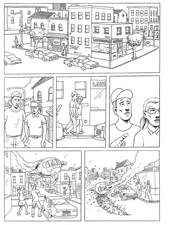
Each version had to tell a story using different types of narration:
- Dialogue only
- Captions only
- A 3rd person narration
- A combination of all 3.
This had to be done on A3 versions of the comic page, which I had to print on 2 pieces of A4 as I was unable to print it A3. I also had to come up with a story for the image that I could use to add narration.
I decided that the story would be about 2 friends that are talking about a movie one had seen which starts to come to life.
Next I had to write out the narration and dialogue to stick to the page. Placement of the text had to be carefully considered so as not to cover up important parts of the images and so that the story made sense. This turned out to be harder than I expected.
Dialogue only
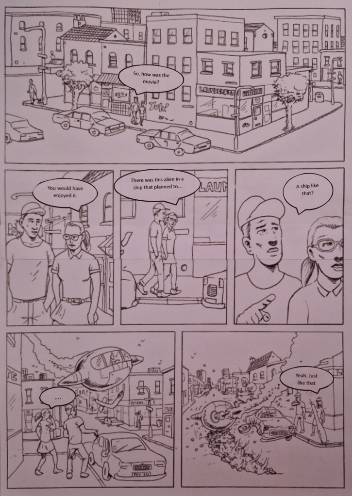
Placing the dialogue was interesting as the scale seemed to create different effects within each image due to the scene that is playing out. For example the speech balloon in the first image seems bigger because of the people inside being smaller to the rest of the panels. This caused some speech to appear more giant, adding more importance to what is being said, even if that wasn’t the intention. It can also make it appear as the person is shouting.
Trying to come up with what may be talked about was challenging. There are so many possibilities. For instance the first three panels could be seen as serious because of how the characters are looking at each other and how close they are to each other. This could also be seen as them being close or maybe in a relationship. They could even be strangers. I decided that they are friends as their hands are in their pockets and there isn’t any other body language to say different.
Placing the balloons fully inside the panels wasn’t always possible as there was too much dialogue. I decided to have the balloon leaving the confines of the panel instead of reducing the amount of text as I thought this connected the panels more.
I tried not to cover anything important with the balloons. I tried to only cover up the areas that didn’t have much detail or didn’t contribute to the story as much. I also tried to make it clear which character was speaking, making sure that the tails pointed to the correct character. If there were more than one dialogue balloon I would have placed the balloons in order, from top to bottom, so as it is clear as to how the dialogue should be read.
Looking at the image again “A ship like that?” may have benefitted from being placed in a scream bubble. This may have helped further express the shock the character is feeling.
Captions only
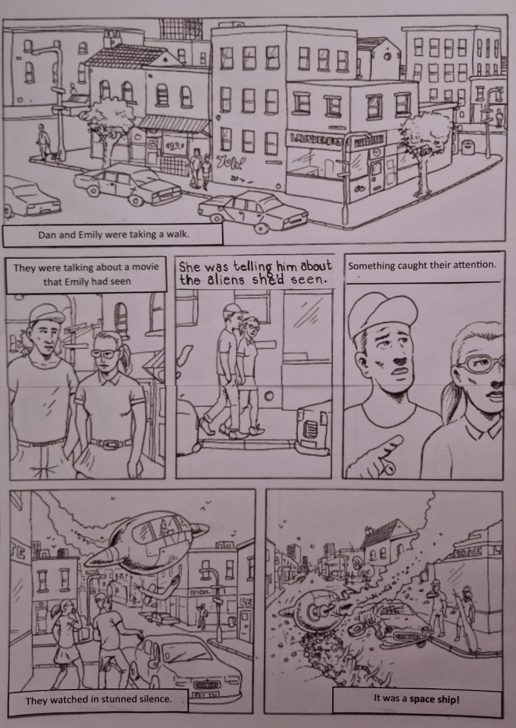
For the captioned version of the image I tried not to cover anything important again. I did have to hand write of the captions because I seemed to have accidentally thrown it away and didn’t want to waste paper printing a new one.
I wanted to capture the main idea of the scene, though this didn’t make it very interesting. Once I was able to get into the characters heads, during the third person narrative it became a little more interesting. As the purpose of the captions was only to narrate, so there was no need for whispers or screaming, I kept with straight, full lines. I liked the uniformity and symmetry of the placement of the captions, this is another reason I have placed them in this way.
Thought bubbles

Instead of the usual type of thought bubbles I decided that this would work better. Using rectangular shapes we are able to see more of the image. I’m not sure if this would be accepted in a comic but I do like how clear everything is. I have used dotted lines instead of the full lines used for captions. I hope that this conveys quiet thought and distinguishes them from the captions.
Using thought bubbles really helps develop the characters. They give a better insight into the story. They also allows us to better understand the dynamic between characters.
Mix

Using a mixture of these was interesting. After isolating the different types of dialogue making them fit together was like putting together a puzzle. I did notice that the different types of text gave of a different effect. The captions felt more matter of fact whilst the thought bubbles felt quiet, almost secret.
 Illustration log