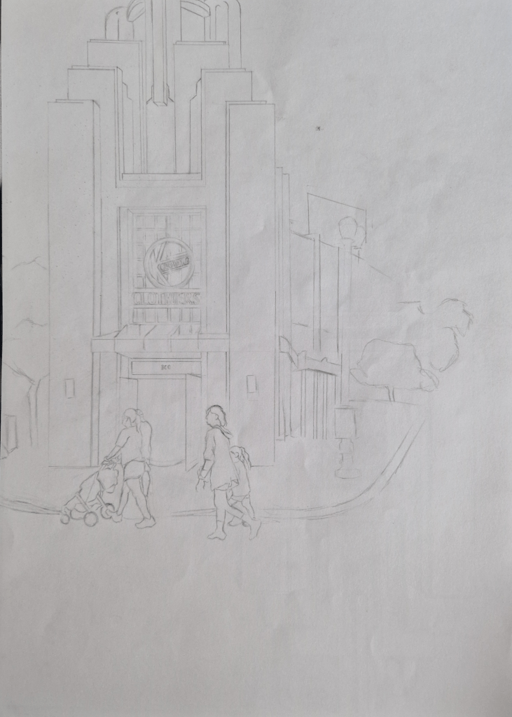
For this exercise I took a photograph that I had taken and turned it into an A3 drawing. From here I had to photo copy the drawing and create a few different versions of it: one using black fine liner, one using a bottle of ink and one adding colour. I used coloured pencils.
The original photo:
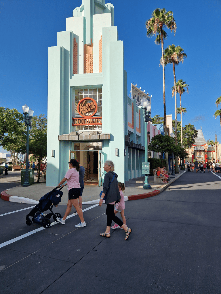
I chose this image as I liked the 50s architecture and it has plenty details to meet the brief.
The original drawing:
Fine liner:
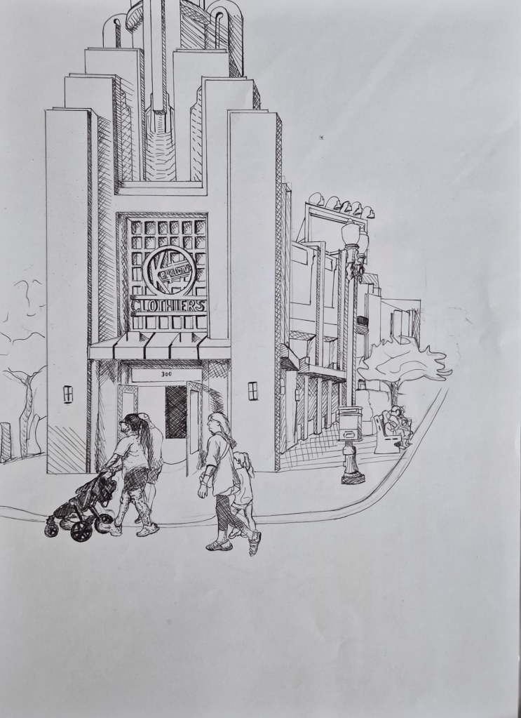
Here I used hatching, cross hatching and stippling. These are all methods I tend to forget about yet they work so well. I was impressed by just how much detail and depth can be given to image by just using these techniques. I felt that the hatching and cross hatching better fit the building but stippling felt more natural and a better fit for people. Stippling would have probably been better for the trees as well. I tried not to over do it. Adding finer details were harder, like the details in the sky as doing so would bring the sky into the foreground since it is harder to differentiate foreground and background when using pen. Over all I did enjoy shading this way.
Ink:
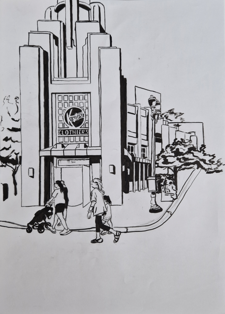
This was the hardest medium to use as controlling the amount of ink that went onto the page was harder than expected. The lack of control I had can be seen in the image above. I like the dramatic effect the contrast gives. Adding a gradual shade is harder with ink. You could try smudging the ink but this risks ruining the picture. Ink is very easy to smudge, as can been seen in the areas I did so by accident. I found that thicker strokes made the image look more shaded. I left the background blank again as it would have been hard to discern the background from the foreground, like with the pen. Using a dry brush may have helped add a gradient of shade as the flow of ink wouldn’t have been as smooth but I didn’t think of this at the time.
Colour:
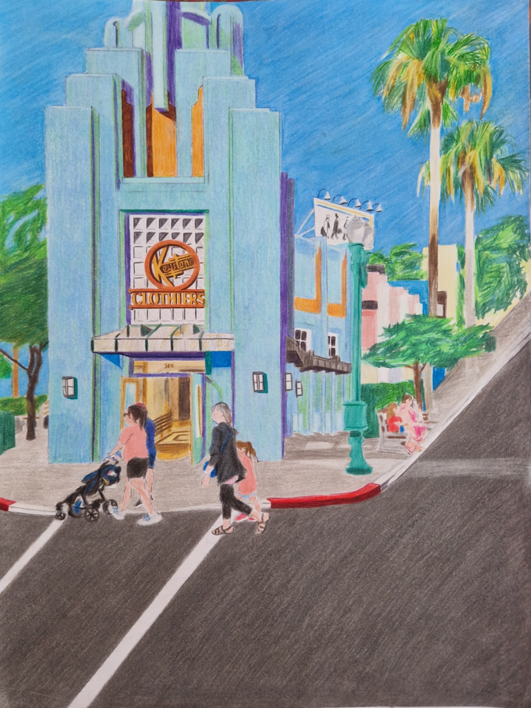
I used pencil to add colour. This was the medium I preferred. I like how the colour can add life to the image. Colour also makes it easier to differentiate between the back and foregrounds. This medium is easier to work with and you can make it as sharp or blurred as you like as it is softer than the previous materials. I tried to keep the colours in line with the era in the image and used a palette that would fit a 50s/60s poster. I used coloured fine liner sparingly to add more depth to the pencil and define some areas. This worked well to separate one part of the image from another.
Pencil and fine liner were the easiest to control. The fine liner was the easiest material to use when needing neat, thin lines. Pencil was the best when trying to add life and gradual shading. I liked the strong colour and punchy effect given by ink. Ink is also the best for quick coverage. Creating thin lines with this was near impossible. This makes ink the best choice when needing to cover a large space with the same colour, e.g. a car. Pen and pencil are better for finer details.
