Exercise One: Your Own Work
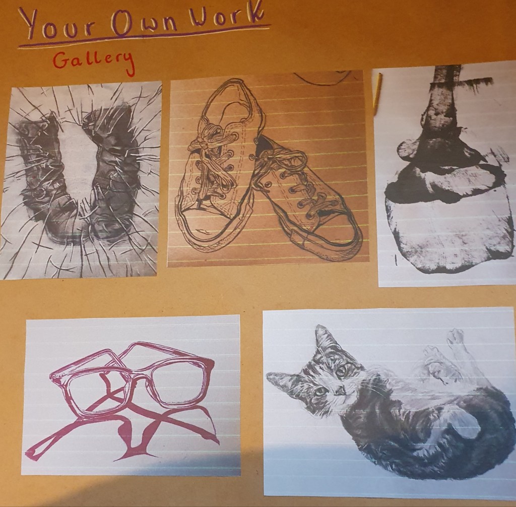
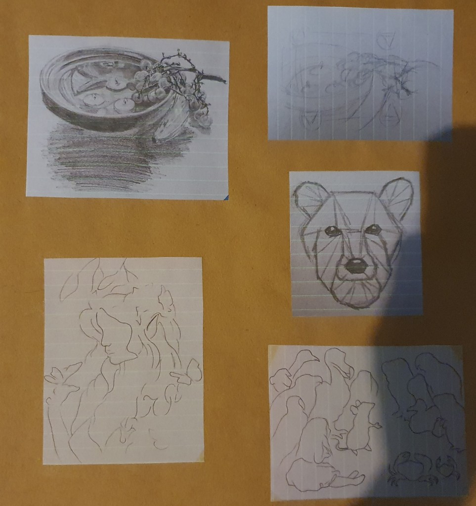
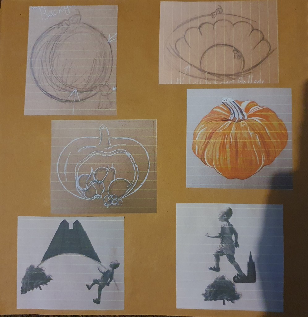
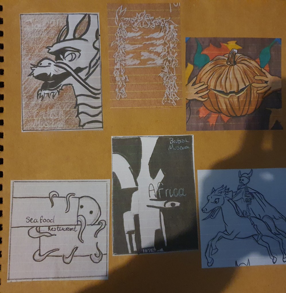
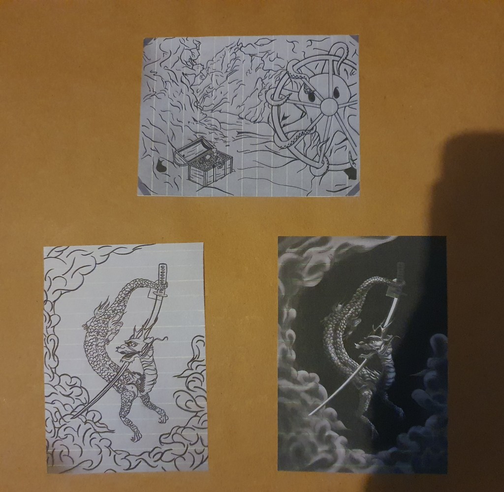
I started this by going through my past works for this course and picking any I liked or thought had any promise with some more work done on them. All of the images selected have elements that I like. I think that some of them make a striking image that I think goes against the expected. Some have interesting textures in them, like the shoes. Others have been made with an interesting and unusual technique, like the cupcake. Some I picked just because I think the colour worked well and others I picked because I think the narrative worked well.
When deciding which part of authorial practice I should go for I debated between prints and having one printed onto an item of clothing. In the end I went for something more practical, that I would use and chose a notebook.
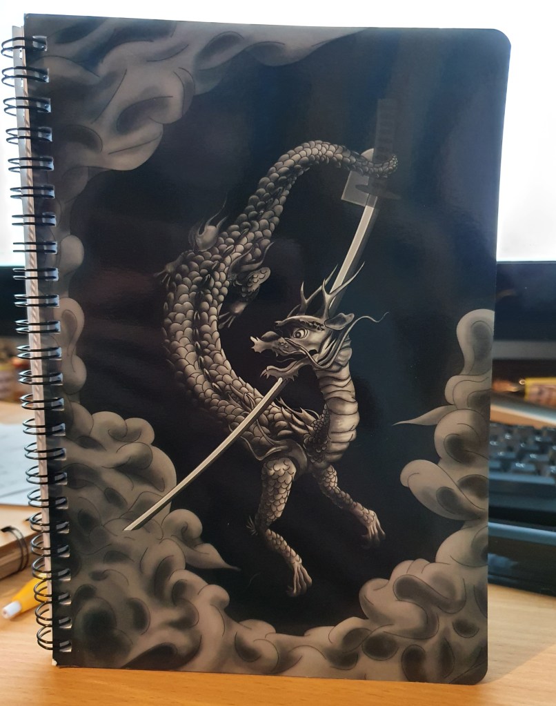
I chose this image as it is the one I like the most of all the images in my gallery. I think it makes a great illustration and would work the best as a product. I aim the product at anyone who can write, however I believe the image would be more appealing to anyone older than 10.
When picking a company to print my notebook I weighed quality, appearance and cost. I looked at few different sites:
https://www.fast-pens.co.uk/products/g/notebooks/?gclid=EAIaIQobChMI9NOBpO7T8AIVw4XVCh1-9gdIEAAYAiAAEgJ_yvD_BwE £14.99 + £3 postage. 160 pages
https://www.snapfish.co.uk/photo-gifts/spiral-notebooks-A5?icid=photo-gifts|Notebooks-and-Diaries|1C0|img|Spiral-Notebook-A5|191230|#!/pdpview £7.99 + £1.99 postage. 150 pages
https://www.smartphoto.co.uk/products/designselection.aspx?pcg=fun_ideas.office_school&p=notebooka5&cpc=notebooka5&cppn=notebooka5_photoonly £7.99 + £2.99 postage. 160 pages
I ended up using Snapfish as it was cheaper than the first site and about the same price as the last. I chose this one between the two as I liked the look of the book better and the spiral binding.
Edit:
Having looked in Paperchase and at Etsy I thought that a pen covered in tiny dragons would be pretty cute. I like the idea of making a pencil case in a few different colours. I also like the idea of paper printed with the dragon and wrapping paper to match.
Exercise Two: Editorial Illustration
I had trouble coming with ideas for this exercise. I believe this is partly due to the lack of articles I found to fit the heading I picked, “Paris, still the best place on earth.” and the fact that I have always loved Paris. There was just too much I wanted to include so limiting it was hard.
I started the exercise by looking into what an editorial illustration is and what skills are required to design one then moved on to buying the newspaper. I ended up with two as finding an illustration inside proved to be hard to do. I managed to find one in each newspaper. The first featured an article on the effect of mouse sweat on cats, using an illustration of Tom and Jerry to draw attention. This also supports the text as most people know what the show is about, and their antics perfectly demonstrate the effect a mouse can have on a cat. The second newspaper contained an article on Brexit and featured a caricature of Boris Johnson with a bull. This image was the perfect fit for the headline used, “Oz deal proves Boris’ Brexit boasts are bull”.
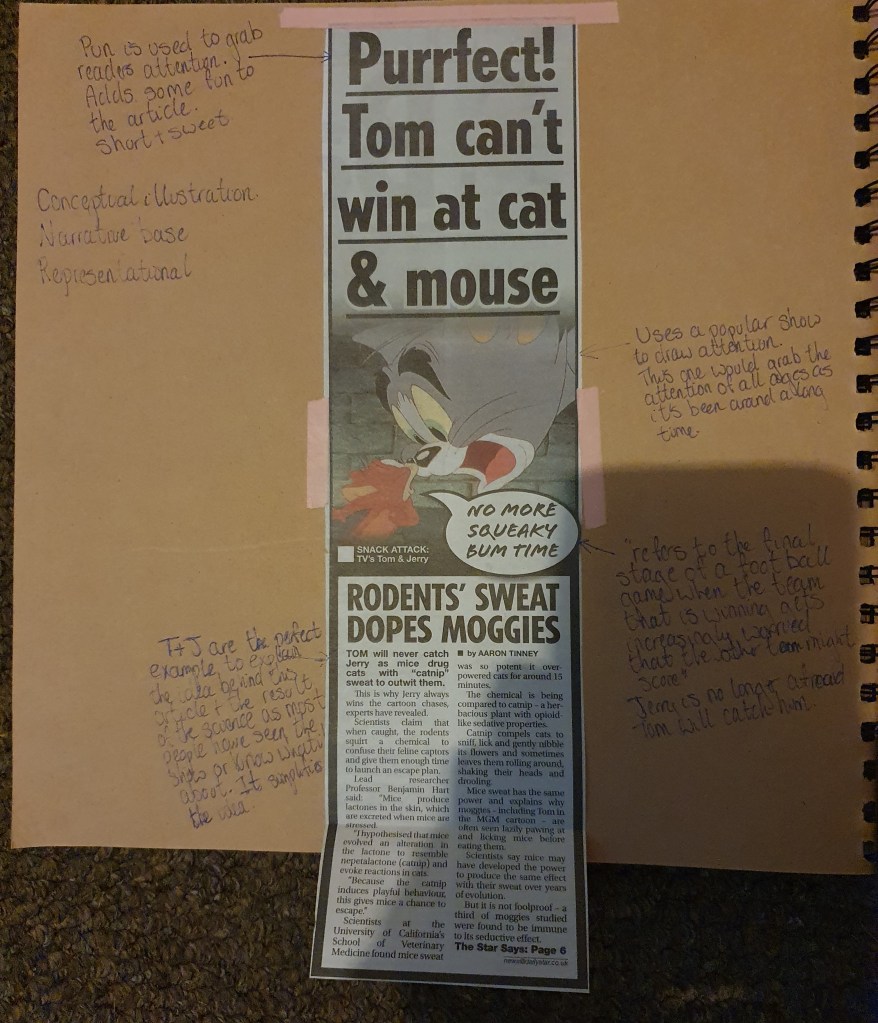
The first article, “Purrfect! Tom can’t win at cat & mouse”, I would say is a conceptual illustration as it is more based on idea, relying on previous knowledge of the show to narrate the text. I would also say that it is representational as Tom and Jerry are used to represent real mice and cats and the basis of the show is used to represent the addiction caused by the catnip effect of mouse sweat.
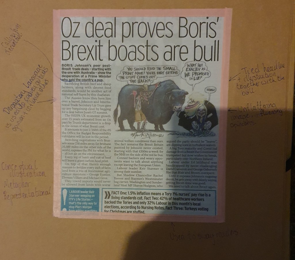
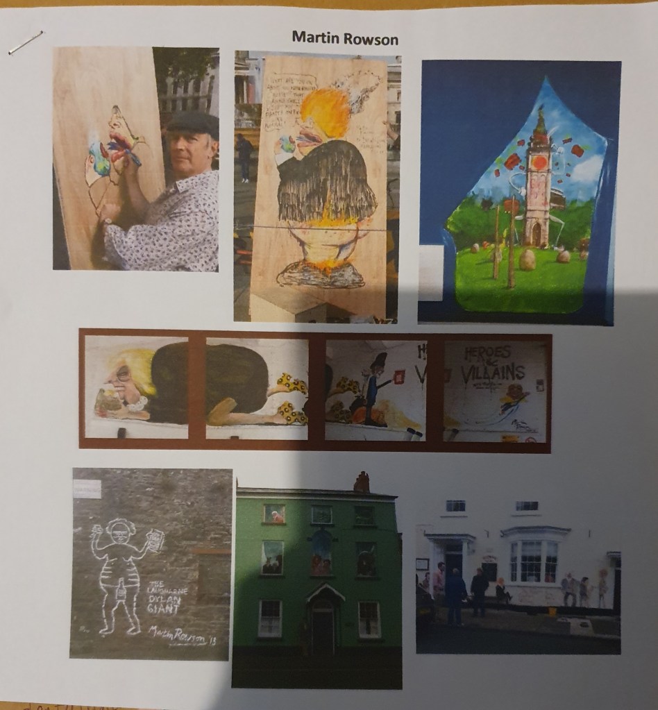
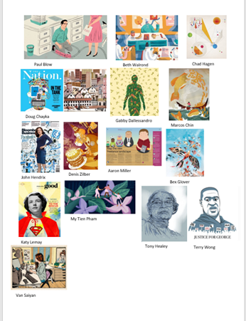
The second article is once again conceptual, though I feel that it crosses over into informational illustration. This is because the image, though cartoon, does give some information, provided by the metaphor within the image. It is also representational. I then looked up more work by the artist, Martin Rowson, to find that a lot of his work is the same and centered around politics. Afterwards I looked into some more illustrations by different artists to see the range of different styles possible.
Edit:
Martin Rowson has a unique style. The scruffiness of his work does well to enhance the ideas behind his work. It pairs well with the images to communicate his dislike of his subject. His take on political issues seems to reflect the thoughts of a fair percentage of the country, especially his work around covid-19. I don’t think that this has informed my own approach in any way as my subject matter is completely different.
Next was to pick my headline. My choices were:
- How green is your food?
- The best restaurant in town
- Loves me, loves me not
- Throwing your money away
- The object of my desire
- Finding your family history
- An interview with Melvin Bragg
Or, my favorite,
- Paris, till the best place on earth.
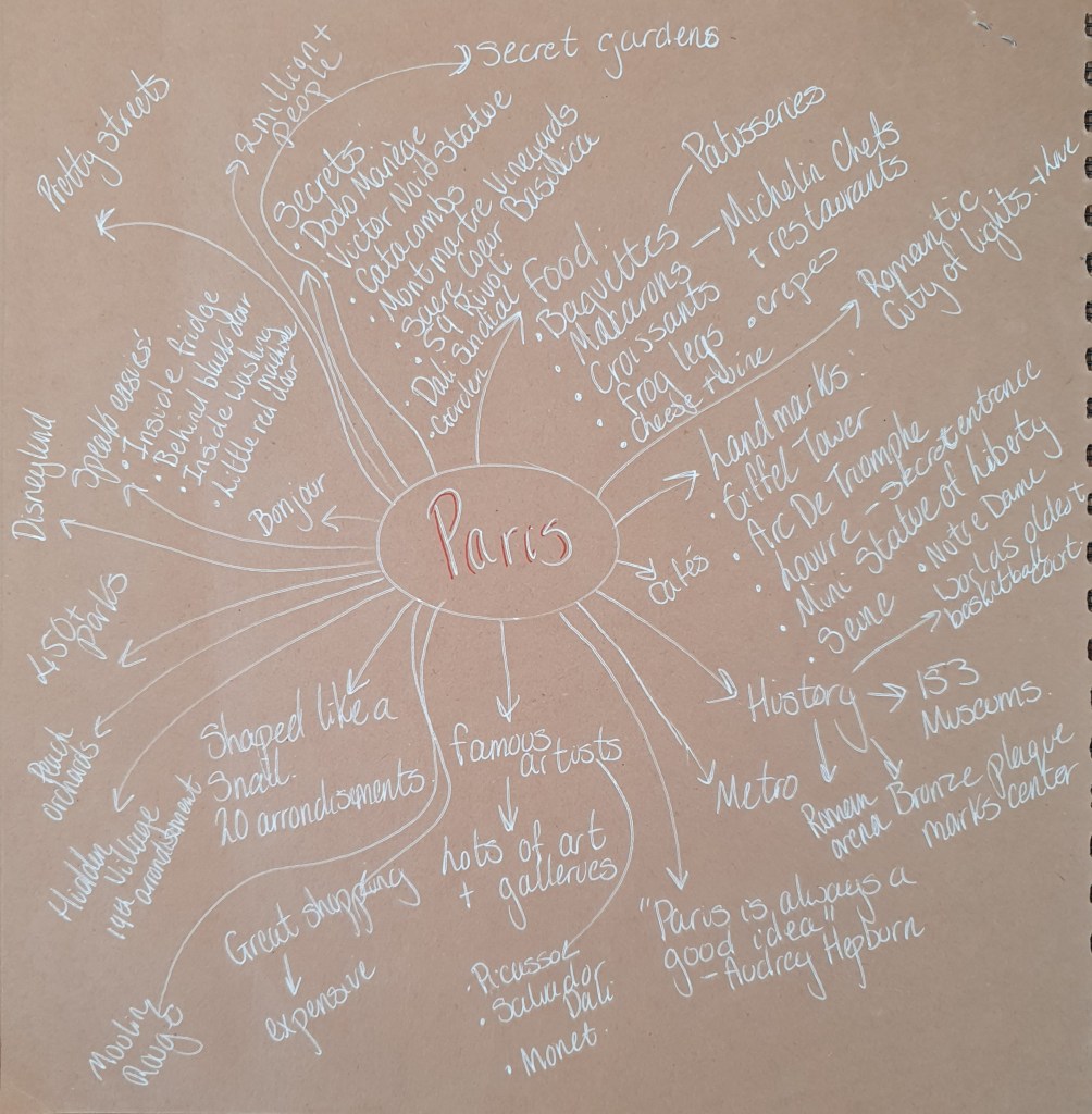
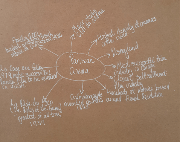
I started this with a mind map of things that come to mind when thinking of Paris. I did look the city up too so that I could fill it out. Doing so I came across some interesting things. However, none of these really fit the article I eventually found, all about Parisian cinema:
https://www.travelandleisure.com/trip-ideas/city-vacations/paris-movie-theaters
The article discusses the cinema going habits and enthusiasm for cinema of Parisians. The range of genres and history of Parisianm cinemas is explained. The article tells us of the thriving cinema going experience despite the competition of home streaming.
Having read through the article multiple times I started to underline some areas of focus. This led to me looking into the different cinemas based throughout the city. The focus of my piece eventually became the part where hopping the train was mentioned.
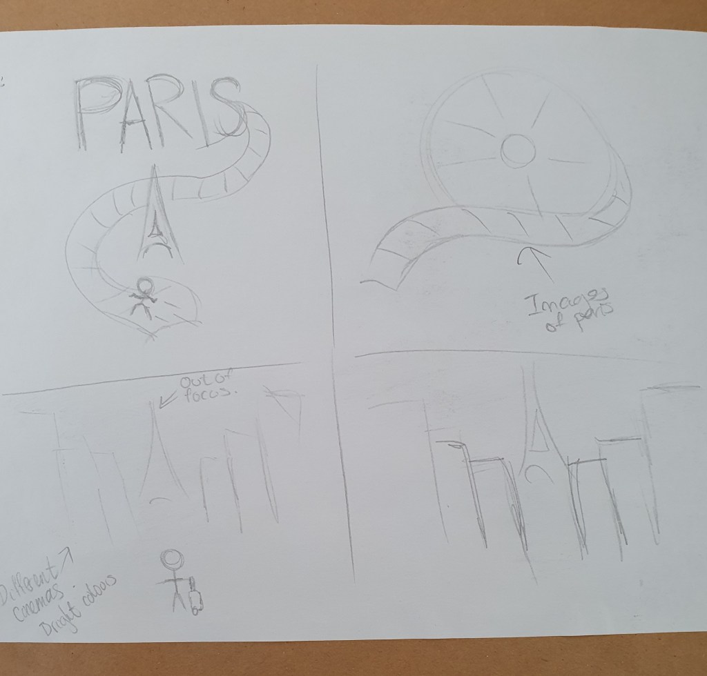
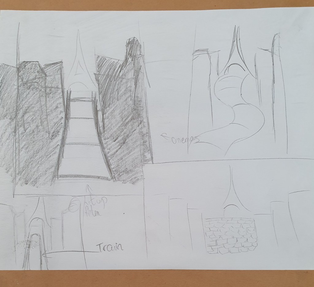
Before focusing on this, however, I was to draw some quick sketches as I read through. I wasn’t impressed with any of them really. I didn’t feel that they would translate well for people to understand them.
When thinking of the article and the image I would like to pair it with I decided that the image should be:
- Bright
- Representational
- Narrative
To continue I decided to find out some more about Parisian cinema.
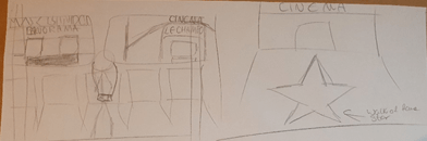
. Then I tried a couple more ideas, one being more successful than the other.
Which lead me to my line visual, in the size of the Brexit illustration.
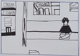
I modified it a bit from the original drawing as I felt it made a better composition. I also used some reference photos from google to make it more authentic.
For this piece I decided that paint would be the best medium to use. Not only would it allow me to create the effect I wanted but it has been used a long time, adding some old to the image since cinema, though still relatively new, has become an old art being over 100 years old. I wanted a bright palette so that the piece seemed livelier, reflecting cinema itself and the culture around it in Paris.
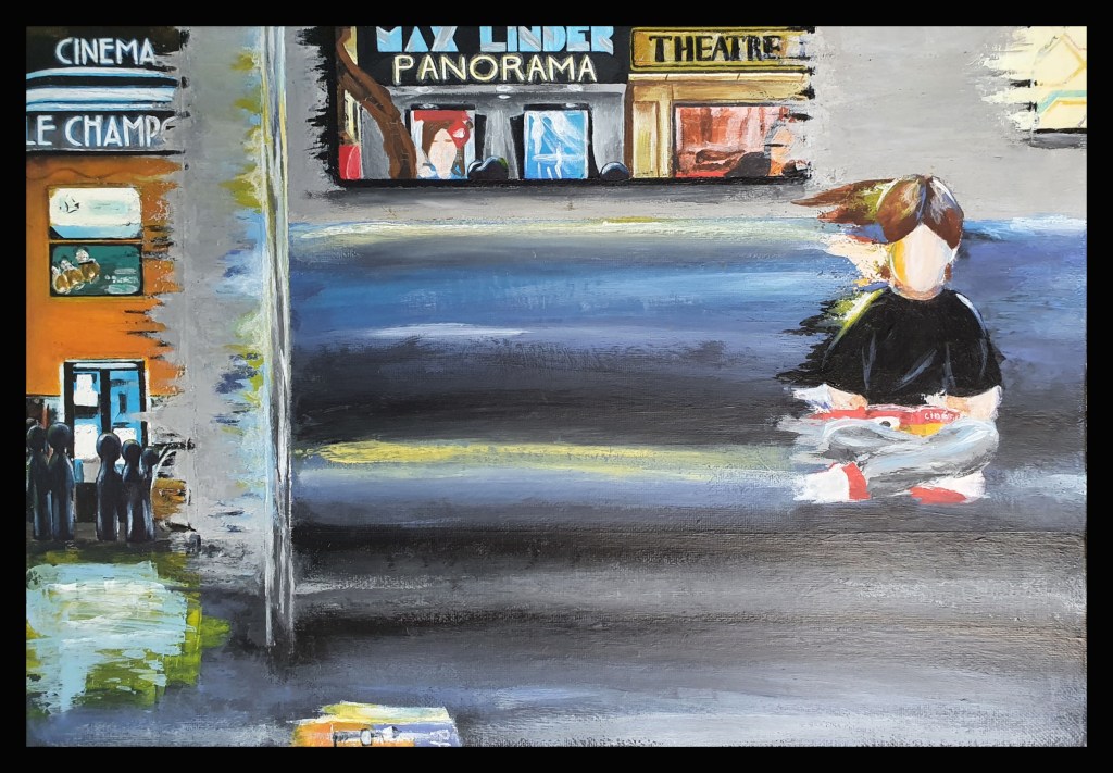
In this piece I wanted to express the fanatic culture based on cinema in Paris. To do this I had to make some more adjustments from my line visual. I started knowing I wanted bright, bold colours. I feel that this better reflect the feel of the piece and fits better with the nighttime scene. I also knew that I didn’t want the paint to look all smoothed out. I felt that the rougher texture would feel more alive and also allowed my intended style choice of scraping the paint so that it would create a movement like affect. This is to make the train seem as though it is moving and bring focus to the cinemas featured in the piece. I used images of metro trains as reference to get the inside right. The idea is based on a line from the article. Plain clothes and an empty face were used to make the scraping simpler. Not that I was confident in painting a face anyway. Paris magazines are used to place the scene and the cinema front cover being read is to enforce the love of cinema. I ended up adding the shadows of people waiting outside as doing so didn’t have the same affect and feel I was looking for. Adding them makes it look busy, whereas before it was like a ghost town. When this was all finished I debated on adding something to the middle. I decided against this as I thought it would make the image too busy and draw attention away from the main focus. I also didn’t think that it would shrink well for a newspaper.
I am happy with my final piece as I believe that it is the strongest of my designs and is a good companion to the article. I am unhappy with my other ideas as I feel that they are not of a good standard and would confuse people. They are more conceptual and I’m not sure that they make sense. I had a lot of trouble coming up with something that I thought I could work with as I believe I was overthinking things. During research I found that I like the more representational pieces best. I decided on the line I used because it was a more personal piece of information given by the author and when reading it I could imagine him getting on different trains for the movies.
Exercise Three: Travel Guides
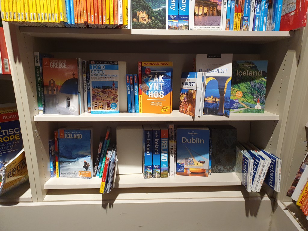
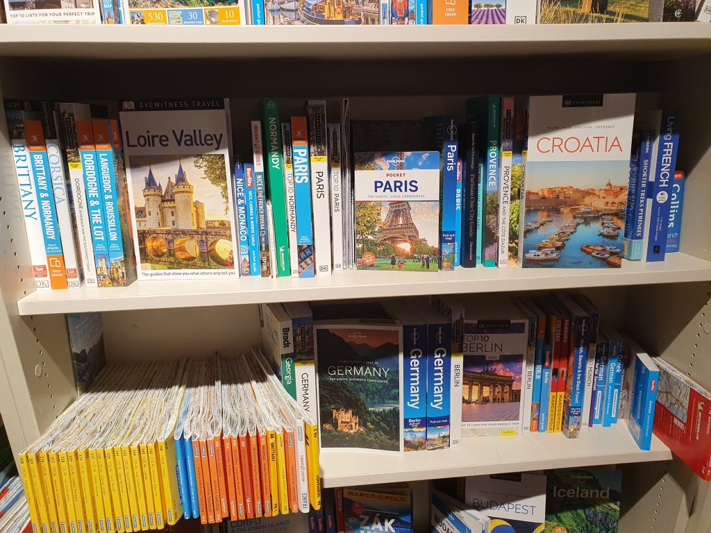
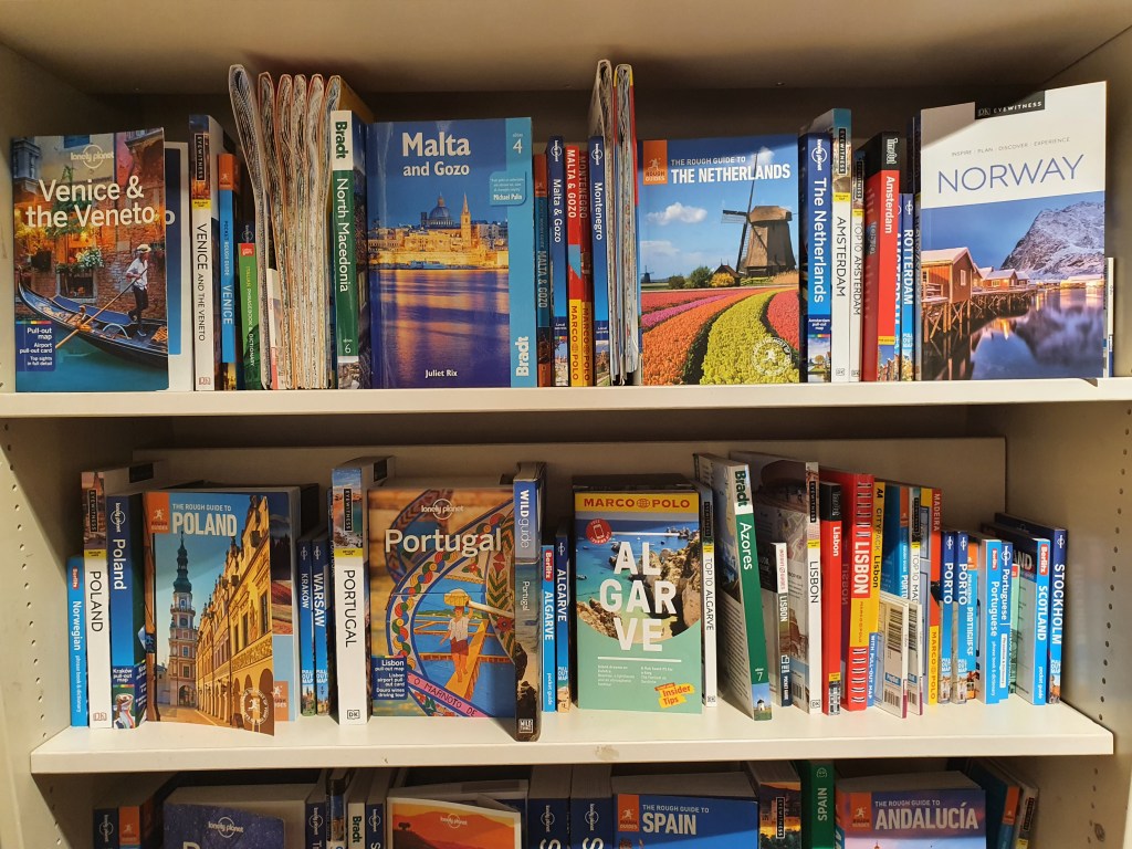
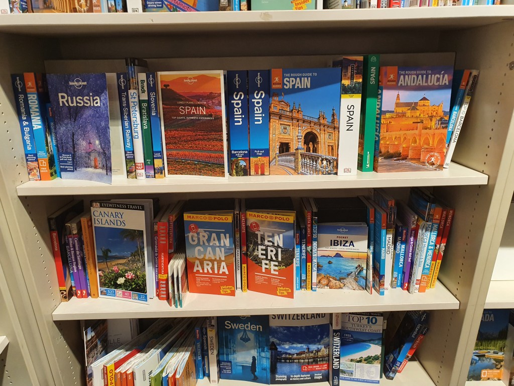
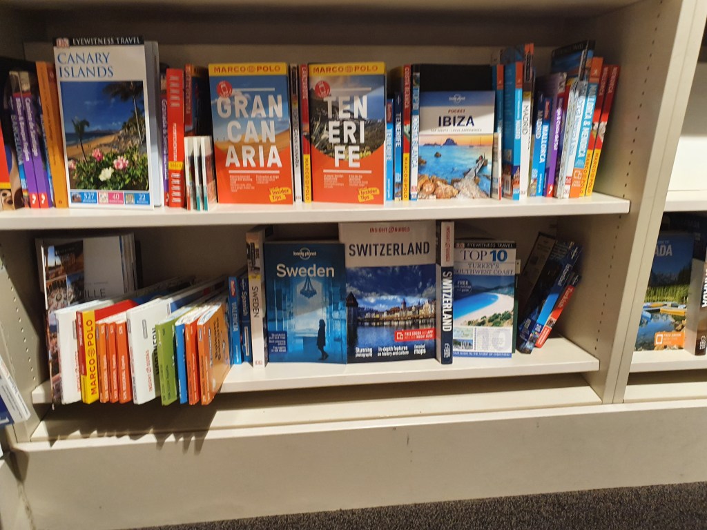
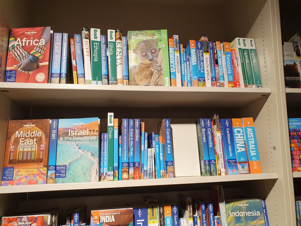
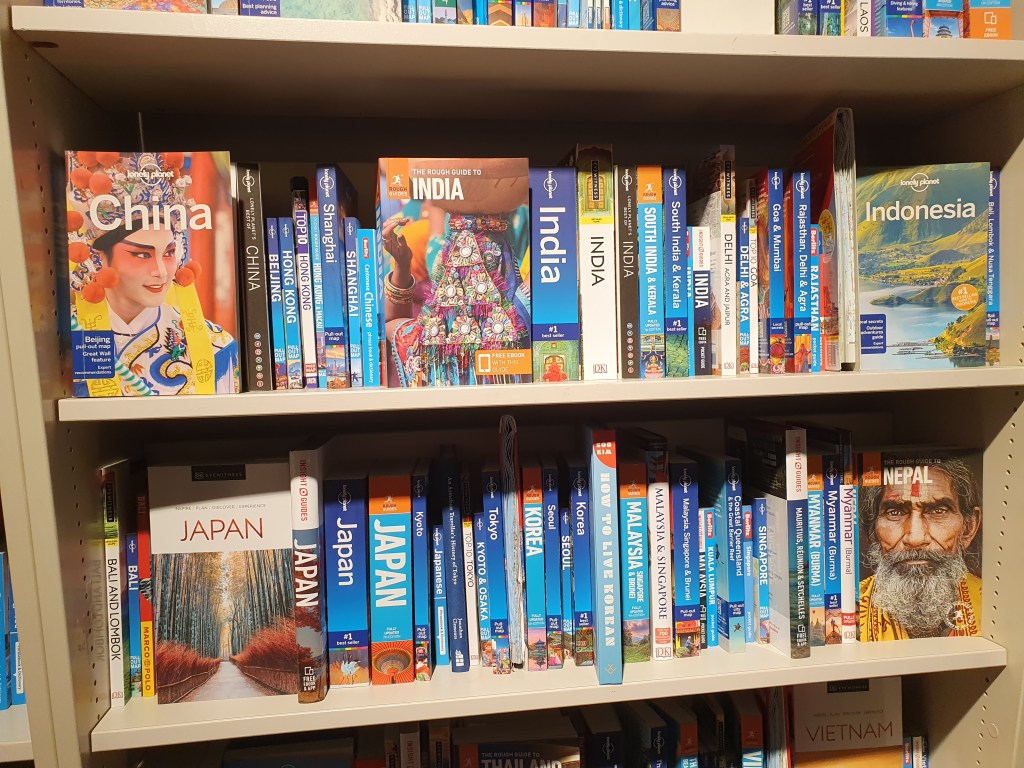
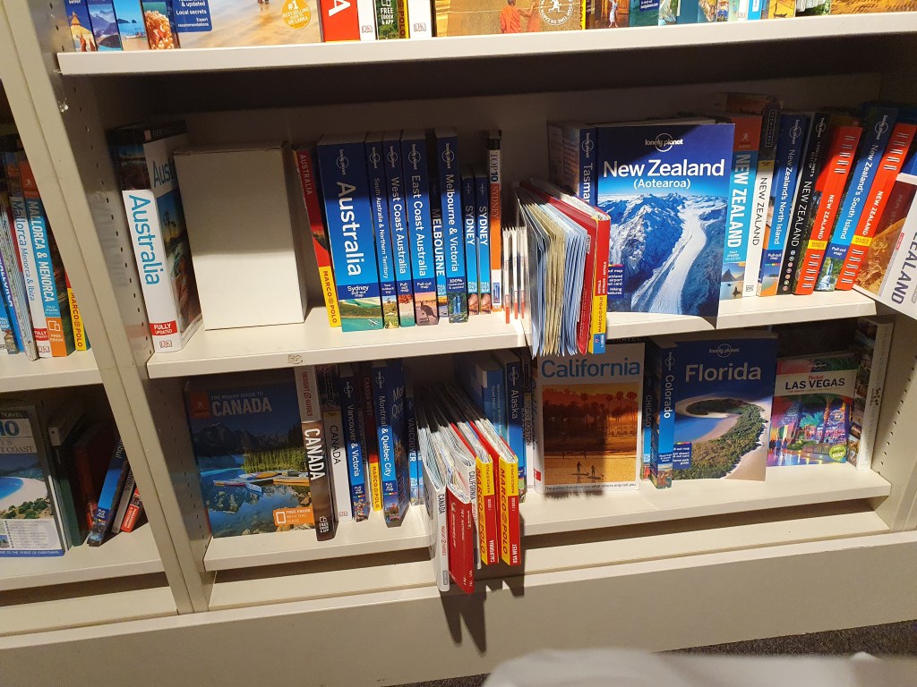
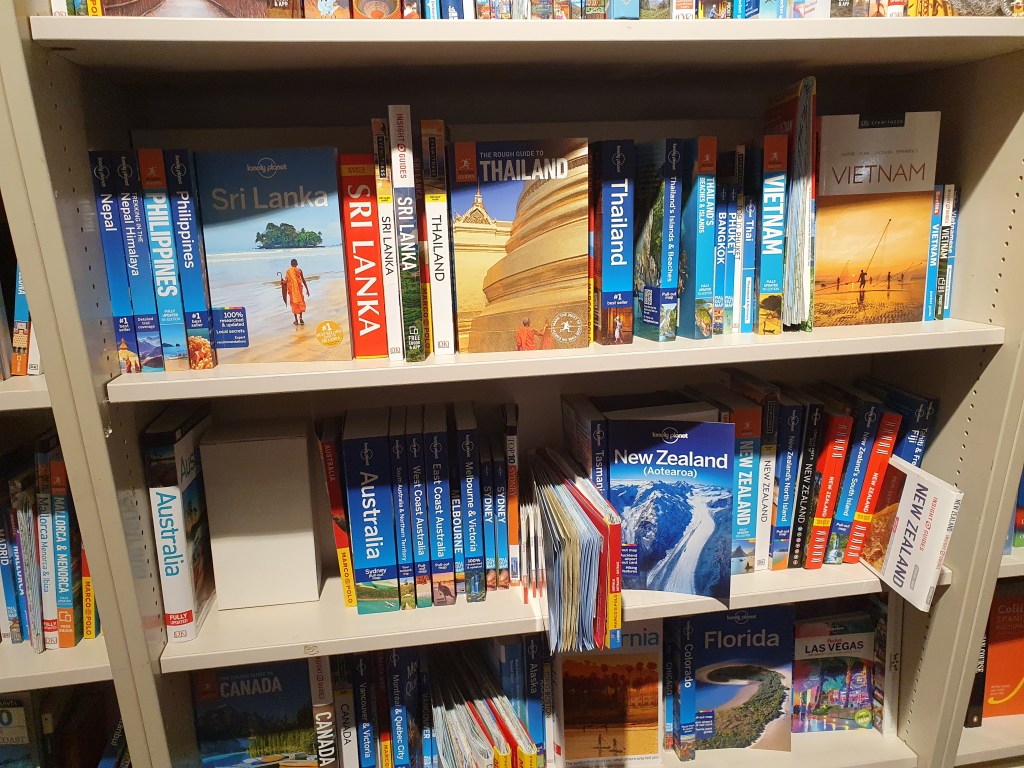
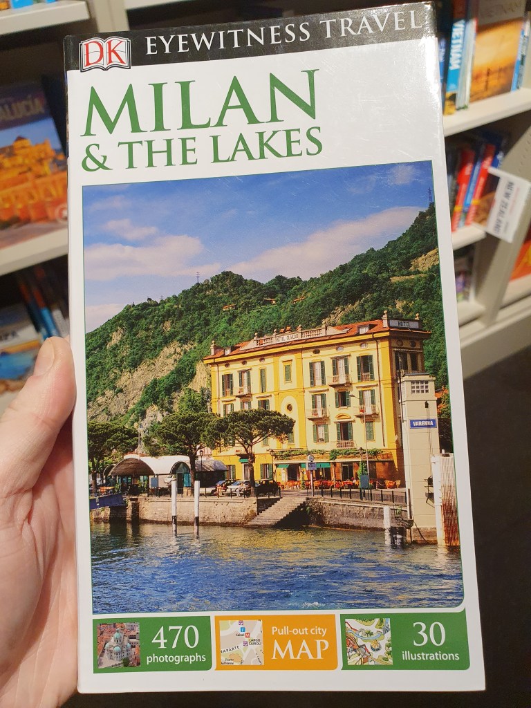
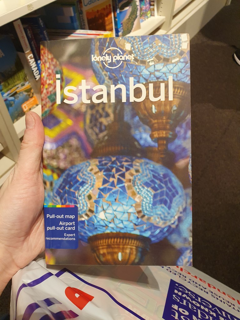
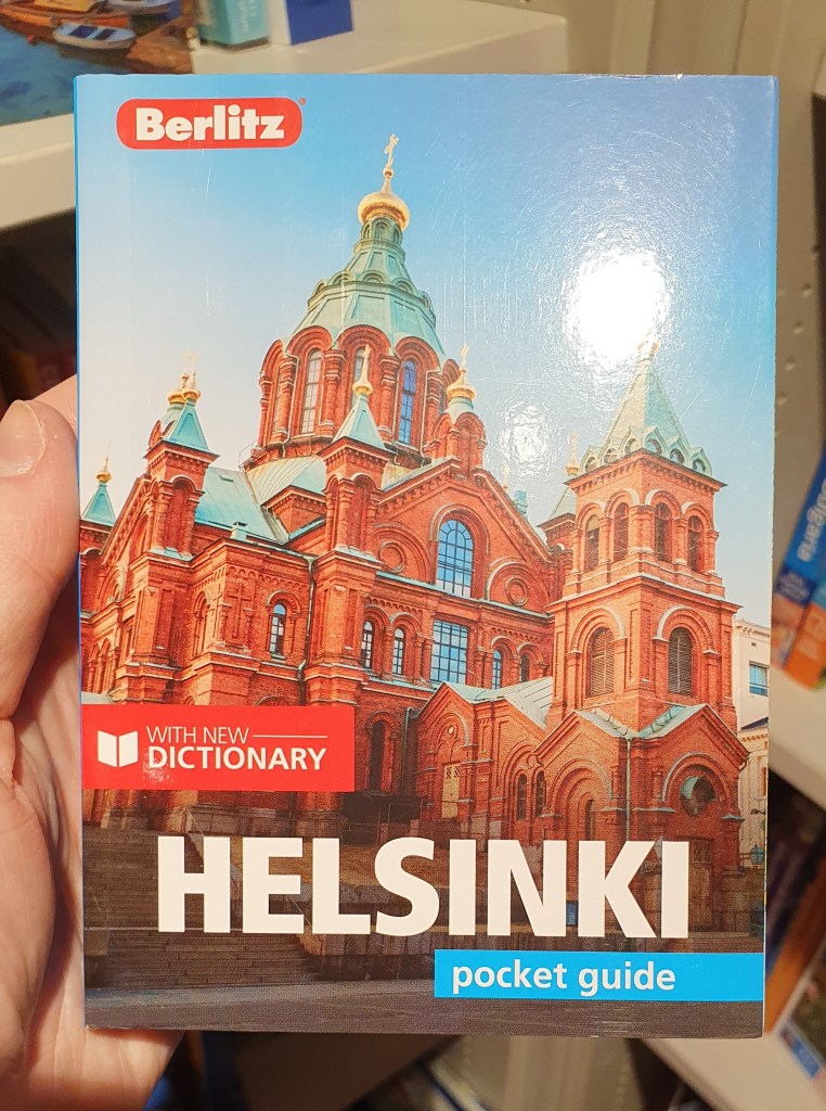
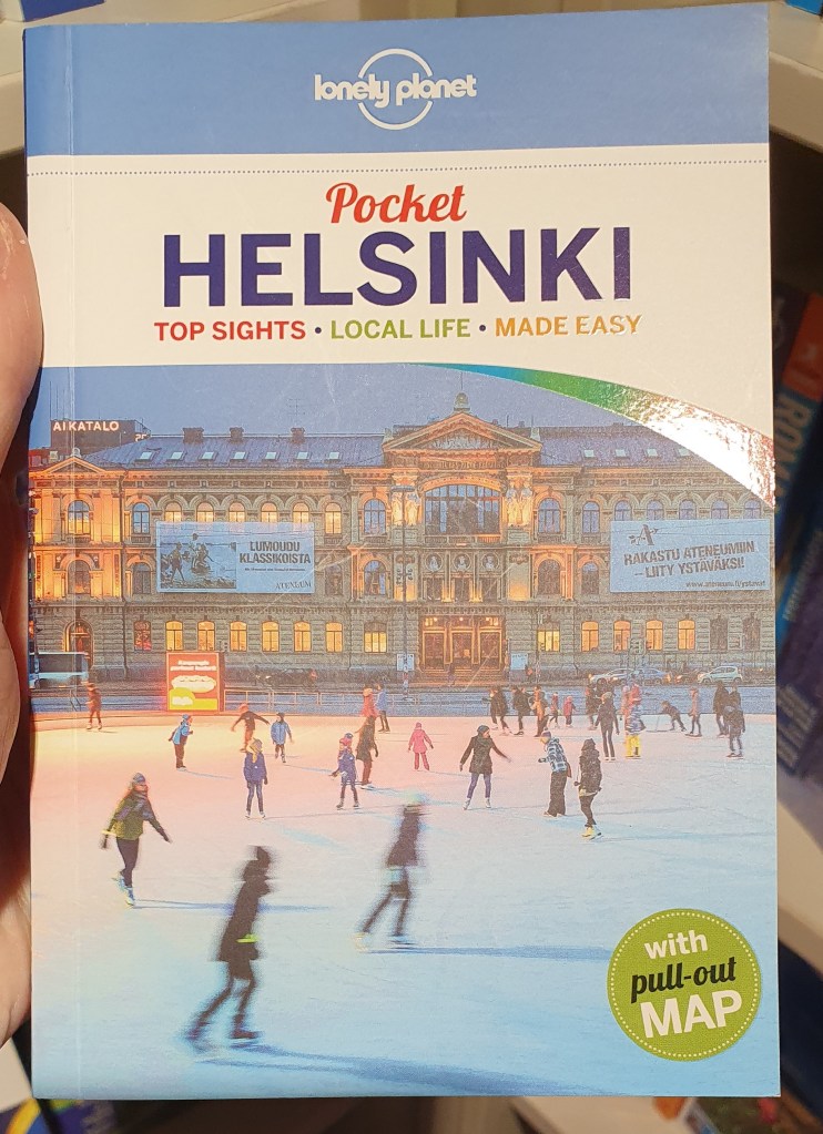
To start this exercise, I did some research on each of the destinations given: Istanbul, Helsinki and Milan. I tried to gather information on attractions, culture and traditions to get a feel of the place and try to work it into the designs. I then gathered images of them for some visual research. When in town I went to my local Waterstones to look at some existing travel guides.
I’m not sure how well I did on the brief as I still find it strange having to write one for myself. I tried to keep it simple to not over complicate things:
Travel Guide Brief
Create three illustrations for a travel guide jacket for each of the following destinations:
- Istanbul
- Helsinki
- Milan
Each of these illustrations must be hand drawn. Provide one mock up.
The jackets must be eye catching and convey the feeling of the location it is promoting. The designs must be diagrammatic in nature and fit a regular sized travel book.
Next, I decided to how to design a travel guide to see if there was anything I hadn’t thought of. I did this by looking at how DK go about designing theirs. I found the best way is to keep it simple.
The next step were the designs. They were draw at the size of a DK book of 21.5 x 12.5cm.
I started with Istanbul:
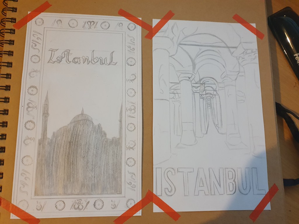
For the first design I took inspiration from Turkish carpets. The country takes great pride in their carpets so I thought that it would represent a big part of their culture. I used the Hagia Sophia Mosque as an example of the unique architecture and the religious culture of the city. I shaded it into a silhouette to keep the image simple and not too cluttered. I used the font I did as a felt that it fit the carpet borer and the hand drawn requirement of the brief the best.
The second design features the Basilica Cistern. I thought that this was an excellent example of the cities traditional architecture and since it runs throughout the city, I felt that it represented the heart. I also liked the composition of it running deeper into the center of the image. I used a simpler font as I thought it would be more impactful against the more complicated image.
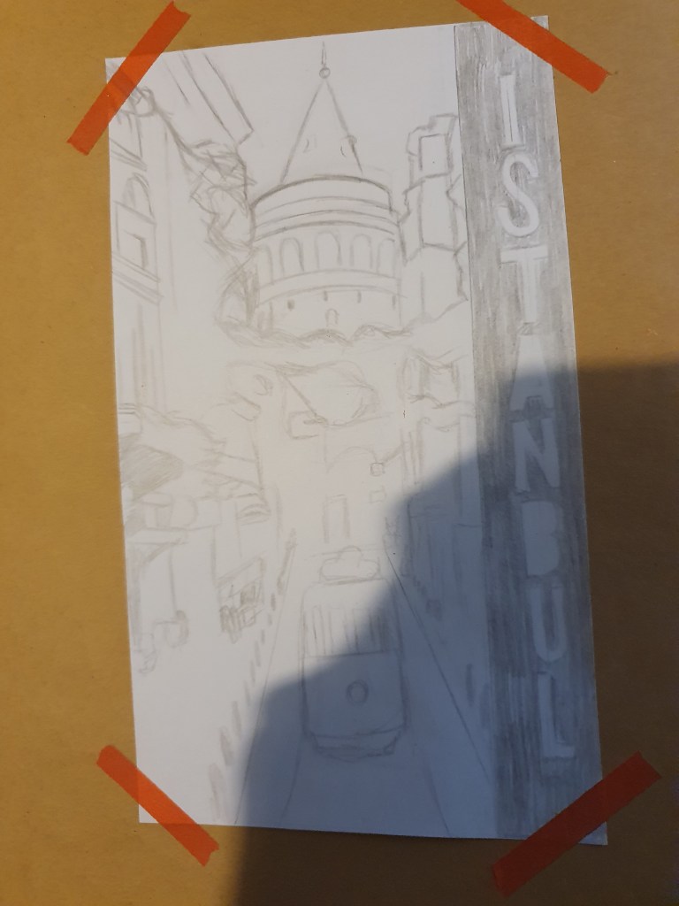
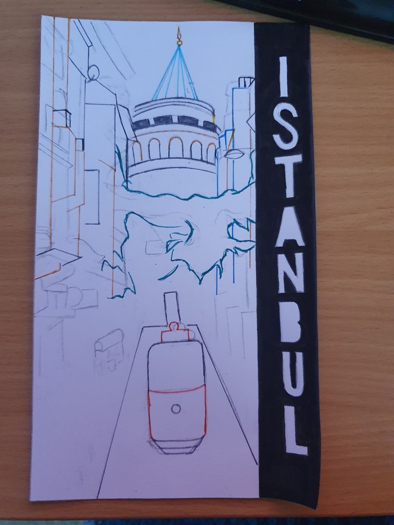
The third design features the Galata Tower. This tower offers views of the whole of Istanbul. When first built it was the city’s tallest structure and is now used as an entertainment center. I felt that this, along with its fairytale aesthetic, would make a good cover image and representation of the city. This however, relies on previous knowledge of the tower. To remedy this I added a tram, a popular source of transport in Istanbul and a carpet stall. I placed the locations name to the side as I thought it felt more organic within the composition of the image and blocked it out from the rest to make it stand out and draw attention.
The next destination was Helsinki:
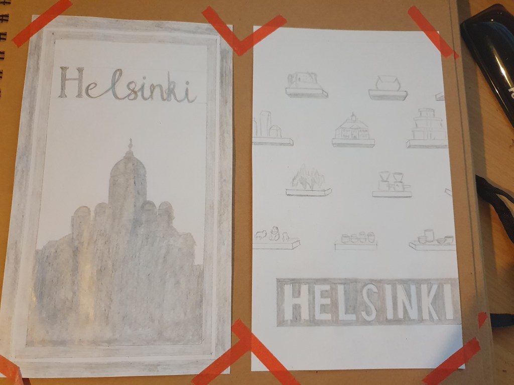
For the first design here, I continued with the idea of a patterned border. I used a Finnish carpet for this. I feel that you can clearly see the difference between the two cities from this alone. To fit with the Istanbul design, imagining that these would be turned into a real series of guides, it features an architectural silhouette. This time I chose the Helsinki Cathedral. Once again, a prominent part of the Finnish culture is their religion. Its unique shape also spares any confusion other which building it is. It is also known as the most famous structure within the whole of the country, making it even more recognizable.
The second design is based on the fashion district. I took an image from one of the shops and replaced some of the items on the shelves with something that better represents the archipelago. These included: a sculpture from the district itself, the Porvoo Town Hall and the Raseborg castle ruins. I chose the town hall as it is a distinctive building within the island with its bright pink exterior and the ruins for its historical past. I like the idea of using this as the castle was used to protect and took two centuries to build. I placed the font as I did to make it stand out plus it looks like a price tag, fitting with the image. I like the simplistic style of the image as I feel that it fits with the feel of the culture.
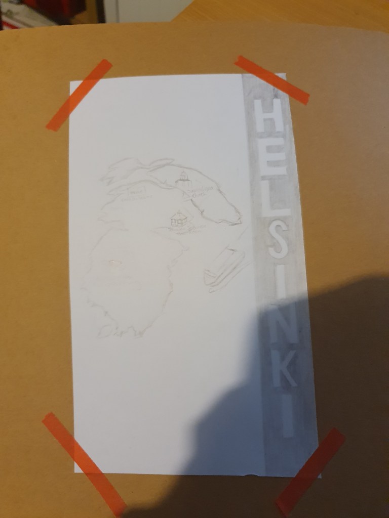
The third design was where I ran out of ideas. It was meant to show the different islands that make up the archipelago, though after drawing it I realized that it was only one island. Suomennlina. I added some attractions to the map to make it look more interesting and give more information. I chose the font to fit with the previous one for Istanbul. It also makes the name clearer.
Last of all was Milan:
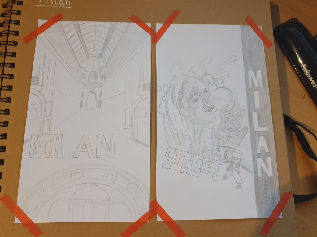
I felt that Milan was the most artistic of all three destinations so I tried to show this in my designs. Thye first design was inspired by one of Milans biggest events, Fashion Week. I took inspiration from the layout of fashion magazines and replaced the runway with the Galleria Vittorio Emanuele II. This may not have been the best choice as you have to be a millionaire to be able to shop here, however I felt that it properly conveys the presence and standard of fashion in the city. The architecture is also very beautiful so I felt that it would make an attractive cover.
The second design is inspired by street art found within the city. Though not a traditional cover for a travel guide I felt that it would draw attention. I liked the idea of bring the different works into the image and shining some light on them. Street art is found throughout the city so I feel that this displays a little bit of its heart.
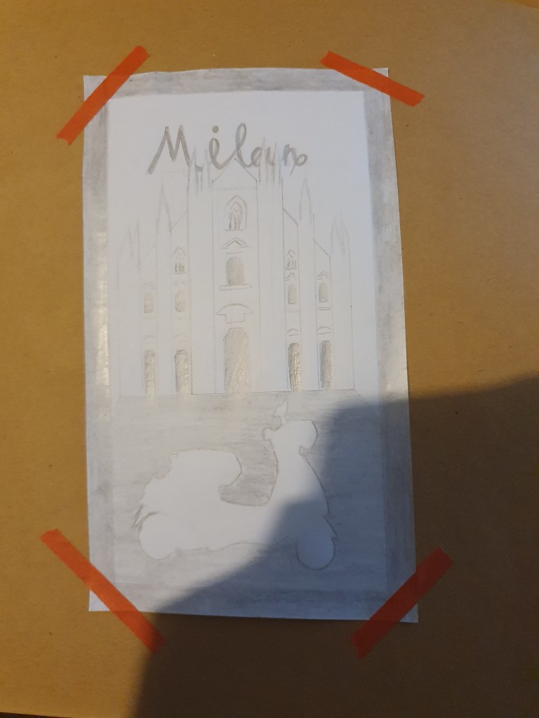
The last design features the Milan cathedral. Again, I was out of ideas so this isn’t my favorite design. I used the cathedral to show the cities religious roots. I used the vespa as a stereotypical representation. I wanted to create a contrast by having the cathedral shadow the vespa and keep that white.
I then tried two different styles for my final design. The first was kept very simple to highlight the hand drawn aspect.
Having copied the original drawing, you can still see the lines underneath. I decided that only adding the necessary lines would give a simpler, more calming effect. I chose this design as I like the composition and the fairytale look makes it feel more inviting.
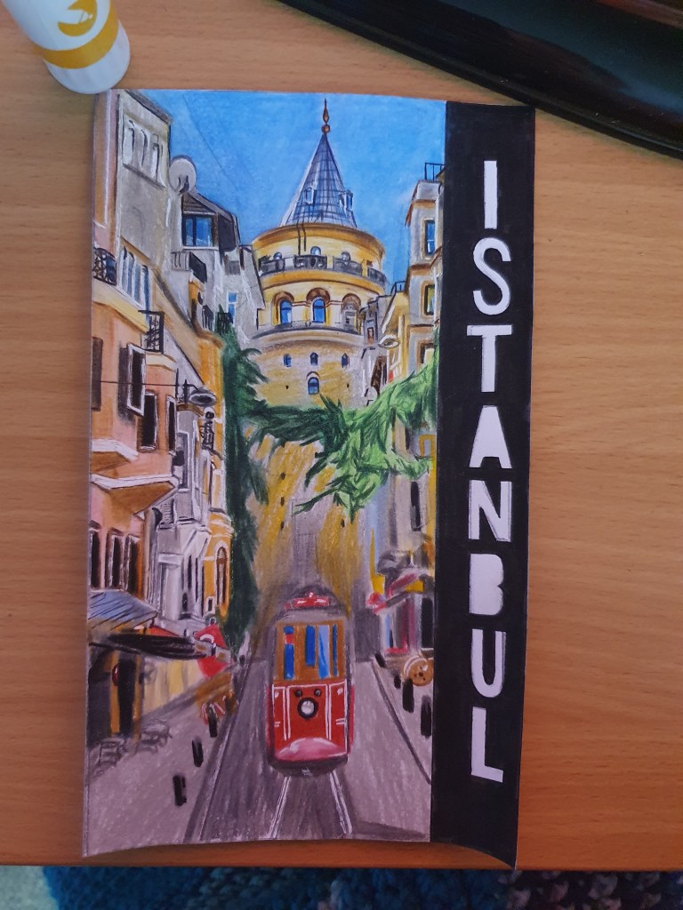
The final image is a lot less simplistic. Because of this the perspective is very off, however as this is only a mock up I didn’t feel that correcting this was too important. It would just need to be fixed if it ever where to really be produced. I chose the bright colours to make it a happier looking scene and add to the illustrative effect. I didn’t try to make it too realistic as it is meant to be a drawing and I like the way the pencils work together. I think that, besides the perspective, the image has turned out well. I believe that the bright colours will attract attention. I think that the scene chosen makes Istanbul look like a friendly, attractive place with lots to offer. If I were to draw it again I would fix the perspective and maybe add some people to the street to make it look busy. I believe that this would add to the warm, friendly feel that is desired of a holiday destination.
Edit:
I’m not sure if these pieces work as diagrammatic images as I still get a little confused to what fits under the category. I do think that they work well as travel guide covers but am not convinced that they fit the brief.
I used a stacked type as I didn’t see this on any of my research examples and thought that it would help them stand out. This may not be the usual practice for a travel guide as the type can interfere with the rest of the cover.
I think that photos and illustrations work just as well as each other as long as the right style and content are used. The two work to draw in different types of people.
I feel that covers using only one image are more effective as they are more immersive, giving the viewer a feel of what it would be like in the location featured.
To create a series the use of font, placement and border, or no border, seem to unite the books and make it clear that they belong together.
Exercise Four: Text and Image
Here I gathered images that communicate the meaning of the words given.
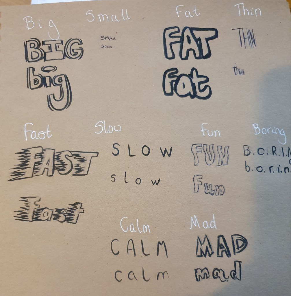
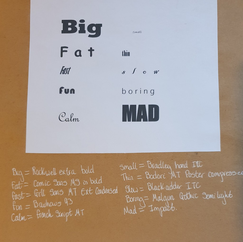
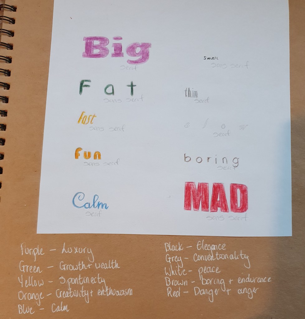
Big
Large in size
- Bold in colour
- Can use pop culture
- Uses bold styles
Small
- Small in size
- Simple designs
- Limited colour
- Thin line work
Fat
- Cluttered image
- Many, bold colours
- Bold line work
Thin
- Simple
- Clear
Fast
- Reproduced
- Simple
- Repetitive
Slow
- Detailed
- Large
Fun
- Plays with existing things
- Uses pop culture
- Bright colours
Boring
- Indistinguishable subject
- Too simple
- Bland colour palette
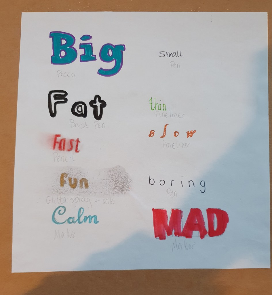
Here I used the appropriate materials for each word. For big I used posca pens as they can have very fat nibs I used green as its associated with growth and wealth. For small I used a pen as the nibs are small and its black as small things tend to be elegant. For fat a brush pen was used as you can vary the weight of the line with it, which I used to create a fat line. It is black and white as white represents peace, so I outlined it black as it is a dark colour, contrasting the meaning of white since getting fat can cause many health problems. Thin is done with a fineliner as they are really small. Fast is done with pencil as it allowed me to smudge it and create the effect. Its red for passion. Slow is an orange fineliner as such a small pen seems fitting and orange is comforting. For fun I used gold in and glitter spray because it seemed more fun this way. Boring is a black pen as it is the most used pen so pretty boring. Calm is a blue marker as blue represents calmness and the marker glided across the paper smoothly. Mad is also done with a marker as it has a fat nib, allowing for a fast, rough look and it’s red for danger and anger.
Exercise Five: Packaging
I started this exercise with a bit of research. I wanted to look into what you should think about when designing for children. From here I looked at the developmental stages of a childs mind to understand at what ages a child can understand different things. From this research I found that children prefer brightly coloured packaging as it is easier for them to see and more stimulating for their minds.
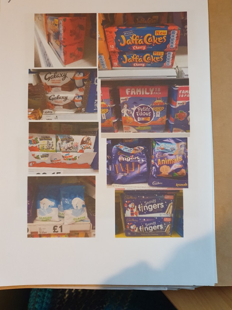
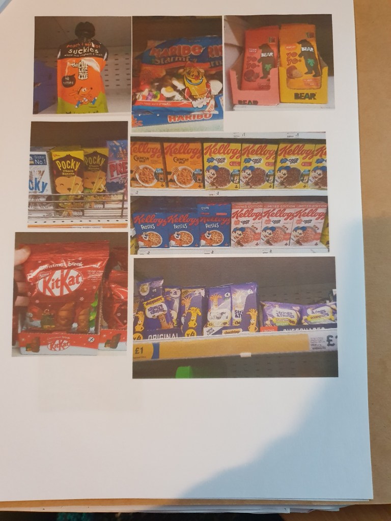
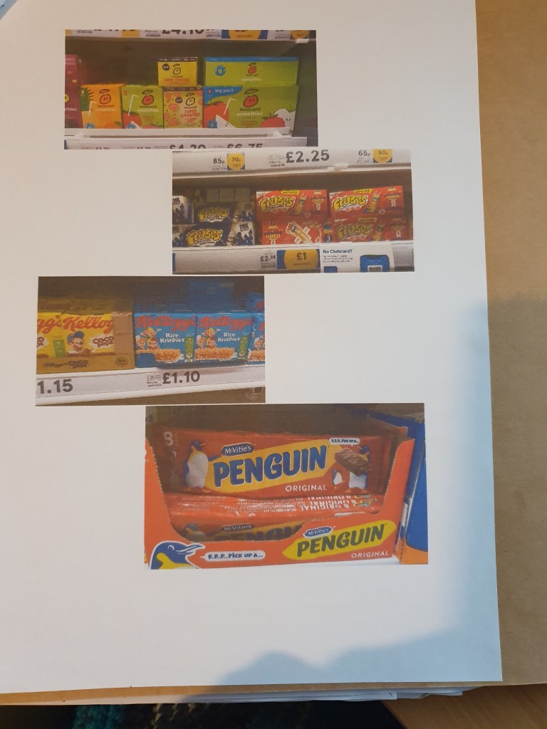
The next thing I had to do was take photos of packaging designed for kids. I was able to do this whilst at work. When doing so I tried to take photos of anyhthing that featured a character. As christmas stock has just come out this was easier as there was plenty to photograph. I also took some photos when I went to poundland of products I didn’t come across during my shift. Doing this I came across lots of bright colours and styles.
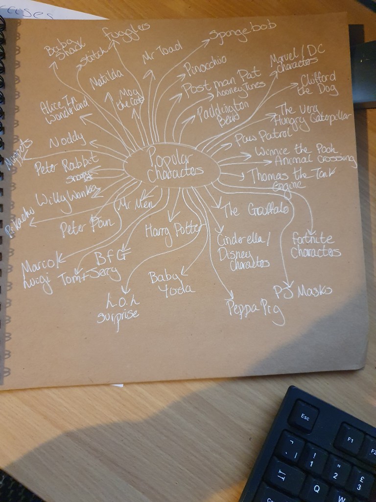
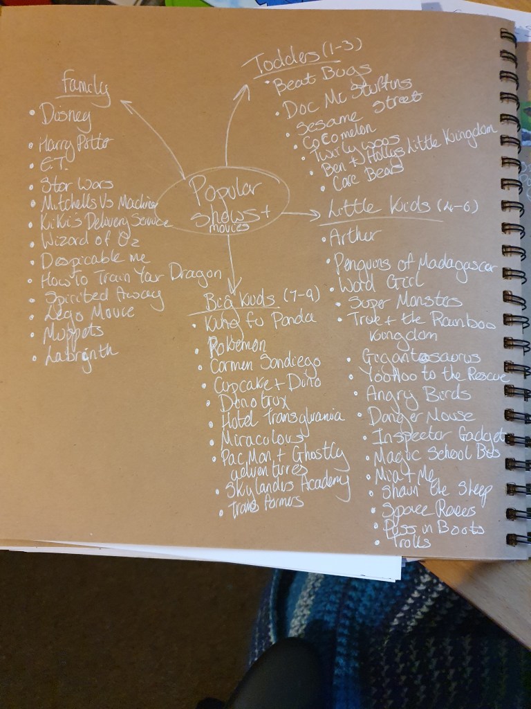
Before starting to design my character, I looked to see which characters are the most popular. Most of them id heard of before. I also added some that I know my nephews like. I did this to get an idea of style I should use.
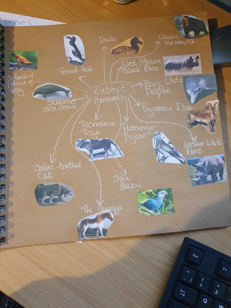
As the brief asks for the use of extinct animals so I felt that I should look some up. From this mind map I was able to decide of which animal I should use.
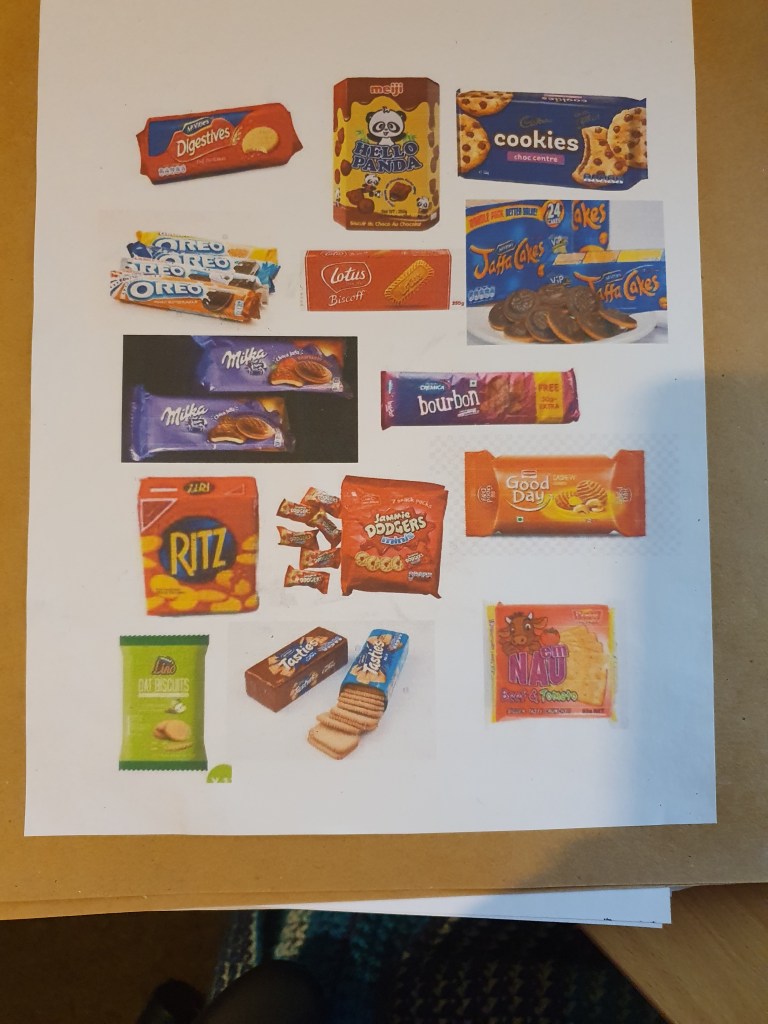
One last thing before doing any designing, I looked at designs specific to biscuit packaging.
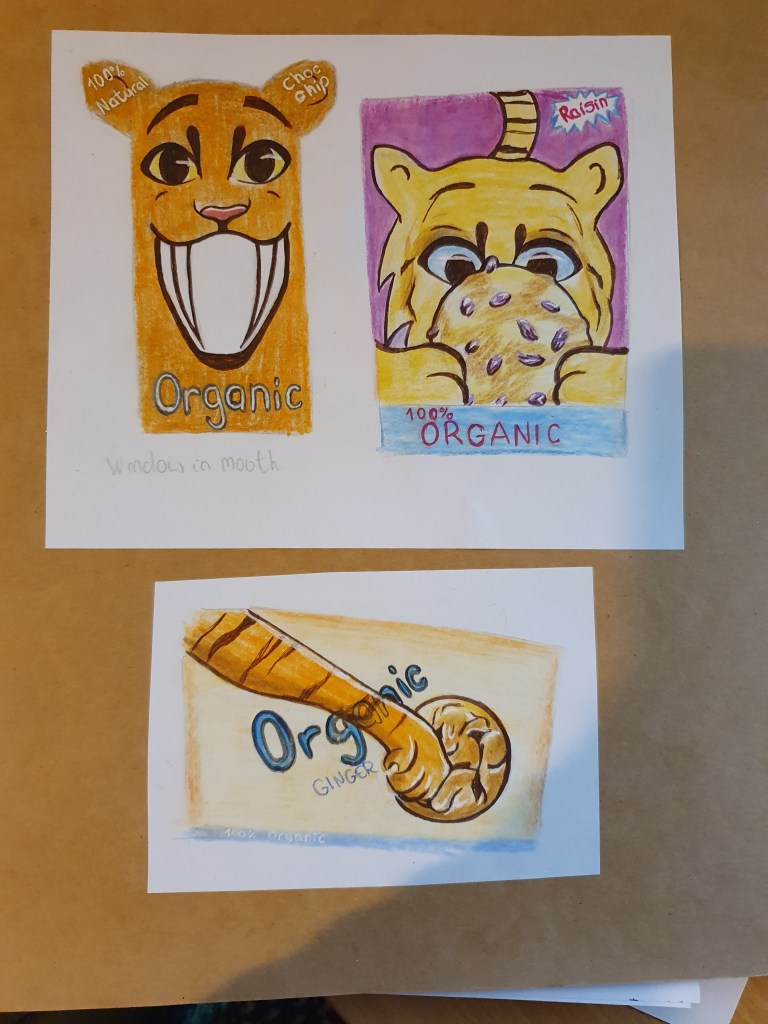
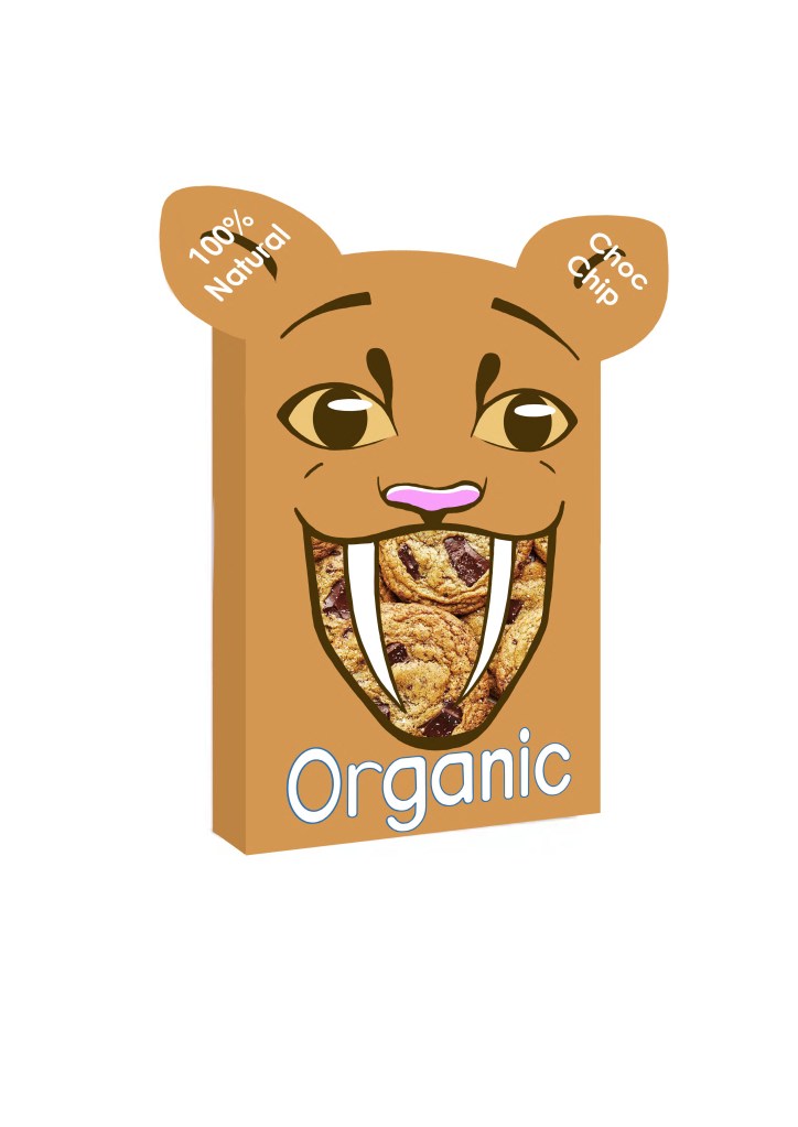
I decided to use the Sabre-Toothed Cat. This is because of my love for all cats. The first design is a smiling Sabre-Toothed Cat, the space in its mouth will be covered with plastic to make a window, displaying what’s inside. I chose to use orange instead of its natural brown as it is a brighter color that will attract kids to the product. The smiling face should promote positive impressions, hopefully encouraging children and parents to want to buy the product. I chose to use a simple style so as not to over stimulate the kids minds. The outline was done in brown for a softer effect and to reflect the color of chocolate chips, as asked for in the brief. The shape of the packet is meant to bring more of a fun feel and will hopefully be more attractive to kids. As the window will allow you to see what is inside, I didn’t feel that the flavor of the biscuits had to be front and center in the design. This is why I put this in the ear. I chose I softer, rounder font as I felt this would be less harsh and it is sans serif to keep it simple. I chose white as it fits with the color palette already used and blue as it is a calm color and contrasts greatly against the orange.
The second design shows the cat holding a raisin biscuit. It is looking at it longingly, hopefully making people want to buy it. The background is purple to reflect the flavor. I chose to make the cat yellow in this design as it pairs better against the purple. Because of this I had to change the color of the eyes, which is why they are blue. Big eyes are used to make it cuter. Once again it is outlined with brown, instead of black, for the softer, warmer feel. I used blue at the bottom to contrast the purple as the color has already been used in the design and it is calmer than any other color I could have used. I don’t feel that this one works too well as, since you can only see half the face, it is unclear what the animal is and I don’t think that the expression is too clear either.
For the last design I had trouble thinking of a position for the kitty. It is because of this that I chose to only use the paw. I have it reaching out to swipe the ginger biscuit, hoping making it look as though the cat wants to eat it. I reverted to orange as I feel that it is a more exciting color. I chose a yellow background to reflect the flavor of the biscuit. I didn’t feel that this was clear enough, however, so I placed the flavor in the center. I have the work organic passing behind the paw as I felt that this would make for a better image, making it just that little bit more fun. It is because of this that I have also put it at the bottom of the packet, so that it is clear to read.
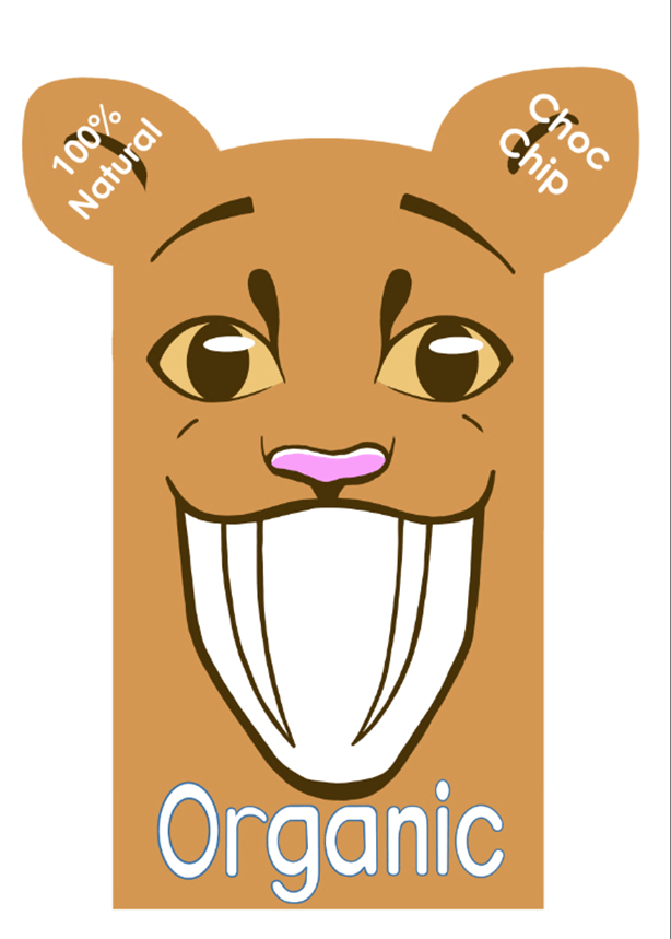
I chose the first design as I feel that it has the most promise. With its simplistic design and smiling face I feel that it could make an impression on the consumer. By displaying the cookies for people to see, I am hoping that it will encourage sales as you can see the delicious looking biscuits inside.
I’m not sure how well tis design would do if it was really used, maybe it’s a little too simple? However, I do think that it is cute and that its unique shape would draw attention.
Exercise Six: Working For Children
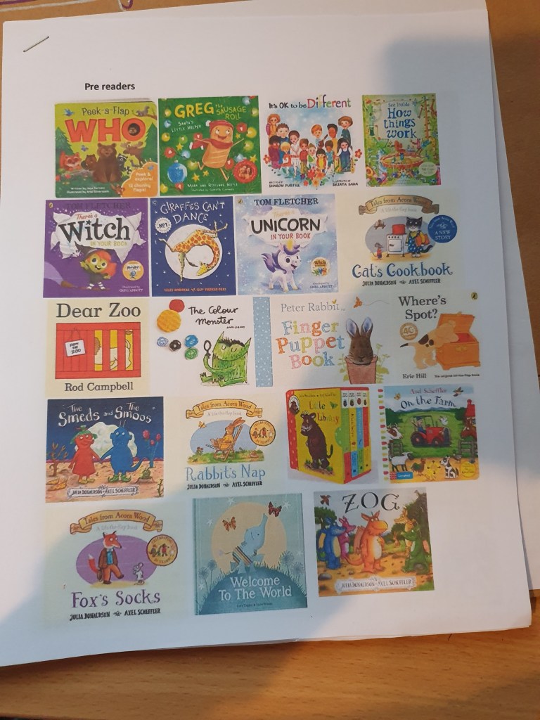
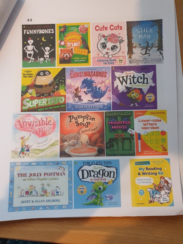
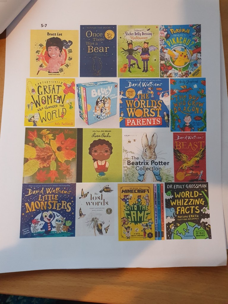
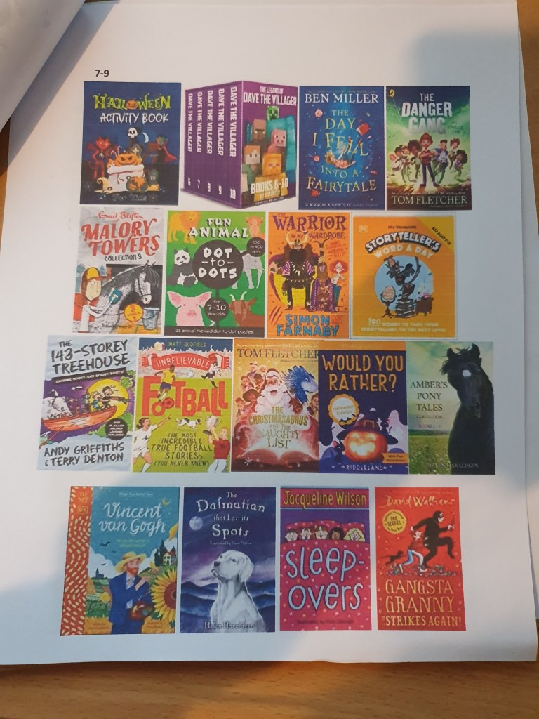
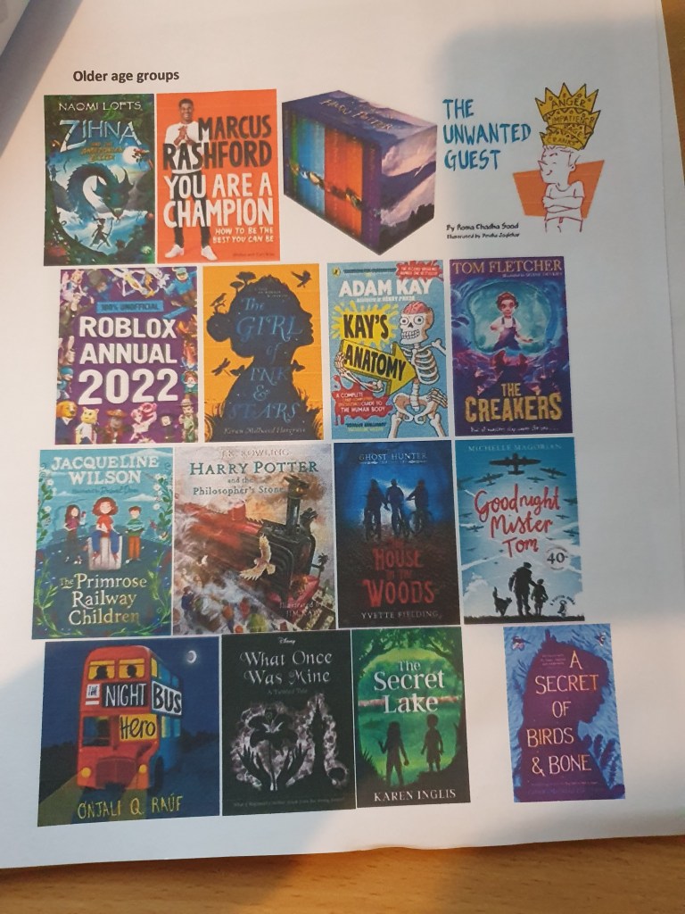
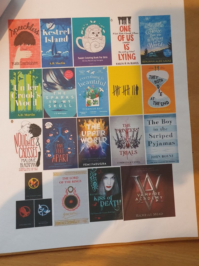
I started this exercise by collecting imagery made for children. I did this with children’s books. Each of these images was sorted into an age group: pre reader, 3-5, 5-7, 7-9 and older. Whilst doing this I found that a fair amount of them overlapped through the age groups.
Next, I had to brainstorm a word. The choices were: festival, scary, wild, growing, journey, sad, family and discovery. I chose the word scary as I felt I could do more with it.
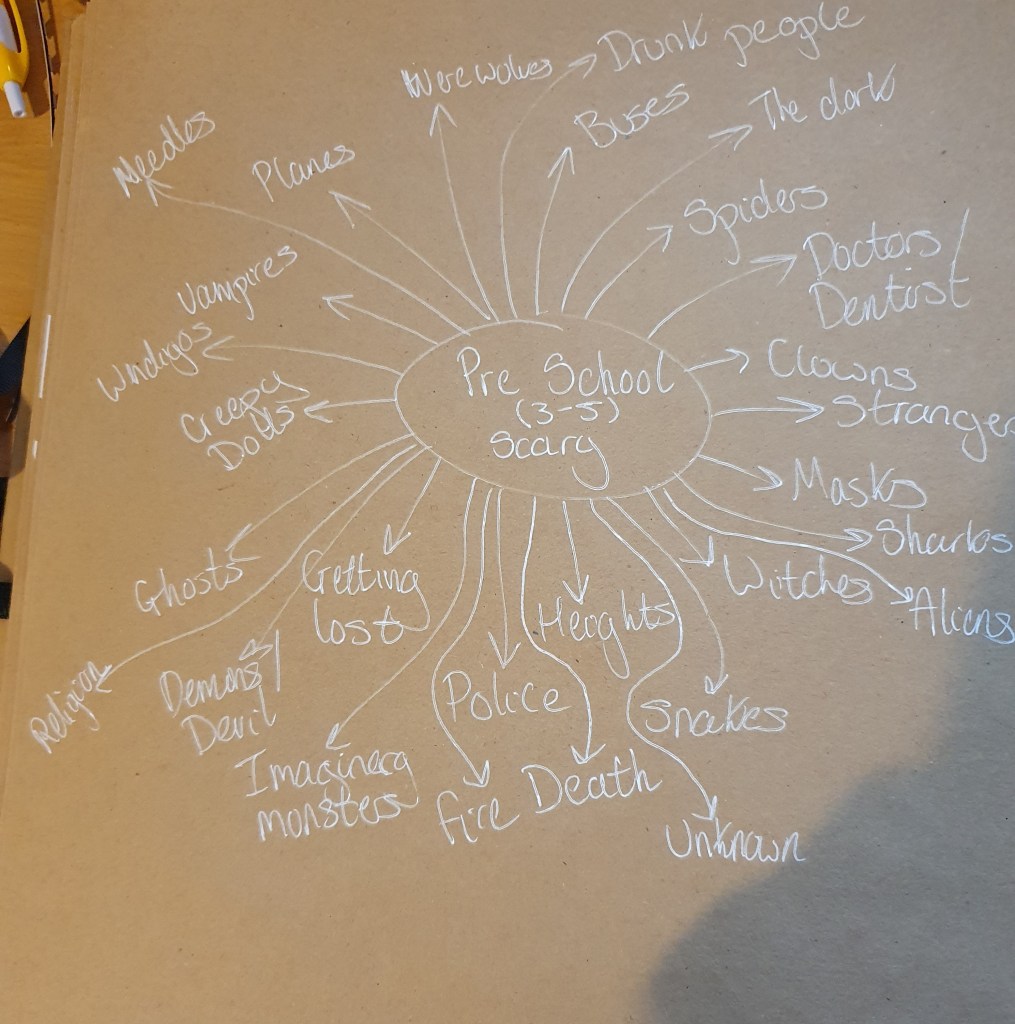
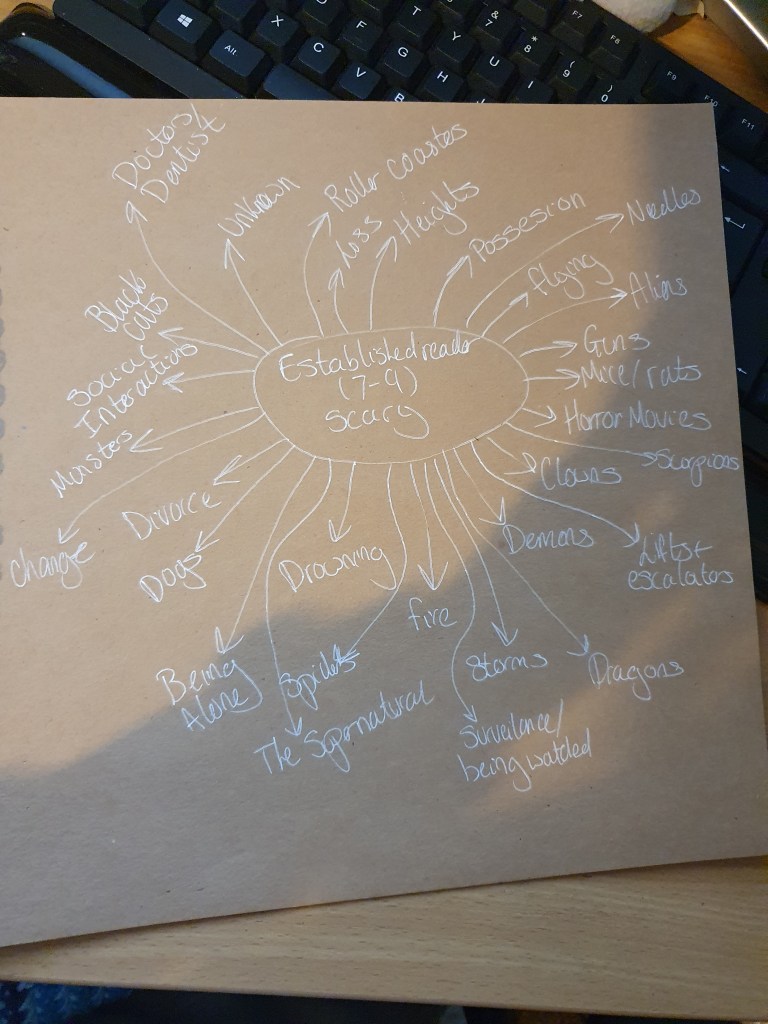
After this I had to pick an animal to use for each age group. I chose two age groups on opposite ends of the scale so that I could make two completely different illustrations.
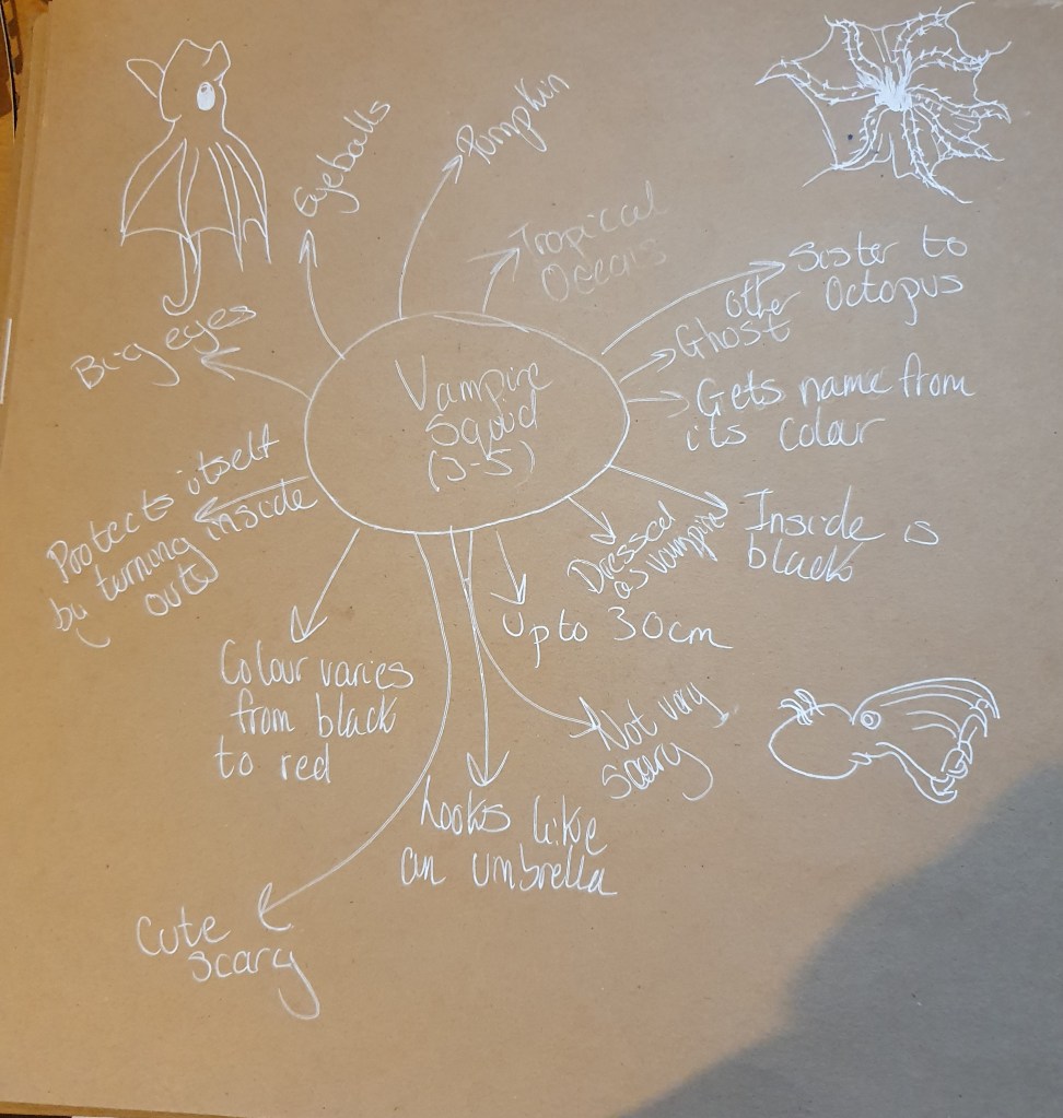
For the 3–5 year old’s I decided to use the Vampire Squid. I felt that this, though not usually seen as cute, could make a very cute cartoon. I decided that the image should be cute so as not to scare the young kids.
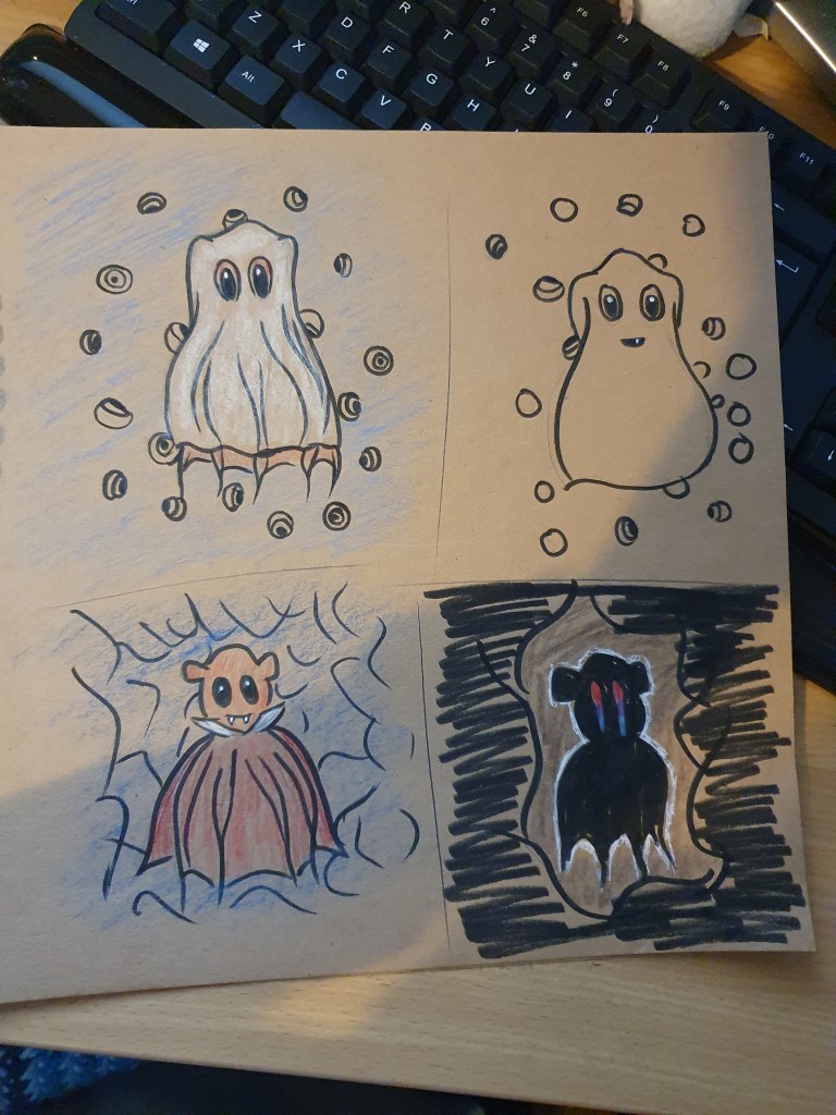
While trying to decide on my image I came up with a few ideas. The first was to have the Vampire Squid dressed as a ghost. I felt that a cuter, more playful take on scary would be best for this age. To make the image a little scarier there are eyeballs floating about. I wanted to keep the image simpler for the 3 – 5s so as not to over stimulate their minds.
The second is just there for me to decide whether more or less eyeballs would be best.
The third is a play on the squids name. I thought it would be cute to have it dressed as a vampire. It is placed in a cave as this seemed a more natural fit for a vampire.
The last one is meant to be dramatic, yet still simple. This time placed in the opening of the cave, the squid is backlit, causing a chiaroscuro in the lighting. I didn’t feel this would be the best idea for such young children as so much darkness just wouldn’t interest them.
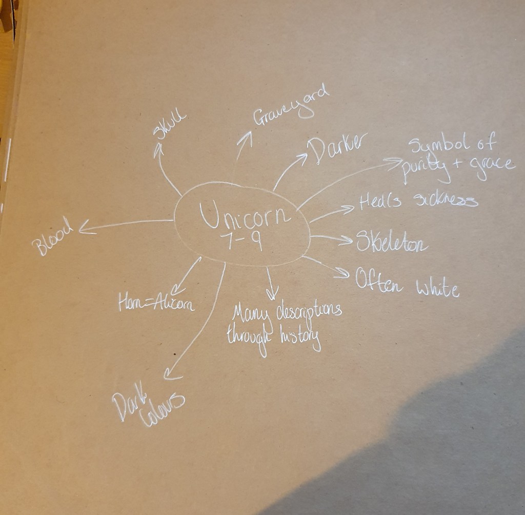
For the 7 – 9 year olds I chose a unicorn. I liked the idea of a scary unicorn as they are usually portrayed as pure, white, gentle creatures. I didn’t think that the reverse would be expected.
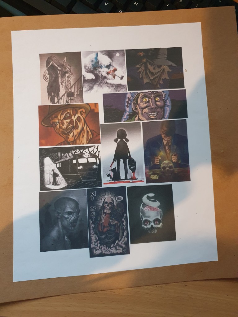
Before drawing anything, I felt the need to have a look at some scary images.
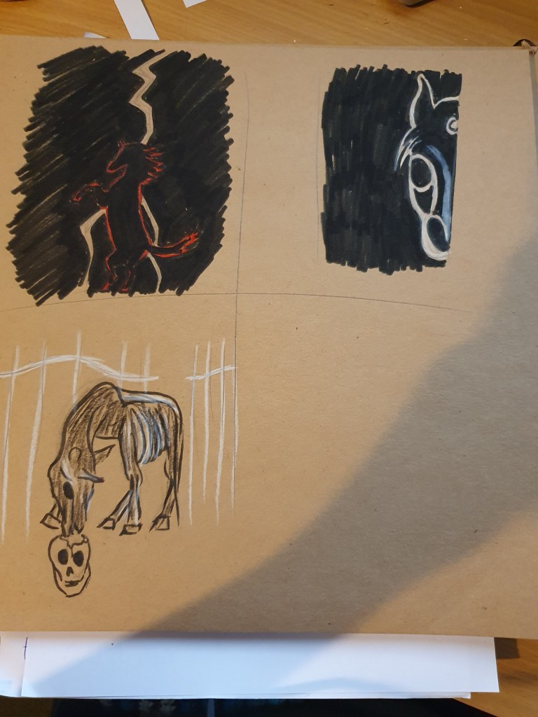
I decided that darker colours would work for this age group. I didn’t need to work about over stimulating little minds either.
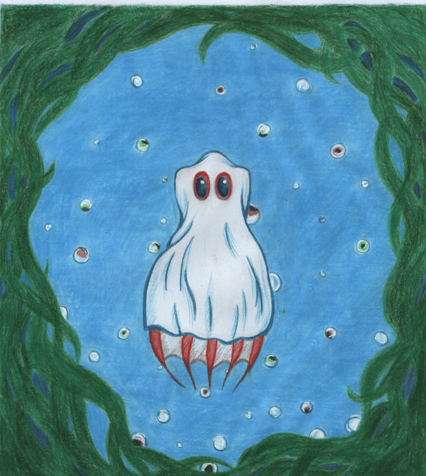
For the 3 – 5s I decided on the ghost. I used bright colours as that’s what draws the attention of young children. I kept a limited palette so as not to clog the image with colour. Pencil was used for a softer effect. Overall, I’m pleased with the final image. Though I’m not convinced I got the creases in the sheet right.
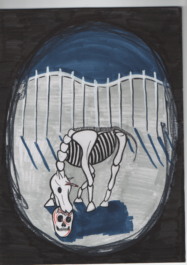
I meant for this picture to be scarier, however I didn’t manage to create the effect I was hoping for. I’m also not sure that I got the skeleton right. I used darker colours as it fits with the scary theme best. I wanted a skeletal unicorn as it feels darker than a regular one and I’m hoping it’ll seem scarier to the kids. Have him eating worms out of a skull and blood on the bone horn to suggest death and possible murder, hopefully making the image scarier.
It’s not easy to split children into different brackets as each child is at a different developmental stage. This is why I found such an overlap during the research. Generally, splitting them by their ages will work, as long as there’s some leeway in the ages. It’s the same with the text. The use of image and text together will change along with the developmental stages, as it becomes easier for children to understand.
I don’t think all children’s illustrations have to use bright colours. In general Id say using them is the best way to go with really young kids but as they get older and their understanding develops darker colours work just as well.
Exercise Seven: Educational Strip
I started this exercise by looking at examples of what’s already out there about puberty. I didn’t manage to find all that much but there must be more out there. What I did find is very formal and uninviting.
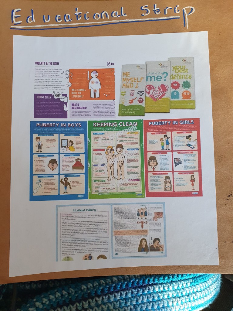
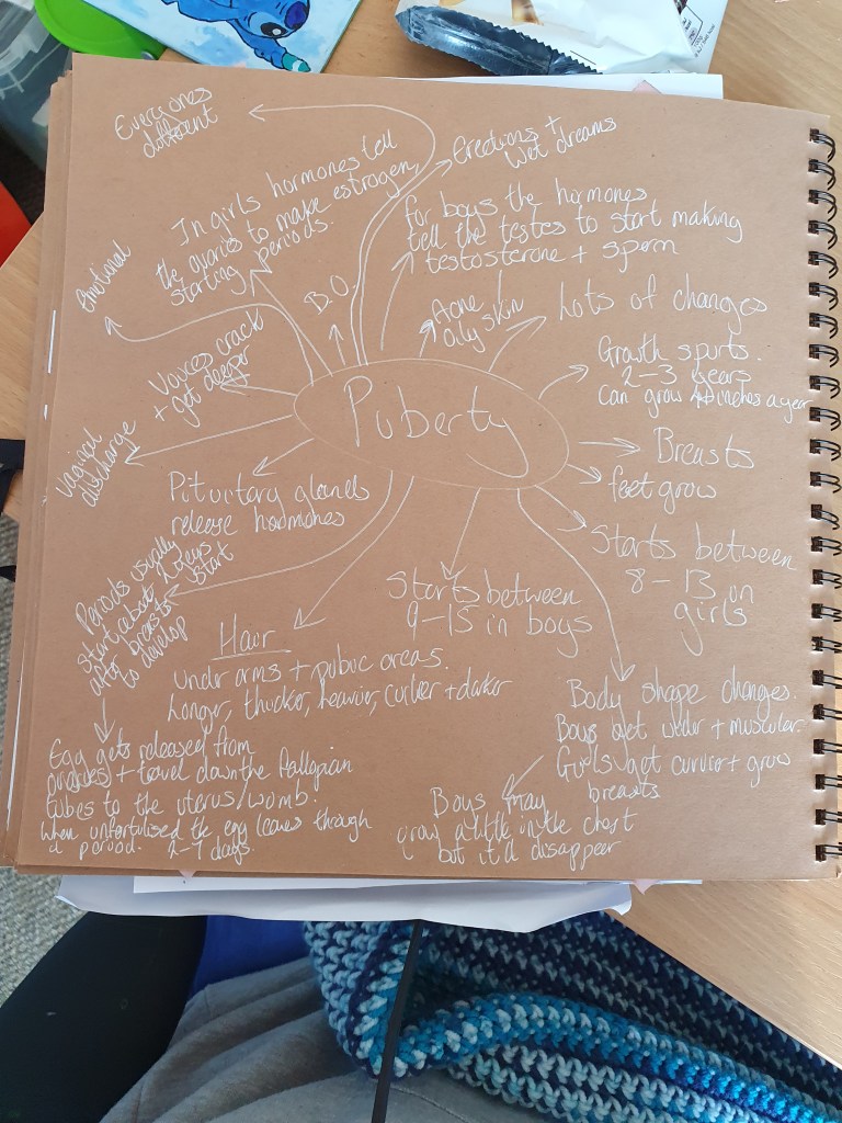
I then looked into puberty to make sure I got the main points and didn’t miss anything.
Whilst doing this I noticed that there was even less information aimed at atypical kids and thought that what I was able to find might seem a bit standoffish. I also didn’t think that what was there would be reassuring enough as puberty for these kids is a little different, the biggest issue being that at this age autistic kids are more vulnerable to mental health issues.
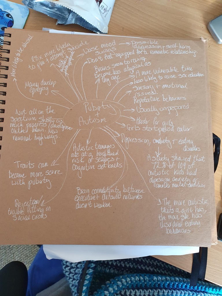
It’s because of this that I wanted to make something that will hopefully be more reassuring than what I found. This led to me looking into what puberty is like for autistic people of any age. I found that there are different changes to the brain than typical children. This isn’t what I wanted to focus on, however, as I didn’t think that it would be reassuring and since there is nothing that can be done about it, I decided to leave this information out of my strip.
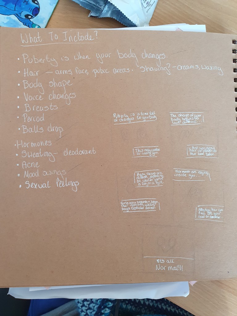
There was a lot of information that could have been included in the strip, however there was limited space. I decided to write down the main changes and choose the main points I wanted to make from there.
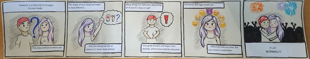
This is my final strip. I decided that keeping things simple would be the best approach. I chose an off-white paper as it is softer on the eyes, meaning it is easier for atypical kids to look at as they have sensitive senses. It also makes the information stand out with the white paper. The square shape is used as it seems less formal and less off putting. I also liked the idea of it being able to fit in a pocket when folded between the images.
I thought that a cartoon style would seem more approachable and better fits with the brief. It also segregates the illustrations, making it clearer to what pairs together. I originally wanted to move the speech bubbles around for each square but felt that this would be too disorganised for the atypical mind and didn’t want to mess with anyone’s OCD. This is why I tried to keep the boxes around the same size too.
To keep with the simple style, I left the clothes uncoloured. This is so that there isn’t too much for the mind to process, making it easier for the mind to retain the information. It also causes the coloured areas to draw the attention, bringing the focus to the important parts of the image. I used ink and pencil. I decided against drawing this digitally as I feel that it gives a harsher finish and wanted the finish in my strip to be softer and kinder on the eyes.
I omitted the use of a mouth as I feel that the simpler expression would be easier to understand and that the use of a mouth would over complicate things. The use of a clear expression in the eyes is all that’s needed to convey the emotion being projected. Autistic people often feel as though they don’t get heard or have a voice too, so I felt that this would be the perfect expression of this. I kept the rest of the figure simple, including the hands, as they’re not the focus of the images and drawing detailed hands seemed like it would ruin the style. I decided that the use of emojis would be a good way to show a range of emotions and printed them out as they would be more recognisable and clearer to the viewer than if I had drawn them. I used red and purple for the hair as they are unusual colours (or at least unnatural colours), fitting with how unusual atypical kids can feel.
I feel that the images are pretty clear as to what’s going on. Especially once the text has been read. I used Calibri as the font, instead of a more handwritten font, as it is clear and easy to read. I decided to cover the main points of puberty, instead of a specific area, as I wanted the strip to reassure the kids that everything, they are going through is normal.
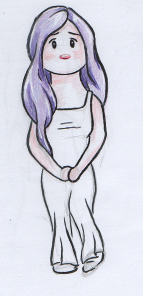
For the lone illustration I tried to use a pose that would look anxious, fitting with the theme.
I used both genders to appeal and reassure everyone who reads it. If I were to change anything it would be the figure of the girl as I think she looks a little too developed for her age.
Assignment Five: Seven Days
Thinking of something to do for this assignment felt daunting as I was basically given free reign, as long as it related to “seven days”. My first thought, as I’m sure it is for many people, was the seven days of creation. I decided that I wanted to tell some kind if story as this is what I like to do.
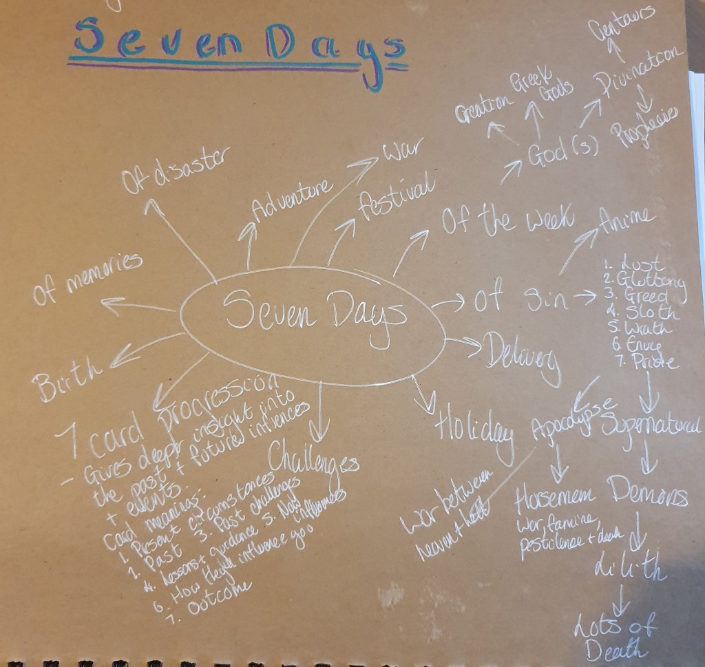
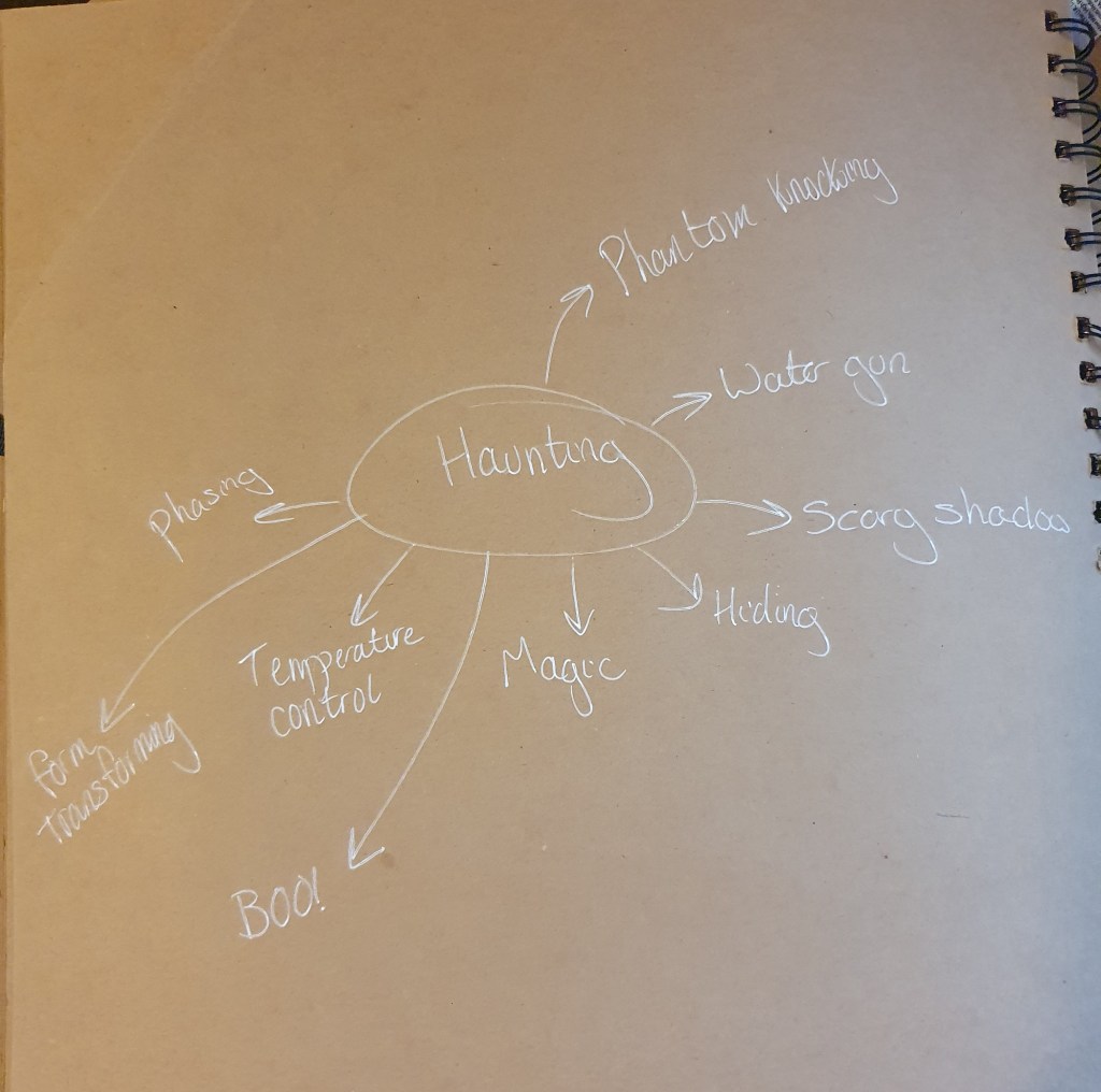
When thinking of what I could base this assignment on, I tried to think of everything possible, hoping to come up with a unique idea. Whilst doing this I decided that I would like to make some kind of strip. I did contemplate the idea of seven cards, possibly tarot themed as I like the supernatural, however I couldn’t come up with an idea I thought I could make work. After lots of contemplation I decided that “Seven Days of Learning to Haunt” could be a good theme. It would show a shy, unfriendly ghost slowly coming out if its shell to learn how to scare people. After many attempts, it finally manages to get a reaction, however small an accomplishment it may be.
It was at this point that I was faced with having to decide just how scary I wanted this to be. Having had trouble with this in a past exercise I decided that a lighter theme would be best as I’m not too good at the scary part, which of course, was a bit of problem with the idea I had in mind. Creating a cute story for little kids seemed to be a good solution to this.
When thinking of how to lay the images out I thought that a comic book layout would be more interesting to kids. This is why I looked at different page layouts.
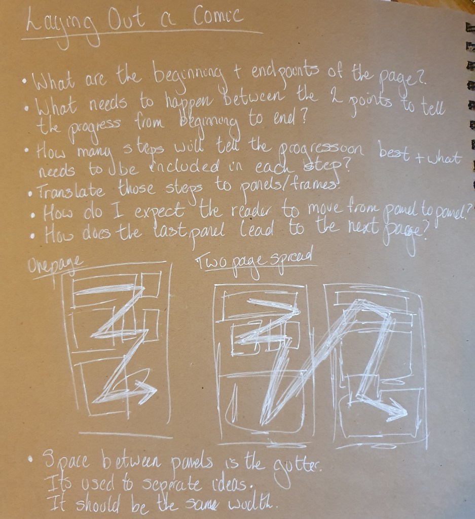
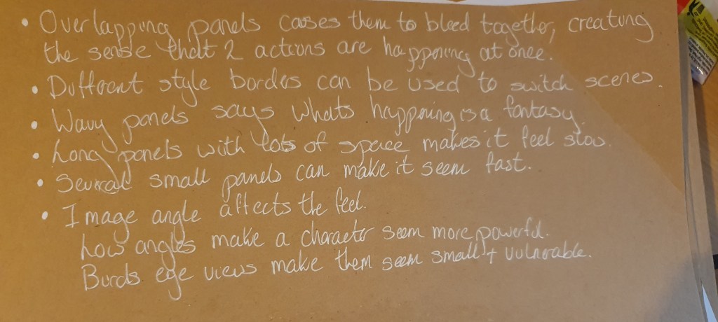
It’s because of this that I researched the mechanics of laying out a comic book. Some of the different transitions between images confused me a little. I kept confusing which one you can use when.
Next, I wrote my brief. This took a while as I’m not too good at creating my own briefs. Even now I’m not convinced it turned out well.
The brief
You have been asked to create a short comic strip for young children. The story is to be based around a not so scary ghost who wants to reach his potential as a world class haunter.
The story should show the progression the ghost makes as time goes by. He will have many failed attempts at scaring his target but the story should end with a successful scare. The ghost should be friendly looking so as not to scare the young kids.
The overall feel of the comic strip should be friendly and inviting, appealing to kids. Make sure to use colours that will appeal to the age group.
The final production size of this strip should be comfortable for children to hold. The recommended size is A5, 21 cm by 14.8 cm.
Now, having decided what I should do, I moved onto the details.
As you can see, I ran out of ideas. At this point I looked at some real life hauntings, though they seemed too scary. I then watched Casper Scare School and clips from the Casper tv series and Monsters University to get into a better mind set to draw for kids. I also tried to look into why Casper is such a success, however all I could find was on the Christina Ricci movie, which didn’t receive the best reviews on release.
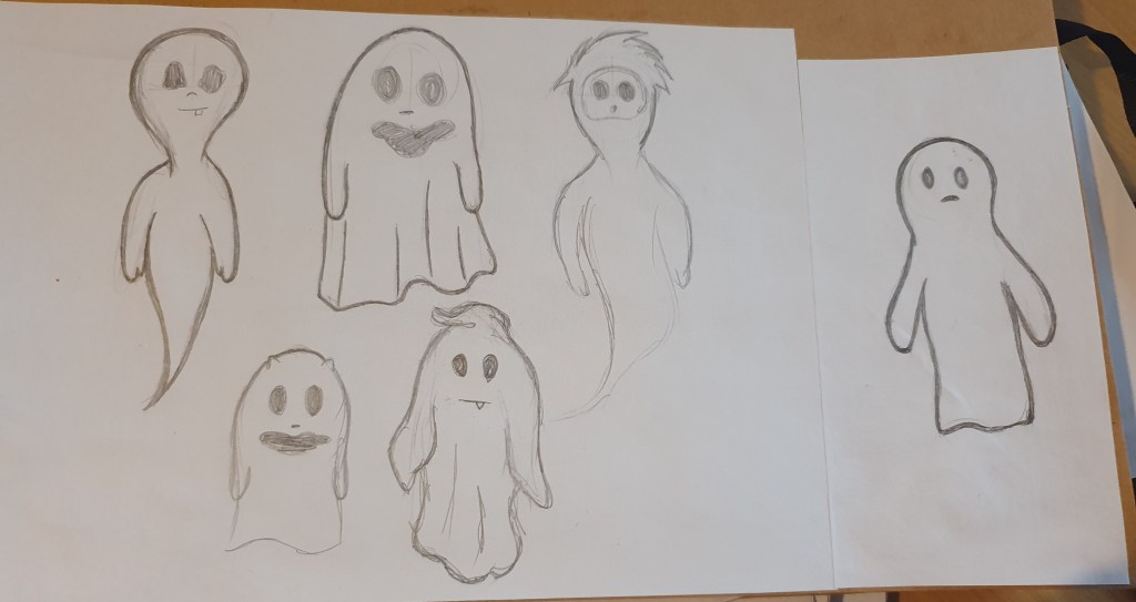
By this point, based on past research, I knew keeping things simple would be best and that using cliches would translate better. By basing my character on a recognizable image, it would be more recognizable to kids. I found that circular eyes would make a clearer expression for the ghost and adding anything slightly unhuman made the character look inhuman and unrecognizable. I felt that a free, more malleable form would best as it familiar yet allows for more interesting shapes and images.
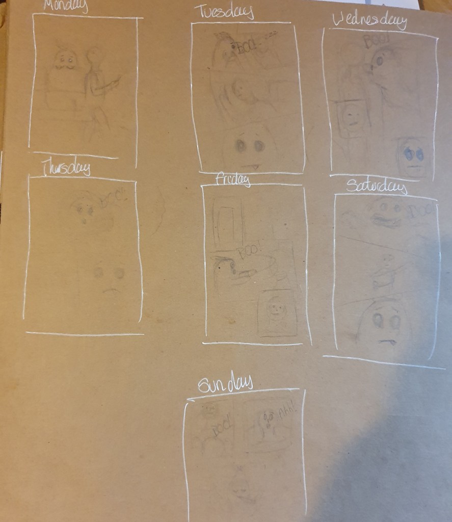
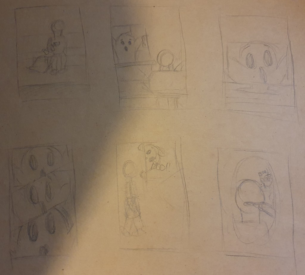
The next step was to plan my comic strip. Choosing the right actions and views was harder than I expected as keeping things simple made some of the options hard to do. I’m hoping that the transitions I used make sense. I tried not to use too many to be confusing.
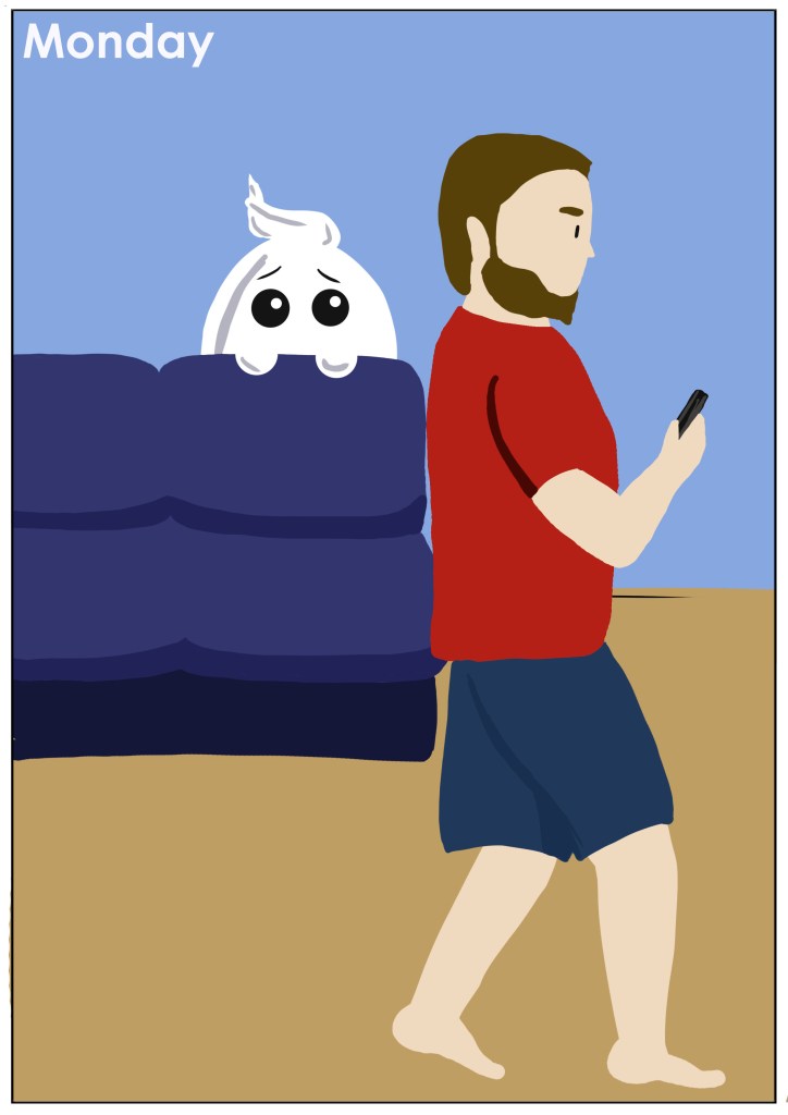
In the first image the ghost is too scared to try to scare so is silently watching, building its courage.
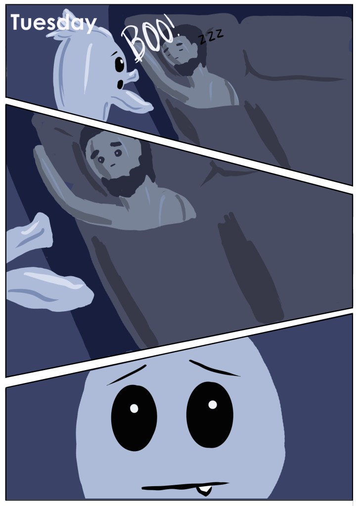
Tuesday’s image shows the ghost trying to scare the man while he sleeps, though it only manages to wake him up.
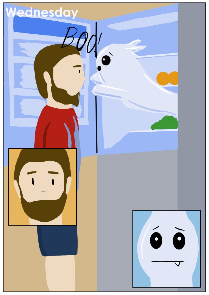
Wednesday’s image shows the ghost jumping out of the fridge to scare him.
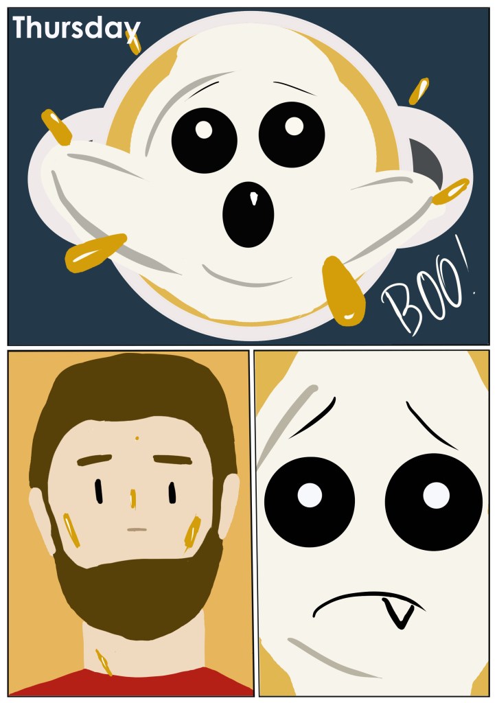
Thursdays shows the ghost in a saucepan while the food cooks.
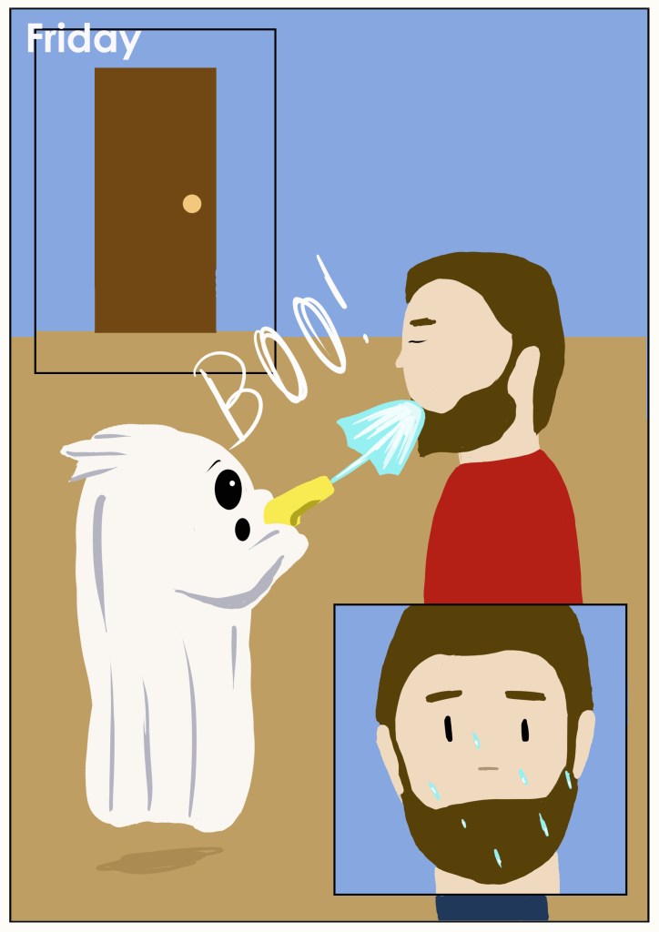
Fridays is a little more fun, squirting the man with a water gun as he walks through the door.
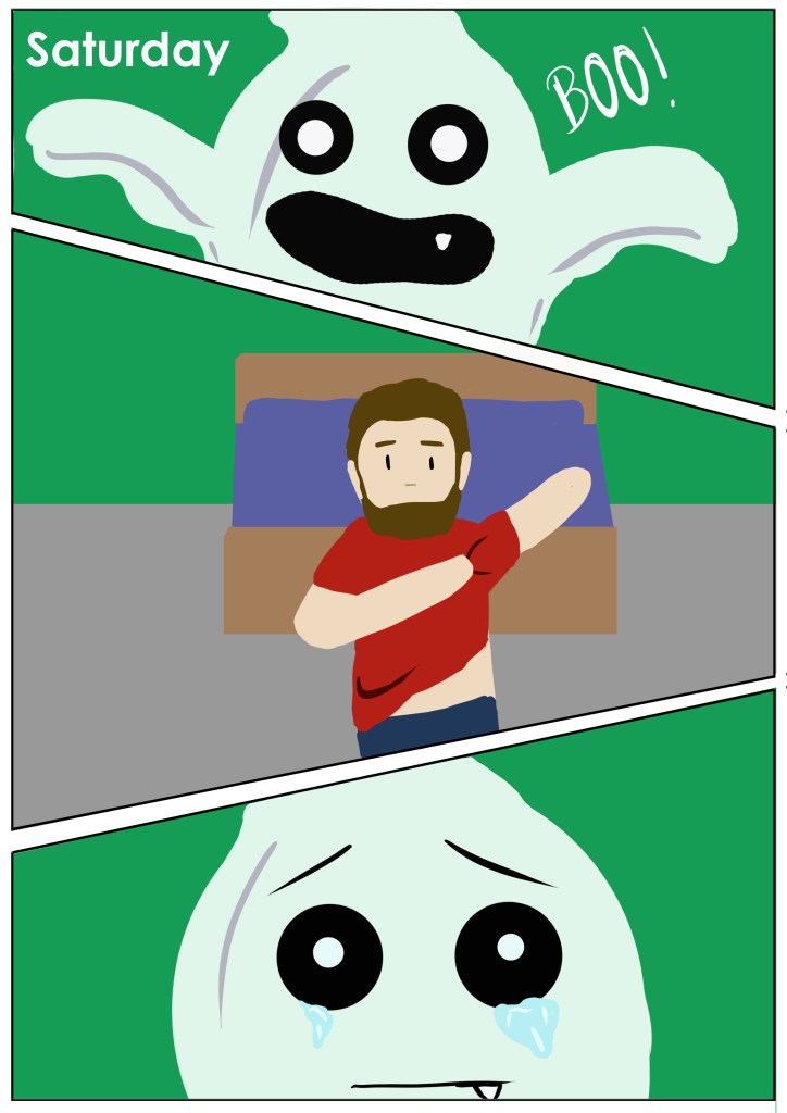
Saturdays shows the ghost walking in while the man is changing.
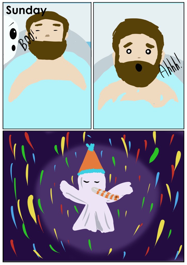
Sundays is the final, most successful scare, where the man gets scared by the ghost while he’s in the bath.
Hopefully all of this translates well.
Bright colours were used to be more attractive to kids. I tried to keep them as close to reality that I could while making them more fun. I didn’t want to outline the images as I felt it would be too cartoon like and this way just felt more organic. I used multiple frames to show the reactions, making it seem like the images flow. I also used zoom to add emotion to the piece. I found that zooming in on faces makes the emotion clearer and more intense. Using my own handwriting for the boos seemed to fit best as fonts seemed too harsh.
I think that this turned out well. I do think that the free, unsmoothed style is a little risky as it may look unfinished to some people, however I feel that it has worked well. I decided on this style as I feel that the children might relate better to an unrefined illustration, much like their own colouring. Looking at the images again, the borders could possibly do with being made thicker, so as to clearly define the boundaries. I tried to use the least amount of objects possible so as not to distract from the main action in the images. I used photoshop to draw these as the final effect is clearer and easier for smaller eyes to make out.
I’m thinking I should have done a bit more to prepare before creating my final images, however time was running out so I didn’t want to go over the top and then not be able to finish the illustration. I think that one of the most successful parts on this piece are the droplets flying from the saucepan as some of them look as though they are heading straight towards you, adding a sense of realism and interaction.
Edit:
Some ideas I forgot to include before. I liked the tv idea but didn’t think it would fit with the comic book theme. I feel that more would have been better but had trouble coming up with more ideas.
I do feel that these image communicate what was intended.
I did consider using text but I have never been good at doing so. I thought that the simpler approach worked better anyway.
I didn’t consider tracing any of my research examples because I didn’t want it to look exactly the same. I did think about laying them out on one page but to fit them I would have to change the layout of one of the images.
Bibliography
Editorial Illustration
Dictionary.cambridge.org. Publish date unknown. [online] Available at: <https://www.dictionary.cambridge.org/amp/English/squeaky-bum-time>
Design.tutplus.com. Publish date unknown. [online] Available at: <https://www.design.tutsplus.com/tutorials/what-is-editorial-illustration-how-to-get-into-it-cms-35776>
Domestika. 2021. What is an Editorial Illustrator and What Skills do I Need to Become One? | Blog | Domestika. [online] Available at: <https://www.domestika.org/en/blog/6834-what-is-an-editorial-illustrator-and-what-skills-do-i-need-to-become-one>
Hand Luggage Only. 2022. 14 Fantastic Secret Spots You Have To See In Paris. [online] Available at: <https://handluggageonly.co.uk/2016/01/02/14-secret-spots-you-must-see-while-in-paris/>
Paris, W., 2021. Paris is Always a Good Idea: 10 Reasons to Visit Paris | World In Paris. [online] World In Paris. Available at: <https://www.worldinparis.com/paris-is-always-a-good-idea>
Parisinsidersguide.com. Publish date unknown. 10 Historical Secrets Of Paris | Paris Insiders Guide. [online] Available at: <https://www.parisinsidersguide.com/secret-paris.html>
Thrillist. 2015. 12 Paris Secrets You Had No Idea Existed. [online] Available at: <https://www.google.com/amp/s/www.thrillist.com/amphtml/entertainment/paris/paris-secrets-you-had-no-idea-existed>
Time Out Paris. 2016. The best ‘speakeasies’ in Paris | Bars & pubs | Time Out Paris. [online] Available at: <https://www.timeout.com/paris/en/bars-and-pubs/the-best-speakeasies-in-paris>
solosophie. 2021. These Pretty Paris Streets Are Unreal: 15 Roads in Paris You Must Visit!. [online] Available at: <https://www.solosophie.com/must-see-pretty-paris-streets/>
Youtube.com. Topjaw. 2019. [online] Available at: <https://www.youtube.com/watch?v=_oZC_XQmz8Y>
Youtube.com. Hungry Passport. 2020. [online] Available at: <https://www.youtube.com/watch?v=mmCUu5xKBOs>
Youtube.com. Elena Taber. 2018. [online] Available at: <https://www.youtube.com/watch?v=tKXrpRrj7Ow>
Youtube.com. Wolters World. 2018. [online] Available at: <https://www.youtube.com/watch?v=oYSTtOtaYNs>
Youtube.com. Dreamy Travel Story. 2019. [online] Available at: <https://www.youtube.com/watch?v=zAL7y2xzxCY>
GoNOMAD Travel. Publish date unknown. Hidden Gardens Of Paris. [online] Available at: <https://www.gonomad.com/3452-hidden-gardens-of-paris>
Travel + Leisure. 2021. Why Paris Is Still the Best Place in the World to Go to the Movies. [online] Available at: <https://www.travelandleisure.com/trip-ideas/city-vacations/paris-movie-theaters>
Medium. 2016. 25 Editorial Illustrators We Love. [online] Available at: <https://medium.com/@modernthrive/25-editorial-illustrators-we-love-eeb7eb1368fc>
Anna Goodson Illustration Agency. Publish date unknown. Editorial Illustrators | Anna Goodson Illustration Agency. [online] Available at: <https://www.agoodson.com/styles/editorial-illustrators/>
Travel Guides
En.wikipedia.org. 2021. Istanbul – Wikipedia. [online] Available at: <https://en.wikipedia.org/wiki/Istanbul>
Tripadvisor.co.uk. Publish date unknown. Explore Istanbul [online] Available at: <https://www.tripadvisor.co.uk/Tourism-g293974-Istanbul-Vacations.html>
Planetware.com. 2021. 22 Top-Rated Tourist Attractions & Things to Do in Istanbul | PlanetWare. [online] Available at: <https://www.planetware.com/tourist-attractions-/istanbul-tr-is-i.htm>
World Tour & Travel Guide, Get Travel Tips, Information, Discover Travel Destination | Adequate Travel. 2020. Discover What Istanbul is Best Known for | Why Istanbul is Famous. [online] Available at: <https://www.adequatetravel.com/blog/discover-what-istanbul-is-best-known-for/>
Turkey, E. and Istanbul, E., Publish date unknown. İstanbul Traditions | Erasmus experience Istanbul. [online] Erasmusu.com. Available at: <https://erasmusu.com/en/erasmus-istanbul/erasmus-experiences/istanbul-traditions-937823>
En.wikipedia.org. 2021. Galata Tower – Wikipedia. [online] Available at: <https://en.wikipedia.org/wiki/Galata_Tower>
Travel Tips from Real Locals – Like A Local Guide. 2018. 10 Famous Symbols of Istanbul. [online] Available at: <https://www.likealocalguide.com/blog/10-famous-symbols-of-istanbul/>
En.wikipedia.org. 2021. Helsinki – Wikipedia. [online] Available at: <https://en.wikipedia.org/wiki/Helsinki>
VisitFinland.com. Publish date unknown. Top places to visit around Helsinki — VisitFinland.com. [online] Available at: <https://www.visitfinland.com/article/top-places-to-visit-around-helsinki/#d17eb565>
Theculturetrip.com. Publish date unknown. 8 Quirky Finnish Cultural Customs You Should Know. [online] Available at: <https://theculturetrip.com/europe/finland/articles/8-quirky-finnish-cultural-customs-you-should-know/>
hotels.com. Publish date unknown. 11 Best Things to Do in Helsinki. [online] Available at: <https://uk.hotels.com/go/finland/things-to-do-helsinki>
En.wikipedia.org. 2021. Milan – Wikipedia. [online] Available at: <https://en.wikipedia.org/wiki/Milan>
Lonelyplanet.com. Publish date unknown. Milan travel. [online] Lonely Planet. Available at: <https://www.lonelyplanet.com/italy/milan>
Introducingmilan.com. Publish date unkown. Milan – Milan Travel Guide – Introducing Milan. [online] Available at: <https://www.introducingmilan.com/>
Artale, A., 2020. Travel Guide Cover Design Case Study: DK Eyewitness Travel. [online] Birds of a Feather. Available at: <https://www.birdsofafeatherpress.com/dk-eyewitness-travel/>
Text and Image
99designs. 2020. Color Meanings and the Art of Using Color Symbolism. [online] Available at: <https://99designs.co.uk/blog/tips/color-meanings/>
Changingminds.org. Publish date unknown. The Meaning of Colors. [online] Available at: <https://changingminds.org/disciplines/communication/color_effect.htm>
Australian Traveller. 2021. A Guide to 30 of Australia’s Iconic Big Things. [online] Available at: <https://www.australiantraveller.com/nsw/a-guide-to-australias-most-iconic-big-things/>
Reader’s Digest Canada. 2019. The World’s Biggest Things. [online] Available at: <https://www.readersdigest.ca/travel/world/worlds-biggest-things/>
Artists Network. Publish date unknown. 3 Things a Painting Can’t Live Without. [online] Available at: <https://www.artistsnetwork.com/art-techniques/3-things-a-painting-cant-live-without/>
Packaging
99designs. 2018. Designing for kids: 3 ways to make children love your product. [online] Available at: <https://99designs.co.uk/blog/logo-branding/designing-for-kids/>
SmashBrand. 2019. Packaging Design for Kids – SmashBrand – Package Design and Branding Agency. [online] Available at: <https://www.smashbrand.com/articles/packaging-design-for-kids/>
The Unique Group. 2018. 4 Tips for Creating Packaging for Kids. [online] Available at: <https://theuniquegroup.com/tips-packaging-for-kids/>
Jenn David Design. 2017. Designing Food Packaging for Kids: 6 Things to Know | Jenn David Design. [online] Available at: <https://jenndavid.com/designing-food-packaging-kids-6-things-know/>
bakeryandsnacks.com. 2013. Little consumers have big impact on food packaging. [online] Available at: <https://www.bakeryandsnacks.com/Article/2013/12/09/Packaging-for-kids-foods-requires-intelligent-design>
Children’s Health Orange County. Publish date unknown. Child Development: Milestones, Ages and Stages – Children’s Health Orange County. [online] Available at: <https://www.choc.org/primary-care/ages-stages/>
Thomason, T., 2021. 20 Best-Loved Children’s Book Characters. [online] Spaceships and Laser Beams. Available at: <https://spaceshipsandlaserbeams.com/20-best-loved-childrens-book-characters/>
Group, C., 2021. The most popular cartoon characters 2021. [online] Blog.cerdagroup.com. Available at: <https://blog.cerdagroup.com/en/top-popular-cartoon-characters>
Ranker. 2021. The Best New Family & Kids Shows Of 2021. [online] Available at: <https://www.ranker.com/list/best-family-kids-shows-2021/molly-gander>
Planet DISH |. Publish date unknown. Best Kids’ TV Shows 2022 | Popular Family & Kids’ Shows Guide. [online] Available at: <https://planetdish.com/best-kids-tv-shows/>
Commonsensemedia.org. Publish date unknown. [online] Available at: <https://www.commonsensemedia.org/lists/best-kids-tv-shows-on-netflix>
Time Out Worldwide. 2021. 50 Best Family Movies to Watch With Your Kids. [online] Available at: <https://www.timeout.com/new-york-kids/things-to-do/films-for-families-the-top-50-movies-to-watch-as-a-family>
OneKindPlanet. Publish date unknown. 10 Animals That Are Now Extinct | OneKindPlanet. [online] Available at: <https://onekindplanet.org/top-10/top-10-worlds-extinct-animals/>
SafarisAfricana. Publish date unknown. Recently Extinct Animals: List Of Extinct Species 2021. [online] Available at: <https://safarisafricana.com/recently-extinct-animals/>
Working for children
En.wikipedia.org. 2021. Vampire squid – Wikipedia. [online] Available at: <https://en.wikipedia.org/wiki/Vampire_squid>
En.wikipedia.org. 2021. Unicorn – Wikipedia. [online] Available at: <https://en.wikipedia.org/wiki/Unicorn>
Educational Strip
Kidshealth.org. 2015. All About Puberty (for Kids) – Nemours KidsHealth. [online] Available at: <https://kidshealth.org/en/kids/puberty.html>
Spectrum | Autism Research News. 2021. Puberty and autism: An unexplored transition | Spectrum | Autism Research News. [online] Available at: <https://www.spectrumnews.org/features/deep-dive/puberty-and-autism-an-unexplored-transition/>
Autism Speaks. 2018. Autism in Teens: Helping Your Child Through Puberty | Autism Speaks. [online] Available at: <https://www.autismspeaks.org/expert-opinion/autism-teens-helping-your-child-through-puberty>
Raising Children Network. 2021. Preparing for puberty: autistic children and teenagers. [online] Available at: <https://raisingchildren.net.au/autism/development/physical-development/preparing-for-puberty-asd>
The Autism Community in Action (TACA). Publish date unknown. Puberty in Autism. [online] Available at: <https://tacanow.org/family-resources/puberty/>
Seven Days
Clipstudio. Publish date unknown. How to Layout Your Comic! Panels, Gutters, and Page Flow. [online] Available at: <https://www.clipstudio.net/how-to-draw/archives/160963>
Berntsson, S., 2015. Create a Comic: How to Plan and Lay Out Your Comic. [online] Design & Illustration Envato Tuts+. Available at: <https://design.tutsplus.com/tutorials/create-a-comic-how-to-plan-and-lay-out-your-comic–cms-24179>
National Trust. Publish date unknown. Haunted by a friendly spirit who loves children. [online] Available at: <https://www.nationaltrust.org.uk/features/haunted-by-a-friendly-spirit-who-loves-children>
Marie Curie. 2020. Friendly ghosts: Japanese attitudes to death and memorialisation. [online] Available at: <https://www.mariecurie.org.uk/talkabout/articles/friendly-ghosts-japanese-attitudes-to-death-and-memorialisation/283591>
Casper the Friendly Ghost Wiki. Publish date unknown. Casper the Friendly Ghost. [online] Available at: <https://casper.fandom.com/wiki/Casper_the_Friendly_Ghost#History>
GIANT FREAKIN ROBOT. 2021. Casper Turns 25: Why Critics Hated It And Why It’s Now A Childhood Classic. [online] Available at: <https://www.giantfreakinrobot.com/ent/casper.html>
Slashfilm. 2020. 25 Years After It Hit Theatres, ‘Casper’ Remains A Melancholy Technical Marvel. [online] Available at: <https://www.slashfilm.com/574368/25-years-laster-casper-remains-a-melancholy-technical-marvel/>
Narik Chase. 2016. Ghost Powers and Abilities in Fiction. [online] Available at: <https://narikchase.com/index.php/2016/10/07/list-of-ghost-powers-and-abilities-in-fiction/>
