Exercise One: Identifying Tools and Materials
For this exercise I decided to look at artists who use markers for their work. I thought that this would be a good idea as I had just bought my own set of alcohol markers, though I didn’t limit the search to purely alcohol markers.
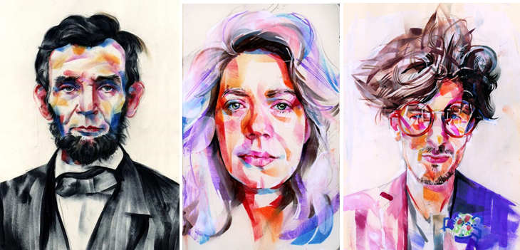
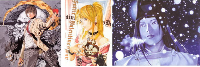
When cataloguing the artists I found, I started with Tom Deslongchamp, Elena Mortirno and Stephen Gardner.
Tom Deslongchamp:
Elena Mortirno:
Stephen Gardner:
These 3 artists all work in a similar, rushed way with varying degrees of texture. Tom Deslongchamp manages to achieve a high amount of roughness by using dried out markers in his pieces.
Edit:
The rough texture is caused by the dried out markers and many short strokes. Tom’s images have a loose, free style, creating a strict, yet messy look. The marks in the face seem more contained, contrasting the hair. I like this as it creates an interesting image and take on portraits. He seems to have had to push fairly hard because of the dryness of the marker, creating dense, vibrant marks.
Next I looked at instagram artist Znk Art (Tim)
And Vincer Okerman
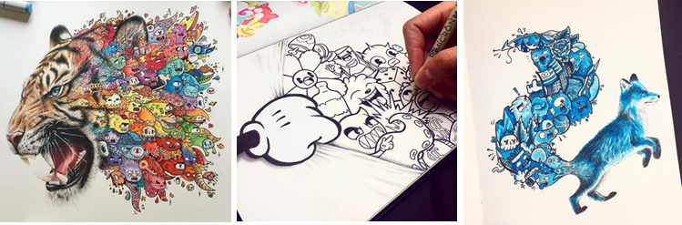
Who both use markers and pencils to create ultra pigmented pieces. They both have a tendency to use a white background to exaggerate this effect.
Next I looked at Tino Valentin
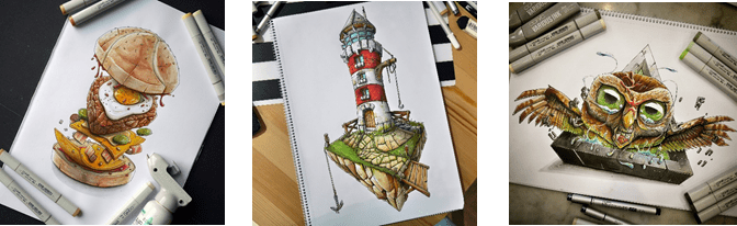
Lisa Krasnova
Stephen Wards
Each of these artist seem highly concerned with creating a smooth, popping effect in their work.
Edit:
Stephen Ward’s work is done with traditional materials, though with his skill it can be hard to tell.
I then began to look at Chichiro Howe
And Sibilline Meynet
I placed these 2 together as they create a clean, almost digital effect in their work. Whereas both use markers, Sibilline also likes to use water colours.
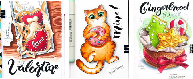
Last of all I looked at Takeshi Obata
And Tyler Goodrum
I found similarities here as both artists seem to like to add a darkness to their work. Each of the subjects seem to have a sadness in them.
Categorising these artists was hard as I could see similarities between lots of the pieces. An example of this is the way that Stephen Gardner and Znk Art use colour and the way that Lisa Krasnova and is able to blend colour. Vince Okerman and Tino Valentin are also both really good at creating a 3d effect that pops of the page.
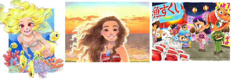
I had trouble choosing between these three images for which would be my favourite as I love them all for different reasons. The colour and serene landscape in the first, the softness of the portrait in the second and the beautiful colours and distortion to create a frame in the third are what appeals to me.
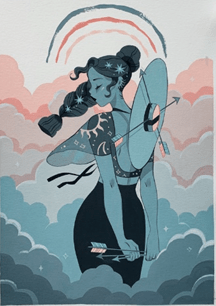
Eventually I decided on this one by Sibilline Meynet. I believe the biggest draw for my favour in this image would be the use of portrait as this is what I enjoy to draw the most. The colours are also enticing as they inspire a feeling of calm, furthered by the simplicity of the image. The limited and muted pallette, along with the simple background brings a uniqueness to this piece. The muted pallette and lack of bright colour makes it easy on the eyes. I like the way that the woman seems to appear from the clouds as it makes her seem as though she could have even been made from them and it adds a depth to image. I think that this image is beautiful in its simple serenity and the stars in the hair add just the right amount of sparkle. Metaphor has been added to the picture through the addition of the arrows. Having them attatched to the hat makes it look like a compass and the one in the hand seems to be showing her the way. Having some cloud at the forefront of the image helps interwine all the compenents and tie the image together. I believe the idea behind this image may be along the lines of following your dreams.
After doing this I had to redraw 2 previous pieces in the style of these artists. For the first piece I decided to redraw my pumpkin in a similar style of Sibilline Meynet.
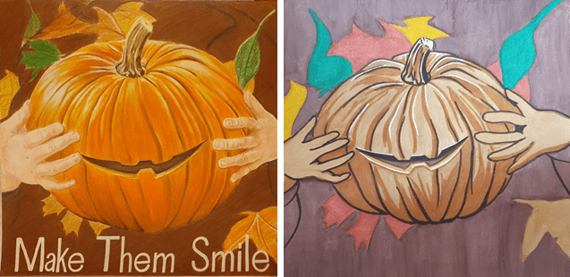
I like how this turned out but don’t feel that it fully fits with Sibilline’s style. I think that less saturated colours would have been a better fit for this piece. I found that using watercolour was harder than I expected as I don’t use it very often and that I layered it on thicker than it should have been. Not being used to using medium I had trouble controlling it and found it hard to get an even wash of colour. Using the markers for definition and shading was easier but I ended up using the wrong one too outline the hands, which left them too thick and odd looking.
For my second picture I decided to redo the woman I drew for the first assignment.
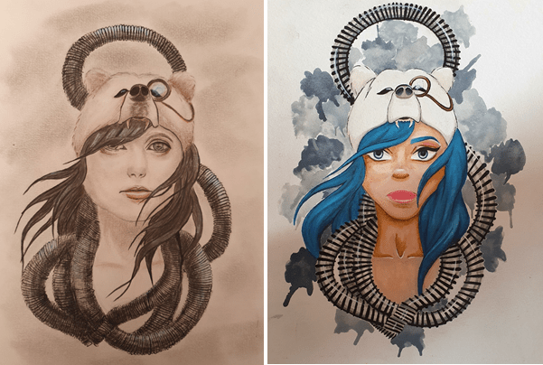
I like my second attempt at this drawing a lot better. I feel that the colours and the proportions are a better fit for the image, although the eyes are a little too big. For this piece I used more markers than I did in the pumpkin, I found that it helped even out any uneven paint. The area with most marker on is the hair. I like the way that the blues have blended together for a smooth look. Once again I had trouble with the watercolour, laying it on too thick and accidently rubbing some of the paper off. I did try to use a more muted palette, to fit with Sibilline’s style but had just as much trouble with it as the first time. Watercolour definitely isn’t my strong suit. Having tested out both watercolour pans and tubes I have found that I prefer the tubes better as they make it easier to mix colours, though I do like the portability of pans and water brushes better. I couldn’t resist adding some white ink to highlight some areas. I think the part I am most pleased with in this image is the hair and the bear hat.
I enjoyed working with both watercolours and markers as I think that they work well together. I decided to change the colours in this image as I felt it would create a more human and well rounded feel. They might be more vibrant than I intended for this exercise but as an image on its own I believe it has a better effect. I feel that the punchier colours add a sense of life that others wouldn’t have.
Edit:
I like to use traditional media a lot in my work. I seem to find using them easier, and sometimes more enjoyable, than digital work. I do, however, want to get better at using photoshop so that I can use it a lot more. part of the reason for this is that this type of art is more portable, so that I can work on an image anywhere. Another reason is that digital art is becoming more common and the skill is required more and more. Also, I do enjoy using it too.
Exercise Two: Museum Posters
For this exercise I had to think about how an image relates to an audience, which wasn’t super easy. I started the exercise by looking into how and what is required of an advert. This included what is specifically required for kids and any strategies that could be applied to the exercise. I then looked at existing museum poster to try and get a sense of what draws peoples attention and understanding. I found that bright and bold draws a general audience as it stands out against most things. Kids need something that they consider fun, like a character or a game. I found that teenagers and adults generally like that same things but the understanding and general appropriateness differs.
As I couldn’t go to a museum physically because of lockdown, I looked online for a digital museum. By doing this I was able to take a digital tour of the British Museum. I also watched some shows based in a museum, hoping it could help with the exercise. By doing this I gathered a bunch of objects that could be used and I gathered as much background about the objects as I could.
The three age ranges I had to think about were 5-9 year olds, 13-16 year olds and a general adult audience. What was required for each age group made this a little more complicated as the levels of understanding are a lot different. When thinking of the younger kids it was hard to figure just how much they would understand as I didn’t want to make the poster too simple but also didn’t want it too be to confusing for them. I found it hard to make old objects interesting to young kids. This made grouping the objects into age ranges difficult. In the end I chose anything that could resemble a toy or possibly be in a children’s story book for the 5-9 year olds. For the 13-16 year olds I tried to find things that could possibly reference anything that they could be interested in, like fashion or sci-fi.
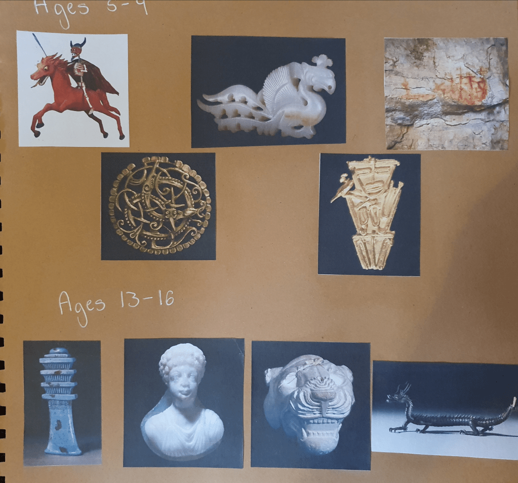
Everything else went into the general adult category as there would be a wider range of interests.
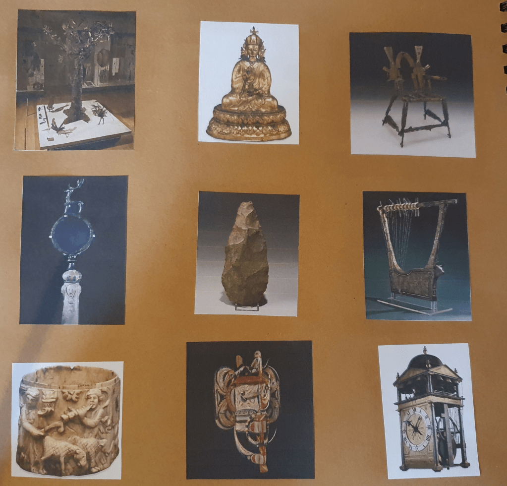
I then picked which object I would like to use from each age group and researched them some more to see if anything about their history could help decide what to do for my poster.
For the kids I decided the Atomic Apocalypse would be best as, although some kids might find it a little creepy, its the one that most resembles a toy. I thought that this would allow for more room in my designs and draw the kids attention the most. I did wrestle with the idea of using the Tunjo however, so thought that drawing them both might help me decide.
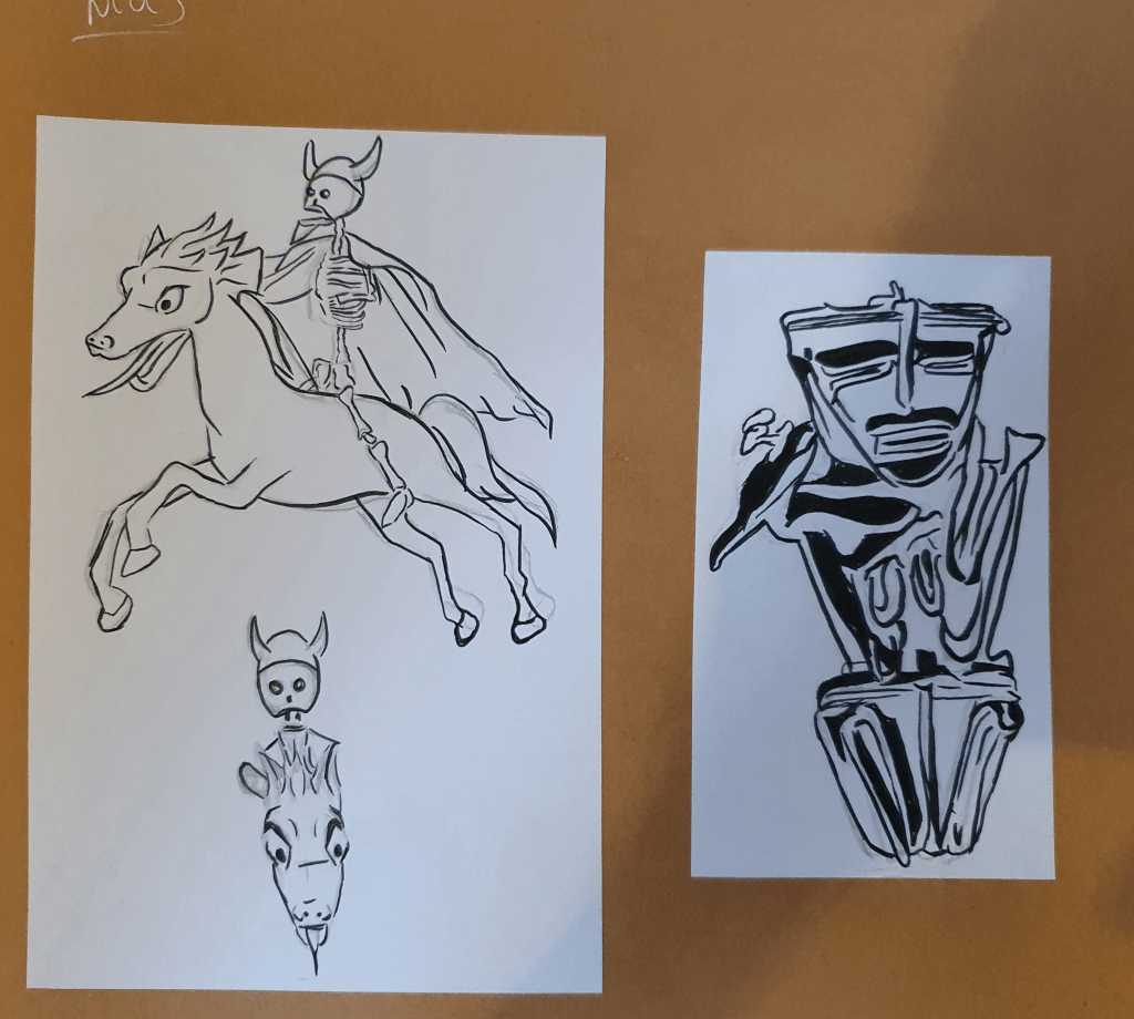
I also played with the angle of the horseman but couldn’t come up with a result I liked.
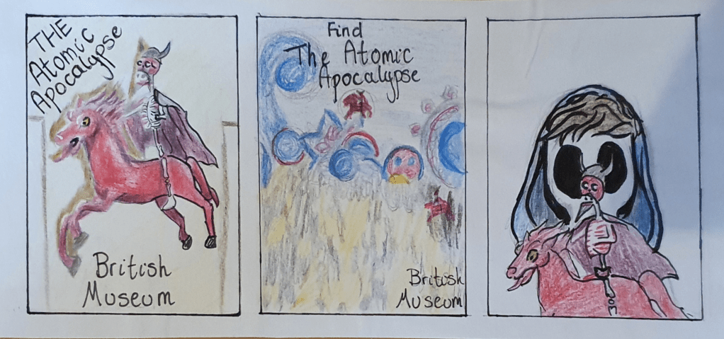
My first idea was the simplest and most boring, showing the painting in the museum. I knew this idea was no good straight away but figured that drawing it any way might help me think of something else. My second idea was to turn the poster into a game, in a Where’s Wally?” kind of way. The third idea was to draw on the Mexican Day of the Dead history and have a face painted kid playing with the horseman but I felt that this was also too boring for the kids and possibly a little scary because of the skull face paint. I may have under estimated kids here though as they seem to be ok with Disney’s Coco.
Out of these three designs I think that the middle one is the best. The idea is more fun and interactive, so more likely to engage and draw their curiosity. The bright colours are also a big attraction.
I decided that the best artefact in the teenage category would be the Myochin Dragon. With its history and significance in fantasy I felt that it would be the biggest draw of all the objects I was considering. I started these designs by researching the history of the object, which I felt was pretty interesting. I didn’t, however, like the static position the dragon was placed in so searched for any references that would help me change it. I came across a partner dragon on an auction site that was a useful reference.
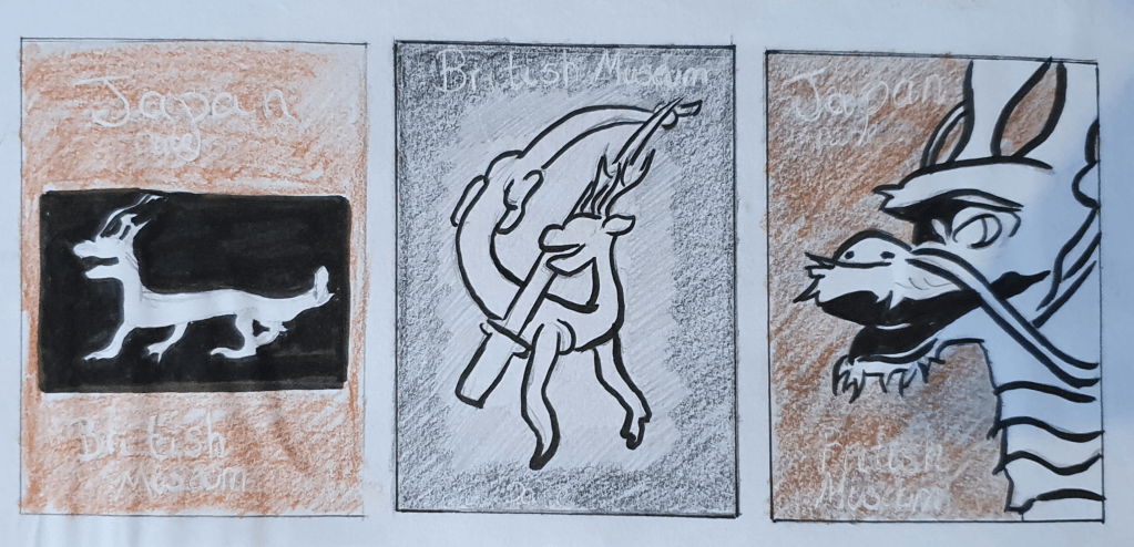
The first idea, again, was boring and quickly discarded. The second, again, was my favourite. This was inspired by its Samurai past and, although not brightly coloured, held the most promise. The last idea was used used to showcase its features and craftmanship, but also seemed too bring.
The second idea is my favourite. It has the most story to tell and feels the most organic. I did know that the background needed something more but at this point, still wasn’t sure what would fit.
For the adults, I felt that the Throne of Weapons would draw the most attention because of its resemblance to the Iron Throne.
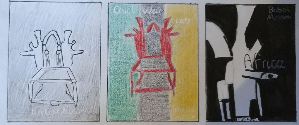
For these designs I drew on the thrones Mozambican background. The throne has an interesting story and I wanted to try and showcase it. The first idea, again the simplest, was intended to be dramatic and resemble the promo photos taken of the Iron Throne to promote Game of Thrones. I thought that this would draw fans of the show. The second idea was based around the flag of Mozambique. I thought it would be a good idea to show its origin country. The last idea was to emphasize the fact that the throne is made up of old guns. I thought that this would interest people and encourage them to attend any event that were to take place.
I like the first design the most. I like the idea of the dramatic lighting and felt that the idea behind it would inspire a higher attendance than the rest. The last design was a runner up though, as I felt that it would be a fitting poster because of all the layers of meaning in its history.
The design I felt was the most promising was the one with the dragon.
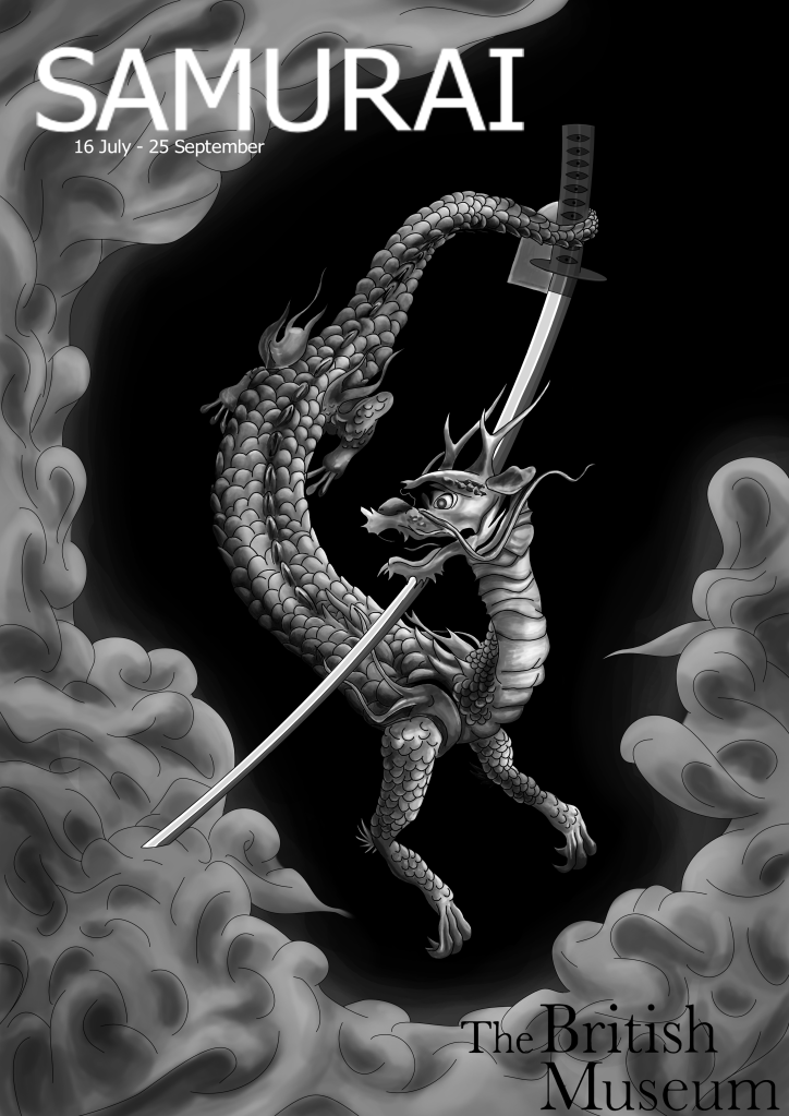
I’m not sure that it is the strongest poster design, however it is the one I, personally, would be the most interested in. This is because the image holds a narrative and generally looks more interesting. By using a photo of the duplicate dragon from the auction site, I was able to reposition the dragon to a more comfortable pose than the one shown in the picture from the British Museum without it looking disproportioned. The designs for the different age groups differ greatly in style. I didn’t think that a matching style was important as long as the correct information was clearly conveyed in the design. I made sure that the British Museum logo was clearly placed in each design so that there would be no confusion as to where the exhibit was placed. I chose a representational approach as this is what I am most comfortable with and felt that a diagrammatic approach wouldn’t fit the purpose.
I changed the design slightly to my original idea as the placement of the samurai sword looked too awkward. By turning it upside down and having the dragon hold it with its tail the image looks more organic and natural, adding a soft flow to it. I decided to try and create a narrative in the design. The idea behind this image is based on the history of the object. Inspired by the peace of 17th century japan and the Myochin family’s history in making samurai armour, I used the ash around the edge of the image to symbolise the end of war. With a double representation of how the dragon was made by metal, forged in fire, I felt that this was an essential part of the image. I didn’t want the ash to complete its circuit around the edge as I felt that this made the image too confined and stiff looking. The style of the image was inspired by an artist I saw in ImagineFX magazine, Kerby Rosanes, who embraces the Asian style of art. I made this image digitally as I felt that it fit the task better than traditional techniques. I toyed with the idea of traditional mediums as I thought that it would be fitting considering the fact that the object was made hundreds of years ago, before modern mediums were invented, however I didn’t feel that it would achieve the smooth, professional look I feel is needed for a museum poster.
I decided that a black and white Asian style design would be the best fit for this poster, although the opposite to what is expected, as it holds a more ageless and dramatic feel to it. I also felt that this style would appeal to the age group with its resemblance to tattoo and more narrative styles. I wanted the image to convey that that the dragon was rising from the ashes, coming out swinging with its sword. I decided against a geographical setting as I thought that it would take away the slight air of mystery that this design holds. I feel that this is needed to provide intrigue and interest people enough to attend the exhibit. I didn’t feel that a running style throughout the designs was super important, as the information on the poster would give people all that they needed.
Edit:
I did consider using red in the eye, however, I didn’t like the way it drew the attention straight to it, causing the rest of the image to fade into the background.
A website could have been added to the poster so that more information could be gathered and people could see if they wanted to go.
The poster is aimed at an older age group as the monochrome colours wouldn’t be very attractive to young kids.
To fix the pixilation in the image, which I didn’t notice, I would have to get InDesign. I would also have to use InDesign to align the text better by using a grid.
Exercise Three: A Children’s Book Cover
For this exercise I had to create a book cover for a children’s history book, entitled Animals From Around the World. The first thing I did to prepare for this was to research illustrating children’s books and then a book cover in general. My next step was to look at children’s book covers. They were all cute and brightly coloured. Most had a character at the forefront of the design. Next I made a mind map of ideas and anything that related to the subject.
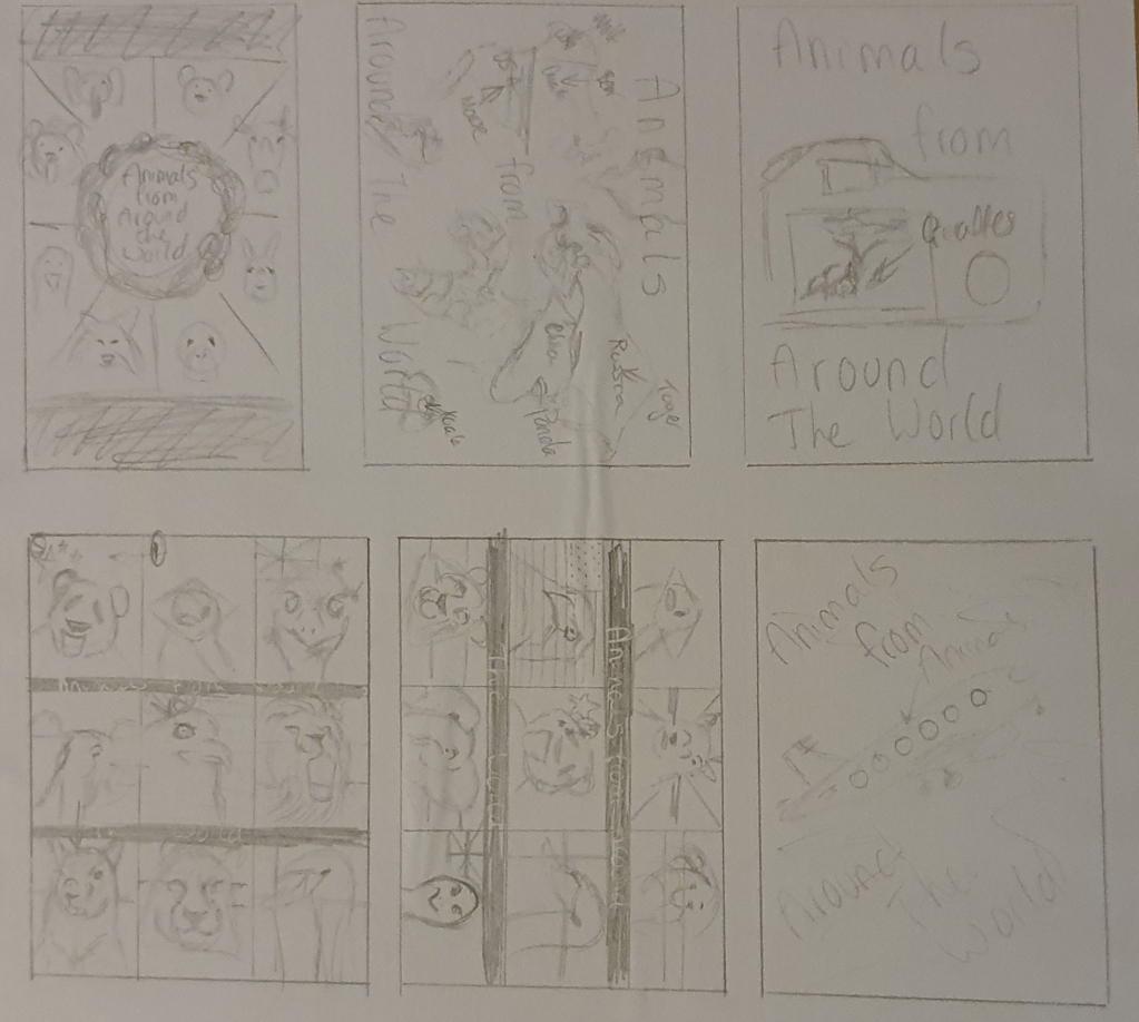
Whilst looking into children’s books I found that they are usually slightly larger than regular books and a square format is a popular choice. When thinking “around the world” I thought of holidays, travel and photo albums. I tried to include these in my designs. I did like the idea of showing lots of different animals from different countries, which became a running theme in my designs. I tried to use the nation animal from each country I chose. The turned out to be: a panda for China, Emu for Australia, Squirrel for the UK (lion was already taken), Bald Eagle for the USA, Tiger for Russia, Rufus-Bellied Thrush for Brazil, Elephant for India, Lion for Kenya and a swan for Denmark.
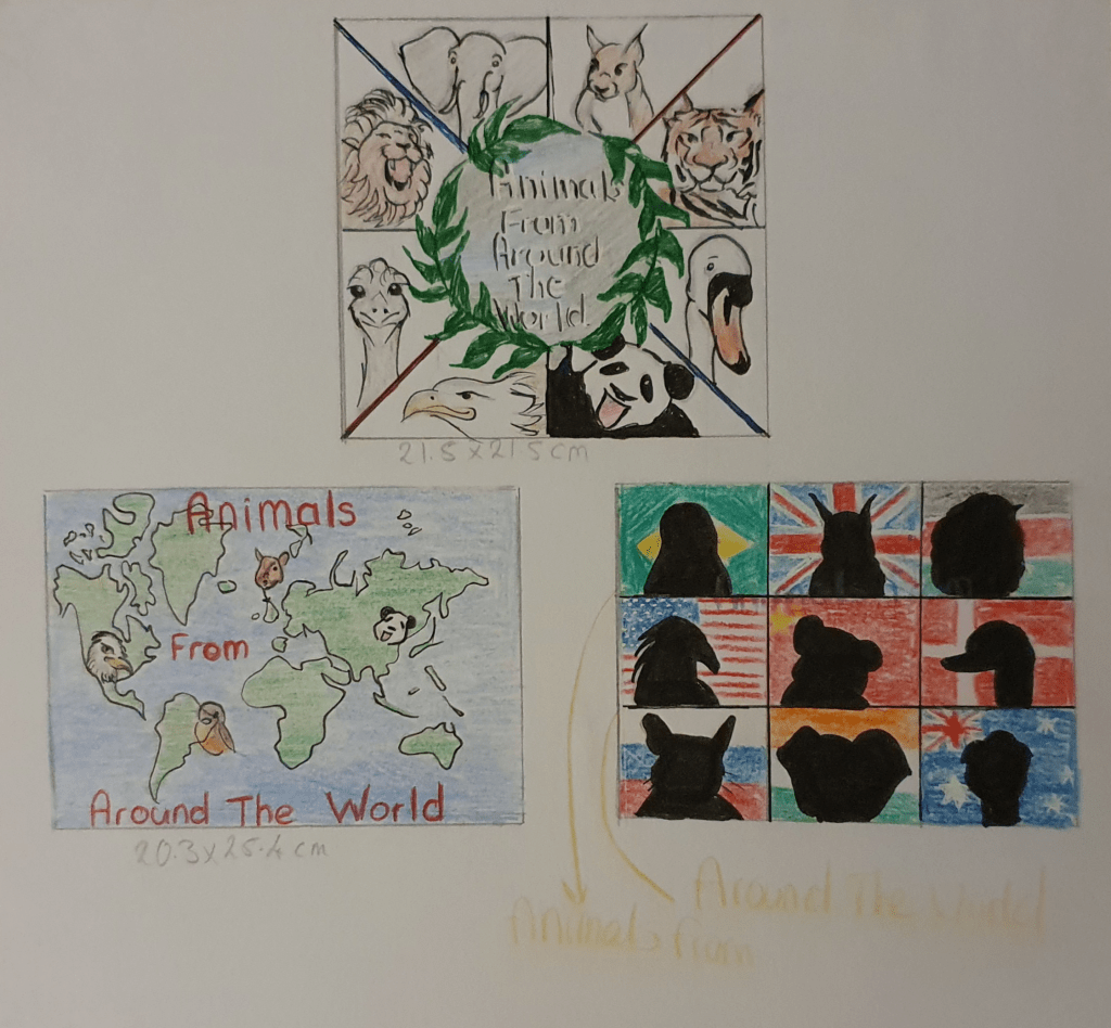
I then redrew my three strongest designs in more detail. The top design, also the one I like best, was supposed to display the animas in a simple way, easy for children to read. The second is a little more geographical and text book like, with a few animals thrown in to get the point across, again fairly easy to understand. The last design was based off of a military picture I saw. I thought the premise of having the animals in front of their national flags would be a good idea and the silhouettes of the animal would add an air mystery. I also felt that it would accentuate the fact that all the knowledge is inside, so until the book has been read they wouldn’t know about the animals, kind of like “Guess Who?” I believe this to be my strongest design, if not the one I like the best.
Edit:
These designs were aimed at a younger age group, though I did try top make them appealing to older kids as well.
I would create the final image in a square format as this is more attractive and easier for a kid to hold. The image would be done digitally as I feel that kids are becoming more familiar with digital art than traditional and it would feel more comfortable for them. I think a softer typeface would be best.
Exercise Four: A Menu Card
Here I had to create an illustration for a menu card for a high quality Seafood restaurant. I had a lot of trouble. Unsure what was meant by “menu card” I had to look it up. I wasn’t sure if it meant a full menu or not. It didn’t. To start designing a small illustration, which could also be used as a logo, for a small card to be placed on plates I looked into the purpose of the card and key points in creating a logo. In doing so I looked into many things, including the theory behind colour emotion and atmosphere. Next I looked at existing menu cards and logos. Thinking of anything that could be used as a logo, mostly fish, I tried to think of some designs and draw them at the required size of 4cm x 4cm.
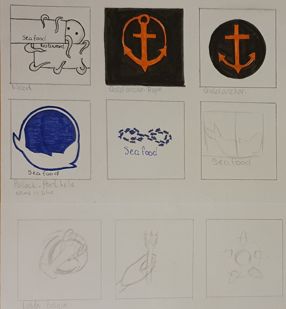
I liked the idea of using driftwood in a design but eventually decided that it wouldn’t make the most sophisticated logo. I did like the design with the octopus peeking out from behind though. I felt an anchor was a staple with sea oriented logos so wanted to play around with that a little. I also experimented with using seafood recipes in the designs.
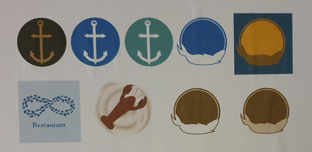
I picked my favourite designs and drew them up digitally for a clear, more professional look. I took this opportunity to also play around with colour, trying to remember colour theory at the same time. I played with the anchor because of its obvious association with the sea. I though that it would have clear meaning. The next is one of my favourites. It’s a fish in a port hole, though depending on colour it can also be a sun. The infinity sign is made of fish. I tried to use this to convey that the restaurant will always be high quality, and had possibly been around a long time, but I didn’t feel this was clear and would confuse people. It’s better in concept than in reality. I liked the idea of using lobster bisque as it’s a high quality food. The lobster alone suggests class and the colours fit with the idea of sophistication. I decides to put it on a menu card to see how it could look.
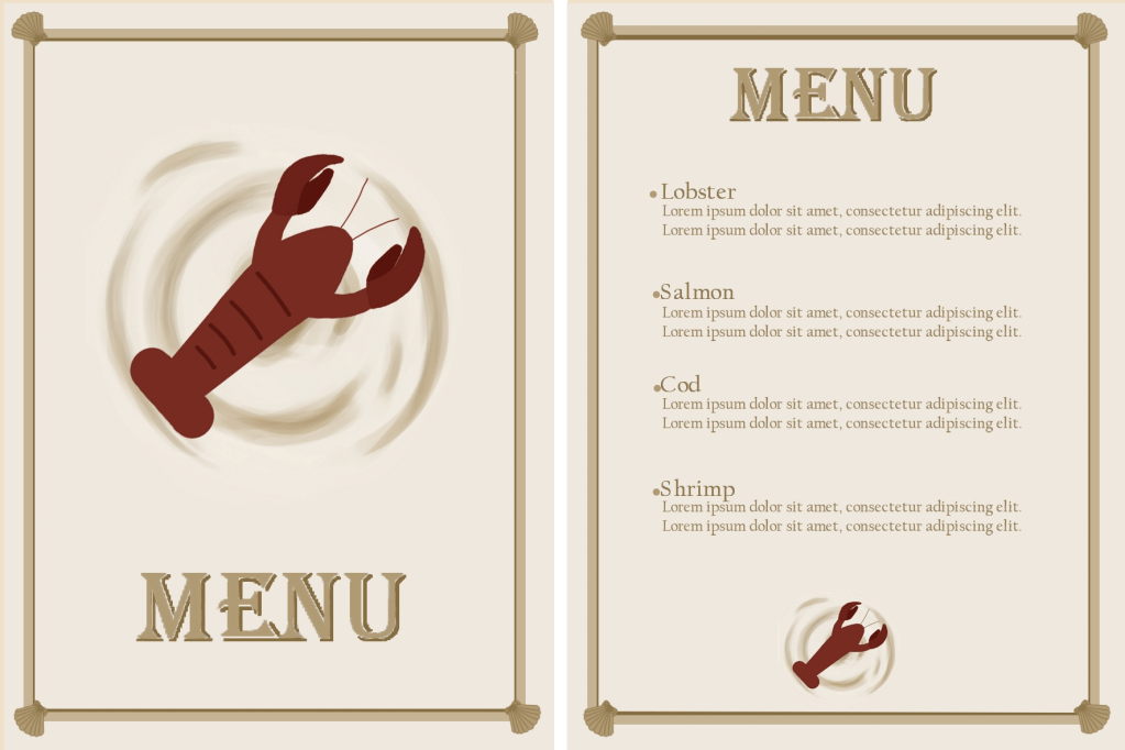
I chose the lobster design in the end as I felt that it would look the best on a sophisiticated menu. I am not totally happy with any of the designs as I feel that none of them are very special or imaginative. I had trouble thinking of a design that would look both creative and sophisitcated at the same time. The idea behind the design is that it resembles a lobster bisque and can be easily incorporated on any background. I thought that this would work as the circular background should eminate a friendly feel and the lobster should communicate the high quality food and ingredients.
I tried to use nautical and sophisticated colours in all the designs. I wanted to make that restaurant seem comfortable and approachable as well as high class. The idea behind the anchor design I was to create a simple logo that would easily communicate the idea, however I felt that, although simple, it was also too boring. I tried it in a few colours to see if a different colour would work better but it didn’t seem to help.
The circle and fish design was meant to represent a porthole and, of course, a fish, to communicate the food. I like it in the blue but didn’t feel that it fit in a hugh class restaurant. This is why I tried different colours, but none of them seemed to work well enough. The second variation of this design is meant to look like a sun instead of a porthole. I thought that this might make it seem friendlier. This would work in a casual seafood restaurant but doesn’t radiate high class food. The third variation was the runner up. I feel that of al four variatons this fits the brief best.
The infinity design was meant to communicate confidence, though it didn’t work out as well as I hoped. I constructed it of tiny fish to represent the food. I feel that this could work as a logo on a wall and made of metal but not so much on paper.
I made a menu card mock up to show how the logo could look in the restaurant. The bisque background could be adjusted to any colour it is placed on.
Exercise Five: A Tattoo
I did a lot of research before beginning this exercise. The whole thing seemed a little daunting as I wanted to make a really good design. I began, as directed, with the history of a tattoo. I started as early as 5000 BC to get a clear idea of how they began and how people got the idea to start inking themselves. The origin of intentional marking was more barbaric than I thought. I then looked into the trends and opinions of tattoos, beginning with the 1910s. Next was to look at old examples and how the designs have evolved through the years. I then began to look into the history and meaning of Mothers Day. By doing so I found how the whole thing was started, although it had been going on ages before that, unofficially and less commercialised. next was a mind map based around mothers day. I also looked into Mothers Day cards to get a feel of what people liked on them. I researched into typography so that I could use the right kind when it came to it and tips on creating a tattoo. I also watched Skillshare videos to help with this.
Eventually I started to design. I started with my character and trying to get the right look.
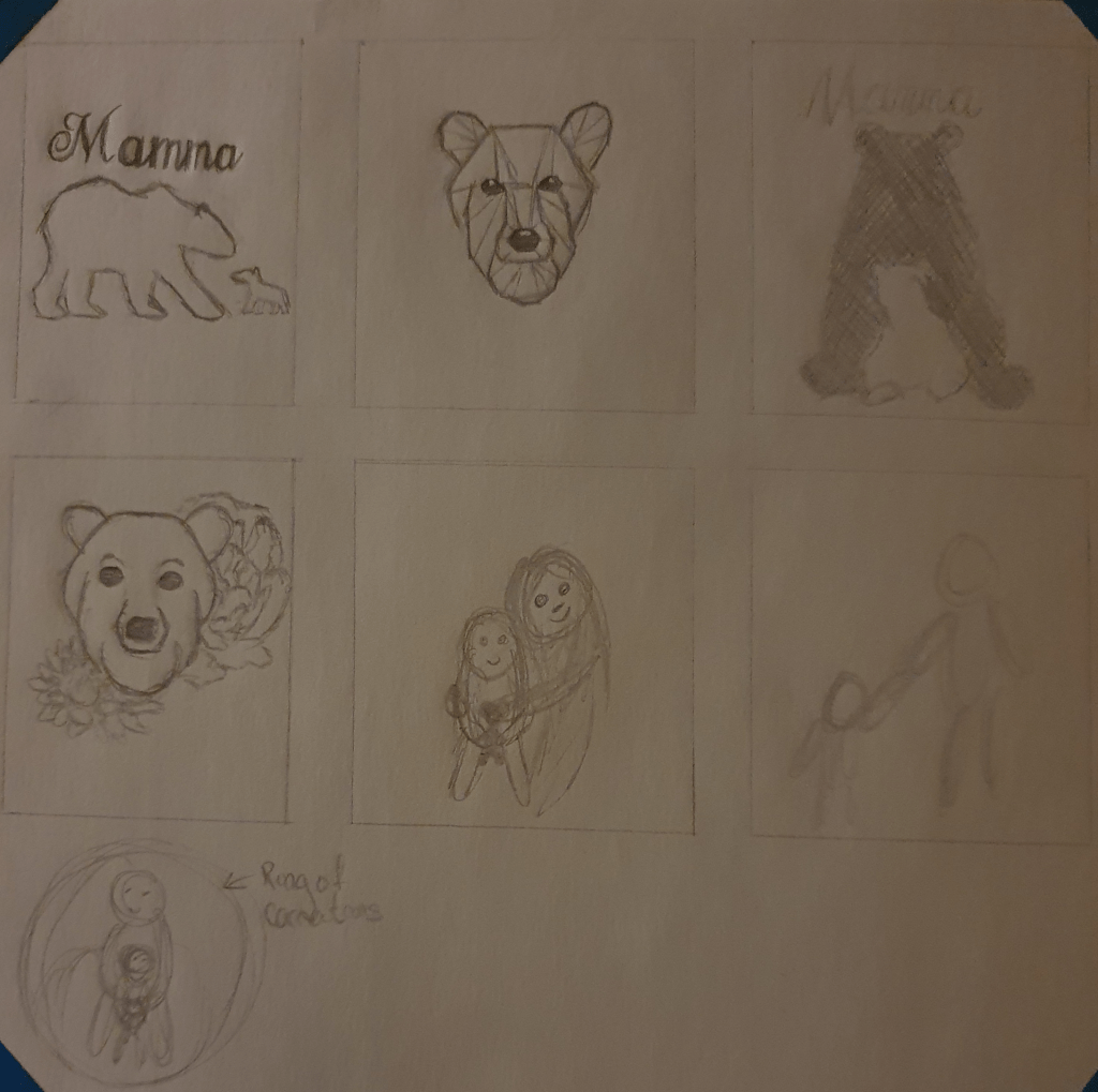
After thinking through some ideas, I decided that I liked the idea of using ragdolls. I felt that the making of these dolls help a sentimentality and tradition to it that would add to the design.
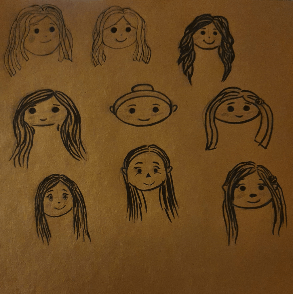
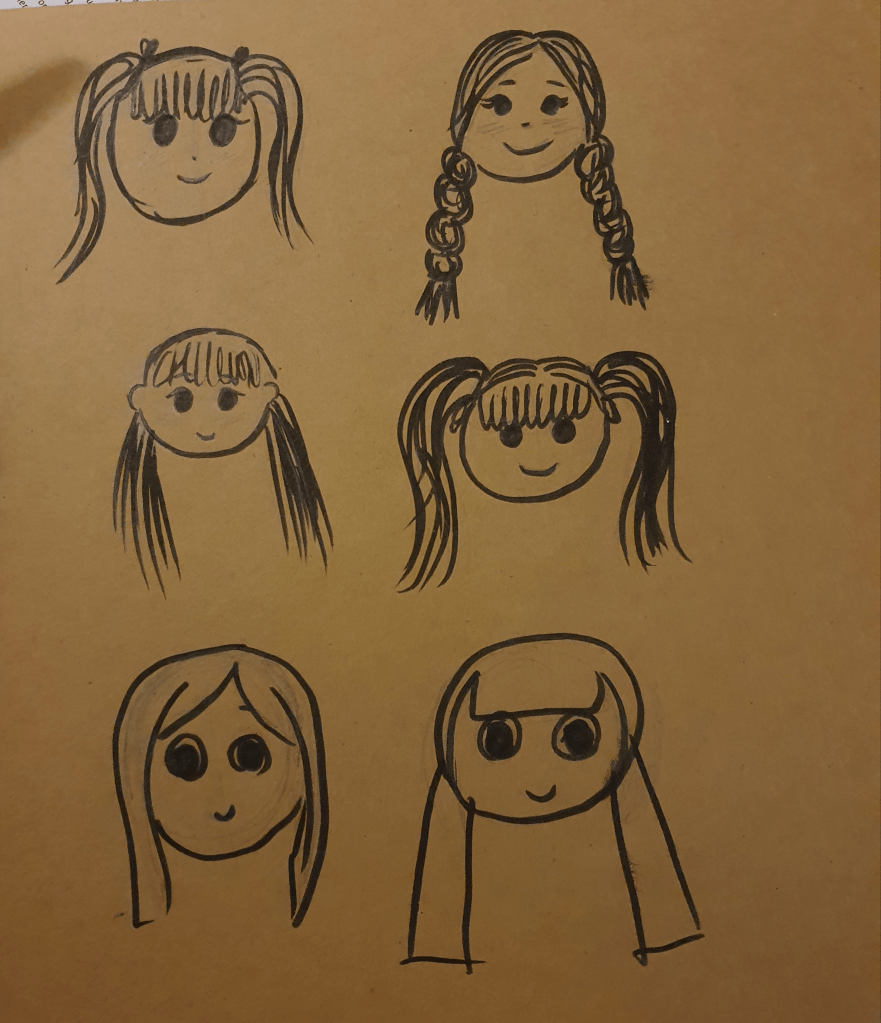
I wanted to get the right look for my character before drawing the tattoo.
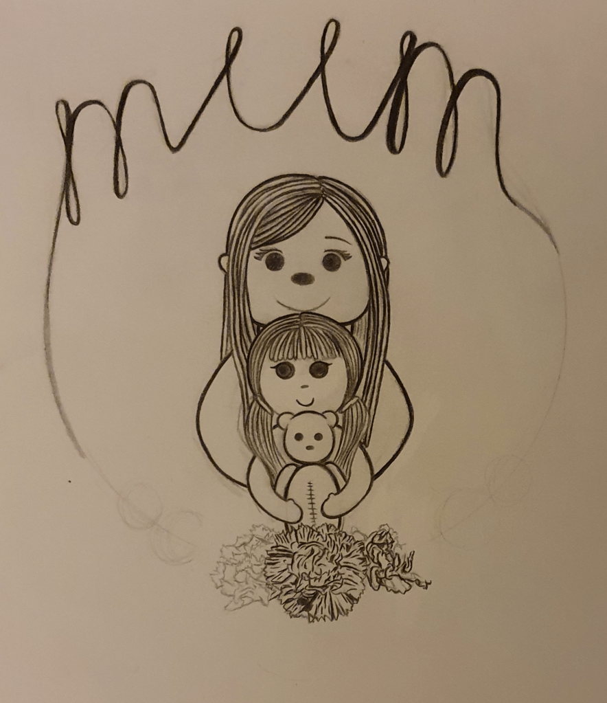
I liked the idea of having my characters in a circle, but when thinking of how this would fit on the body I realised that there aren’t many places that it would fit well.
I feel that this fixes that problem. I went into this intending to come out with a traditional styled tattoo, which you can see didn’t happen. I feel that this design fits a card better than a tattoo. I can see it used as a tattoo but not as well as if I had come up with a more traditional style. It’s cuter than intended.
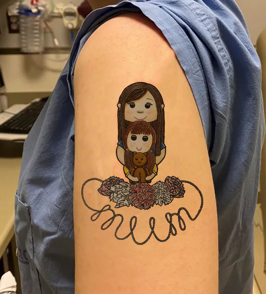
As this is meant to based around Mothers Day I thought it important to have a mother and her child as a base. Having them holding onto each other is meant to communicate the bond and a softness. I liked the idea of the child holding onto her teddy bear as it’s a typical child thing to do but also accentuates the fact the she is a child. This is also the reason I gave her this hairstyle. The bear has stitches on is stomach as I thought this would add a sense of authenticity and it adds to it’s cuteness. I gave her a rounder face and bigger eyes to try and get a more child like appearance. This is why the mothers face is more square. I think that the absence of a nose gives of a more innocent look. I wanted the mums ears to peek out from the hair as I felt she looked a little alien without them. She has eye lashes as they give off more mature, made up look. Their hair is made of wool as this is a traditional material used on ragdolls. I tried cloth hair but it didn’t look right as was a little creepy. This is something I was trying to avoid as this image could easily take a turn that way if the wrong colours were used and some of the features were exaggerated.
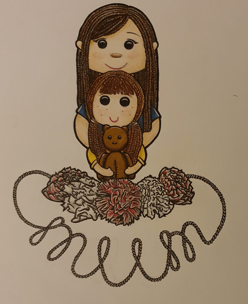
I used pink and white carnations as these flowers are the traditional flower of Mothers Day. White was used to represent anyone who had passed. I wasn’t sure whether the word mum was required to be in the image or not but decided to use it just in case. I like this placement more as I feel it would fit more organically on a body part. Throughout the design process I was trying to think of how it would fit on the body and I didn’t want it to look awkward. I’m not sure if I succeeded in this or not but I do know that is is better than before. I’m happy with the flowers as they resemble a more traditional style more closely. I decided to use bright, vibrant colours as they are happier and I didn’t want my colour choice to dampen the spirit of Mothers Day. Using markers helped with this and gave a cleaner look. I used pencil to add any small details and for some light shading.
Over all I’m happy with the final result. I feel that it’s more me than a typical style. However, if I were to do this again, I would try to incorporate a tattoo like style into it more.
Exercise Six: Visual Distortion
I found the beginning of this exercise easy but had a lot of trouble with the second half. I chose to draw my cat. I mostly used a photo of him but he was laid beside me too. The first drawing was meant to look real, which I didn’t have much of a problem with.
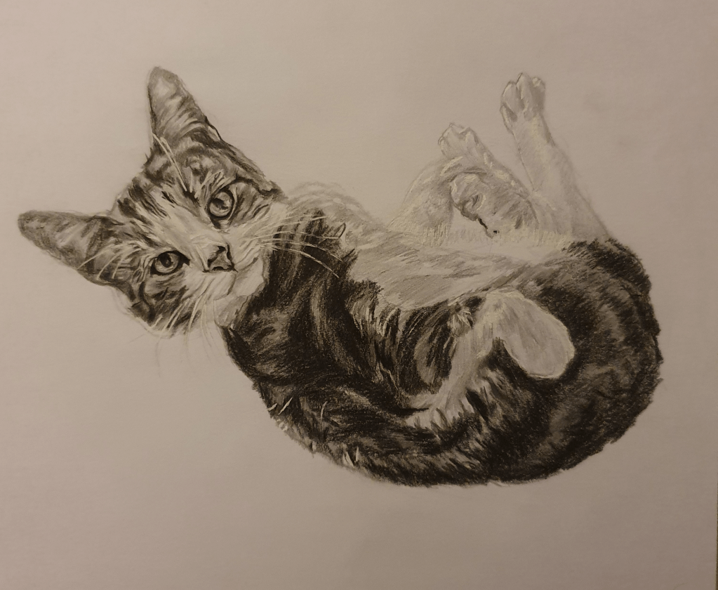
His head is a little too big for his body but other than that I don’t see anything else wrong with it. I tried to find a picture that would show his puppy like personality. Here he is waiting for a tummy rub.
Next was a drawing with no more than five lines.
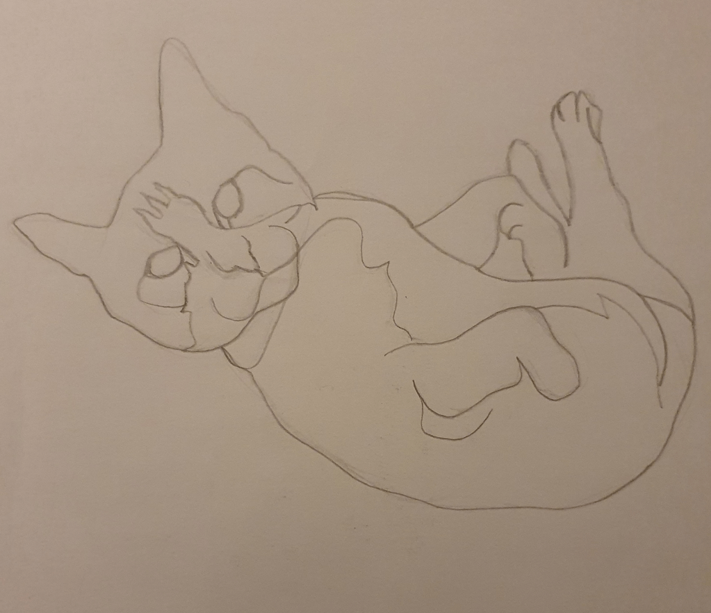
I used 4 lines, overlapping in a few areas.
Next I had to make a collage that distorted reality. This is where I became stuck. I had trouble with the distortion aspect. I wasn’t sure how far I could go. I wanted the image to still be recognisable as a cat but at the same time wanted to meet the brief. I tried a few different ideas and didn’t really like any of them. I ended up doing this digitally to avoid wasting anymore paper since I was struggling with this task.
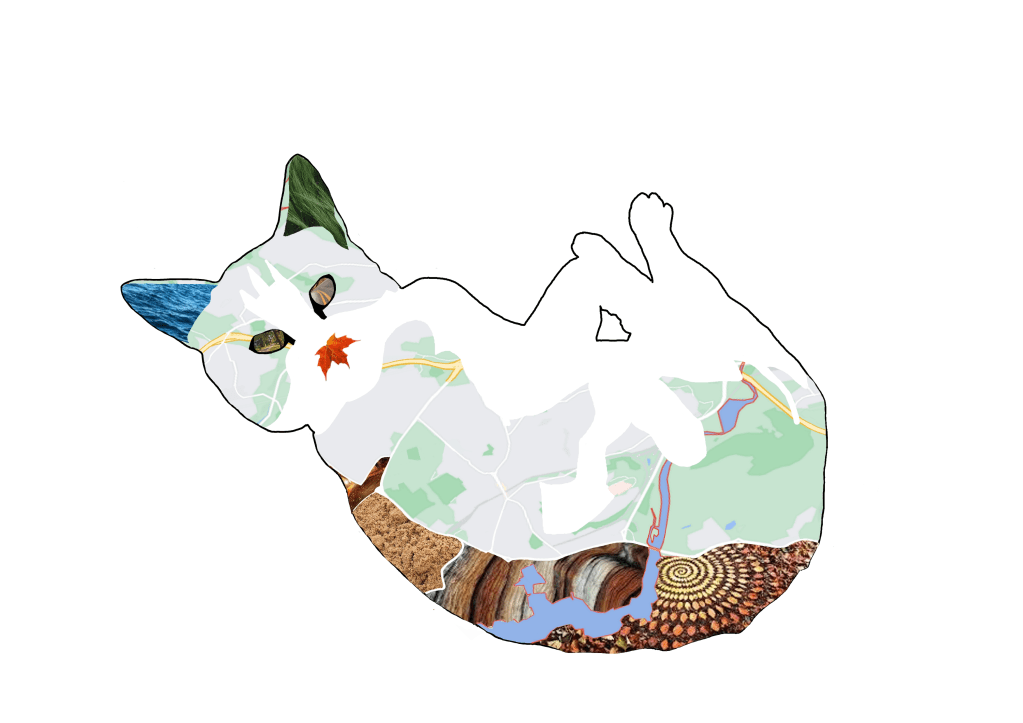
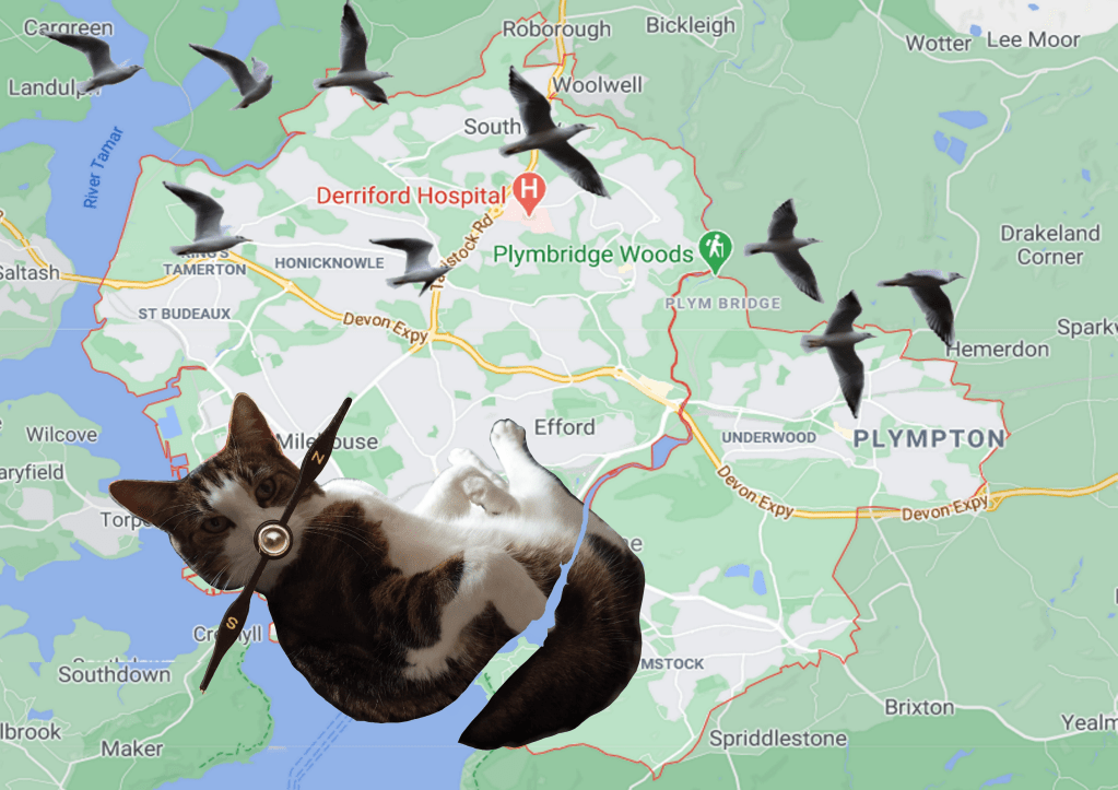
Trying to choose a theme for this collage, I settle on trying to show how he likes to explore (though we keep them in since one of them was hit by a car). Following this thinking I thought of a map. I wanted to use the map of our home and when I saw that the river is the same shape as one of his stripes I thought it would be perfect. I felt that a compass would make a good nose since that’s what a cat mostly uses to get a sense of direction. Since birds are always outside and he has a love for them I thought that they would be good to add to the image. Having them flying around the head was meant to show how they influence him when outside. I distorted the sizes to make for a better collage.
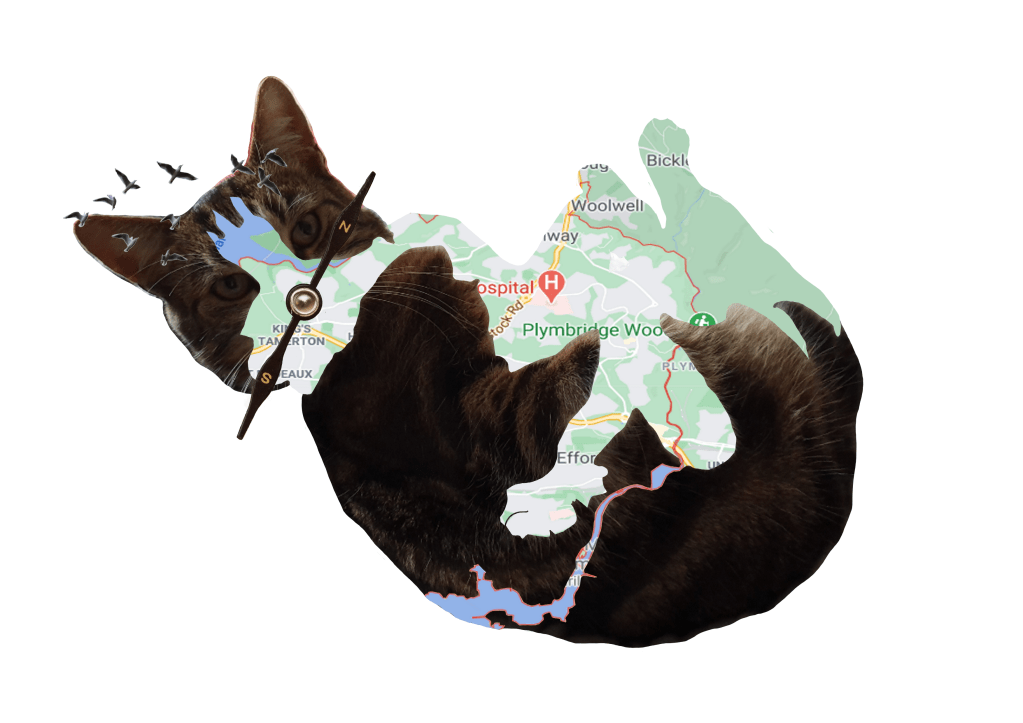
Next was to draw this image.
This part was also easy. I added stitching along the edges of the map to make it look as though the had been sewn together. I thought this would exaggerate his wandering personality more. I also added outline to define his shape better.
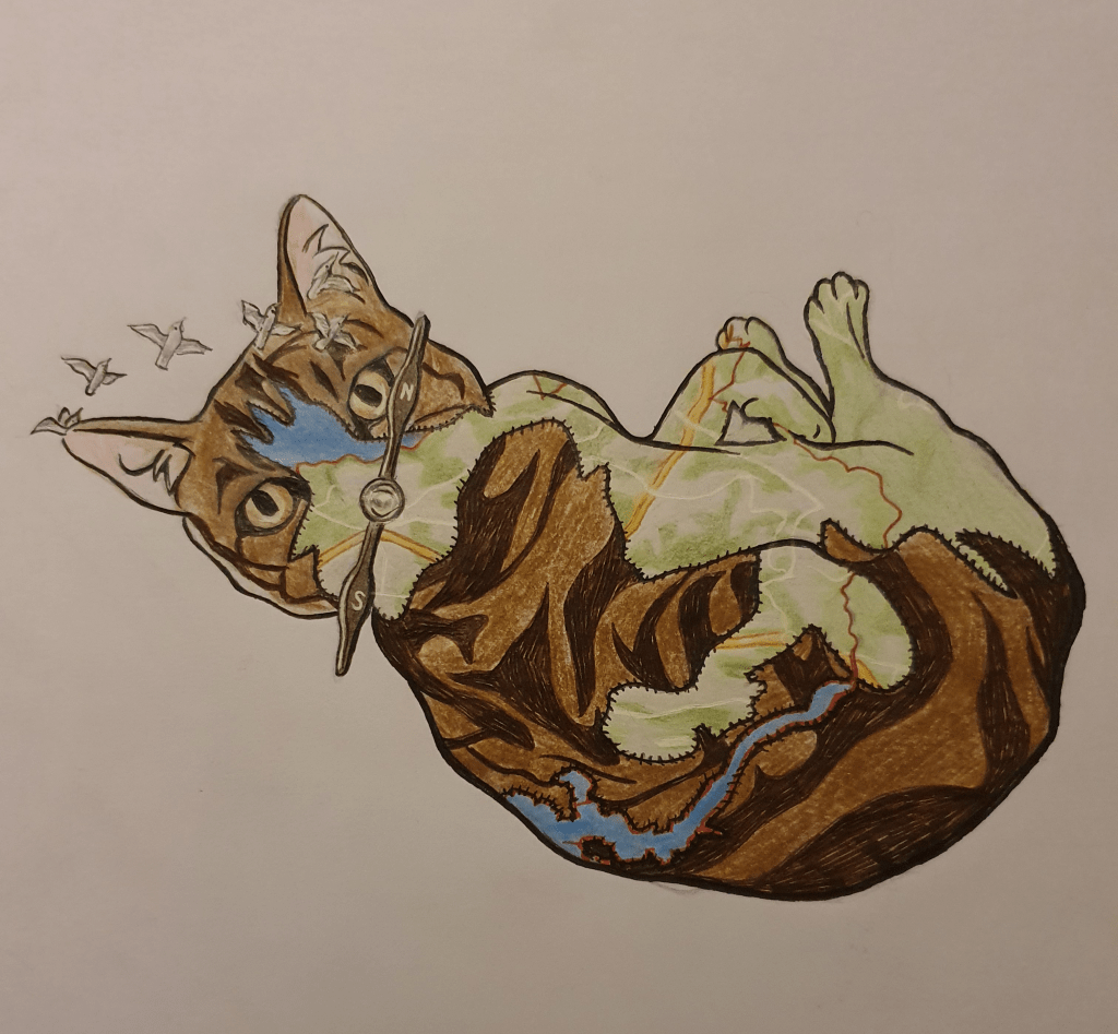
Next was to turn it into a bigger picture with narrative. I also found this hard.
I did this to begin with but didn’t think that there was enough narrative.
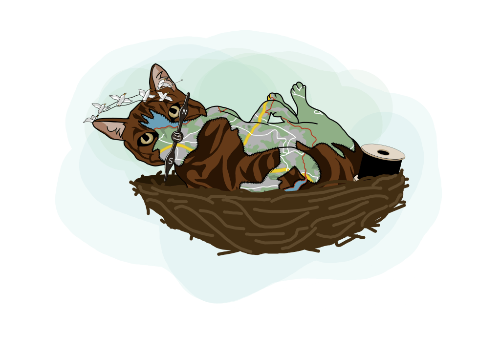
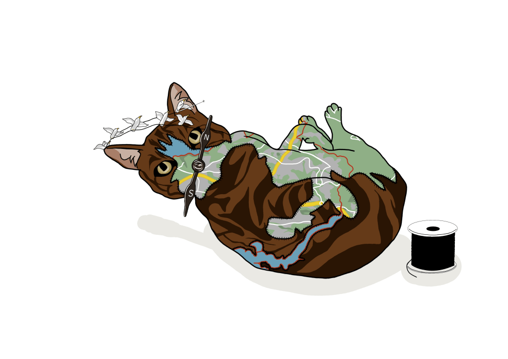
This is my second attempt. It’s meant to show a cat being sewn together by birds out of a map and a material that resembles fur. They are in a birds nest as this is where the birds life, but also because I image a birds nest with eggs in, so it’s nurturing life. The background is green for the tree.
Exercise Seven: Character Development
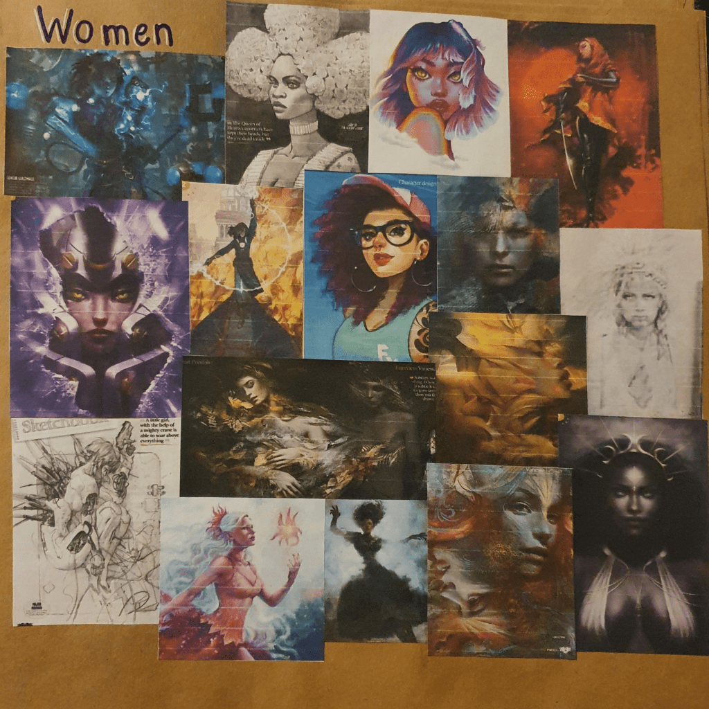
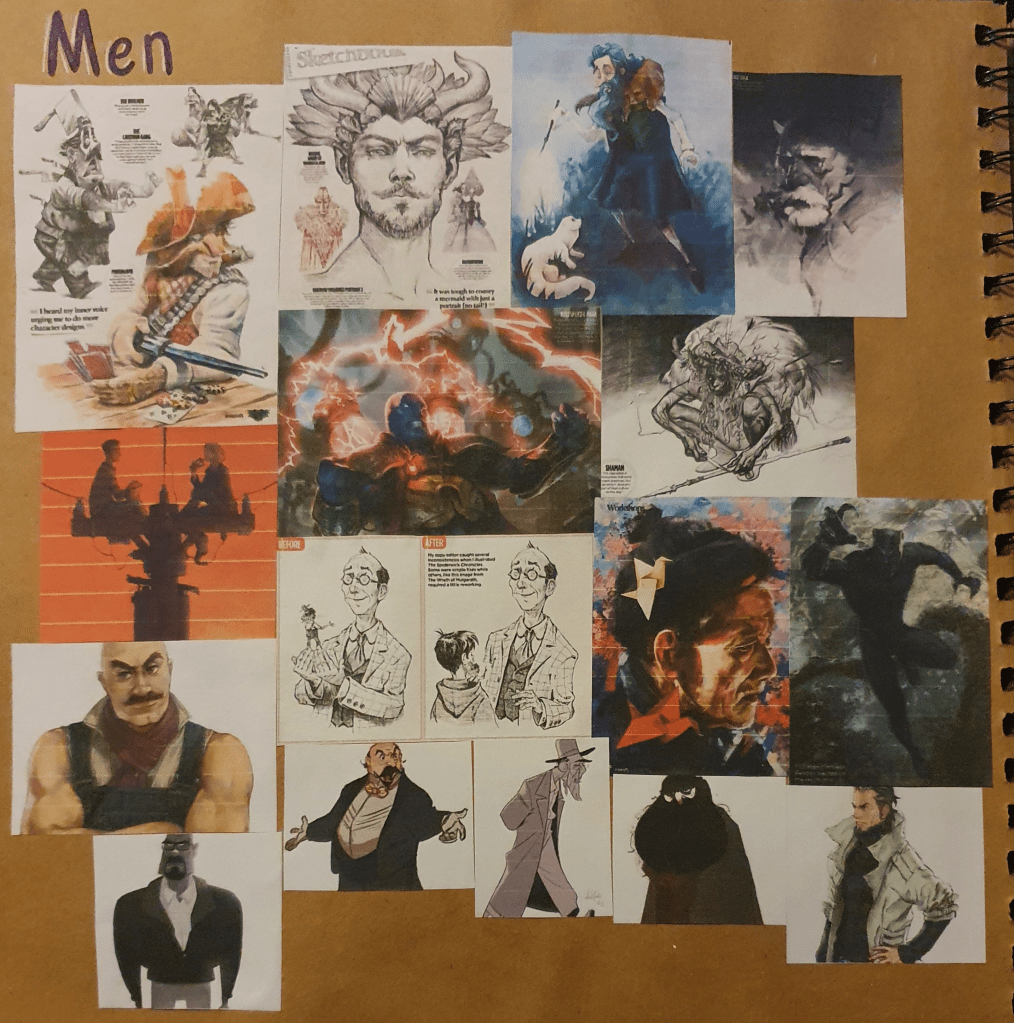
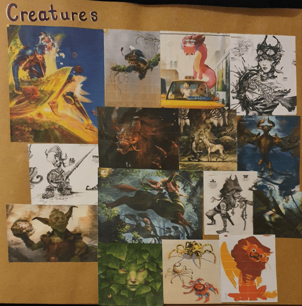
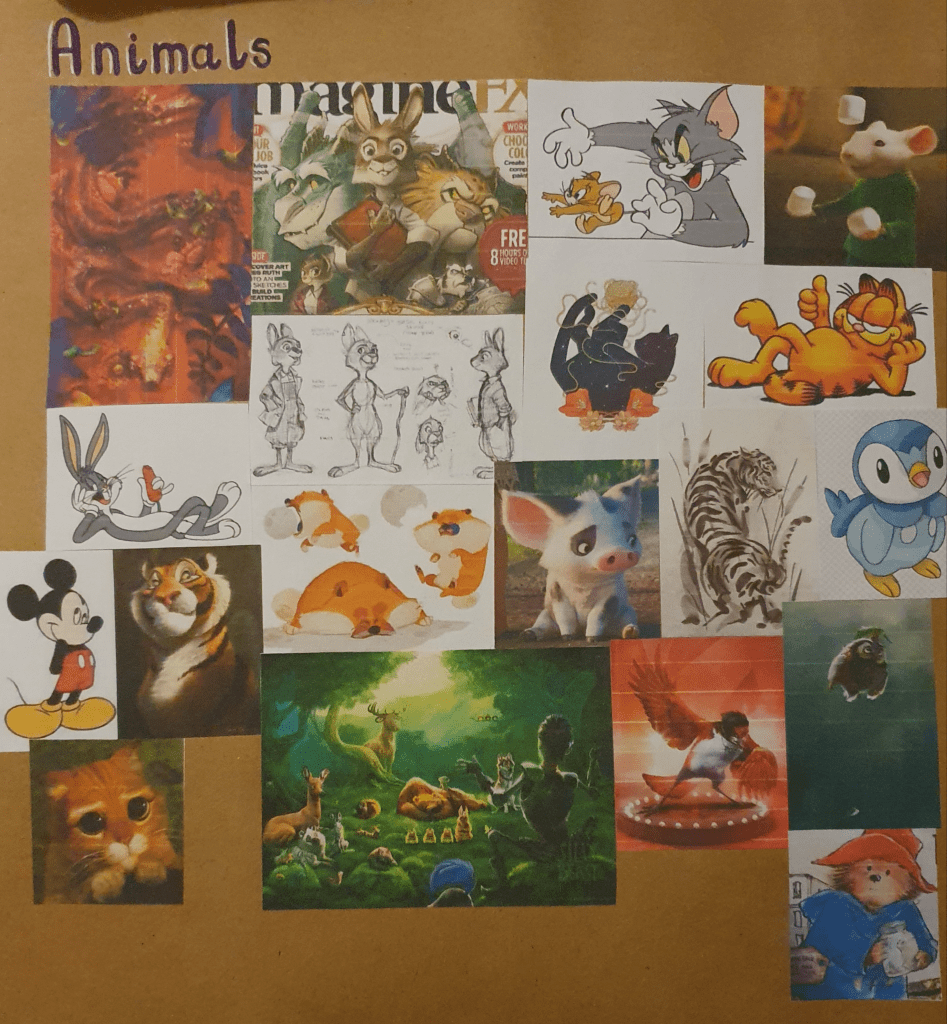
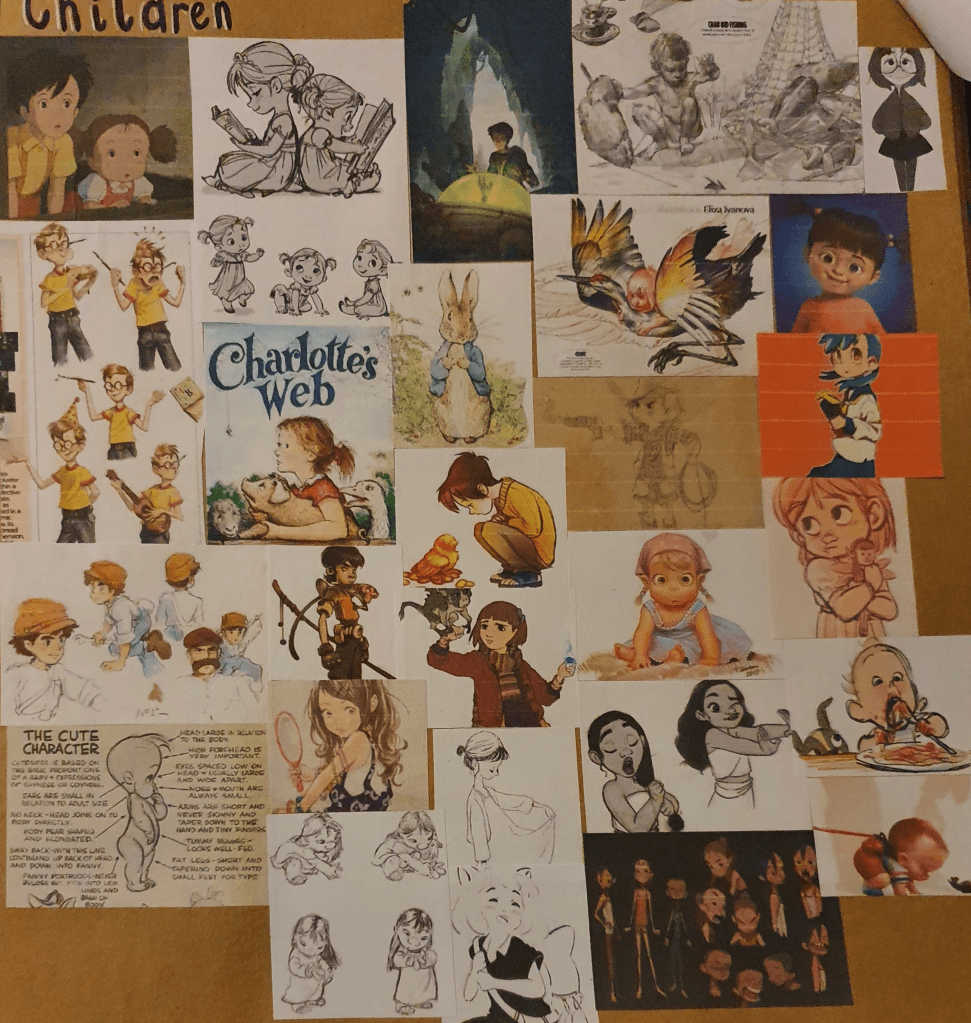
I started this exercise by gathering different types of characters. I used the internet and ImagineFx Magazine for this. I tried to collect a good range of varying designs.
I then took notes from Aaron Blaise’s Character Design course. I didn’t have enough time to watch all the videos so I picked the one I thought would be most helpful, like the ones on expressions, eyes and perspective. Next I tried to think up some characters to draw. The first one I decided on were tiny dragons so I then looked up dragon anatomy so that I could try yo get it accurate. Surprisingly I found a website dedicated to this which was helpful.
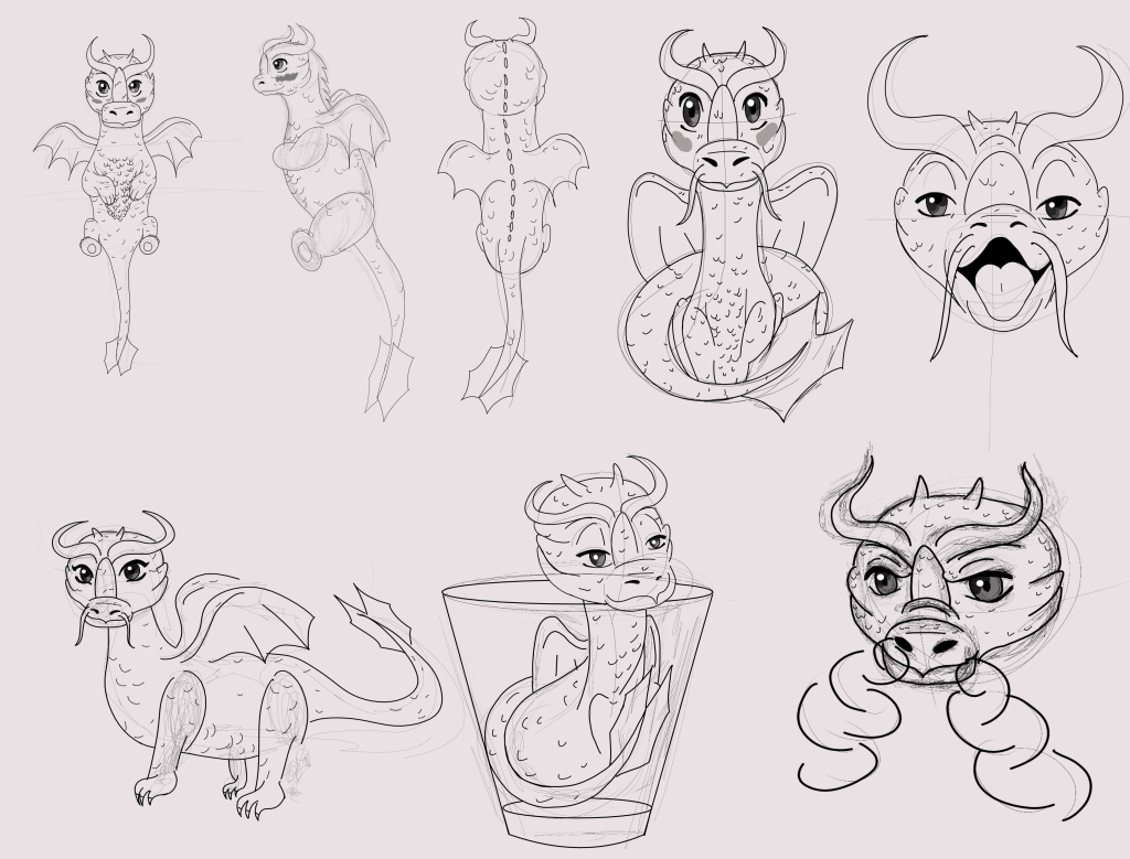
Here I tried to get a range of different angles of the character, including the ones asked for, and different expressions. Some of them could use some work, the proportions on some are definitely off and I need to work on expressions more. Other than these I’m pretty pleased with the results I got. Getting the right perspective from some angles was a little harder than I would have liked. I thought it would be cute to place one of these dragons in a shot glass to show how small it is.
For my second character I tried to create a Werewolf boy, though this didn’t go too well.
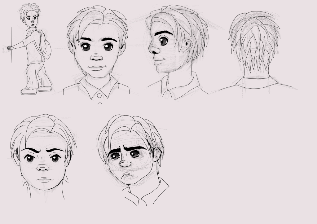
I had a lot of trouble with drawing a full body, more than I expected. I also had trouble keeping a consistent look for the boy. The hair is all over the place. I tried a few different styles of drawing here, not all of them succeeded. To give of the Werewolf look I tried to give him messy hair, slightly pointier ears and a dog like nose. This hasn’t turned out too well in all the drawings. Another surprising thing that I had trouble with was the hand. I thought it would be fairly simple to make it look as though it was holding the door but every attempt came out off, even the one he has now. Once again my perspective is off in some places. I think the first two drawings turned out the best, even with the dodgy hand. I gave him a school uniform to try and make it look like he is skipping school.
All I really took away from this exercise is that I really need to work on my character design and a few tips on how to improve them. I’m not really impressed with any of these drawing, though I do believe the dragon turned out a little better than the boy.
Assignment: Magazine Illustration
To begin this assignment I created mind maps for each of the topics provided.
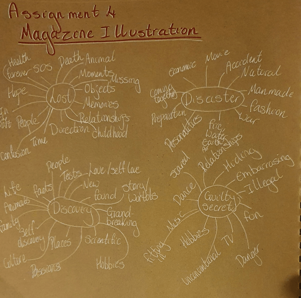
By doing this I decided that I wanted to choose disaster and liked the idea of basing my drawing around the four elements so I began to research them.
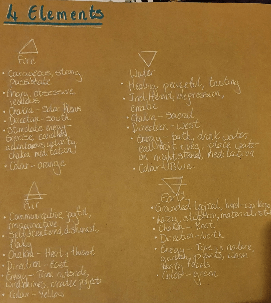
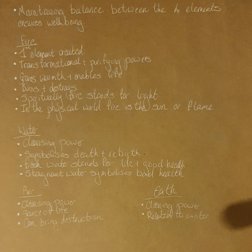
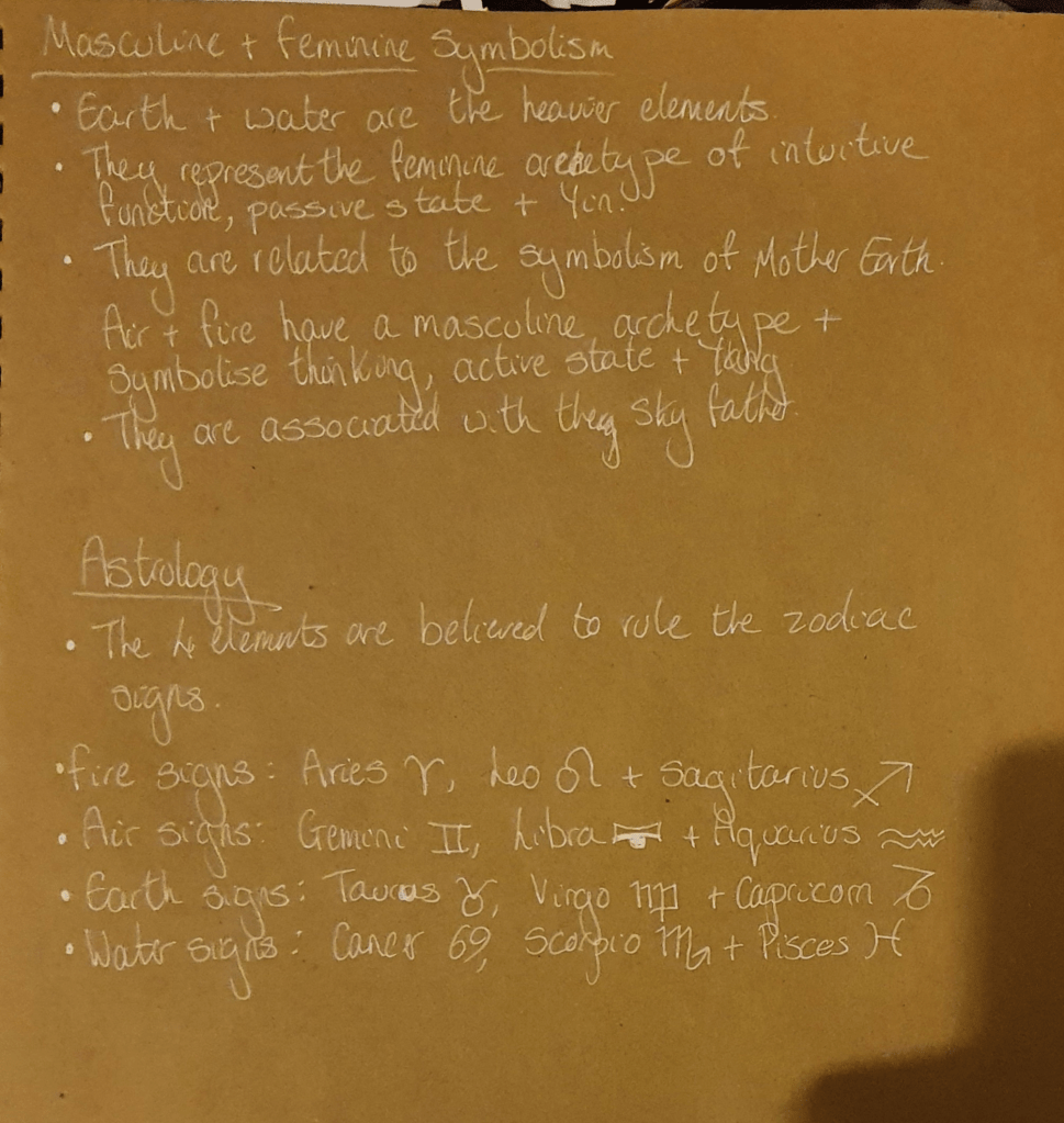
I wanted to focus on how the four elements interact with nature but couldn’t find a huge amount of information on it. I mostly had to use knowledge I already had, which was pretty much limited to them causing natural disasters and that you ned to keep a good balance between them to hold them off.
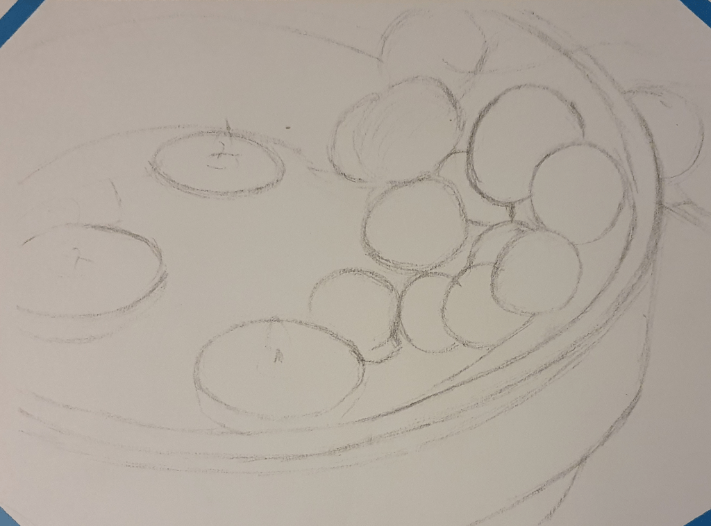
Next I had to decide on what to use in my still life. I found this tough to do. I ended up with some candles and fruit in the bottom of a clay tagine, trying to represent each of the elements. Placement was also tricky as the fruit kept falling over, so once I had a position that stuck I kept with it.
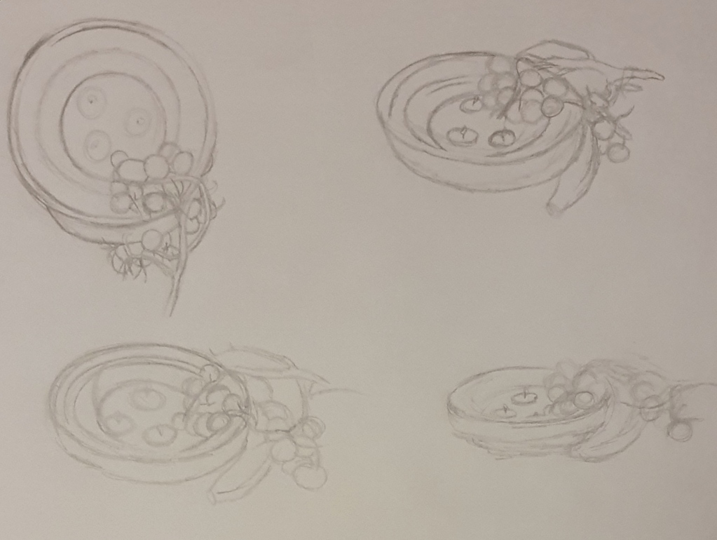
I then drew this from different angles. Picking which one to use in my piece was harder than I expected as I liked the view from the top but you couldn’t really see the flames from the candles. I decided to go with the bottom left corner as it gave a better view of the flames. I wanted the image to have meaning spread out, instead of it being concentrated in one area. I did this by spreading out the candles, I used these to represent fire, though extinguished the one to the left to represent air. I used the clay tagine to represent earth and filled the bottom with water to symbolise itself. I felt that this filled the image fairly well.
I then drew my observational drawing
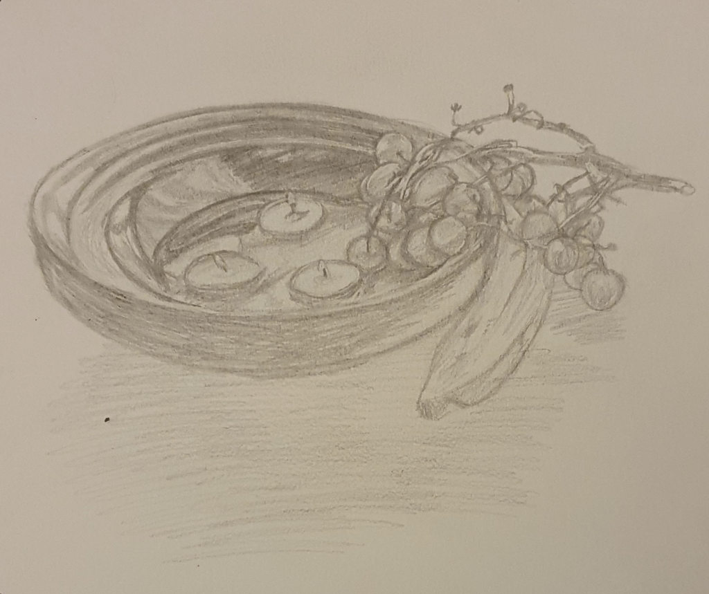
Which I followed with my tonal drawing
I noticed that I concentrated more on the darker areas and added more details when drawing the tonal drawing. It turned out a better version of the observational drawing.
Next I tried to figure out what I wanted to do for my final piece.
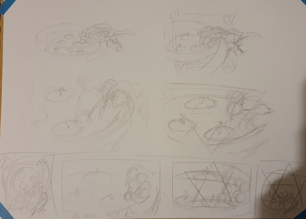
I tested different segments of the image along with adding symbolism to the image. I felt that the image needed something extra to get the point across but couldn’t seem to come up with the right idea. I liked the top right idea but it reminded me too much of a camera viewfinder. I also liked the idea of merging the elemental signs and adding on top but felt that in was too obstructive to the final piece.
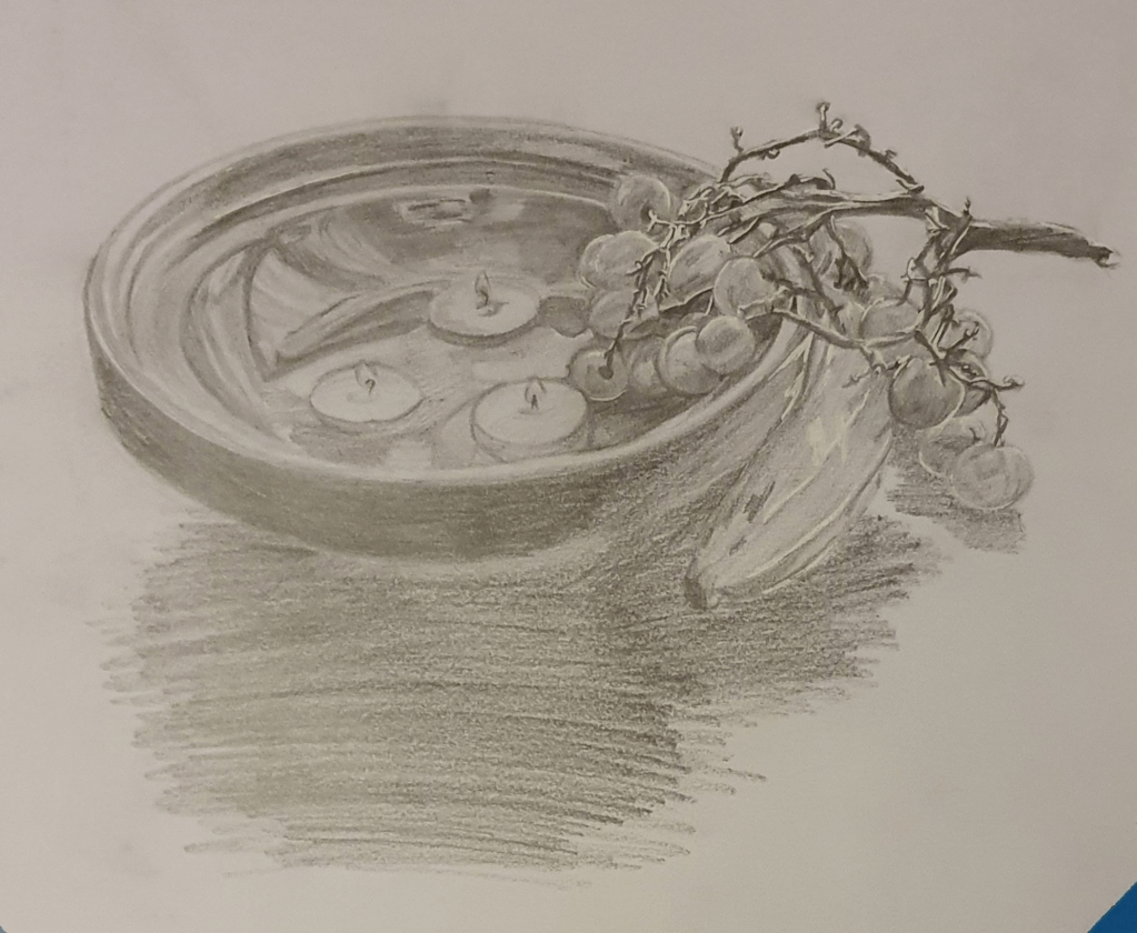
Which is why I decided to go with this one. A simple still life. I felt that it would bring the peace that is needed to balance the elements and represent it well. I felt that this would be a better approach than showing outright disaster. The idea is that the lit flames will represent fire. The extinguished flame will represent air, though there wasn’t much smoke when I did extinguish it so I had to exaggerate the size a little. The water will represent itself and the fruit and tagine work together to represent earth, which I think works well as I see earth as the main element as its what holds everything all together. The tagine works in the same way, holding all the pieces if the image together.
After this is when I started the final image.
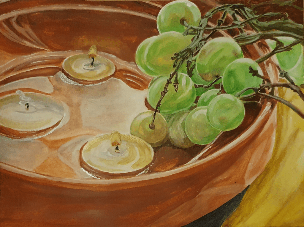
I felt that as simple approach would work best to represent the simplicity of balance. I painted a section of the objects as I felt this holds all the information that is needed and cuts out all the unnecessary noise. I feel that this composition holds a good balance between the represented elements and has a peacefulness to it. I decided that using watercolour would be the best medium to use as its base is one of the elements. I still need to work on my skills with this though as I had trouble controlling it one again and ended up layering it on too thick. I don’t think that I did too bad a job with the water in this painting though. I felt that a more observational route would be best for the style as this would show how these objects naturally looked the best, furthering the representation of nature. I’m not sure that I have managed to complete the brief in the way that was expected but by focusing on the balance needed to keep disaster from happening that I have done so in my own way. After all balance is needed in every aspect of life to keep all kinds of disasters from happening. At the end of the painting I couldn’t resist adding something to the image to further the symbolism but decided to do so with subtlety. I did this by adding some gold and silver ink to the flame, wick, smoke and water. I felt that this added emphasis to each of the elements in a quiet, peaceful way. When the light shines on it each of them are highlighted, though you can’t see this in the photo I took. Although not hard, as the objects were basically the colours used anyway, I used earthy colours as I felt that it fit best with the overall idea of this piece.
Overall I am pleased with this painting. I feel that I have managed to make a fairly realistic, if slightly more dramatized, well balanced image. Any concerns I have, I have already mentioned.
Bibliography
Identifying Tools And Materials
Smart Art. 2018. 5 Marker Art Pieces That Will Inspire and Motivate You. [online] Available at: <https://smartartbox.com/blogs/smart-art-blog/5-marker-art-pieces-that-will-inspire-and-motivate-you>
Tom DesLongchamp. Publish date unknown. Tom DesLongchamp. [online] Available at: <http://www.tomdeslongchamp.com/>
Copicmarker.com.au. 2015. Copic Australia | Copic Feature Artist – Stephen Ward. [online] Available at: <http://www.copicmarker.com.au/copic-feature-artist-stephen-ward>
Youtube.com. 2015. Copic Marker Australia. [online] Available at: <https://www.youtube.com/watch?v=hzMl7Y8-muM>
Gardnerillustration.com. Publish date unknown. Sketches | Stephen Gardner. [online] Available at: <http://www.gardnerillustration.com/sketches>
Cosme, M., 2017. The Prime Belgian Doodler You’ve Never Heard Of. [online] Doodle Arts. Available at: <https://www.doodleartsmagazine.com/benevolent-benelux-the-prime-belgian-doodler-youve-never-heard-of/>
Google.com. 2021. vince okerman – Google Search. [online] Available at: <https://www.google.com/search?q=vince+okerman&safe=strict&rlz=1C1CHBF_en-GBGB902GB902&tbm=isch&source=iu&ictx=1&fir=WNPTjzI8WKLgwM%252CE4J-ZvOP63t0EM%252C_&vet=1&usg=AI4_-kSZjboV9EeFYgL4n-DH2tQTmaLnFQ&sa=X&ved=2ahUKEwiFra6TqOztAhWBYsAKHQAKBkkQ9QF6BAgcEAE&biw=1536&bih=754>
Google.com. 2021. lisa krasnova – Google Search. [online] Available at: <https://www.google.com/search?safe=strict&rlz=1C1CHBF_en-GBGB902GB902&source=univ&tbm=isch&q=lisa+krasnova&sa=X&ved=2ahUKEwiMhP6-quztAhUwQUEAHZkTAlAQ7Al6BAgDECY&biw=1536&bih=754>
The Curiously Creative. 2016. 12 Amazing Copic Marker Artist You Should Follow on Instagram – The Curiously Creative. [online] Available at: <https://www.thecuriouslycreative.com/12-amazing-copic-marker-artist-you-should-follow-on-instagram/>
SIBYLLINE MEYNET ILLUSTRATION & COMICS. 2021. W O R K S P A C E. [online] Available at: <https://www.sibyllinemeynet.com/w-o-r-k-s-p-a-c-e.html>
Art Station. 2022. [online] Available at: <https://www.artstation.com/tinocopic>
Instagram.com. 2021. Login • Instagram. [online] Available at: <https://www.instagram.com/znk_art/>
IAMAG Inspiration. Publish date unknown. The Art of Takeshi Obata. [online] Available at: <https://www.iamag.co/the-art-of-takeshi-obata/#jp-carousel-159969>
Facebook.com. 2021. [online] Available at: <https://www.facebook.com/tlgdrawing/>
Museum Poster
Research Briefings. 2021. Advertising To Children. [online] Available at: <http://researchbriefings.files.parliament.uk/documents/CBP-8198/CBP-8198.pdf>
Google.com. 2021. museum posters for kids – Google Search. [online] Available at: <https://www.google.com/search?q=museum+posters+for+kids&safe=strict&rlz=1C1CHBF_en-GBGB902GB902&hl=en-US&source=lnms&tbm=isch&sa=X&ved=2ahUKEwj8vK7p6bTuAhUJCsAKHVi4BA8Q_AUoAXoECBAQAw&biw=1536&bih=754>
Campaignlive.co.uk. 2004. 10 Tips – How to advertise to children. [online] Available at: <https://www.campaignlive.co.uk/article/10-tips-advertise-children/513770>
Fizzicseducation. Publish date unknown. 6 TIPS FOR TEACHING STUDENTS TO CREATE AWESOME SCIENCE POSTERS. [online] Available at: <https://www.fizzicseducation.com.au/articles/6-tips-for-teaching-students-to-create-awesome-science-posters/>
Travel + Leisure. 2020. Stuck at Home? These 12 Famous Museums Offer Virtual Tours You Can Take on Your Couch. [online] Available at: <https://www.travelandleisure.com/attractions/museums-galleries/museums-with-virtual-tours>
BBC. 2021. [TV series] Secrets of the Museum
Museum of the World. Publish date unknown. The Museum of the World. [online] Available at: <https://britishmuseum.withgoogle.com/>
Teachinghistory100.org. Publish date unknown. Teaching History with 100 Objects – The Atomic Apocalypse. [online] Available at: <http://www.teachinghistory100.org/objects/about_the_object/the_atomic_apocalypse>
Travel. 2017. Top 10 things to know about the Day of the Dead. [online] Available at: <https://www.nationalgeographic.com/travel/destinations/north-america/mexico/top-ten-day-of-dead-mexico/>
En.wikipedia.org. 2021. Tunjo – Wikipedia. [online] Available at: <https://en.wikipedia.org/wiki/Tunjo>
Kevin Page Antiques. Publish date unknown. The stories behind the art: Jizai Okimono – Kevin Page Antiques. [online] Available at: <https://kevinpage.co.uk/news-and-blog/stories-behind-the-art/the-stories-behind-the-art-jizai-okimono/>
Okimono Project. 2020. Jizai okimono. [online] Available at: <https://okimonoproject.wordpress.com/2020/02/03/a-new-okimono/>
Bonhams.com. 2011. Bonhams : A fine, rare and small iron jizai (fully articulated) okimono of a dragon By Myochin Kiyoharu, Edo Period, 18th/19th century. [online] Available at: <https://www.bonhams.com/auctions/18980/lot/376/>
Stories from the Museum Floor. 2015. There be dragons here …. [online] Available at: <https://storiesfromthemuseumfloor.wordpress.com/2015/11/20/there-be-dragons-here/>
Bbc.co.uk. 2010. BBC – A History of the World – Object : Throne of Weapons. [online] Available at: <http://www.bbc.co.uk/ahistoryoftheworld/objects/97OnxVXaQkehlbliKKDB6A>
Museum.wa.gov.au. Publish date unknown. Throne of Weapons | Extraordinary Stories. [online] Available at: <http://museum.wa.gov.au/extraordinary-stories/highlights/throne-weapons/>
En.wikipedia.org. 2021. Throne of Weapons – Wikipedia. [online] Available at: <https://en.wikipedia.org/wiki/Throne_of_Weapons>
The Vintage News. 2017. The Throne of Weapons:A sculpture entirely made of decommissioned weapons used in the Mozambican Civil War – The Vintage News. [online] Available at: <https://www.thevintagenews.com/2017/05/04/the-throne-of-weaponsa-sculpture-entirely-made-of-decommissioned-weapons-used-in-the-mozambican-civil-war/>
A Children’s book Cover
Creative Bloq. 2015. 5 tips for illustrating children’s books. [online] Available at: <https://www.creativebloq.com/illustration/5-tips-illustrating-childrens-books-91516706>
Hassell, L., 2020. Illustrating book covers: the insider’s guide. [online] Digital Arts. Available at: <https://www.digitalartsonline.co.uk/features/illustration/illustrating-book-covers-insiders-guide/>
Hassell, L., 2018. 25 Book Design and Illustration Tips. [online] Digital Arts. Available at: <https://www.digitalartsonline.co.uk/features/graphic-design/25-book-design-illustration-tips/>
99designs. 2018. How to Design a Book Cover: The Ultimate Guide. [online] Available at: <https://99designs.co.uk/blog/book-design/book-cover-design/>
Reedsy. 2019. The 50 Best Children’s Book Covers of 2019. [online] Available at: <https://blog.reedsy.com/childrens-book-covers/>
A Menu Card
Template.net. Publish date unknown. Importance of Menu Card in Food Service. [online] Available at: <https://www.template.net/design-templates/menu/menu-card-importance/#:~:text=A%20menu%20card%20is%20not,and%20theme%20of%20the%20restaurant.>
Annsbridalbargains. Publish date unknown. WHAT ARE WEDDING MENU CARDS?. [online] Available at: <https://www.annsbridalbargains.com/blog/2015/08/what-are-menu-cards-7498.html>
Google.com. Publish date unknown. seafood menu cards – Google Search. [online] Available at: <https://www.google.com/search?q=seafood+menu+cards&safe=strict&rlz=1C1CHBF_en-GBGB902GB902&hl=en-US&source=lnms&tbm=isch&sa=X&ved=2ahUKEwje_4Hp1IXvAhWJunEKHeXPDL4Q_AUoAXoECA8QAw&biw=1536&bih=754#imgrc=Ju66uIjh63r-zM>
Google.com. Publish date unknown. restaurants menu cards – Google Search. [online] Available at: <https://www.google.com/search?q=restaurants+menu+cards&tbm=isch&ved=2ahUKEwjSxYbr1IXvAhUG-hQKHYvwAoEQ2-cCegQIABAA&oq=re+menu+cards&gs_lcp=CgNpbWcQARgAMgYIABAHEB4yBggAEAcQHjIGCAAQBxAeMggIABAHEAUQHjIICAAQBxAFEB4yCAgAEAcQBRAeMggIABAHEAUQHjIICAAQCBAHEB4yCAgAEAgQBxAeOgQIABBDOgIIAFCHxwRYudQEYM7iBGgAcAB4AIABwQGIAYkFkgEDMC40mAEAoAEBqgELZ3dzLXdpei1pbWfAAQE&sclient=img&ei=Cew3YJKdFYb0U4vhi4gI&bih=754&biw=1536&rlz=1C1CHBF_en-GBGB902GB902&safe=strict&hl=en-US>
Google.com. Publish date unknown. restaurant logos – Google Search. [online] Available at: <https://www.google.com/search?q=restaurant+logos&tbm=isch&ved=2ahUKEwjSxYbr1IXvAhUG-hQKHYvwAoEQ2-cCegQIABAA&oq=restaurant+logos&gs_lcp=CgNpbWcQAzIFCAAQsQMyAggAMgIIADICCAAyAggAMgIIADICCAAyAggAMgIIADICCAA6BAgAEEM6CAgAELEDEIMBOgcIABCxAxBDOgoIABCxAxCDARBDUKfMA1is4gNgn-UDaABwAHgAgAHIAYgBrQ6SAQU2LjkuMZgBAKABAaoBC2d3cy13aXotaW1nwAEB&sclient=img&ei=Cew3YJKdFYb0U4vhi4gI&bih=754&biw=1536&rlz=1C1CHBF_en-GBGB902GB902&safe=strict&hl=en-US#imgrc=iDH4E7YAEM7X7M>
99designs. 2020. 61 best restaurant logos to inspire you – 99designs. [online] Available at: <https://99designs.co.uk/blog/creative-inspiration/restaurant-logos/>
BBC Bitesize. Publish date unknown. Emotion, mood and atmosphere – Colour – National 5 Art and Design Revision – BBC Bitesize. [online] Available at: <https://www.bbc.co.uk/bitesize/guides/z3bqycw/revision/10>
A Tattoo
Wellcome Collection. 2010. A brief history of tattoos. [online] Available at: <https://wellcomecollection.org/articles/W9m2QxcAAF8AFvE5?utm_source=Google&utm_medium=adgrant&utm_campaign=Stories_Apr20&gclid=EAIaIQobChMI8pPaqKaK7wIV74FQBh3jGwnzEAAYASAAEgIodvD_BwE>
AuthorityTattoo. 2021. History of Tattoos: A Complete Timeline – AuthorityTattoo. [online] Available at: <https://authoritytattoo.com/history-of-tattoos/#:~:text=Tattoos%20date%20back%20many%20thousands,3370%20BC%20and%203100%20BC.>
king of tattoos. 2013. A Brief History of Tattoos. [online] Available at: <https://kingoftattoos.wordpress.com/2013/11/07/a-brief-history-of-tattoos/>
HuffPost UK. 2014. The Gorgeous History Of Tattoos, From 1900 To Present. [online] Available at: <https://www.huffingtonpost.co.uk/entry/tattoo-history_n_4957215?ri18n=true>
Alker, R., 2020. How tattoos became fashionable in Victorian England. [online] CNN. Available at: <https://edition.cnn.com/style/article/tattoos-victorian-england-conversation/index.html>
Flashbak. 2015. Wonderful Women With Wicked Tattoos: 1900-2000 – Flashbak. [online] Available at: <https://flashbak.com/wonderful-women-with-wicked-tattoos-1900-2000-32177/>
Custom Tattoo Design. 2020. 100 Years Of Ink: Tattoo Fads By The Decade | CUSTOM TATTOO DESIGN. [online] Available at: <https://customtattoodesign.ca/tattoo-trends/100-years-of-ink-tattoo-fads-by-the-decade>
Cornwell, B., 2021. Top 103 Awesome Tattoo Ideas – [2021 Inspiration Guide]. [online] Next Luxury. Available at: <https://nextluxury.com/mens-style-and-fashion/awesome-tattoos-for-guys/>
Thetrendspotter. Publigh date unknown. [online] Available at: <https://www.thetrendspotter.net/tattoo-ideas-for-women/>
En.wikipedia.org. 2021. Mother’s Day – Wikipedia. [online] Available at: <https://en.wikipedia.org/wiki/Mother%27s_Day#:~:text=Mother’s%20Day%20is%20a%20celebration,months%20of%20March%20or%20May.>
Town & Country. 2020. 20 Facts You Probably Didn’t Know About Mother’s Day. [online] Available at: <https://www.townandcountrymag.com/leisure/arts-and-culture/g19561312/mothers-day-facts/>
Town & Country. 2021. Unique and Funny Mother’s Day Cards She’ll Cherish. [online] Available at: <https://www.townandcountrymag.com/style/g26929890/best-mothers-day-cards/>
TatRing. 2020. The Art of Choosing the Perfect Font and Lettering for a New Tattoo. [online] Available at: <https://tatring.com/tattoo-ideas-meanings/Tattoo-Fonts-and-Tattoo-Lettering>
Inkedcartel.com. Publish date unknown. [online] Available at: <https://inkedcartel.com/typography-tattoos/>
Fontsmith.com. 2018. Skin deep – typography and tattoos. [online] Available at: <https://www.fontsmith.com/blog/2018/02/05/skin-deep-typography-and-tattoos>
PMacNaughton, W. and MacNaughton, W., 2014. Pen & ink.
En.wikipedia.org. 2021. Rag doll – Wikipedia. [online] Available at: <https://en.wikipedia.org/wiki/Rag_doll>
Character Development
ImagineFx, 2021. (Character Design)
ImagineFx, 2021. (Book Illustration).
ImagineFx, 2021. (Animation).
Google.com. 2021. animal characters – Google Search. [online] Available at: <https://www.google.com/search?q=animal+characters&safe=strict&rlz=1C1CHBF_en-GBGB902GB902&source=lnms&tbm=isch&sa=X&ved=2ahUKEwiAuZXQyNPvAhWyo3EKHc4OBocQ_AUoAXoECAEQAw&biw=1536&bih=754&dpr=1.25>
Google.com. 2021. pokemon animals – Google Search. [online] Available at: <https://www.google.com/search?q=pokemon+animals&tbm=isch&ved=2ahUKEwjs46SJ8dPvAhUIQBQKHfxlA3sQ2-cCegQIABAA&oq=pokemon+animals&gs_lcp=CgNpbWcQAzICCAAyAggAMgIIADICCAAyAggAMgIIADICCAAyAggAMgIIADICCAA6BwgAELEDEEM6BAgAEEM6BQgAELEDUIucAVjyogFgn6QBaABwAHgAgAHRAYgBoAiSAQUzLjQuMZgBAKABAaoBC2d3cy13aXotaW1nwAEB&sclient=img&ei=oO5gYOyTIYiAUfzLjdgH&bih=754&biw=1536&rlz=1C1CHBF_en-GBGB902GB902&safe=strict&hl=en-US#imgrc=cYQi2g1VnDvDMM>
Google.com. 2021. Famous animal characters – Google Search. [online] Available at: <https://www.google.com/search?q=Famous+animal+characters&safe=strict&rlz=1C1CHBF_en-GBGB902GB902&hl=en-US&source=lnms&tbm=isch&sa=X&ved=2ahUKEwjWqtjQ79PvAhXkuXEKHdpRCfQQ_AUoAXoECAEQAw&biw=1536&bih=754>
Blackman, N., 2021. Animal Illustration Inspiration: Character, Wild and Cute!. [online] Design & Illustration Envato Tuts+. Available at: <https://design.tutsplus.com/articles/animal-illustration-inspiration-character-wild-and-cute–cms-35797>
Larsson., A. and Yalanska, M., Publish date unknown. Animality: Awesome Illustrations by Therese Larsson.. [online] Design4Users. Available at: <https://design4users.com/animality-awesome-illustrations-by-therese-larsson/>
Character Design References. Publish date unknown. Character Design | Kid Boys. [online] Available at: <https://characterdesignreferences.com/visual-library-2/kid-boys>
Character Design References. Publish date unknown. Character Design | Kid Girls. [online] Available at: <https://characterdesignreferences.com/visual-library-2/character-design-kid-girls?rq=girl>
Character Design References. Publish date unknown. Character Design | Toddlers. [online] Available at: <https://characterdesignreferences.com/visual-library-2/character-design-toddlers?rq=toddlers>
Character Design References. Publish date unknown. Character Design | Men. [online] Available at: <https://characterdesignreferences.com/visual-library-2/character-design-men?rq=men>
Dragonsinn.net. 2020. Dragon Anatomy and Physiology – Dragonsinn.net. [online] Available at: <https://www.dragonsinn.net/dragon-anatomy/>
Magazine Iillustration
Zennedout.com. 2018. What are the 4 Elements and How to Use Them :. [online] Available at: <https://zennedout.com/what-are-the-4-elements-and-how-to-use-them/>
Ancient Symbols. Publish date unknown. Four Elements Symbolism. [online] Available at: <https://www.ancient-symbols.com/four-elements.html>
