Exercise One: Illustrating Visual Space
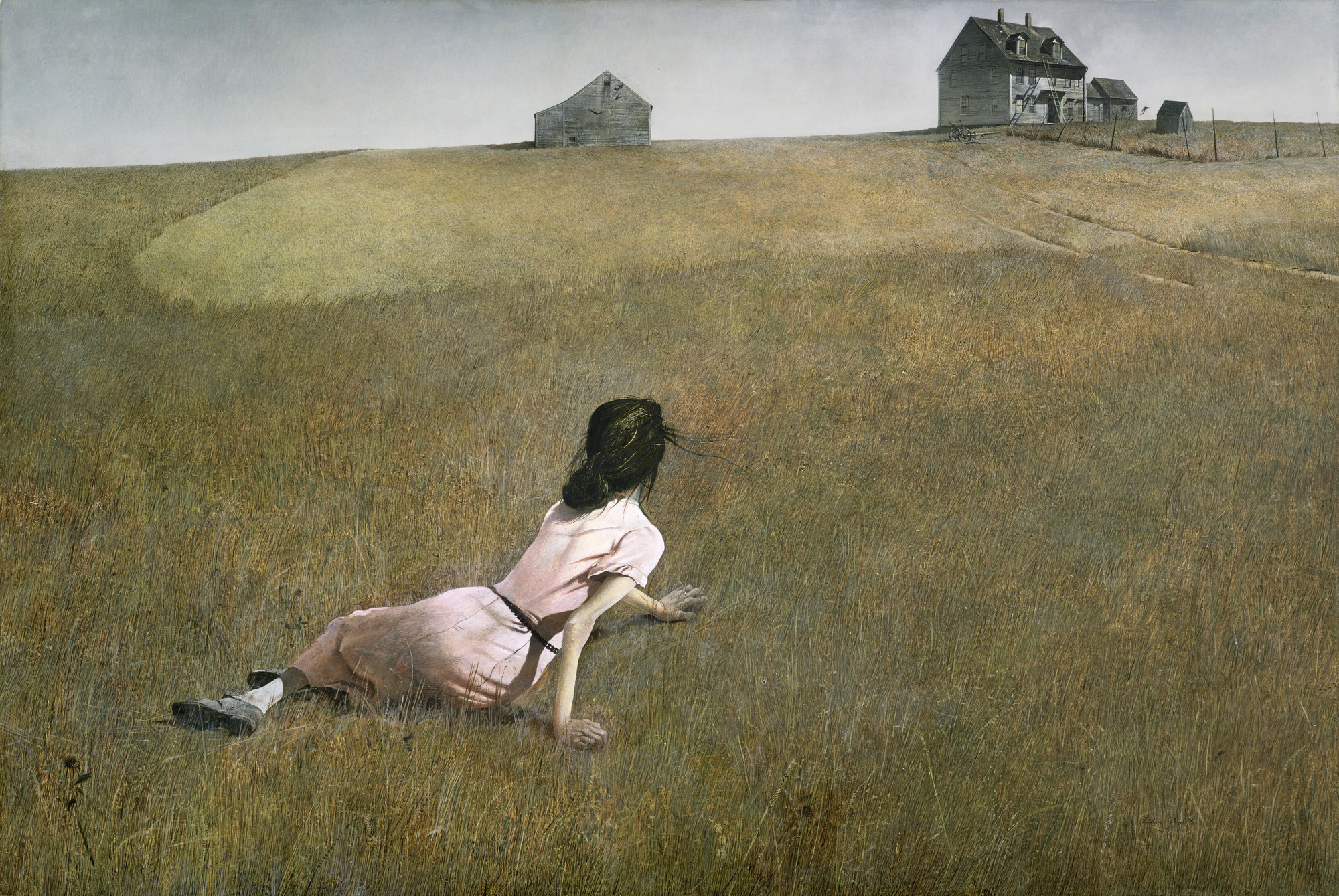
I started this exercise by researching visual space. Doing this lead to me looking at some examples of the use of visual space by artists such as: Andrew Wyeth, Henri Matisse and Henry Moore. A couple examples of the use of visual space I looked at were Wyeth’s Christina’s World and Matisse’s Red Room.

I had to pick an image of three different objects: a tree, a child running/walking and a building. Using feedback from part 2 I used photos I had taken myself. With these images I had to photocopy them in black and white at different scales and sizes and cut them into individual items. On a square format I had to arrange the cut outs into an image.
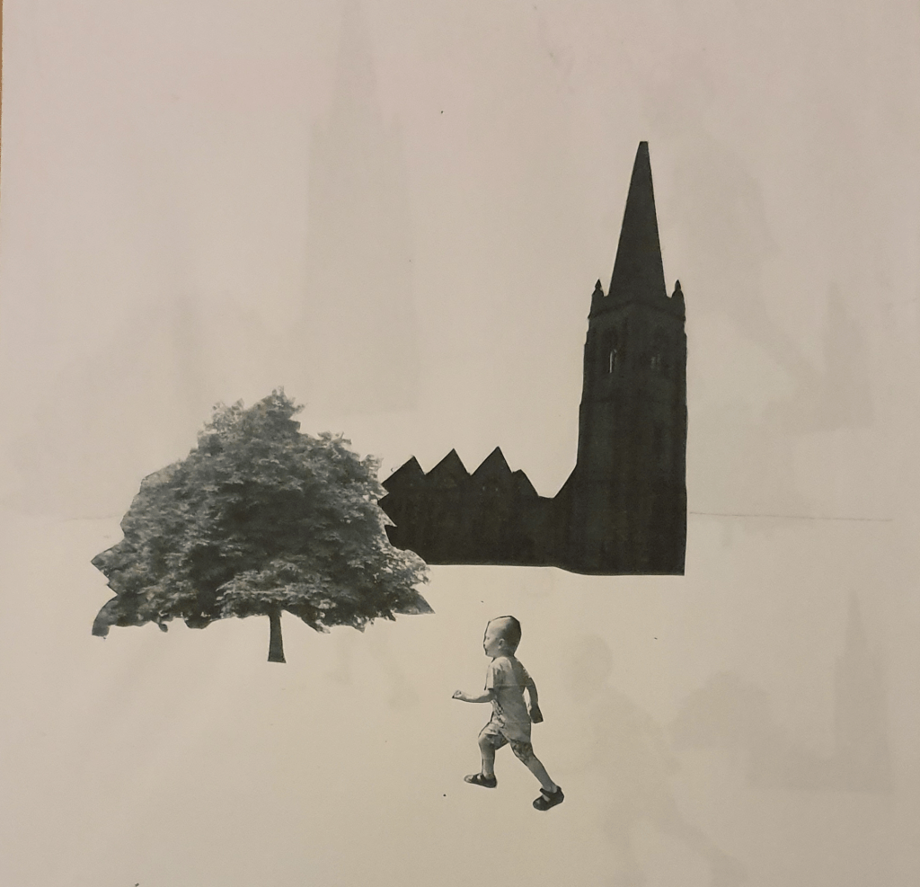
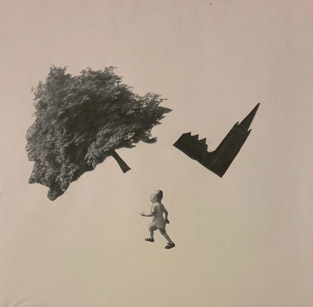
I kept the first image fairly realistic, so that it looks as though the child is walking passed the church. I brought the tree further into the foreground to add distance within the image. Looking at this the image looked as though it was floating in a white space so I added a horizon line to anchor it.
Moving the church back further would have helped create more depth.
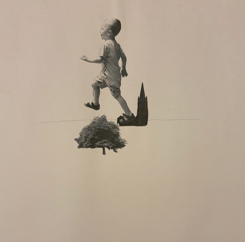
In the second image I played around with size. By doing this I made it look like a giant was stepping on the church. I feel that having the foot hover over the horizon line makes him look like he is stepping further than if it were placed higher up.
I feel that lowering the horizon line a little would have had more impact. There is also too much negative space.
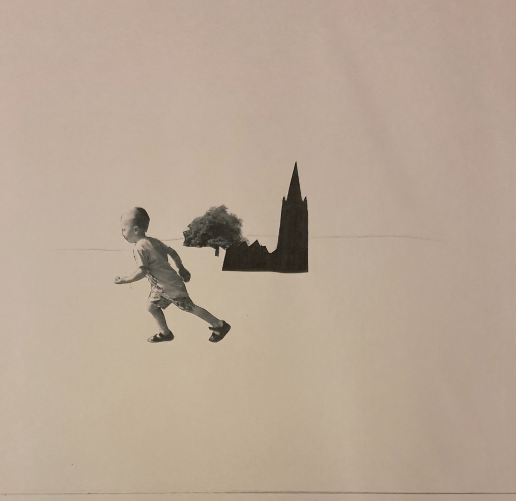
For this image I wanted the tree to appear further away so I picked a smaller cut out and placed it further up the paper, behind the church. I used a bigger cut out of the boy and placed him in the foreground to add even more distance. I tilted him so that he seems to be moving faster.
Here, I put the tree and church on a curve (though the line appears very faint in the photo) to give the impression that the work is twisting around the boy, or that he is moving so fast that the world is rushing by. I feel that this gives the impression that he can bend space and time. The boy is placed up right as positioning him any other way would ruin the illusion. I added the curved horizon line as without it the image just looked a jumbled mess.
I feel that the boy is too small in this and gets drowned out by the other objects.
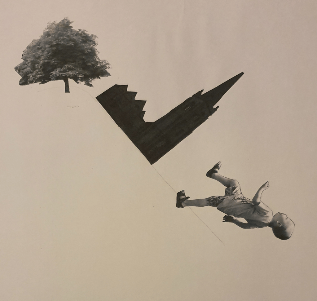
For this image I played with angles. I placed the tree upright and used the horizon line to anchor the angle the image would follow. I tipped the church on its side and placed it along the line so that it would look as though it is sliding down a hill. The boy is placed at a more drastic angle so he would look as though he had fallen down it.
Having the objects placed so close together leaves too much negative space in the image.
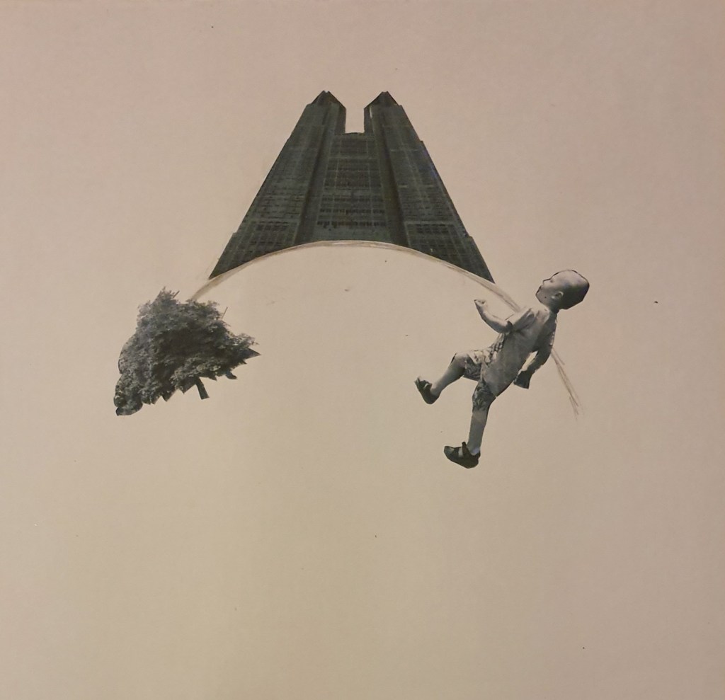
In this last image I once again played with angle. To do this I found an image of a building online that had been taken up close. This distorts the building enough so that when placing a horizon line below it the building looks as though it is falling behind. This gives the illusion that it is on top of a hill or on a ball. The boy looks like he is climbing a hill.
The angle of the building isn’t quite right so ruins the illusion a little and in comparison to the other objects the tree is way too small, giving the image a completely different effect.
Next I was given some questions to answer.
- How does your sense of the image and its meaning change when the figure is smaller than the other elements?
This makes the figure less obvious, drowning it out and giving dominance to the other objects in an image. It gives the image an Alice in Wonderland feel. It can also leave too much negative space and leaves the space too ambiguous. - If the elements are at differing angles to each other and at an angle to the frame, what dynamic is suggested?
This kind of image is the opposite to what the mind expects so gives an image a surreal feel. I think in the case of my image it gives the world the sense of being warped. This can suggest super fast movement or the bending of reality. It reminds me of Inception. Doing this allows you to play around with what the mind expects and considers normal. Going against what is expected can create different effects and feelings, like falling. - If all the elements are completely horizontal and vertical in relation to the frame what dynamic is suggested? What is your opinion about this image and what sensation does it communicate?
This kind of composition is what the brain considers normal and expects to see. This gives an image a more comfortable feel and settles into the mind better. This composition is more orderly which gives the viewer a more obvious path to follow. The foreground and background become clearer in this kind of image, making it more comfortable to read. - Which is your favourite composition? Why is it most successful?
I like the last image best. I feel that is twists reality in a more comfortable way. Bringing the horizon line forward gives the viewer more information, making it more easily read and followed. I think that the angle of the building provides a clear line as the larger component gives a clear focus to the image. It also provides a sense of symmetry, creating a calmer feeling image. The curve of the horizon line reminds me of the moon, adding a sense of serenity.
Edit:
To give the church a feeling of dominance I could have made everything else a lot smaller, so that they looked like ants against the building. I could have also moved it up the page so that it would bleed off the top and give the image a sense of looming I could have also done this other ways by changing the perspective. I thought I had enough variations at the time, however, If I had experimented with more sizes I could have created some more interesting effects. I feel that a bigger contrast in size would have created a better image.
Exercise Two: Reading an Image

- What is the image about? What is it saying?
There is a dragon sleeping. It is surrounded by treasure. A throne, money, armour and weapons make up the treasure. Two kids are to the left of the image, one holding a lit torch, the flame lighting the top left corner. - What is the narrative? Identify the story
In the image two kids have come across a sleeping dragon. Whether they have stumbled upon it or purposely sought it out is unclear. They are in what appears to be a cave surrounded by treasure, which leaves the possibility that they are after it. One of the kids is pointing out of the image, either showing the other child something we can’t see or asking to turn back. The whole scene reminds me heavily of when Bilbo went to steal the Arkenstone from Smaug. - Describe the palette and tonal range.
The artist has used a limited palette. They have used a mix of hot and cold colours. The hot colours used are red, yellow and orange. The cold colours are blue, green and purple. The hot colours have been used for the flame and the parts of the cave that it lights up. Red is also used for the colour of the dragon, a popular choice for this creature because of its fire breathing capabilities. These are the colours that jump out at you when viewing the image. My attention is first drawn to the light reflected from the flame and then is drawn to the dragon. This is because of the dark blues used in the background. The cool colours are used to make up the shadows, the darker blues adding a depth and making the cave seem bigger.
After staring at the image for a while I realised that the shadow is in the wrong place as it should be behind the kids. I also realised that the dragons back leg is at an awkward angle, making it look like it is in the wrong place. I feel that the main focus of the image should be the dragon, but the bright colours of the light on the ceiling is what immediately draws my attention. Maybe adding a little more yellow to the dragon’s skin would draw the eye to it more. - Is there a connection between the hot colours and the importance of the element in the story?
The only importance I can see, that makes sense to the story, is the danger that the dragon imposes because, as stated before, of its fire breathing abilities. The importance given to the roof draws the importance away from the rest of the image.
Hierarchy in the image
I’d say that the most important elements in the image would be the dragon and kids. Having the dragon curled around its treasure really gets the point across of how important it is to the dragon. It also makes me think that it acts as a comfort to the dragon. Sort of like a baby with a comfort blanket. Having the kids pointing in different directions works to send the message that one of them doesn’t want to be there. Though I don’t think the ceiling is as important as the dragon or kids, having it lit up red draws the viewers attention. Whilst this takes attention away from the kids it also leads the eye in that direction, where the eye automatically goes to the kids next. I do feel that the attention should have been brought straight to the kids, instead of through the ceiling. I also think it important that the child who clearly wants to be there is carrying the flame. This distinguishes them as the clear leader. The flame, However could also pose a threat, which would change the idea behind the image. All in all I think that the image is well thought out, I’m just not sure about the reliance given to the importance of the ceiling.
Exercise Three: Image Development
I started this exercise by looking into the development of an image. Doing so gave me tips on the best way to compose an image and where the eye will interpret and read things.
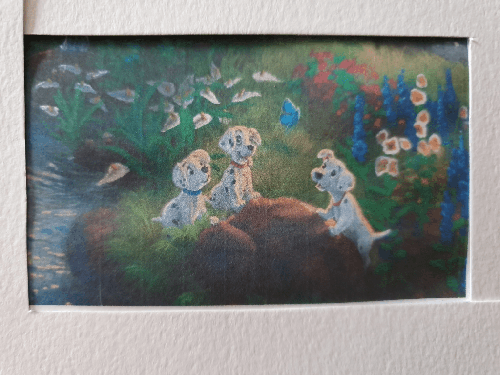
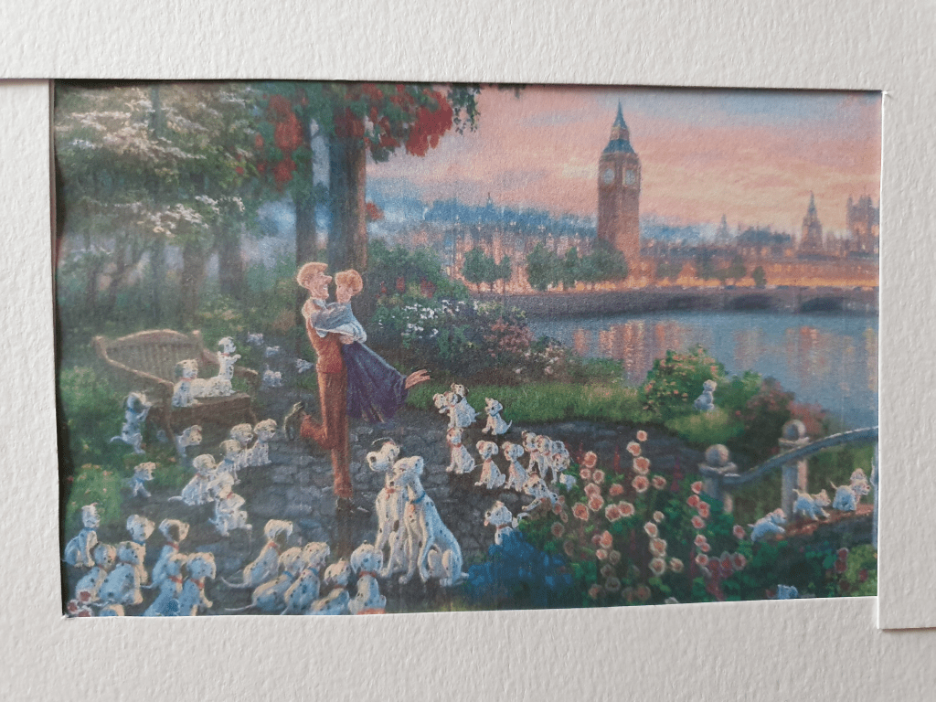
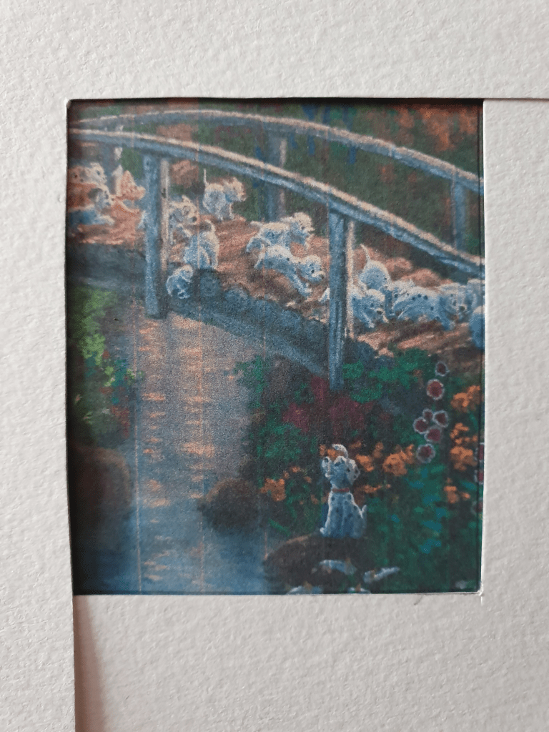
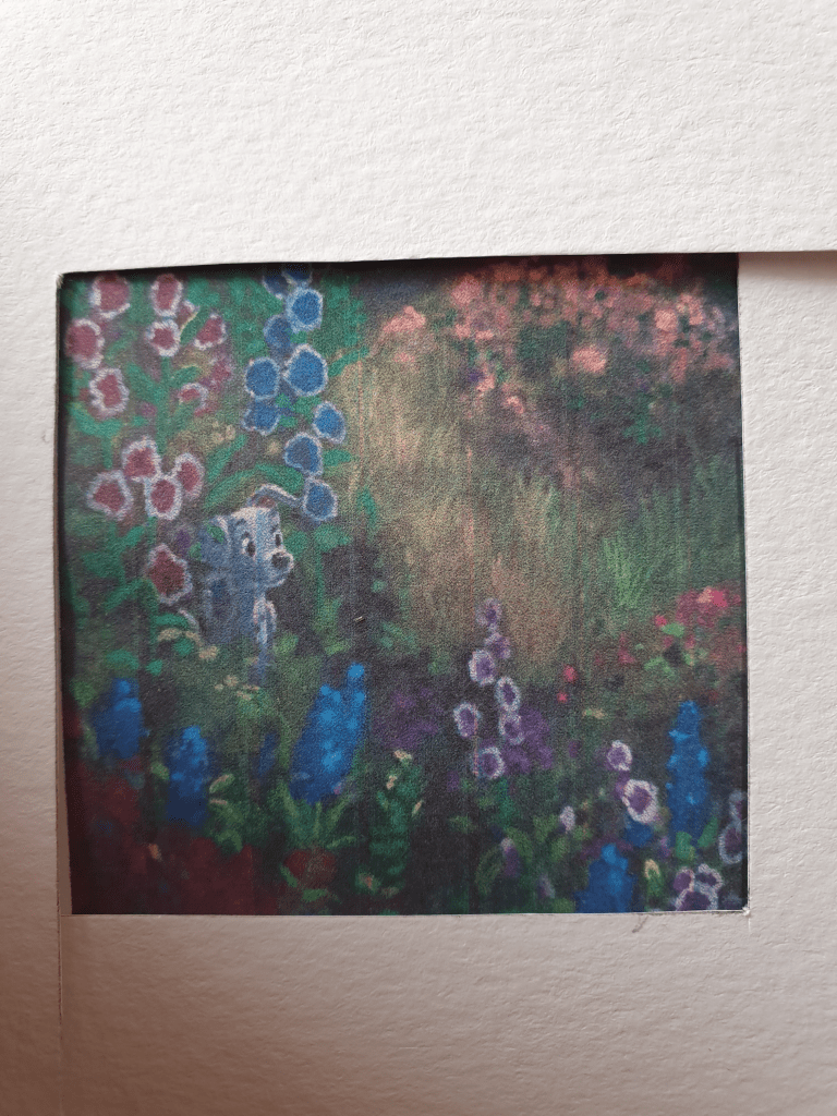
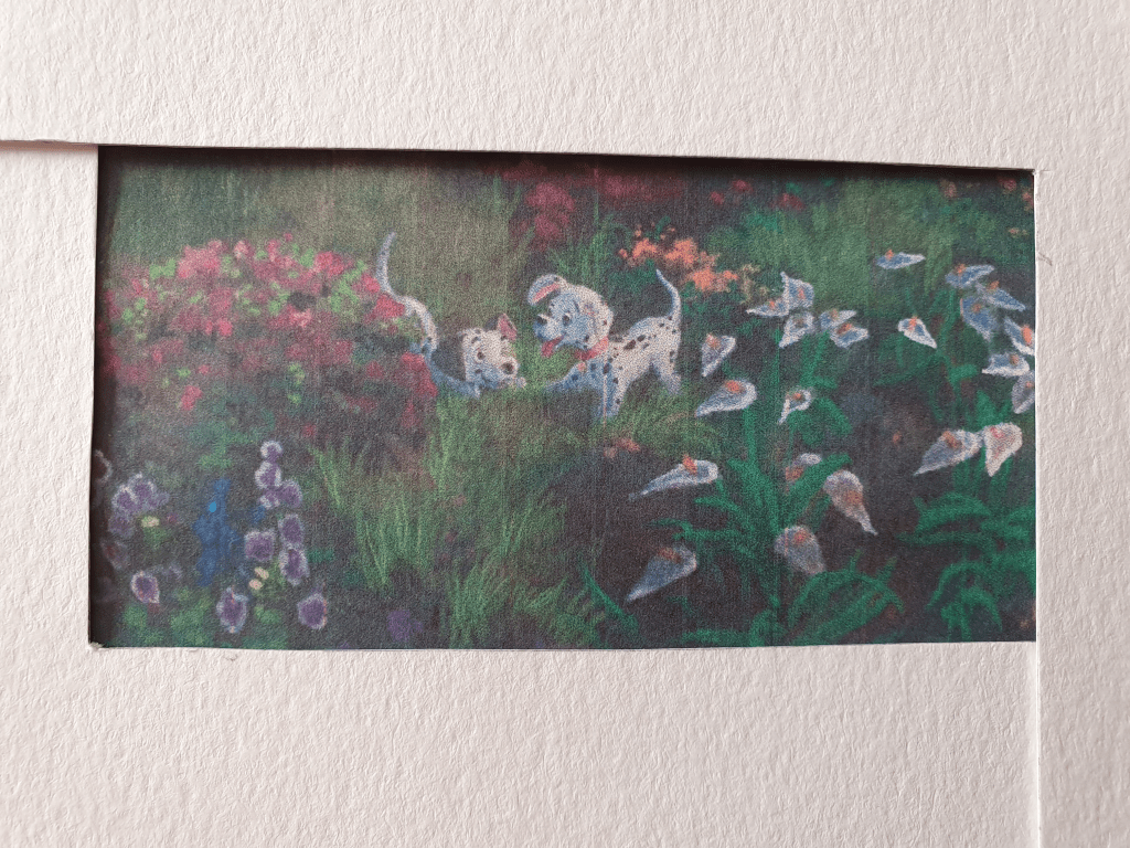
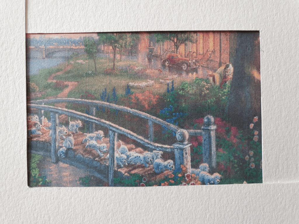
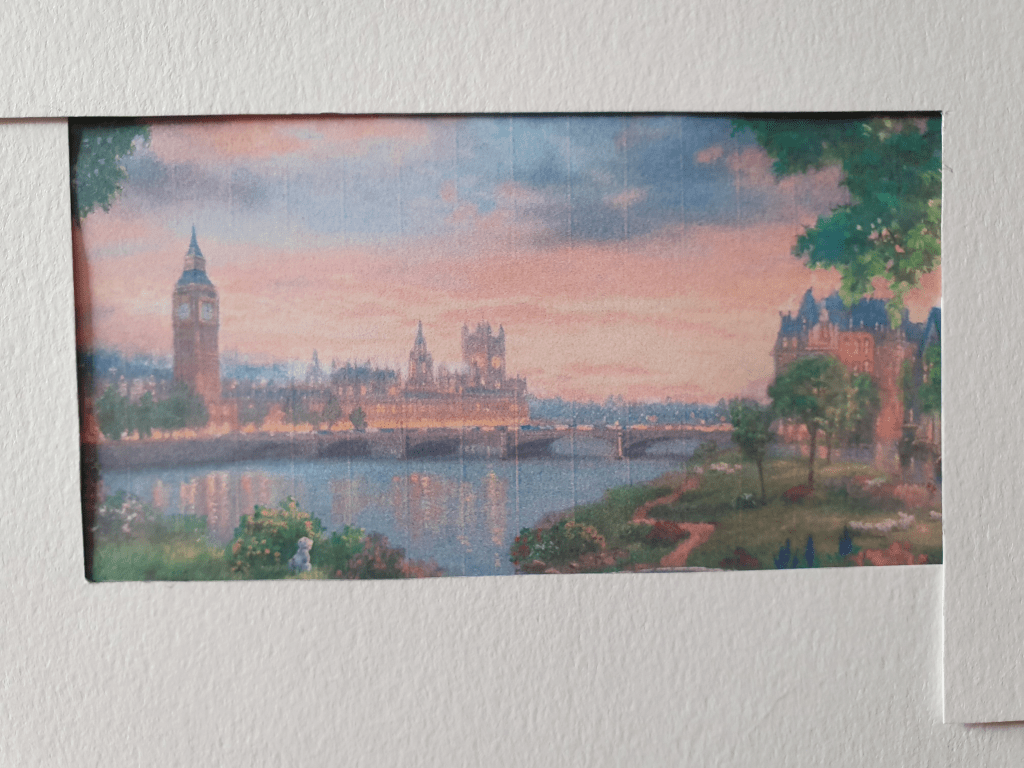
For this exercise I chose to use a painting created by Thomas Kinkade. Kinkade is well known for his Disney art and I picked a painting based on the movie 101 Dalmatians. I picked this as the image is full of activity.

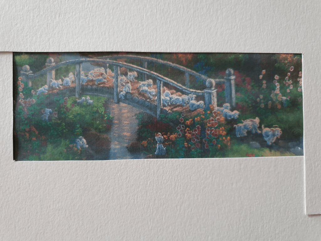
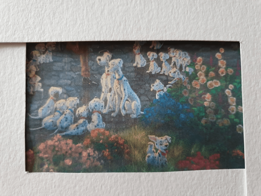
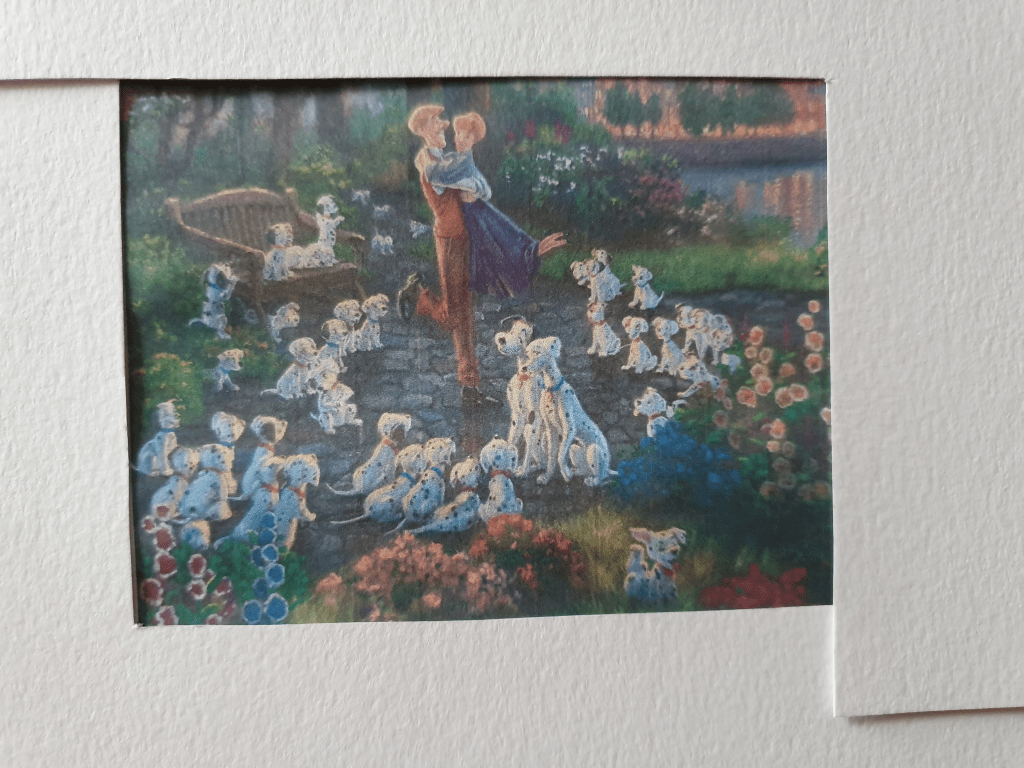
Taking two L shapes to crop the image, having printed it on A4 paper, I created ten smaller compositions. I then had to think of a word to name name each image that related to it in some way.
Here are my images:
I named this one Meeting
I was going to name this one Happily Ever After but changed it to Forever as I wasn’t sure it fell under the brief.
Leading
Proud
Family
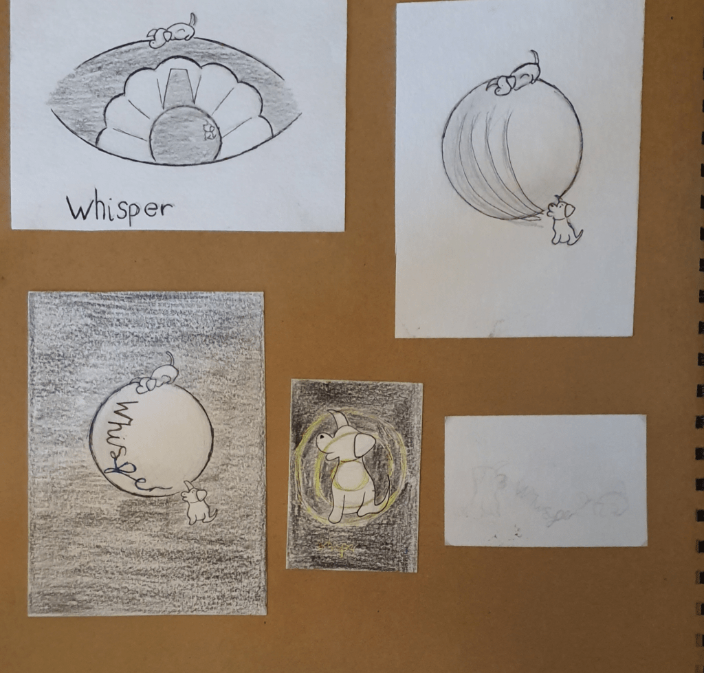
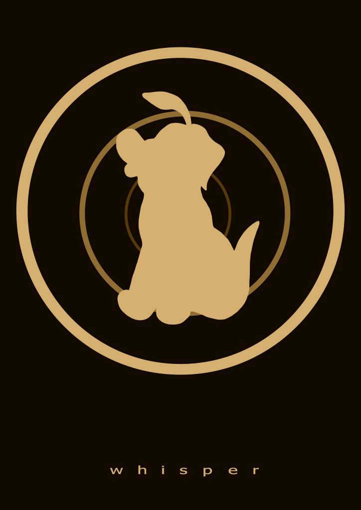
Whisper
Hide’n’seek
Playful
Creeping
Dreaming
Doing this I found that cropping an image can change it immensely. Even the smallest change can effect the image and its meaning in a big way. I’d say that two examples of this would be Leading and Creeping. The images are based around the same area of the painting but because I changed the placement of the paper slightly different aspects of the painting are revealed and the narrative is completely different. The same thing happened with Family and Forever.
I found that the shape of an image can change where the focus is placed. This can then affect the importance of other elements of an image, either adding it or completely stripping an element of its importance. sometimes you end up cutting an element out completely. The feeling of a image can also be affected by this.
Next I was to pick one of the images as a basis for a new illustration. I had trouble choosing between Meeting and Whisper. To make my decision I made a mind map for each and ended up using Whisper. I proceeded to look into the idea behind whispering draw some designs.
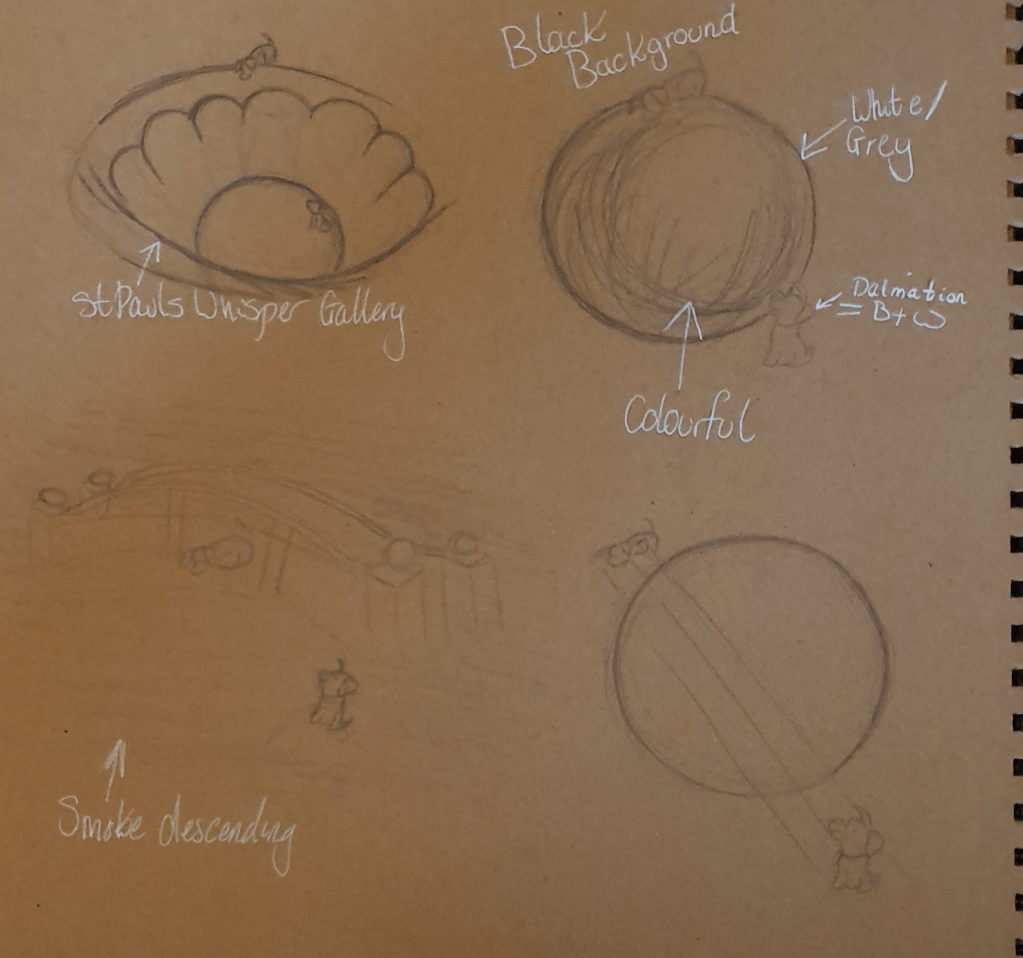
I liked the idea of using a whisper gallery in some way. This is because I liked the idea of being able to hear and send messages to each other from opposite sides of the room. Having looked at both Grand Central and St Paul’s Cathedral, I felt the St Pauls would have been a better representation. I like the shape better.
My Final Piece:
As I didn’t like the effect I was getting working with more traditional mediums and to work on more feedback from the previous part of this course I decided to work digitally. I liked this as it was easier to fix any mistakes I made. I wouldn’t say that I found this an easier medium to work in as I am still getting used to all the tools in the software.
For this piece I decided to use a more muted and restricted palette. I was originally planning to use white for the dog but when viewing it I felt that this made the piece look unfinished and like it had a big blob of negative space as the centrepiece, which wasn’t a good look. I eventually decided upon a cream/beige colour as it is a warmer, more soft and comforting colour. I felt that this added an intimacy to the piece, becoming a better representation of a whisper. The colour is also nearer to the paint used in St Paul’s Cathedral so became a better fit for the rings in the image and adds a more ancient feel to it.
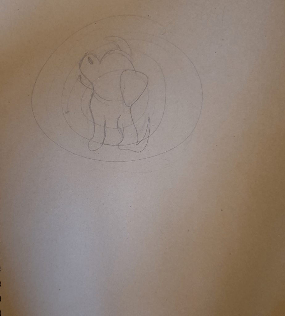
The rings in the picture are used to represent the layers and height of the whisper gallery. This added a few more layer to the image, giving the illusion of distance and looking at the room from a birds eye view. They also look like waves of sound reverberating through the room. Each ring darkens and gets smaller as they travel into the background to add a depth to the image. Doing this also allows the dog in the centre to stand out and not meld into the gallery.
I used the dog as the inspiration from the original image. I placed him in the middle of the gallery to show that the sound is moving around, or to and fro from him. The fact that his ear is up in the position it is in makes it look like he is listening, adding to the effect. I placed the image slightly off centre, up the page to leave room for the text at the bottom so that it wouldn’t look cramped and slapped on.
I had a hard time picking a font as I wanted one that looks soft but I couldn’t find one that felt right. I knew however, that the text should be small, as is the sound that travels the gallery. I chose to use the same colour as the rest of the image to tie it in and because it feels softer than any other colour I thought to use. I spread the letters apart, not only to take up more space but because it makes it last longer, as a whisper takes longer to be heard and lingers. I used all lowercase letters to fit with the whisper.
I do like this image, though I do feel as though something is missing. I’m not sure about the size of the text, I did play around with making it smaller, but this caused it to get lost within the image. I then spread the letters further apart, however, this just made the image look stretched and wrong. The way the text is now does seem to anchor the image more than if it weren’t there. I added a fourth ring but tis just made the image look over full and complicated.
Edit:
I think that having already known the story of 101 Dalmatians, which this painting is based on, has affected my view of the image. Already knowing the characters forms a preconceived idea of what is happening and I am sure that this influenced the feel given by the painting and the way that I cropped the image. I believe that I may have had a different take on this image if I hadn’t seen the movie before.
Exercise Four: Abstract Illustration
I had a lot of trouble with this exercise as I have never really seen what is good about abstract art. It has always looked to me as though someone just threw some paint onto a canvas to make some money so this required me to research the ideas behind this kind of art. I do like the idea of it being free from the restraints of representational art.
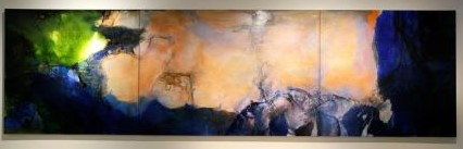
I looked at examples from other artists. Some of my favourites were:
.jpg)
The next thing I had to do was decide which of the following musicians I should listen to whilst making my piece: George Gershwin, The Gypsy Kings, Beethoven or Miles Davis. I chose The Gypsy Kings as I felt their music was more joyful than the others.
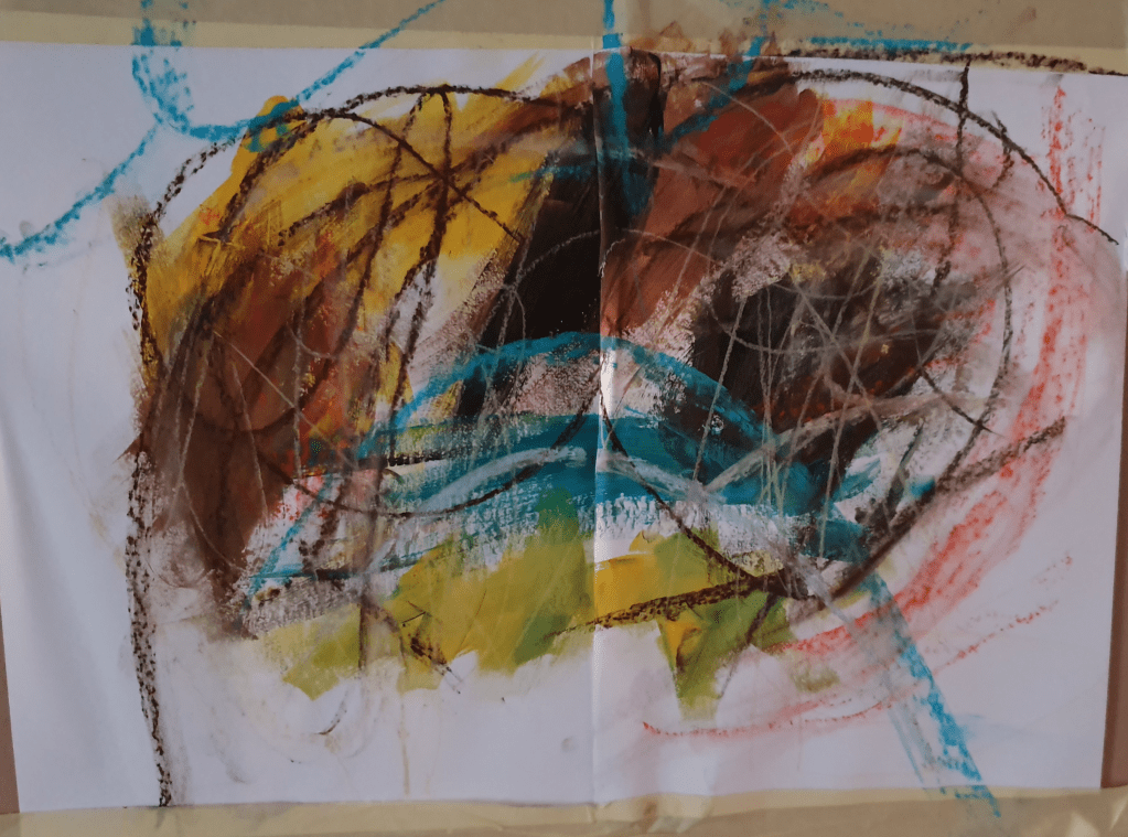
I found working intuitively on this harder than expected. I’m used to giving my subject a form instead of just adding marks to the paper. Because of this I felt that I should try again, hopefully getting better, less restrained results.
I felt that the second attempt was way more successful. In the first image I used a range of materials, trying to vary the effects and textures made. Remembering to change material however stunted my ability to be intuitive so in the second image I only used paint as I felt that this medium allowed more room for experimentation. I did however scratch at the paint with some paper I had beside me to add a different texture. I used earthy and bright colours as that is the feel I get from the music.
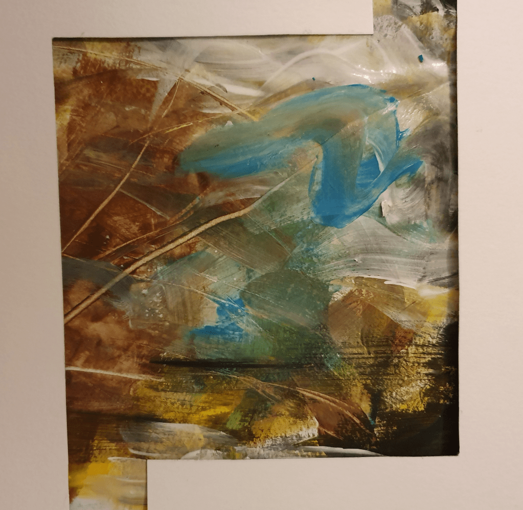
The adjective I chose for the piece is Natural. I chose this one as the scratches I made remind me of a tree and the effect of the paint at the bottom of the image reminds me of water. I feel that the music and piece are both full of life. When looking at the piece and listening to the music in unison I see lively dancing and colours associated with Mexican art. I like the slight bit of black in the corner as everything has a bit of darkness and it looks as though it is being dragged into the image, or out of it, as it seems happens with everything. It also adds a horizon line for the water.
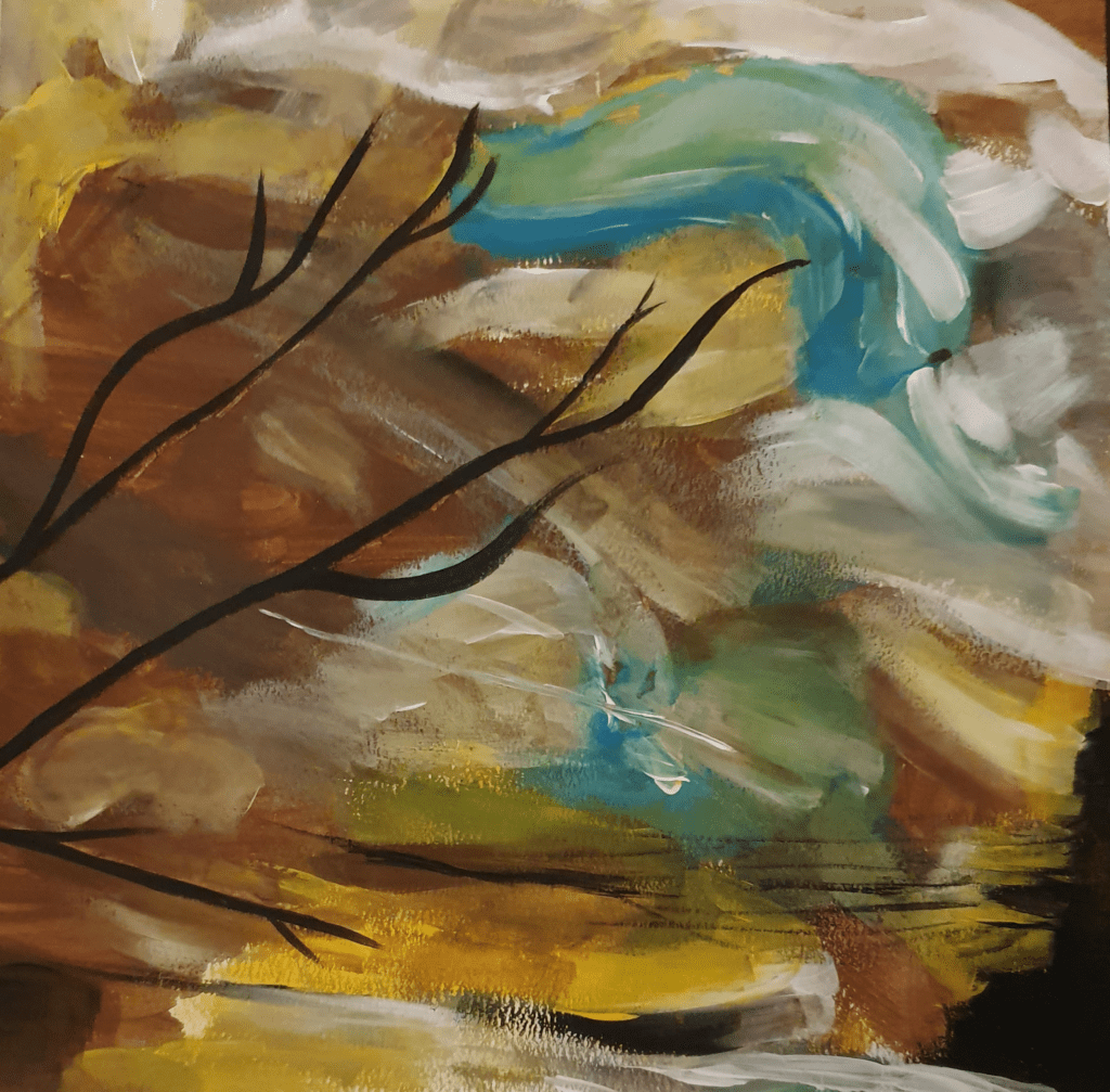
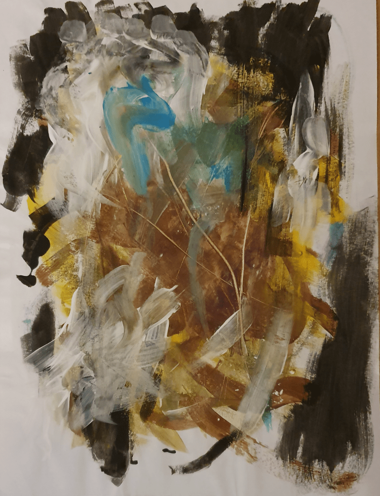
Here I reproduced the last image. I laid black paint over the top of the scratches to enhance the branch look. I felt that using black would give a silhouette look and also tie it in with the black on the opposite side, adding a sense of symmetry. I tried not to change the image too much from the original but brightened it up a little by adding more yellow and blue. The way I have applied the paint gives me a Van Gogh vibe, lending to the reading of the marks as the sky. These marks also help add to the natural, lively feel, and suggest movement. I liked the image this created, however it was at this point that I realised I had only used one type of media which doesn’t fulfil the brief properly, which I had to fix.
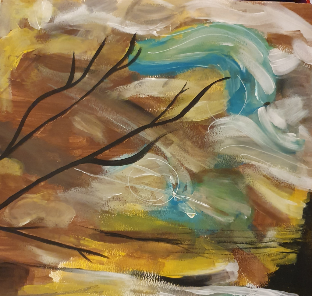
Not wanting to ruin the effect I already had I used pencil and ink sparingly. I added the slightest bit of pencil in the bottom corner to suggest the reflection of a branch in the water. I then added white ink, keeping with the movement in the sky to suggest wind. I like the effect this created although the part in the middle almost looks like a planet, suggesting that this is some alternate universe where you can see the rest of space from land. This does ruin the natural feel I was trying to create. Though if it doesn’t make you think if this I think I have succeeded in my goal.
I’m not convinced that this would work as a successful CD cover for The Gypsy Kings as they are now. However, if they were to make a slightly calmer album I feel that this could be a good contender for that space.
Thinking about it now I should have used something other than a brush to apply the paint and if I had thought about it at the time I would have looked on Skillshare for videos on abstract art.
Exercise Five: Diagrammatic Illustration
The aim of this exercise was to successfully give instructions through visuals. I started off by looking at the key points to creating a successful diagram. I found that a more simple, obvious approach is best. I then made a moodboard of diagrammatic illustrations. For this I used the internet and some instruction manuals I had at home.
I was to then pick of these subjects to illustrate: making a cup of tea, getting to my house or playing a tune on an instrument. I chose making a cup of tea. To start I researched into the history of tea to generate ideas and themes behind the image. I did this because I didn’t want to create the usual boring looking straightforward manual. I then looked into the most used method of creating a cup of tea. There looks to be more steps than expected when laid out in front of me.
These are:
1. Boil the water.
2. Warm a teapot. Use warm water and then tip it out.
3. Add teabags and water to the pot.
4. Use a tea cozy. This step isn’t always necessary.
5. Steep tea for at least 5 minutes. Additional time depends on taste.
6. Pour the tea into a cup then add milk and sugar. Milk is traditionally added first to protect the china.
7. Grab a biscuit.
Next were the designs:
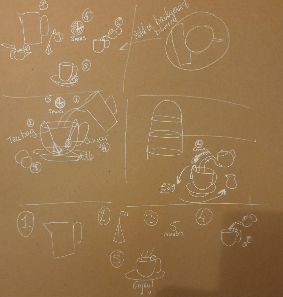
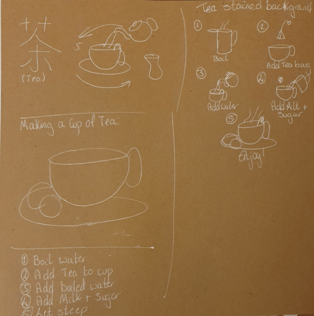
I tried to think of different ways I could present this. I liked the idea of having a cycle as I felt that it would flow better. I eventually decided to have an all encompassing picture. These designs were highly influenced by my experience working at a café. I did try to include influences from other places and cultures in my designs.
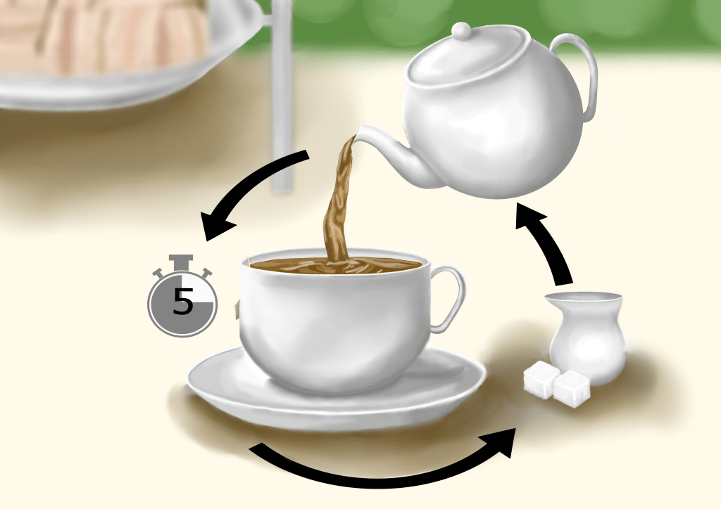
This is my final illustration. Over all I am pleased with it. I decided that since we are in England I would go with an English tradition. Comparing the sketch to the others I felt that this one would make a better illustration. Some of the others seems cold and static. I also thought that it was simple enough to not be confusing and plainly communicate the instructions.
I tried not to use any letters or numbers, however I felt that the number 5 was necessary for the instruction to be correctly interpreted. I thought that a digital illustration would create a better, cleaner look, allowing for clearer instruction. I did change the image slightly from the original sketch as I felt that these instructions are clearer and make more sense, with a better composition. I made a clear separation from the background by blurring anything that wasn’t instructional or necessary. This made the main focus obvious to the viewer. I chose to use colour because I felt that this would make it more approachable and more illustration like. I used a paler palette as I felt it fit the scene best and gives of a calmer vibe. I chose to use big, bold, black arrows as they wouldn’t be able to blend into the background and disappear, making it obvious which way the eye should follow. My only problem with this is that I don’t think I made it clear which one you should look at first. I have relied upon the fact that the viewer would have a basic understanding of the process, which isn’t the best thing when creating an instructional illustration.
Over all I think the illustration looks good, though I’m not sure I highlighted and added the shadows 100% correctly. Other than the concerns I’ve already mentioned I think the image does its job. When asking people what they thought of the image and how it works they said that they find the image to be attractive and function well. I also have a quote on a comment I was given “The background being out of focus really draws the persons view onto the main drawing. On top of this the shadows really bring a great deal of depth to the image and allows it to stand out and the use of lighter colours is very calming and easy on the eyes.”
Edit:
I didn’t feel that showing a person making a cup of tea would be the right way to go as I wanted the focus to go straight to the tea. I thought that having someone in the image would over crowd and over complicate the image.
I chose not to include every step of making a cup of tea as I thought that everyone would have the most basic knowledge of how to do so. I know that the point of this exercise was to show someone how to make the tea, however (I assume) everyone has seen a cup make at least once. With this thought I decided to make instructions on how to make tea properly, with correct timings, and build on the knowledge the person would already have. I do think that moving the tea bag to the forefront of the image, instead of peeking out from the side of the cup, would have had a better effect and create a clearer understanding though. If these instructions were given to someone who had never seen a cup of tea made before, therefore and no prior knowledge to build on, that I would need to add the missed steps.
I agree that a pattern would have made the china stand out more in the image and would have worked to draw the viewers attention easier.
Exercise Six: Viewpoint
Here I had to choose from a list of objects to base my image around. The options provided were: festival, the morning after, summertime and workshop. To decide which to use I made mind maps of things that related to the subjects. In the end I chose workshop as that’s the category I had the most stuff for. Before taking any photos I researched viewpoint and came across the diagonal method. This is a method that theorises that artists intuitively place what they consider important on the bisection of the diagonals of two squares. Then having arranged my objects, using this method, and others, I began to take my photos.

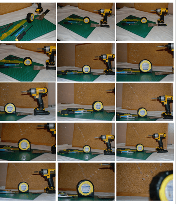
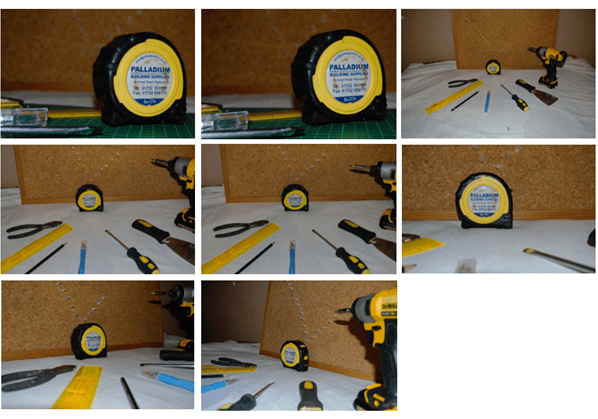
I tried to think of every aspect of the images, including: placement, number of objects, the way the objects draw the eye, closeness to camera and angle of camera. I don’t think I succeeded as well as I thought I had at the time, however I don’t think it was a total fail. Next was to draw the images.
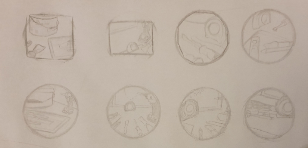
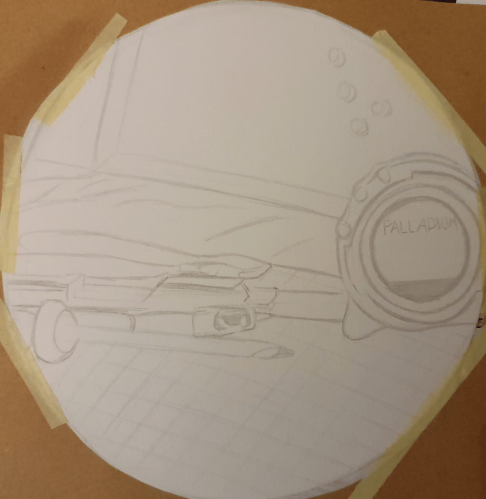
Using the photos I took I experimented with the shape of an image. I tried out a few different formats to find the right one. I liked the circle as it created a smoother image. Choosing my favourite design, I reproduced it in a bigger size.
I liked this one best as I felt it was more directive. I also had some questions to answer.
Which viewpoint best fitted the word your objects illustrated? Why was this?
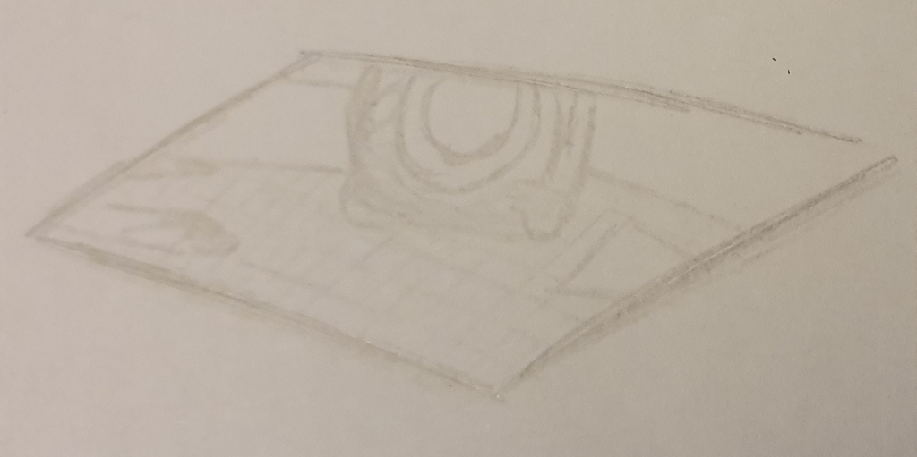
I found that the second to last image best fitted the word workshop. I feel that this is because I zoomed into the objects, so it was like giving a peek into the room. I feel that having the tools laid out plainly gave a better narrative to match the category. Although this angle doesn’t give the best view of the diagonals used I feel that this angles is more immersive.
Which format best illustrated your words?
I found that a circular format fitted best as the squares and rectangles I used felt to rigid. I feel that the circle creates a better flow within the image.
Did changing viewpoints make you think differently about your choice of objects and arrangement of them?
I found that having a far off viewpoint made the image feel more distanced and off putting. Although the image held more information it felt more disconnected. The arrangement of the objects affected how I read the image. Any diagonals I arranged directed where my eyes went.
Edit:
Looking at these images I again, and considering what I learned in the next exercise, I find that so many objects weren’t needed. I feel that taking some away would have given the viewer all the information needed just as well, of not better.
This exercise could become part of my primary research methods as it is good way of figuring out compositions
Exercise Seven: Client Visuals
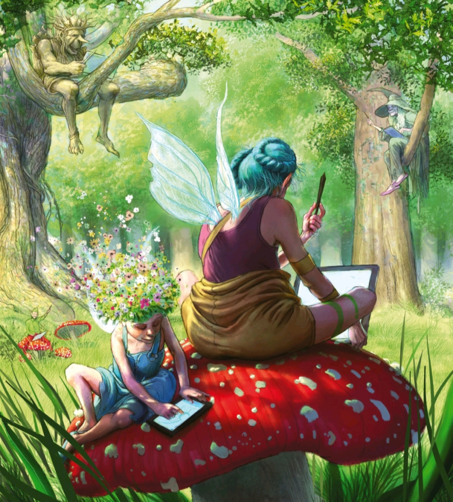
For this exercise I picked an illustration I found in my Alice In Wonderland book, Illustrated by Sir John Tenniel, and an image I found in ImagineFx magazine created by Scot Howden.
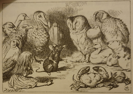
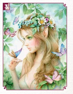
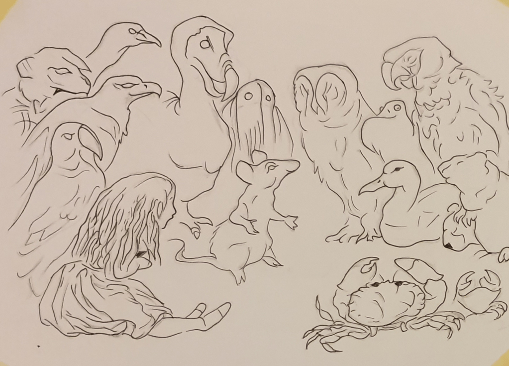
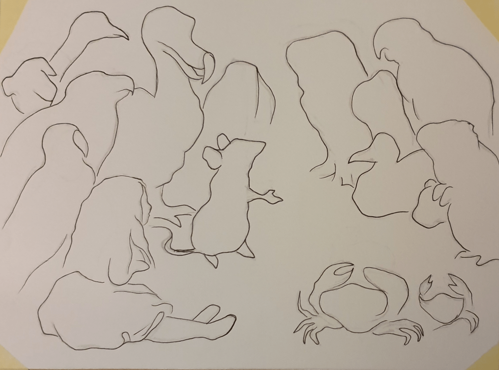
Enlarging the first image by 2.5 times its size to 22cm x 16.75cm I drew a line version of it. I did this twice to allow me to explore just how many lines and details are needed to communicate the image well.
I then reproduced the next image at 17.5 cm x 15cm, having again reproduced it at 2.5 times its original size.
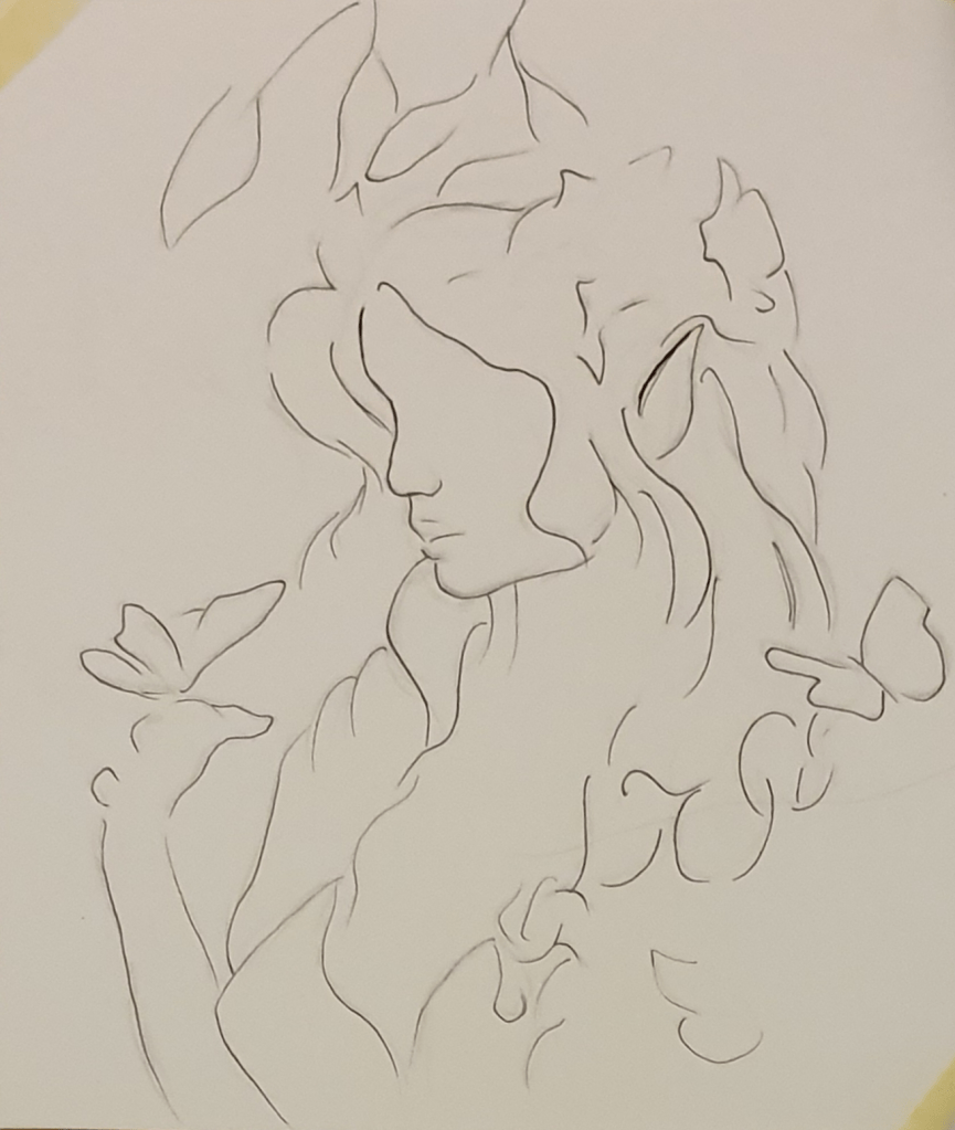
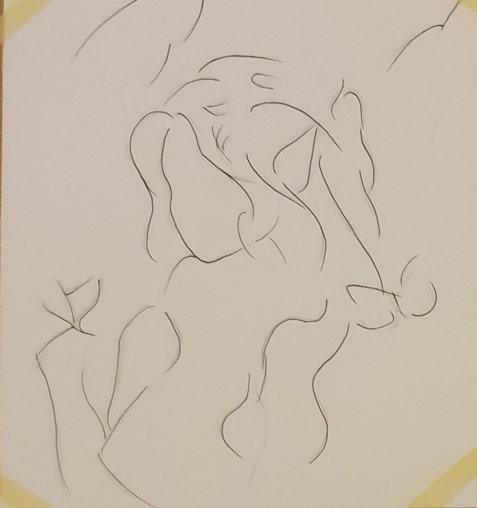
By doing this I got a sense of how much detail is need to effectively communicate an idea. I found that less was needed than I expected. I found that the general shape of an object worked well enough for someone to understand what the image is. I did however find that that for plants and foliage a simple line was not enough to communicate it well. I found that expressions were not needed for understanding but if wanting to show how they will look adding eyebrows will do the job.
I imagine that the purpose behind this image would have been to promote the tablet being used. The main points behind the art direction would have been:
1. Clearly display the tablet.
2. Make it seem exciting/magical
3. Make it bright
4. Have anyone in the image using the tablet
5. Have a clear main focus

I imagine the direction behind this would have been:
1. Create a beautiful portrait
2. Use collage
3. Keep it simple
4. Use a limited palette
5. Include anatomy
Exercise Eight: Making A Mock-up
To begin this exercise I researched the creation of a book cover. To do this I used websites and Skillshare videos. I looked into the purpose of a mock-up and different methods used for a book cover. I then created a moodboard for book covers. I chose the book Bridget Jones’s Diary as I know the story well.
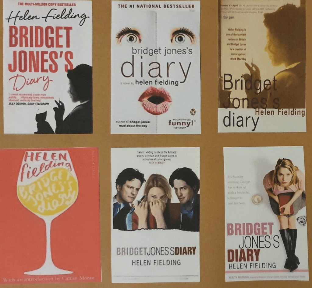
I started planning by collecting all the book covers that already exist. I then made a mind map of things from the book that I could use as the basis of the cover. Next I drew some ideas.
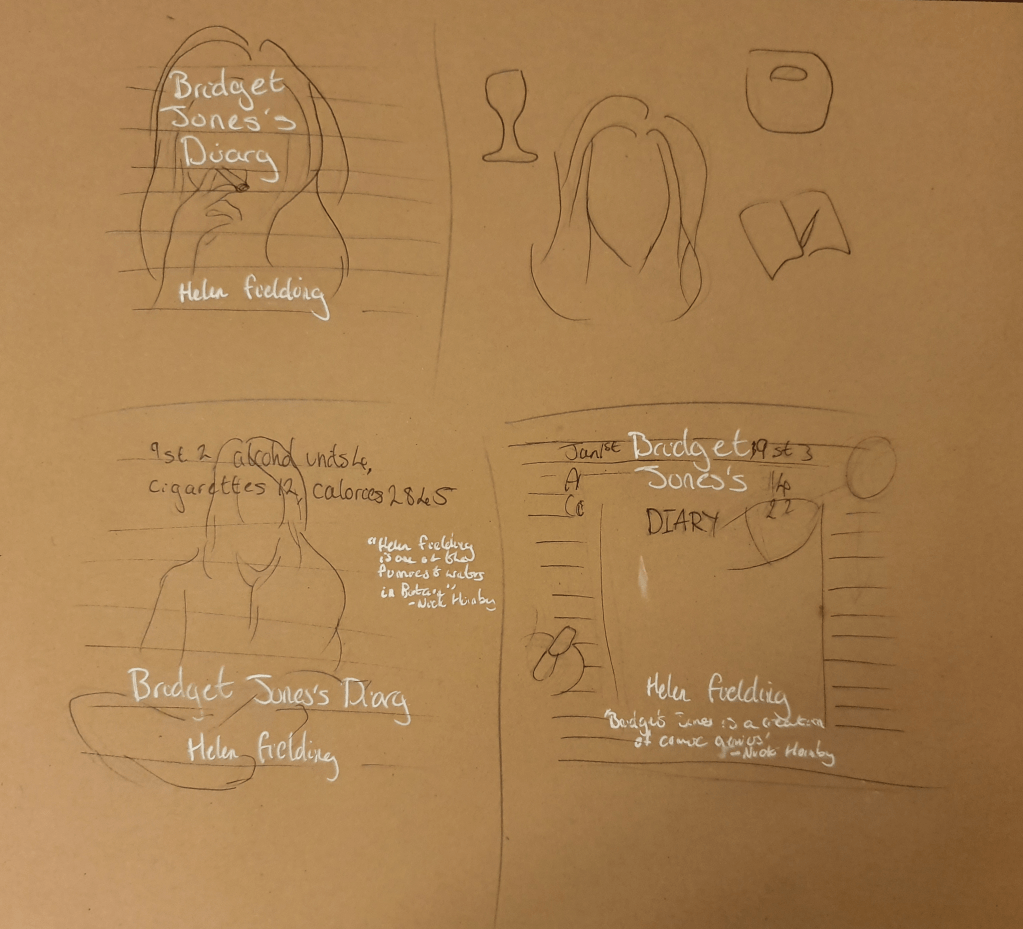
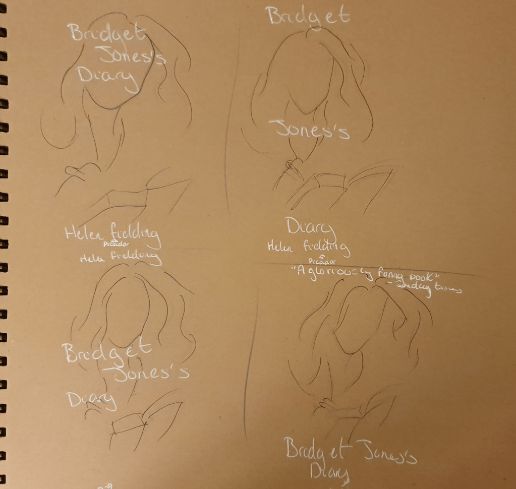
Here I was trying to figure out placement.
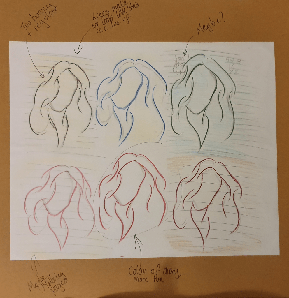
Here I was figuring out colour and if I should add more details.
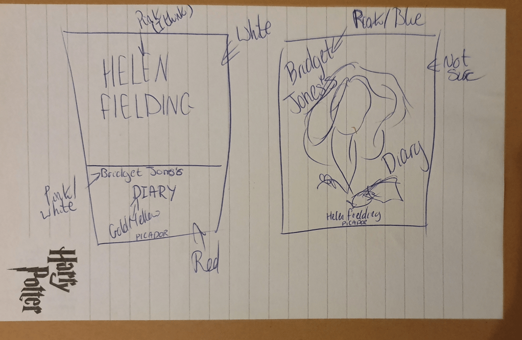
Here are some more ideas I had.
I had some more ideas and some trouble deciding.
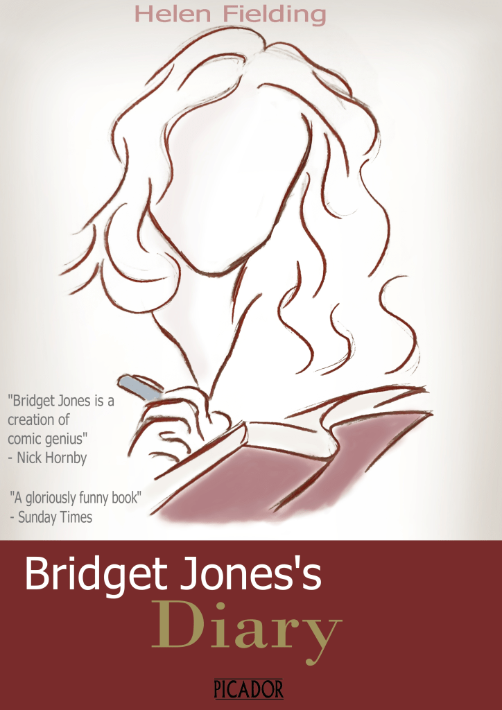
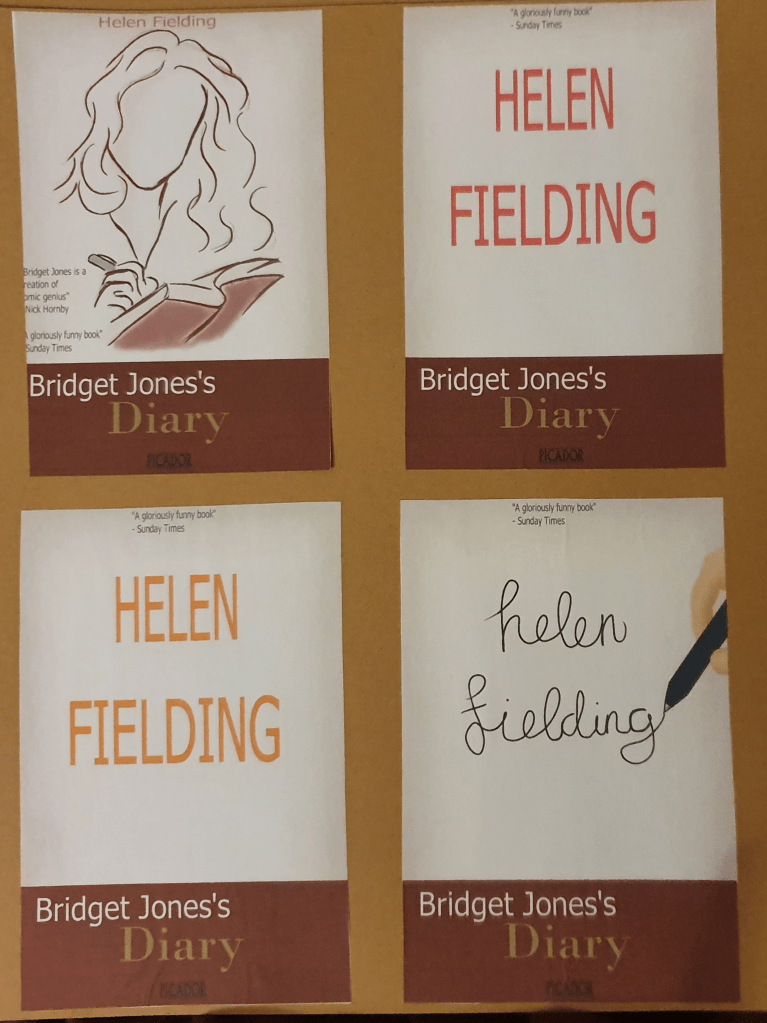
This is the design I went with. I felt that a more sketch like look loosened up the feel of the book. I chose to draw Bridget writing in her diary as this is what to book is based around and the format it is written in. I was originally going to have the drawing take up the whole cover but this didn’t look right. The image looked as though it was lost with some writing slapped on top of it. Because of this I had to rethink the design and anchor it somehow. I decided to add the diary at the bottom as a foundation. I did play around with changing the white background but didn’t think any other colour fit. Having the white background fits better as a representation of paper. I added shading around the edges to make the cover look less empty. I then added some colour to the pen and diary she is writing in to add some life to the image. This then off set the image so I added some shading to the face too. I faded the authors name and quotes on the side so that they wouldn’t draw attention away from the image. I wasn’t sure about the font but I knew that I wanted the word diary to have the same font that they usually do. This helped add to the red and make it look like her diary. I liked the contrast of the red and the white and felt that white font would tie the two part together. This is why her name is in white.
I do like the look of this cover but I’m not sure I managed to fully capture the feel of the book. Not having a huge range of paper to choose from I printed it out on printer paper.
Assignment
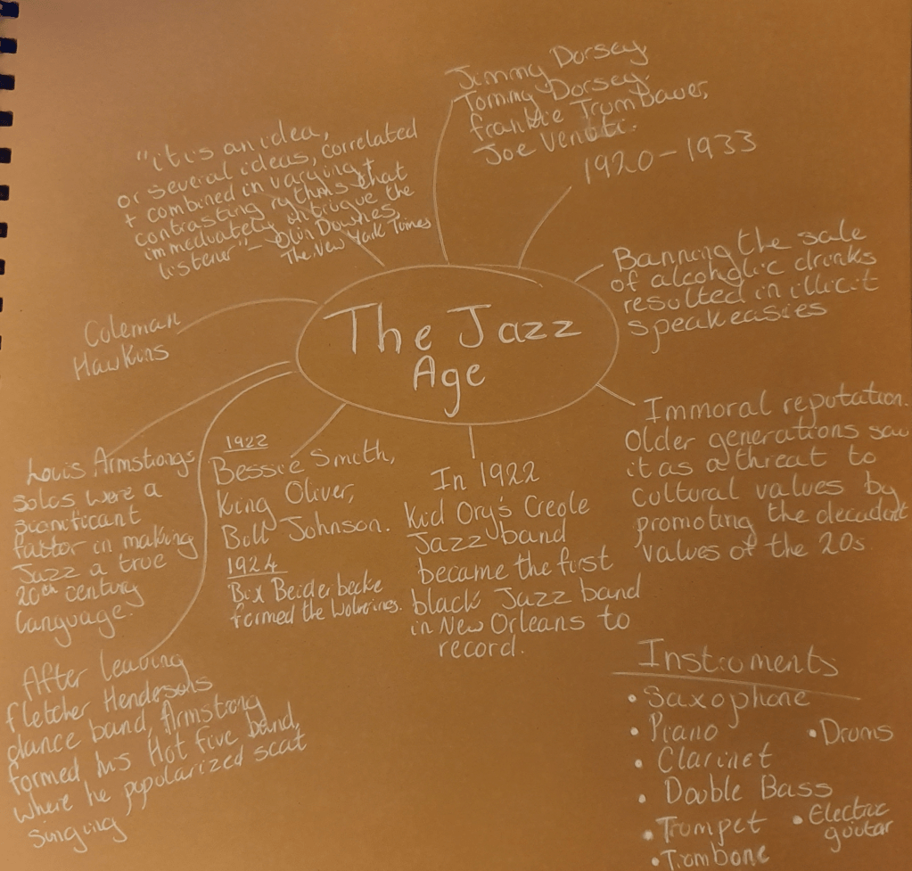
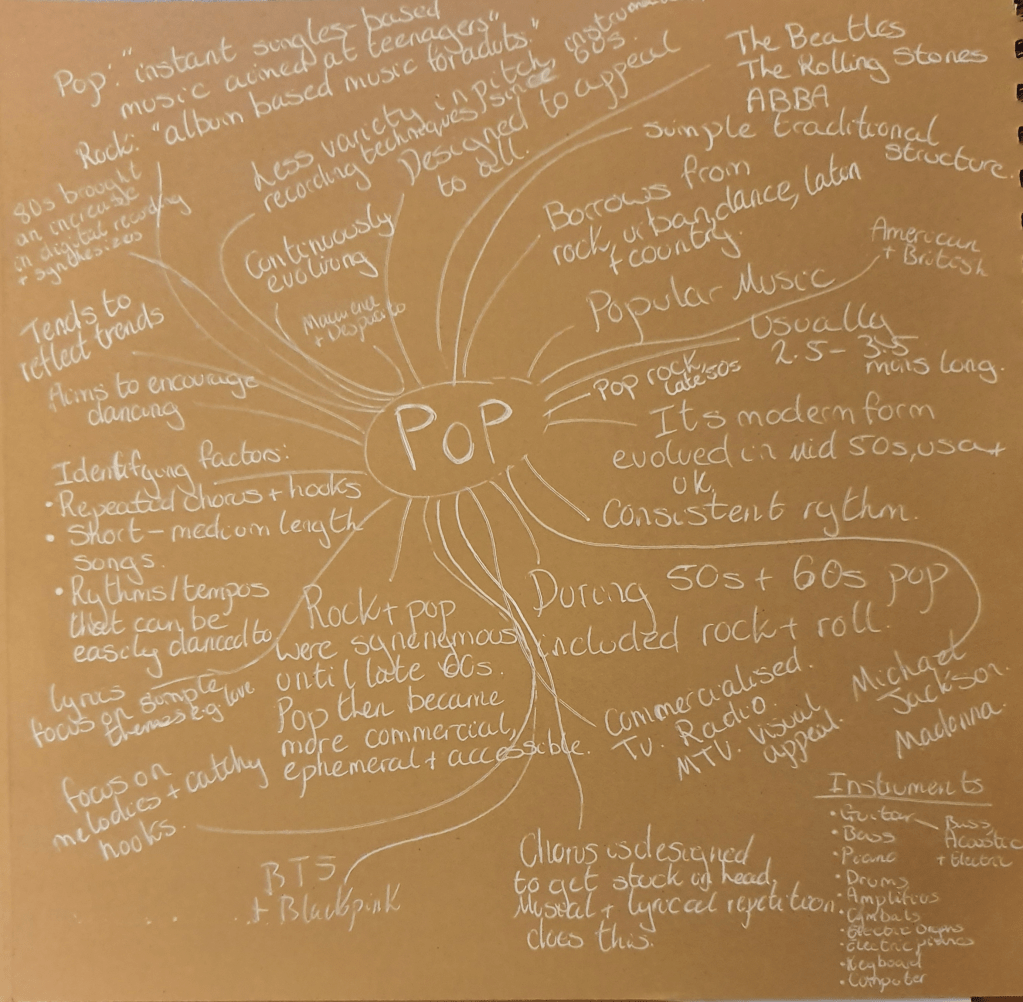
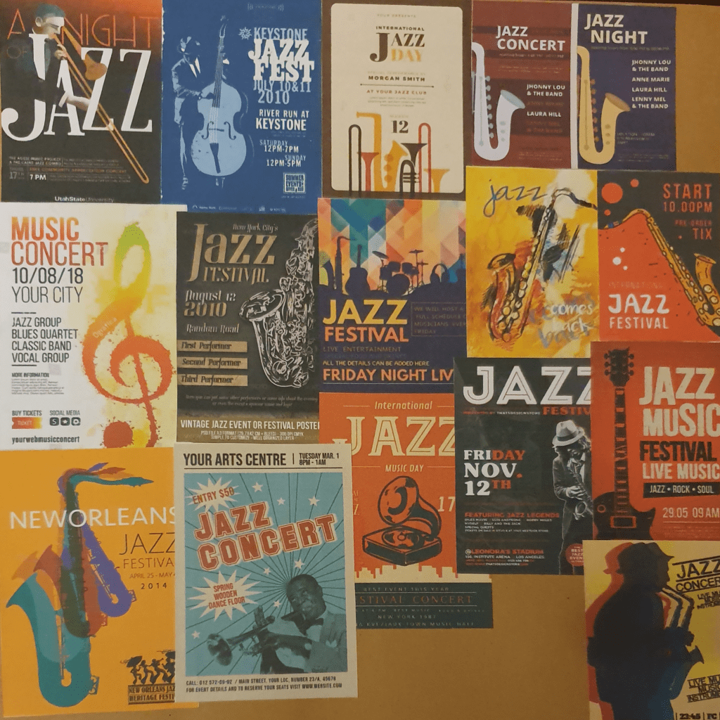
The assignment for part three was to create a poster. I cold make one for either an Early Music concert, a Jazz Event or Pop Group. I started with mind maps for jazz and pop.

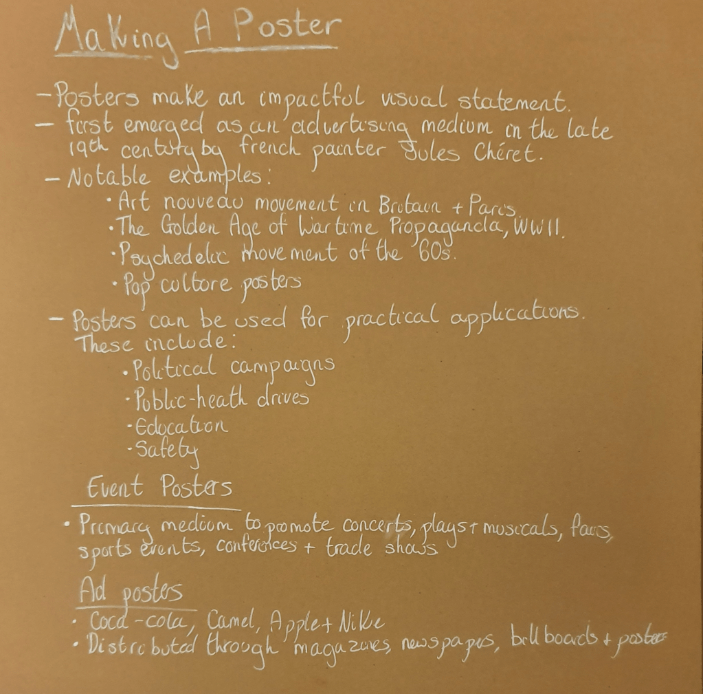
I then researched making a poster.
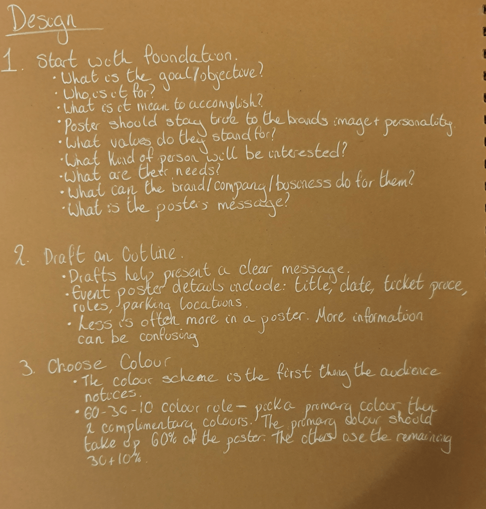
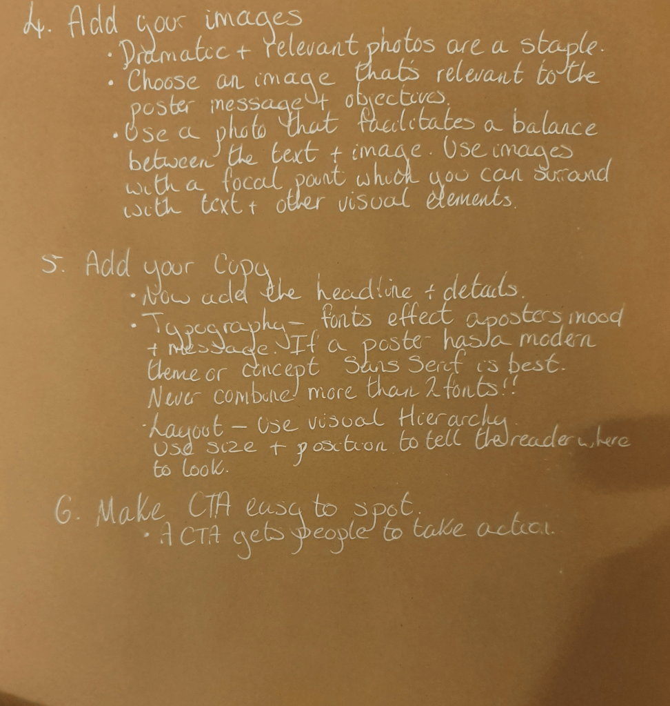
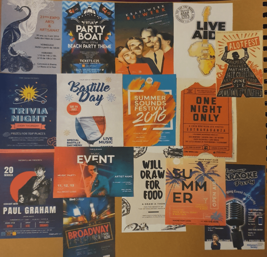
Next I started the mood boards.
I ended up picking pop as this is an umbrella term and allowed me to use a pop rock group. I chose Fall Out Boy.
I then started to plan my poster.

Instead of a more traditional venue I felt that since we can’t go to a concert at the moment because of coronavirus that a digital concert would be more fitting. I tried to think of a wide variety of designs using themes from their videos and songs.
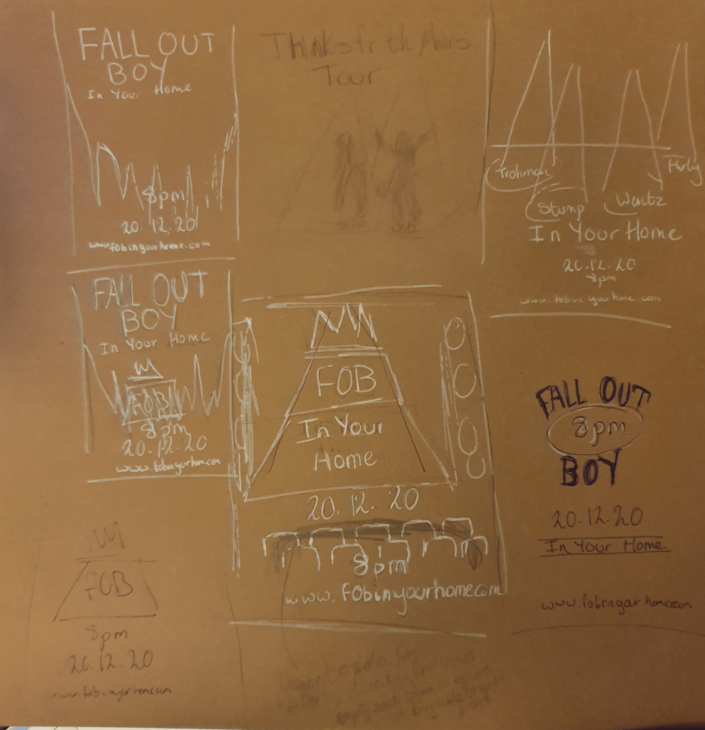
I drew a line drawing of my two favourite designs.
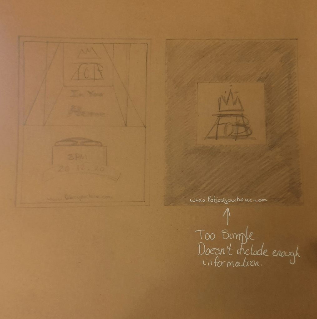
I then settled on colour for my final piece.
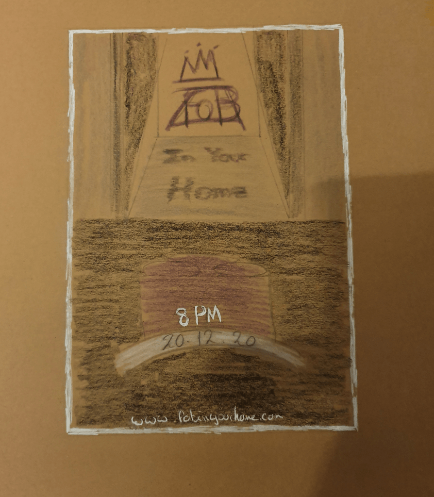
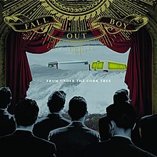
I chose this design as I felt that it had the most promise. I began to like the idea more once I realised that it echoes the album cover from Under The Cork Tree, their second album.
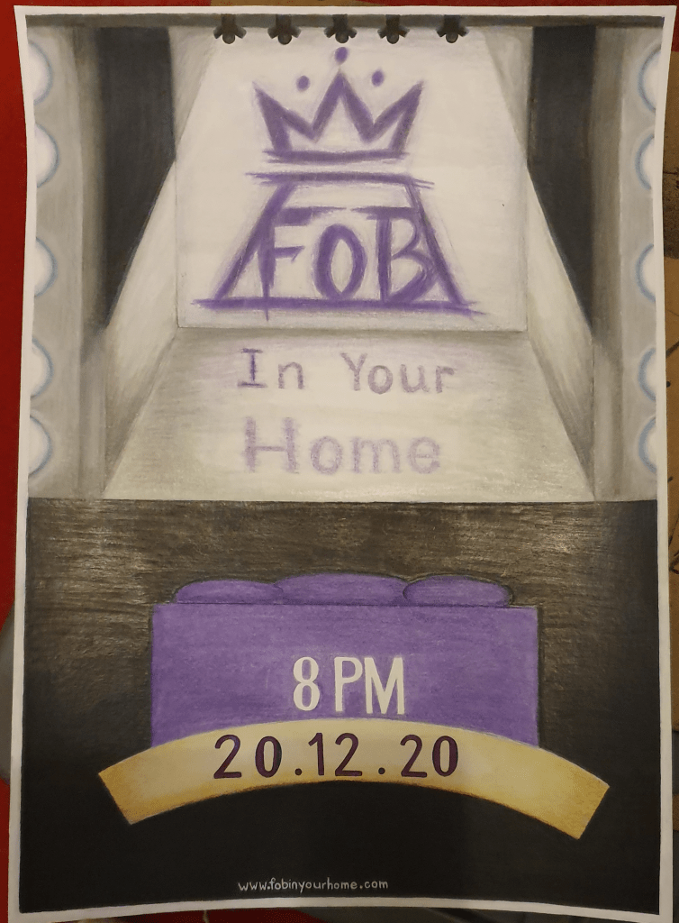
I had trouble picking the colour scheme but decided on purple as the main colour as a nod to their latest album, Mania, which features a purple cover. I used a dark background to make the purple stand out more. I was originally planning for the background to be monochrome but settled on a very dark blue as black made the sofa look like it was floating in an abyss. This was not helped by the size of the sofa, which looking at it now I feel should have been made a little bigger. The stage, I decided should be fairly pale, not only because of the bright lights used but because it contrasted with the rest of the image, drawing the eye. I wasn’t planning on drawing the image quite so realistic, but with a slightly looser style. This, however, isn’t how it turned out. I got caught up in making it look how a stage should look, which while not bad for the final result wasn’t how I planned for it to go. I feel that the final result has a modern, technological feel to it, fitting in with the fact that the concert will be displayed on a screen. I lightened up the blue between the stage and lights because the lights from the stage would do this naturally. I used shadow and highlight in a way, that I believe, is successful in making the lights look like they are turned on. I added the border to the image because in the thumbnail I drew without one the image looked like it ran off the page, which I didn’t feel looked right. Sort of like there should be more to it. By adding the border I have reined it in and made it look like it is being displayed on a screen.
Type is something I always seem to have trouble with. Choosing the colour was easy as I had already picked the colour scheme but I wasn’t sure which font to use. I decided a clean font for the important information would be best, as would be displayed on a computer. For the title, however, I wanted to go with something a little more unique. Having the same font was too harsh on the pale grey anyway. I thought making the font look as though it is being reflected onto the stage would be a good idea. I think I succeeded in this but there is definitely room for improvement. I made the time white to stand out against the rest of the image and tie it together with the border. The date was placed in a banner so that it wouldn’t get lost. I tried curving the date along with the banner but felt having it straight was better. The banner was originally going to be white but this was to harsh a contrast and the yellow looked a bit classier. I used the Fall Out Boy logo instead of anything else as I felt this would communicate better. I created a website that I placed at the bottom so that people could find out more information and get tickets. I purposely left pricing off the poster as I felt that the website was all that was necessary. the website along the bottom is a little of centre, which I’m not too pleased with.
I used a mix of ink, alcohol markers and pencils to create different textures. A mix of marker and pencil was used on the logo because I felt that a rougher texture would represent the band best. This was also used this on the sofa for a better texture and deeper shadows. Markers were used for a smoother texture. I used blue marker to give the lights a glow and make them look on. I left the sofa empty, one because of coronavirus, I felt that this was a good representation and 2, because I felt that it works as an invitation. It’s like the sofa is waiting for people to come and sit on it. I worked at an A3 size as this is the size it would be preproduced at.
The final piece:
Edit:
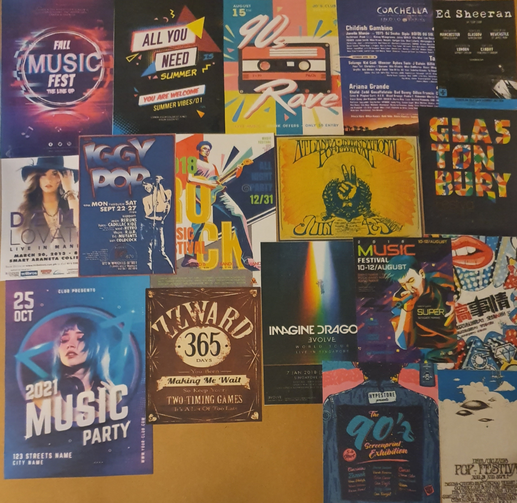
The posters I collected have told me that a simpler, less crowded image creates a better image. A less crowded image is gentler on the mind and allows it to processes the information easier. Bright colours are also a good way to draw attention. I like the contrast made between colours made in some of them as they make a striking image and it also works to tell the reader where to look. The “Alotfest” poster is also a good example of the use of perspective in a poster. The dark shape creates an interesting image and leads you straight to what you need to know.
I imagine my poster to be digital as I feel that this would fit the idea behind it a lot better. I also feel that the contrast between modern technology and traditional techniques and materials would reach the viewer better with a warmer feeling.
I think that I should have changed the perspective of the image by bringing the stage down the page, making the sofa bigger and having it bleed off the bottom of the image. This would create a better composition and more immersive experience.
Bibliography
Illustrating Visual Space
Ncbi. 2015. [online] Available at: <https://www.ncbi.nlm.nih.gov/pmc/articles/PMC5016827/>
ThoughtCo. 2019. The Element of Space in Artistic Media. [online] Available at: <https://www.thoughtco.com/definition-of-space-in-art-182464#:~:text=Updated%20May%2030%2C%202019,%2Ddimensional%20or%20three%2Ddimensional.>
Youtube.com. 2015. Elements of Art: Space | KQED Arts. [online] Available at: <https://www.youtube.com/watch?v=U11B_0FCn6o>
Linkedin.com. 2017. The 6 Qualities Meetings Need to Have to Be Effective. [online] Available at: <https://www.linkedin.com/business/learning/blog/productivity-tips/the-6-qualities-meetings-need-to-have-to-be-effective>
Abstract Illustration
Art Inspiration | Inspiration | Art Techniques | Encouragement | Art Supplies. 2016. 8 Abstract art techniques for the beginner. [online] Available at: <https://keetonsonline.wordpress.com/2016/05/16/8-abstract-art-techniques-for-the-beginner/>
Tara Leaver. 2018. 16 ways to make a painting more abstract – Tara Leaver. [online] Available at: <https://taraleaver.com/2018/01/16-ways-to-make-a-painting-more-abstract/>
Ducksters.com. Publish date unknown. History: Abstract Art for Kids. [online] Available at: <https://www.ducksters.com/history/art/abstract_art.php#:~:text=The%20main%20characteristic%20of%20abstract,paintings%20to%20the%20last%20detail.>
The Artling. 2019. Most Famous Abstract Artworks In The Last 100 Years | The Artling. [online] Available at: <https://theartling.com/en/artzine/famous-abstract-art/>
Diagrammatic Illustration
Data Viz Project. Publish date unknown. Illustration Diagram | Data Viz Project. [online] Available at: <https://datavizproject.com/data-type/illustration-explanation/>
Pinterest. 2020. 13 DIAGRAMMATIC ILLUSTRATION ideas | illustration, infographic illustration, technical illustration. [online] Available at: <https://www.pinterest.co.uk/mccluskeysam/diagrammatic-illustration/>
Central Illustration Agency. Publish date unknown. Tobatron | Illustration | Central Illustration Agency. [online] Available at: <https://centralillustration.com/illustration/tobatron>
Google.com. 2020. diagrammatic illustration – Google Search. [online] Available at: <https://www.google.com/search?q=diagrammatic+illustration&safe=strict&rlz=1C1CHBF_en-GBGB902GB902&source=lnms&tbm=isch&sa=X&ved=2ahUKEwiCzdT28eHsAhVkrHEKHX0yBtoQ_AUoAXoECAsQAw&biw=1536&bih=754>
Dreamstime.com. Publish date unknown. Diagrammatic Illustrations & Vectors. [online] Available at: <https://www.dreamstime.com/illustration/diagrammatic.html?pg=2>
speaker manual
2010. Nikon D3100. Nikon. [manual]
Deviantart.com. Not published. Search ‘diagrammatic illustration’ on DeviantArt – Discover The Largest Online Art Gallery and Community. [online] Available at: <https://www.deviantart.com/search?q=diagrammatic%20illustration> .
Globaltea. Publish date unknown. [online] Available at: <https://globaltea.ucdavis.edu/all-about-tea>
Christina’s Cucina. 2012. How to Make a “Proper” Cup of Tea (British Tea, that is). [online] Available at: <https://www.christinascucina.com/how-to-make-proper-cup-of-tea-british/>
EatingWell. Publish date unknown. Here’s How to Prepare Tea Like the British Do. [online] Available at: <http://www.eatingwell.com/featured/StriveProperWayToMakeTea>
Perfectly, H., Publish date unknown. How To Make A Cup of Tea Perfectly. [online] Twinings. Available at: <https://www.twinings.co.uk/about-twinings/latest-news-and-articles/how-to-make-tea-perfectly>
Viewpoint
En.m.wikipedia.org. 2020. Diagonal method – Wikipedia. [online] Available at: <https://en.m.wikipedia.org/wiki/Diagonal_method>
Diagonalmethod.info. Publish date unknown. diagonal method. [online] Available at: <http://www.diagonalmethod.info>
Making a Mock-up
Skillshare. Publish date unknown. [online] Available at: <https://www.skillshare.com/classes/Design-A-Book-Cover-Graphic-Design-Basics/1457491211>
99designs. 2018. Book Cover Design – Design A Creative Book Cover Online | 99designs. [online] Available at: <https://99designs.com/book-cover-design>
Literary Hub. 2018. The 75 Best Book Covers of 2018. [online] Available at: <https://lithub.com/the-75-best-book-covers-of-2018/>
Literary Hub. 2019. The 78 Best Book Covers of 2019. [online] Available at: https://lithub.com/the-78-best-book-covers-of-2019/
Assignment
En.wikipedia.org. 2020. Jazz – Wikipedia. [online] Available at: <https://en.wikipedia.org/wiki/Jazz>
Dawkes Music. 2019. Which Instruments are used in Jazz Music? | Dawkes Music. [online] Available at: <https://www.dawkes.co.uk/sound-room/which-instruments-are-used-in-jazz-music/>
En.wikipedia.org. 2020. Pop music – Wikipedia. [online] Available at: <https://en.wikipedia.org/wiki/Pop_music>
Slideshare.net. 2012. The history of pop music. [online] Available at: <https://www.slideshare.net/LukaWheeler/the-history-of-pop-music#:~:text=The%20instruments%20used%20to%20produce,acoustic%20guitars%20and%20electric%20guitars.>
Piktochart. 2019. How to Design an Eye-Catching Poster in 6 Steps. [online] Available at: <https://piktochart.com/blog/how-to-make-a-poster/>
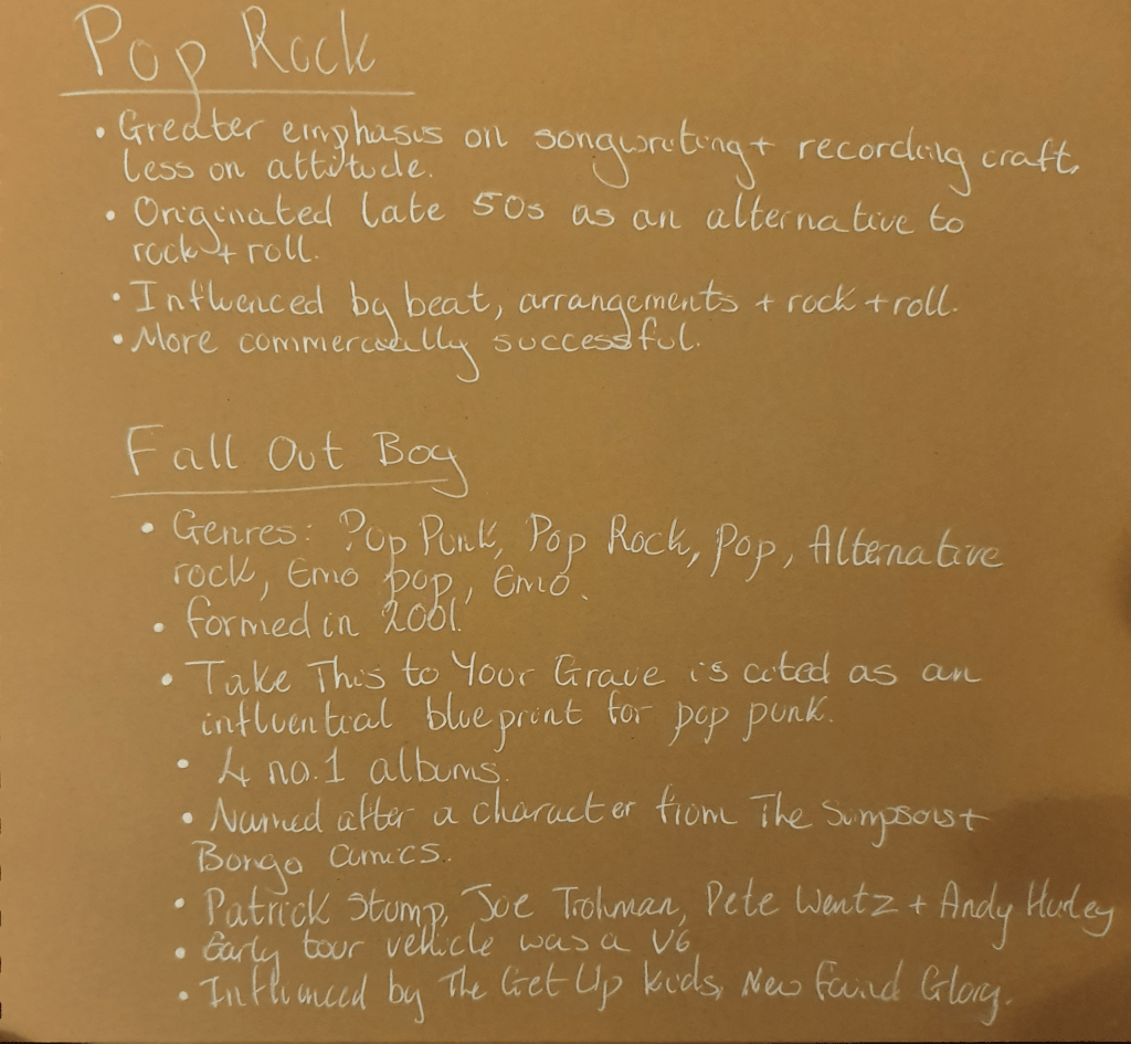
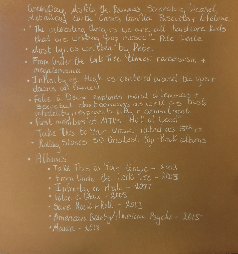
En.wikipedia.org. 2020. Pop rock – Wikipedia. [online] Available at: <https://en.wikipedia.org/wiki/Pop_rock>
En.wikipedia.org. 2020. Fall Out Boy – Wikipedia. [online] Available at: <https://en.wikipedia.org/wiki/Fall_Out_Boy>
