History of Illustration
For the first part of this assignment I decided to use the artists Kathleen Hale and Shichigoro.
I believe a big part of my decision to use Kathleen Hale may have been influenced by my love of cats. However I do love her work and wish I could make pieces like hers.
To complete the task I started by researching the two artists.
Kathleen Hale, 1898-2000
After looking at each of the artists I chose Kathleen Hale. I am unsure whether this was because of the story telling aspect of her work or because of my love for cats. Either way she had a special way of telling a story through her art.
Kathleen Hale was an author and illustrator. When she was five years old she lost her father and was sent to live with her aunt so that her mother could work. She says in her autobiography “with the subconscious desire to create for myself the united family … I had never had”. She used to console herself by spending time with animals and painting and drawing.
“She wrote to reinvent a childhood, to recreate the domestic structure she had so badly lacked. During the war, when families were so dispersed, the cohesive cat clan – living normal human life – had a role to play in keeping up children’s morale”
She studied Fine Art under Professor Allen Seaby at the Reading University College between 1915 and 1917. Here she was taught to make wood cuts.
Hale’s most significant work is probably her Orlando The Marmalade Cat series. The series of books is set between 1930-1970. The main characters are Orlando, his wife Grace and their three kittens, Blanche, Pansy and Tinkle. There is a total of 18 books. The first Orlando book, A Camping Holiday, was released in 1938. She had always had an interest in animals. She liked to take inspiration from her own life, often adding in characters based on people she knew. Orlando was based on her family cat and his character was taken from her husband, Douglas. She based Grace on how she wished she would have been. She also used many objects from her childhood in her books.

Hale was inspired to create the Orlando books by the lack of good children’s books for her sons. She designed the books based on what her sons liked, using the Babar books, created by Jean De Brunhoff, as a model. The first two books were eventually published, after many rejections, by Country Life. She began lithographing the illustrations herself to save time and cut the costs. Her illustrations tended to be full of detail, sometimes being used to carry the story. Each book took about 5 months of work.

Hale used mixed media in her works. She uses a range of oil paints, pencils and watercolours. When her publisher threatened to reduce the detail in her books to cut back costs Hale went to W S Cowell to learn autolithography – the process of drawing the ‘right’ way round on Plasticowell (a thin plastic sheet) with pen, crayon or chalk. The image is then transferred onto sensitised zinc then printed the ‘right’ way round again.
Her work is held in high regard by many, being compared to William Blake. “With Hale, image and words are simultaneous, a complete artistic expression. She is a marvellous artist and lithographer.” Her work has influenced many contemporary artists.
To me Hale’s work feels fun and spontaneous. It feels as though the ideas came to her effortlessly, like she was able to portray exactly what she wanted with only a few strokes. To me, some of her works seem to almost move about the page, like its about to come off. I love how she’s able to add so much detail, but doesn’t add so much that it makes the picture too busy. I also think that she chose the perfect colours to compliment her piece.

Shichigoro, 1986
I have recently discovered a Japanese freelance illustrator named Shichigoro (born Shingo Matsunuma). Having searched the internet, I could only find a limited amount of information about him. I was drawn to his art by the fantasy themes he incorporates into portraits.
He creates fantastical portraits for a world he created, where live mechanical creatures, human and animal. He has studied oil painting at Tama Arts University in Tokyo. He then started using Photoshop and became a digital artist for a game company.

In 2015 he caught attention for his contributions to and TV commercial. His work was featured in a commercial for Tokyo Mode Gakuen, a Japanese art school. He also held a solo exhibition in Russia and was nominated for the Chesley award in 2016 for best cover illustration.

Shichigoro’s work is influenced by the heavy anime/manga culture of Japan. He typically works with a tablet and Photoshop, though is known to have also used oil paints. He says that his work is based around the themes of “silence, peace, kindness, and joy”. His move from oil painting to Photoshop was encouraged by the lack of money to buy materials.
“I want to create original art work that I imagine in my created world. In my world there is no fear; no fear of creatures and no fear of machines, just no fear!”
The first thing I liked about Shichigoro’s work was the use of portrait. I spend a lot of time drawing portraits myself. The second thing I liked was the fantasy aspect of his work. I have always loved anything to do with fantasy and like the idea of being able to create my own fantastical pieces. I find the limited use of colour and overall monochrome of his work a little eerie but love the way he brings his characters to live when he does use more colour. It almost looks like some pieces could be real.

Hale vs Shichigoro
I would say that the biggest difference between the two artists would be the materials used, both artists are hugely influenced by their times. This is also probably the biggest contributing factor to the slight old-fashioned feel that Kathleen Hale’s work holds. There is a clear difference in style, as to be expected by the different times and cultures. I feel that both artist are heavily influenced by their own cultures, maybe Hale more so than Shichigoro, though this could be leant to the growing influence of the internet, allowing people to share things easier.
I feel that a big influence towards both artists was the need to create a better world for themselves. Hale was deprived of a happy childhood and I believe that her works were driven by this to provide happy memories for her children, as well as invent a world for herself, where she can be happy. The use of objects from her past lends to the idea that she wanted to recreate her childhood and unable to do this, she chose the next best thing. From Shichigoro’s work I get the feeling that he is lonely, or at least not happy with his life as it is. Whether this is from the constant use of one character or the dull tones used or all the weapons, I don’t know. In this way both Hale and Shichigoro are very similar.
I don’t see many similarities in their work based on imagery. I would say that the only similar thing is the use of animals, though even this differs in a huge way by the weaponizing of the animals in Shichigoro’s pieces, he either uses them as weapons or as an armour.
Pieces
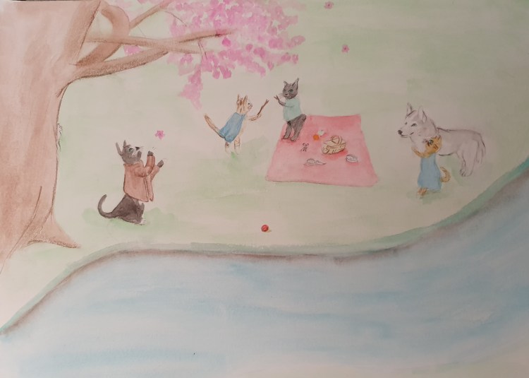
For the Kathleen Hale drawing I used my pets. I First thought of having one of the cats paint the other but felt it was too obvious. After thinking a while I settled on a picnic. I then had trouble getting the cats to look right. I couldn’t get the human stances to look natural and still don’t think I succeeded. I also had trouble using watercolors. I haven’t used them in a long time and even then I hadn’t used them much, I feel much more comfortable with pencils. As a result of this I feel my paint work needs alot of improvement.
The first thing i would fix would be how saturated I made the paint. It’s too pale and patchy as it is now but I was trying to keep the paper from bowing, which I managed at least. I do feel that a paler painting does fit with Hale’s style but I also still believe mine is too pale. I also think that I have took much wasted space and that the tree trunk is too thick.
I do however, think that I managed to catch the personalities of my pets fairly well. I also think that they could have been drawn better as I don’t think the style of the cats fits too well. I think that my need for drawing things realistically leaked through and got in the way.
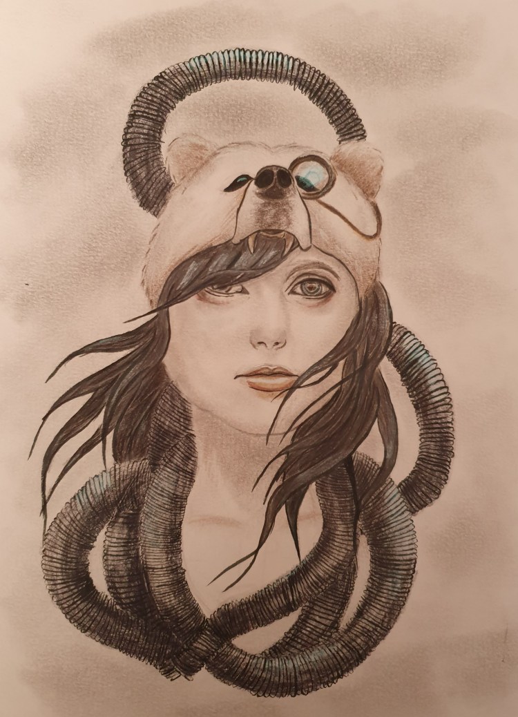
For the Shichigoro piece I think that i managed to catch the essence of his style but it still doesn’t quite fit right. When I first finished the drawing I was pleased with it but ever since I haven’t been able to look at it without noticing flaws, the most blaring being the face, or more precisely the nose. It’s too wonky and maybe a little too thin. Almost like someone tried photoshopping two pictures together and didnt align them right.
I also don’t like the eyes, they just don’t look right. Part of this is lent to the fact that I tried going down the bionic route and gave her a camera for an eye, though this doesn’t even look how it should.
I gave her tubes to further the bionic part of her but they are all different thicknesses and pretty wonky. I also think there are too many in one space at a time. I do however, like how the one above her head creates a sort of halo. I feel it gives the piece a heavenly aspect to it. I think it compliments the tubes at the bottom, that I feel resemble snakes. Sort of like heaven and hell.
I don’t think I developed the hair enough, it looks too undeveloped, almost like in an anime, though not quite. In fact the only part I am happy with is tbe bear hat, though its slightly misshapen.
I think that the pencil work is too bare, in some places you can’t even see any colour. I should have used photoshop, as this is what Shichigoro uses but as I dont have it and have no skills in it I decided to use pencils.
Say Hello
For this part of the assignment my first thought was to draw a pile of things that I like, though I dismissed the thought as soon as I had it. I did this because I thought that it would be the most obvious idea and I didnt think it would look good.
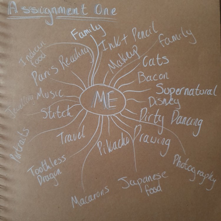
My second thought was that there should be a cat, though I did toy around with some ideas that didn’t involve one. I started with a spider diagram of things about me, though I did miss some things out. I included things that I like (though some weren’t really relevant to the task), what materials I like to use and use often and what I like to draw.
Next I used my spider diagram to get ideas and make some sketches, most I wasn’t too fond of and some I wasn’t sure how to finish. I focused on trying to get a good balance between the things I included and making it look good. I toyed with ideas of drawing a 67 impala, as it’s my favourite car and is in my favourite TV show, I thought about using jewellery as it is part of my daily life, I drew Paris as I love it there and would love to go back and I thought about using my favourite characters from different things. None of these ideas seemed good enough.
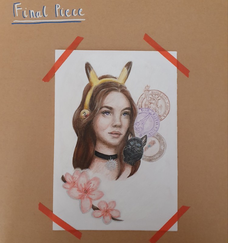
Eventually I decided I should draw a portrait. I felt that this was the best idea as it’s what I draw most and enjoy drawing. I debated using an actor from TV, someone from Supernatural maybe, but felt that it would draw away from the idea and add new meaning. I also thought about doing a self portrait but I don’t even like pictures of my self, let alone a drawing. I would have never gotten anywhere. In the end I used a random picture as a reference and made up someone, though I think it was slightly I fluencened by me recently watching His Dark Materials as I feel she resembles one of the actors a little. It’s hard to see as the picture is so small but her eyes are little galaxies. I liked this because I like stories and felt that this could convey it a bit. Also I am hoping that this course will open up new things to me.
As I said before, I wanted a cat in the picture. This is because I have always had pet cats and love them (in fact I have one curled up on my lap as I write this). I drew him on the shoulder as I thought it would look cute and would show a closeness between them. I used a picture of my cat Sammy as reference.
I gave her a choker because I like jewellery and can often be found wearing one. I added a Supernatural charm to show my love of the show. It is a big part of my life as I watch it alot and a couple of my cats are named after the actors or characters (Sammy and Jensen) which kind of adds another meaning to having Sammy in the picture.
I gave her headphones because I am constantly listening to music. I gave them pikachu ears because I love the adorable little creature, as does both my nephews. I felt that this was a way of working them into the drawing a little.
I drew the cherry blossoms because they are my favourite flower and I thought they would look pretty but this left the picture unbalanced so I drew some stamps from different countries behind her. I had the idea of drawing some from all around the world because I really want to travel it all but felt it made the picture too busy. I settled on the three I did because they are places I have been. I tried to keep them pale so as to draw away from the portrait and make them sit firmly in the background. I think that they add a postcard type of aspect to it too.
Just to show that it does work as a card and stands up:
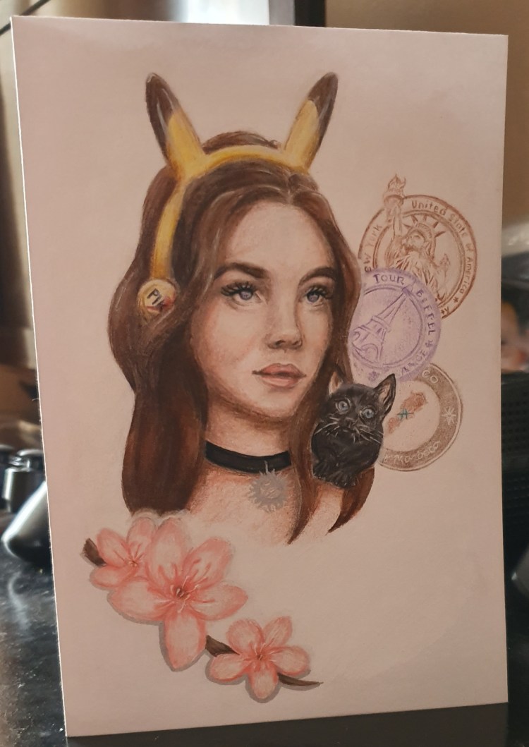
For the piece I drew on an a4 piece of paper and used pencils and ink. I use them most and they are what I feel most comfortable with. Over all I am happy with the piece, though I feel the pencil could have blended better. Also I think the hair makes the head look to long or pointy. I think I managed to include alot about me and not make it seem cluttered, though maybe I should have included different things. Explored deeper. Though I’m not sure how I would have displayed it if I had.
Bibliography
Reading.ac.uk. 2007. Kathleen Hale, Orlando (The Marmalade Cat) buys a farm, 1972. [online] Available at: <https://www.reading.ac.uk/web/files/special-collections/featureorlando.pdf>
The Independent. 1995. ART MARKET: Orlando’s raffish role models. [online] Available at: <https://www.independent.co.uk/arts-entertainment/art-market-orlandos-raffish-role-models-1523978.html>
Specialcollections.mmu.ac.uk. 2005. Colour and Autolithography in the 20th Century. [online] Available at: <https://www.specialcollections.mmu.ac.uk/files/mmu_colour_litho.pdf>
the Guardian. 2000. Obituary: Kathleen Hale. [online] Available at: <https://www.theguardian.com/books/2000/jan/28/news.obituaries>
Escapeintolife.com. Publish date unknown. Shichigoro (Shingo Matsunuma) | Escape Into Life. [online] Available at: <https://www.escapeintolife.com/artist-watch/shichigoro-shingo-matsunuma/>
Digital meets culture. Publish date unknown. [online] Available at: <https://www.digitalmeetsculture.net/article/the-photoshop-world-of-shingo-matsunuma/>
PIE International. Publish date unknown. 海外ISBN ウサロボセカイ | PIE International. [online] Available at: <https://pie.co.jp/english/search/detail.php?ID=4877>
